Elements can have default values and/or options to select from. These can be specified in the Attributes panel as described on the documentation pages of the respective form element (see Prepopulation for each supported form element).
There may be cases, however, where values of form elements need to be set dynamically at service runtime. Doing this is possible for all form elements.
Select Field Example
The following example shows how to set options to a select field.
UseLib_CustomerData_Example
Click here to download a simple example model that uses the CustomerAddress_Lib library.
Building the Data Model Structure for a Select Field
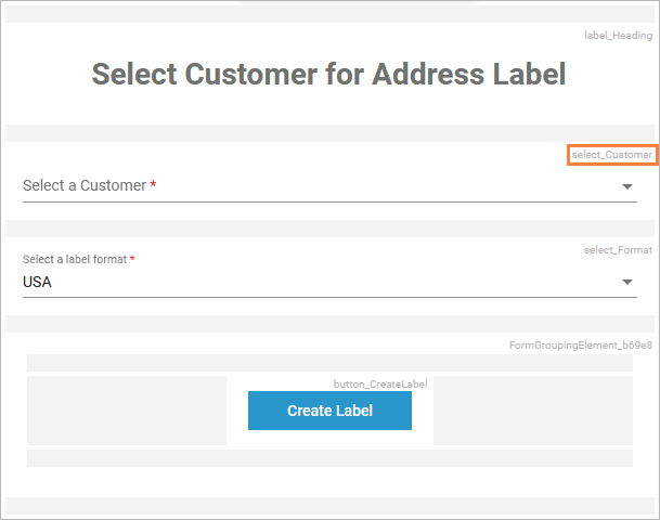
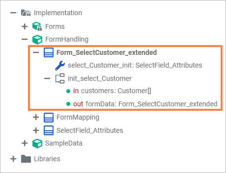
The mentioned UseLib_CustomerAddress_Example contains the following form Form_SelectCustomer:
To be able to set a list of values to a select field, you need to build a certain structure in your data model in the Implementation folder. This structure is based on PAS data types that are provided with the Base Types.
Wanting to prepopulate the customer select field select_Customer with custom data dynamically, you need to prepare the the following structure in your data model:
Elements marked in orange need to be created, elements marked in red must have a name that conforms to certain rules.
In the example service, a select field select_Customer on form SelectCustomer is populated from an array of customers.
For creating the needed structure, proceed as follows:
-
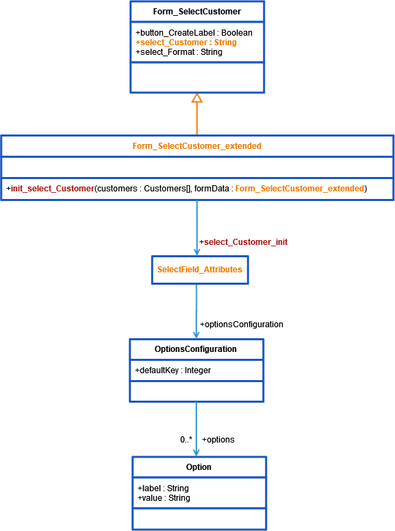
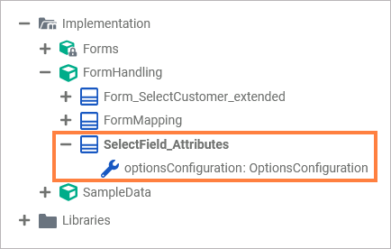
In your Implementation folder, create a class that defines the attributes of a select field.
In the example that would be SelectField_Attributes. -
Add a property of type BaseTypes.PASFormElements.pas.form.elements.select.OptionConfiguration to this class. This property will contain the options.
-
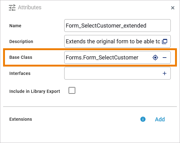
Create an extended class that derives from your form class.
In the example, that would be Form_SelectCustomer_extended which derives from Form_SelectCustomer.
This new form class must extend the form class by two elements having specific names:
-
a property called <name of the select field>_init
This property must be of the type you created earlier, the type that defines the attributes of a select field (e.g. property select_Customer_init of type SelectField_Attributes). -
an static operation called init_<name of the select field>
This operation must have exactly one output parameter having the type of the owning class. An example for that is operation init_select_Customer, having the output parameter formData of type Form_SelectCustomer_extended.
You can add as many input parameters to this operations as you need for setting the field options. The example operation has one input array of type Customer that contains the customer data that should be used to prepopulate the customer select field.
Setting the Options for a Select Field
To actually set the options, you need to implement the init_... operation. The example operation init_select_Customer is implemented with a mapping diagram.
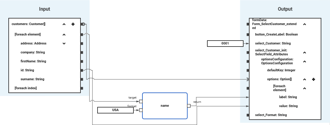
Using a foreach loop, values from the customers array are set to the options array of the select field. You can use the select field itself (select_Customer) to initialize the default selection of the select field.
UseLib_CustomerData_Example
Click here to download a simple example model that uses the CustomerAddress_Lib library.
Form_InitialDataLoading_Checkbox_Example
Click here to download a simple example model that shows how you can initialize checkbox elements dynamically in a form.
Available Properties for Dynamic Access
Every form element has a set of default and additional properties that you can initialize dynamically in your execution. Find below a list of all element properties that can be set dynamically.
|
Property |
Type |
Description |
Available for |
Possible Values |
|
|---|---|---|---|---|---|
|
Label
|
String |
Element name shown in the form. |
|
any string |
|
|
Placeholder
|
String |
Placeholder text, displayed when form field is empty. |
any string |
||
|
Read-only
|
Boolean |
Specifies whether the form element is read-only or not. |
|
true |
Element is read-only. |
|
false |
Element is not read-only (default). |
||||
|
Mandatory
|
Boolean |
Specifies whether the form element is mandatory or not. |
|
true |
Element is mandatory. |
|
false |
Element is not mandatory (default). |
||||
|
CSS Class
|
String |
Specifies a CSS class for this form element. |
|
a valid CSS class from your associated CSS file |
|
|
Regular Expression
|
String |
A regular expression to validate input values against. |
a valid regular expression |
||
Image Element
The table below lists properties that are available for the Image element only.
|
Property |
Type |
Description |
Possible Values |
|
|---|---|---|---|---|
|
Horizontal Alignment
|
Integer |
Horizontal alignment of the image element. |
0 |
Align the image to the left (default). |
|
1 |
Align the image to the horizontal center. |
|||
|
2 |
Align the image to the right. |
|||
|
Description
|
String |
Element description for documentation purposes. |
any string |
|
|
Caption
|
String |
Caption of the image element. |
any string |
|
|
Target URL
|
String |
Click target URL. |
a valid URL |
|
|
Image
|
String |
Specifies a source URL to get the image from at runtime. |
a valid URL |
|
Select Field / Radio Button Group / Checkbox
|
Property |
Type |
Available for |
Possible Values |
Example |
|
|---|---|---|---|---|---|
|
Options
|
OptionConfiguration |
an array of label/value pairs |
UseLib_CustomerData_Example Click here to download a simple example model that uses the CustomerAddress_Lib library. Form_InitialDataLoading_Checkbox_Example Click here to download a simple example model that shows how you can initialize checkbox elements dynamically in a form. |
||
|
Layout Orientation
|
Integer |
0 |
Distribute the radio buttons horizontally. |
||
|
1 |
Distribute the radio buttons vertically. |
||||
|
Label Position
|
String |
before |
Display the label before the checkbox. |
||
|
after |
Display the label after the checkbox (default). |
||||
File Upload Element
|
Property |
Type |
Description |
Possible Values |
|
|---|---|---|---|---|
|
Allowed File Types
|
Array of String |
List of allowed file types. |
an array of values |
|
|
Allowed Mime Types
|
Array of String |
List of allowed MIME Types. |
an array of values |
|
|
Max File Size
|
Float |
Maximum file size that can be uploaded. |
any float value |
|
|
Upload Type
|
String |
Specifies whether only one or multiple files may be uploaded. |
Single |
Only single file upload (default). |
|
Multiple |
Allow multi-file upload. |
|||
|
profileName |
String |
Name of a namespace the file should be uploaded to. |
a valid Designer namespace |
|
Date Picker
|
Property |
Type |
Description |
Possible Values |
|
|---|---|---|---|---|
|
dateFormat |
String |
Formatting of the date. |
one of
|
|
|
UseCurrentDate
|
Boolean |
Specify whether to prepopulate with the current date. |
true |
Display the current date. |
|
false |
Provide a date picker to select a date (default). |
|||
Data Table
|
Property |
Type |
Description |
Possible Values |
|
|---|---|---|---|---|
|
items |
Array of data table item |
Array items to prepopulate the array with. |
an array of valid table item objects |
|
|
columnModel |
The column configuration of the table. |
a valid column configuration object |
||
|
Rows per Pages
|
String |
The count of rows a page has. |
a valid count of rows per page |
|
|
Remove Row
|
Boolean |
Specify if the user can delete rows from the table. |
true |
Removing table rows is allowed. |
|
false |
Removing table rows is not allowed (default). |
|||
|
Add Row
|
Boolean |
Specify if the user can add rows to the table. |
true |
Adding new tables rows is allowed. |
|
false |
Adding new table rows is not allowed (default). |
|||
|
No Data Text
|
String |
The text that is displays when the table is empty. |
any string |
|
|
preSelection |
String |
Name of a Boolean column key that should be selected from the table. |
a valid table column name |
|
|
selectable |
Boolean |
Specify if the table has a selection checkbox in front of each table row. |
true |
Display a checkbox before each data row to be able to select rows. |
|
false |
Data rows are not selectable (default). |
|||
|
emptyCell |
String |
The text that is displayed for empty table cells. |
any string |
|
Property Types
Column Model
|
Property |
Type |
Description |
Allowed Values |
|
|---|---|---|---|---|
|
name |
String |
Specify a column name. |
a string that conforms with the element naming rules |
|
|
emptyCell |
String |
Specify a text for empty cells. |
any string |
|
|
label |
String |
Specify a column label. |
any string |
|
|
cssClass |
String |
Specify a CSS class that contains styling information for the column. |
a valid CSS class |
|
|
hidden |
Boolean |
Define the visibility of the column. |
true |
Column is visible. |
|
false |
Column is hidden (default). |
|||
|
editable |
Boolean |
Specify whether the column should be editable. |
true |
Column is editable. |
|
false |
Column is read-only (default). |
|||
|
filterable |
Boolean |
Specify whether the column should be filterable. |
true |
Column is filterable (default). |
|
false |
Column is not filterable. |
|||
|
resize |
Boolean |
Specify whether the column should be resizable. |
true |
The width of the column is sizable. |
|
false |
The column has a fixed calculated width. |
|||
|
sorting |
String |
Define the sorting direction of the column contents if sorting is allowed (see disableSort below). |
no value |
Do not sort the table contents by this column (default). |
|
ascending |
Sort table contents by this column ascending. |
|||
|
descending |
Sort table contents by this column descending. |
|||
|
disableSort |
Boolean |
Disable sorting for this column. The sorting direction can be defined with sorting (see above). |
true |
Column is not sortable (default). |
|
false |
Table contents can be sorted by column contents. |
|||
Related Content
Related Pages: