The Element Button
|
Element Icon in Sidebar |
|
|
Form Field |
|
|
Function |
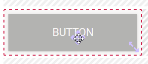
Buttons are necessary to leave a form and access the next process step. They are also used to invoke other models. |
|
Default |
A newly created button does not contain any functionality. Buttons must be configured appropriately. |
|
Example |
The button Close triggers saving of data, the input is also validated and after that the execution is stopped (the open form is closed, the process stops): 
The following options were activated for this button: 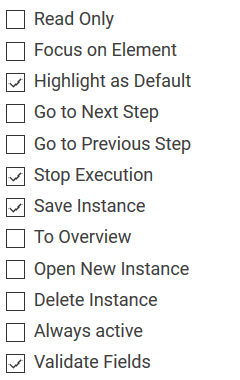
|
Configuration Options
The form element may be edited via the Edit Sidebar.

|
Name Field name shown in the form. |
|
|
ID The read-only field contains the model ID of the element. Designers can use the ID for example in the search to link the element in other models. |

|
Description When a user hovers over a form element during execution, the content of the commentary field is shown as a quick info: 
|

|
Hashtags Possibility to insert your own key terms . The leading hashtag sign # (hash) will be inserted automatically. Use the spacebar to insert multiple hashtags: 
One hashtag may be issued for multiple elements: 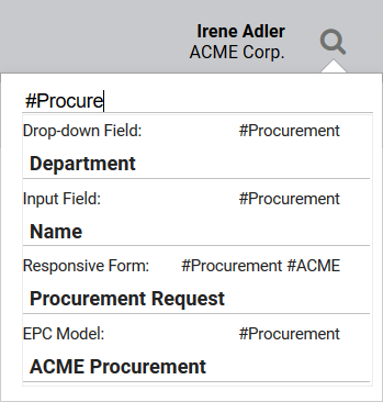
|

|
Additional CSS Classes Enables a field-acurate layout customization. |
|
|
Read Only This button can not be clicked. |
|
|
Focus on Element The button can be executed directly in the browser by pressing ENTER. |
|
|
Highlight as Default The button will be colored to distinguish it from other buttons. This indicates to the user that this button is the default button in the current form. |
|
|
Go to Next Step A click on a button with this configuration transfers the user to the next process step or the next form (if available). |
|
|
Go to Previous Step This option allows you to jump back to the previous process step. Use this button to configure a Back button.
|
|
|
Stop Execution Aborts the execution of the entire process. Use this option to close forms (see page Configuring Buttons). If you wish to save the entered data prior to closing the form, then also activate the additional button option Save Instance. Attention: All following process steps will no longer be executed, the process will stop at this position. |
|
|
Save Instance Activating this option results in saving all instance data in the database. Only the data from form elements with activated option Save Value in Instance is saved.
An authorization check will always be performed while saving. |
|
|
To Overview Enables a jump to the Process App Overview. This option is a presetting of the standard button Go to Overview which exists in each new form. |
|
|
Open New Instance Use this option to enable the user to create a new instance. A click on the button will open the corresponding Process App - Create, where you can immediately create a new instance. This option is used in the New Button of each Overview Model to enable users to create new instances directly out of the search. Save the reference model you wish to open in the field Run Model After Click. Whether the new instance is saved or not depends on the user and his decision to click the Save Button in the reference model. |
|
|
Delete Instance If this option was chosen for a button, then clicking it will result in marking the instance as deleted. The dataset can no longer be retrieved via the search function. It is however still archived and not deleted from the database.
|
|
|
Always active Choosing this option will enable the user to click the button even if the rest of the form is write-protected, for example because the user role has read-only authorization. |
|
|
Validate Fields
The validation defined in the form element is triggered by the click on this button. It is checked if all defined mandatory fields were completed and if the used Regular Expressions are valid. |
|
Empty: Containing Content: |
Function: After Click Clicking on the gear wheel opens an editor. Code saved in this function will be executed right after clicking the button - even before the start of a possibly added model in field Run Model After Click. The color of the gear wheel shows, whether an element is empty (light grey) or if content has already been saved (dark grey). |

|
Run Model After Click Option to insert a different EPC model from a current BPaaS project. Clicking the button triggers execution of the model saved here. |
|
Empty: Containing Content:
|
Function: After Model Execution A click on the gear wheel opens an editor. The coding saved here is executed last, after execution of a possibly added entry in the field Run Model After Click. The color of the gear wheel shows, whether an element is empty (light grey) or if content has already been saved (dark grey). |

|
Field Name in Container Defines the name under which the form element will be saved in the data container. If the Field Name in Container remains empty, then the field identifier (name) will be used. If two form elements share the same Field Name in Container, then both will access the same value. The Field Name in Container is a technical identifier. It is often used for extended coding. Therefore the Field Name in Container should not contain any spaces, special characters or umlaut. For further information please visit page The Container Principle. |


