The Element Table
|
Element Icon in Sidebar |
|
|
Form Field |

|
|
Function |
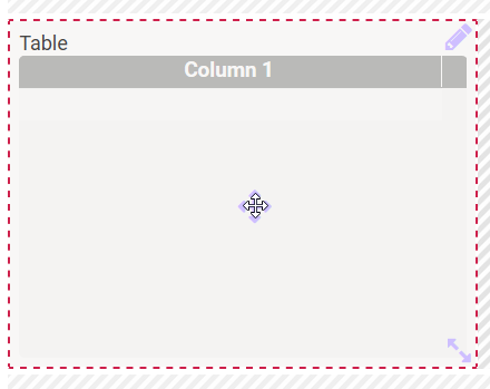
Use this element to insert a table into the form, the contents of which you can configure according to your needs and in which you can insert free text values. |
|
Default |
By default, a new table contains the sample column Column 1. You may freely define the number and content of columns and rows. Presettings can be made in edit mode. Terminate the edit mode by clicking the Check icon. If you want to enable the user to fill table cells, activate the option Editable during column configuration. Tables have to be configured by the modeler. Please see chapter Configuring Tables to learn more about the available configuration possibilities. |
|
Example |
The following table is used to manage the ACME parking lot. It contains the columns Parking, Employee, Department and Holidays CW: 
|
Configuration Options
The form element may be edited via the Edit Sidebar.

|
Name Field name shown in the form. |
|
|
ID The read-only field contains the model ID of the element. Designers can use the ID for example in the search to link the element in other models. |

|
Description When a user hovers over a form element during execution, the content of the commentary field is shown as a quick info: 
|

|
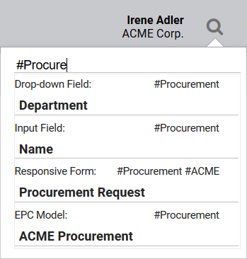
Hashtags Possibility to insert your own key terms . The leading hashtag sign # (hash) will be inserted automatically. Use the spacebar to insert multiple hashtags: 
One hashtag may be issued for multiple elements: 
|

|
Additional CSS Classes Enables a field-acurate layout customization. |
|
|
Display Button 'Add Table Row' This option adds the Plus button to the table which enables users to add new table rows. |
|
|
Display Button 'Remove Table Row' This option adds the Minus button to the table which enables users to delete table rows. |
|
|
Read Only This field is write-protected. The option applies to the entire table element. During Manual Table Configuration you can also define individual columns as read-only. |
|
|
Save Value in Instance If this checkbox is marked, the value entered in this field will be saved to the database during form execution. |

|
Row Number In this field, you can define the number of rows that are to be displayed by default. |
|
Empty: Containing Content: |
Function: After Row Selection Desig users who are familiar with JavaScript have the possibility to store corresponding code in this editor. The code will be executed after a row has been selected by the user. This option is mainly used if you want to trigger something when clicking on the row, for example sorting content. The color of the gear wheel shows, whether an element is empty (light grey) or if content has already been saved (dark grey). |

|
Run Model After Click Option to insert a different EPC model from a current BPaaS project. |
|
Empty: Containing Content: |
Function: After Model Execution Click on the gear wheel to open the editor where JavaScript code can be stored. The coding will be executed at the very end, only after any entry in field Run Model After Click has been executed. The color of the gear wheel shows, whether an element is empty (light grey) or if content has already been saved (dark grey). The testing possibilities of a form are limited within play mode. To test the interaction between multiple apps, start the apps using the tiles in the Scheer PAS Cockpit or use the process app's start link in the Project Editor. |
|
|
Column Configuration Click on the gear wheel to open an editor, which enables editing the columns of the table. An overview of available options can be found on page Manual Table Configuration. |
|
|
Configure Column Type This option allows you to define your own column types. You could replace actual values with other output values, for example to display a picture instead of a value from the container. In order to define when a set value is replaced by a defined value, conditions have to be defined. How to configurate a column type is described on page Defining Column Types. The color of the gear wheel shows, whether an element is empty (light grey) or if content has already been saved (dark grey). |

|
Field Name in Container Defines the name under which the form element will be saved in the data container. If the Field Name in Container remains empty, then the field identifier (name) will be used. If two form elements share the same Field Name in Container, then both will access the same value. The Field Name in Container is a technical identifier. It is often used for extended coding. Therefore the Field Name in Container should not contain any spaces, special characters or umlaut. For further information please visit page The Container Principle. |


