The Element Instance Table
|
Element Icon in Sidebar |
|
|
Form Field |
|
|
Function |
An instance table is used to display instances created in apps. |
|
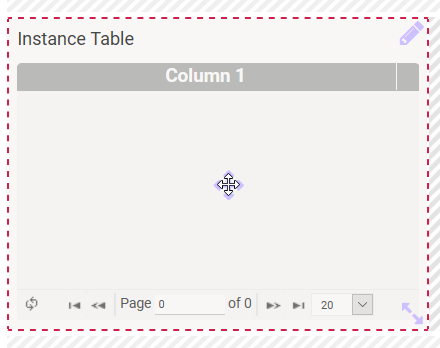
Default |
By default, a new instance table contains no content. The number and content of the columns can be determined freely. Via button Edit you can switch to edit mode and configure the table navigation (footer of the table). Terminate the edit mode with button Check. Tables have to be configured by the modeler. Please see chapter Configuring Tables to learn more about the available configuration possibilities. |
|
Example |
The classic use case for an instance table is the table in an overview. The table displays all instances created in the corresponding app. The Item Table example shows the overview of a catalog app in which items are created that are available for order. The instance table contains the columns Item Picture, Item Name and Price per Unit in $: 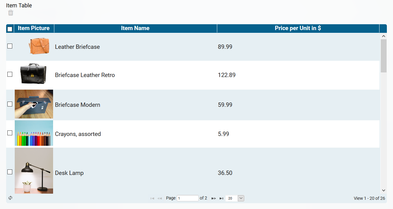
|
Configuration Options
The form element may be edited via the Edit Sidebar.
|
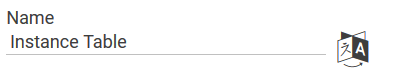
Name Field name shown in the form. |
|
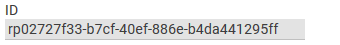
ID The read-only field contains the model ID of the element. Designers can use the ID for example in the search to link the element in other models. |
|
Description When a user hovers over a form element during execution, the content of the commentary field is shown as a quick info: 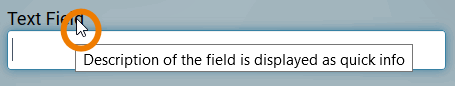
|

|
Hashtags Possibility to insert your own key terms . The leading hashtag sign # (hash) will be inserted automatically. Use the spacebar to insert multiple hashtags: 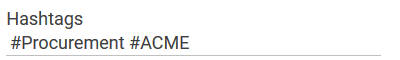
One hashtag may be issued for multiple elements: 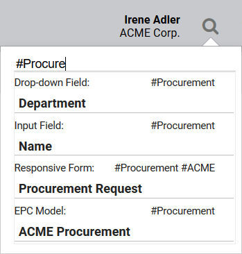
|
|
Additional CSS Classes Enables a field-acurate layout customization. |

|
Display Button 'Delete' If this option is selected, a trash can is displayed above the table and checkboxes appear in its first column: 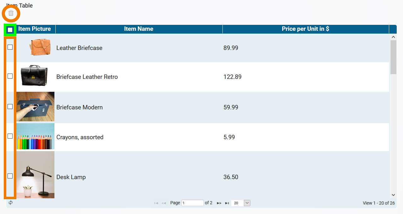
The checkboxes can be used to select individual instances. The checkbox in the header row marks all instances of the displayed table page. The marked instances can be deleted by clicking on the trash can. When creating a new instance table, this option is deactivated by default. For more information on deleting instances, see page Saving and Deleting Instances. |

|
Default Page Size Determines the default value for the table page size. |

|
Configure Column Type This option allows you to define your own column types. You could replace actual values with other output values, for example to display a picture instead of a value from the container. In order to define when a set value is replaced by a defined value, conditions have to be defined. How to configurate a column type is described on page Defining Column Types. The color of the gear wheel shows, whether an element is empty (light grey) or if content has already been saved (dark grey). |

|
Search Interval (sec) In this field specify how often the search for new instances should be started. The interval must be entered in seconds. If you do not want to use the automatic reload of instances, enter a number less than 0, for example -1. |
|
Field Name in Container Defines the name under which the form element will be saved in the data container. If the Field Name in Container remains empty, then the field identifier (name) will be used. If two form elements share the same Field Name in Container, then both will access the same value. The Field Name in Container is a technical identifier. It is often used for extended coding. Therefore the Field Name in Container should not contain any spaces, special characters or umlaut. For further information please visit page The Container Principle. |

|
Link Selected Values The button Link Selectes Values is displayed below the instance table, but only in context with a Process App Link (multiple). Use the checkboxes in the first column of the table to select the table rows whose contents should be linked. Click on Link Selected Values to adopt the selected contents into the table of the Process App Link (multiple). |