|
Element |
|
|---|---|
|
Icon |
|
|
Description |
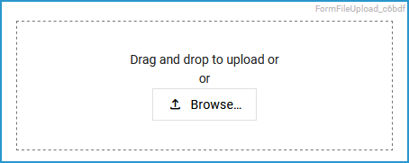
Form field where images and other documents can be uploaded. If the user clicks the upload button, he/she can select files to upload from a file browser. Alternatively, the desired files can be added with drag&drop into the marked frame. The upload takes place as soon as a file is added to the element. Uploads are stored to the file storage of the PAS installation, to a path related to the sandbox of the current user (sandbox_<user name>/<identifier>, e.g. sandbox_david.stringer/1e10d48a-db07-4589-9e5f-8bb6448ef657). The uploaded files can be referenced in forms. |
|
Type |
String or Array of String |
|
Prepopulation |
You can prepopulate the file upload element via the Attributes panel (attribute Default Files) or via Browse in the element itself. Depending on your choice in attribute Upload Type you can upload one or multiple files to the file storage, and add a reference within the file upload element.
|
|
Editing |
Refer to Modeling Forms for further information regarding editing of form elements using the context menu. |
Configuration Options
Use the Attributes panel to edit the form element.
|
Attribute |
Description |
Allowed Values / Examples |
||
|---|---|---|---|---|
|
Name |
Technical identifier for data processing and not visible for the end user. |
Alphanumercial characters and underscore. It is not allowed to start the name with a number. |
||
|
Description |
A commentary field for the developer. The content is invisible to users and its sole purpose is internal documentation. |
Any string. |
||
|
Label |
Field name shown in the form. |
Any string. |
||
|
Read-only |
This field is write-protected. When you use the option, the label Read-only is added to the bottom right of the element: 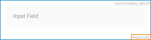
|
true |
User cannot enter values. |
|
|
false |
User can enter values (default). |
|||
|
Mandatory |
The element must be filled or used if the checkbox is activated. |
true |
Element must be filled. |
|
|
false |
Element may remain empty (default).
|
|||
|
CSS Class |
Enables a field-acurate layout customization. |
A valid CSS class. |
||
|
Custom Attributes |
The attribute is used to activate Angular directives, that are created as development kit (devkit) library to expand the default functionality. For detailed information about Angular directives, visit the official Angular documentation. For details about the usage of the Custom Attributes, refer to Developing Custom Directives. |
|
||
|
Max File Size |
In this field you can limit the size of a file. Each file is checked individually against the restriction. The unit of measurement is megabyte, a period is used as separator. |
Decimal number with period as separator. |
||
|
Upload Type
|
Use this option to specify whether only one or multiple files may be uploaded. |
Single |
Allows to upload only one file. |
|
|
Multiple |
Allows to upload several files. |
|||
|
Allowed File Types |
If you want to allow certain file types only, specify the types you want to allow in the editor. Add a new row for each file type: 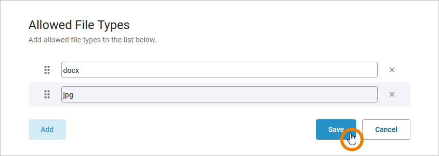
To remove a row, click the X. Confirm your changes with Save, or discard pressing Cancel. |
All common file extensions. Example: |
||
|
Allowed Mime Types |
A mime type is a two-part identifier for file formats and format contents used by internet protocols such as HTTP and document file formats such as HTML. If you want to allow certain mime types only, specify the types you want to allow in the editor. Separate type and subtype with a slash and Add a new row for each type: 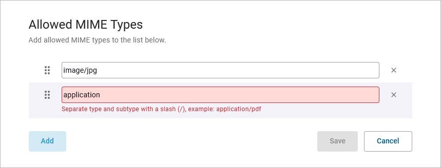
To remove a row, click the X. Confirm your changes with Save, or discard pressing Cancel. |
All common mime types. Example:
|
||
|
Default Files |
The element is empty by default but you can preset the element with a default file. Click in the middle of the editor to open the upload view or add a file with drag & drop: 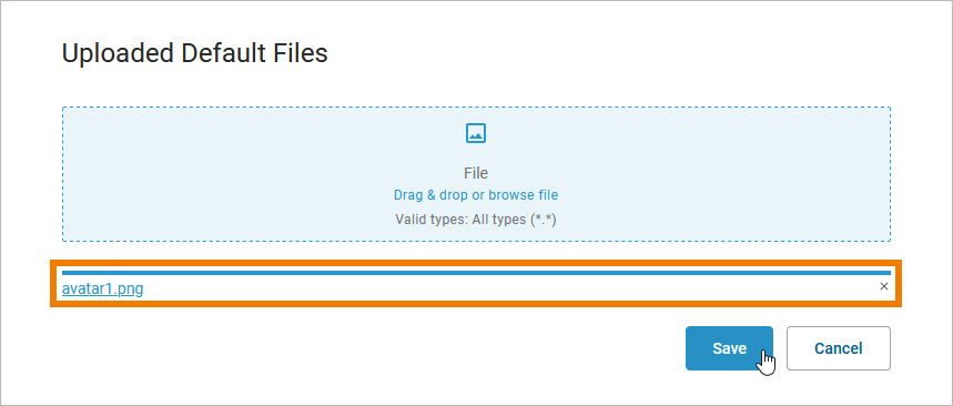
The file name will be displayed at the bottom of the element/editor. You in the editor / the user in the executed form can click the file name to download it. To remove the file, click the X. |
No restrictions.
|
||
Form_Simple_Example
Click here to download a simple example model that shows how you can configure form elements in Scheer PAS Designer.
Related Content
Related Pages: