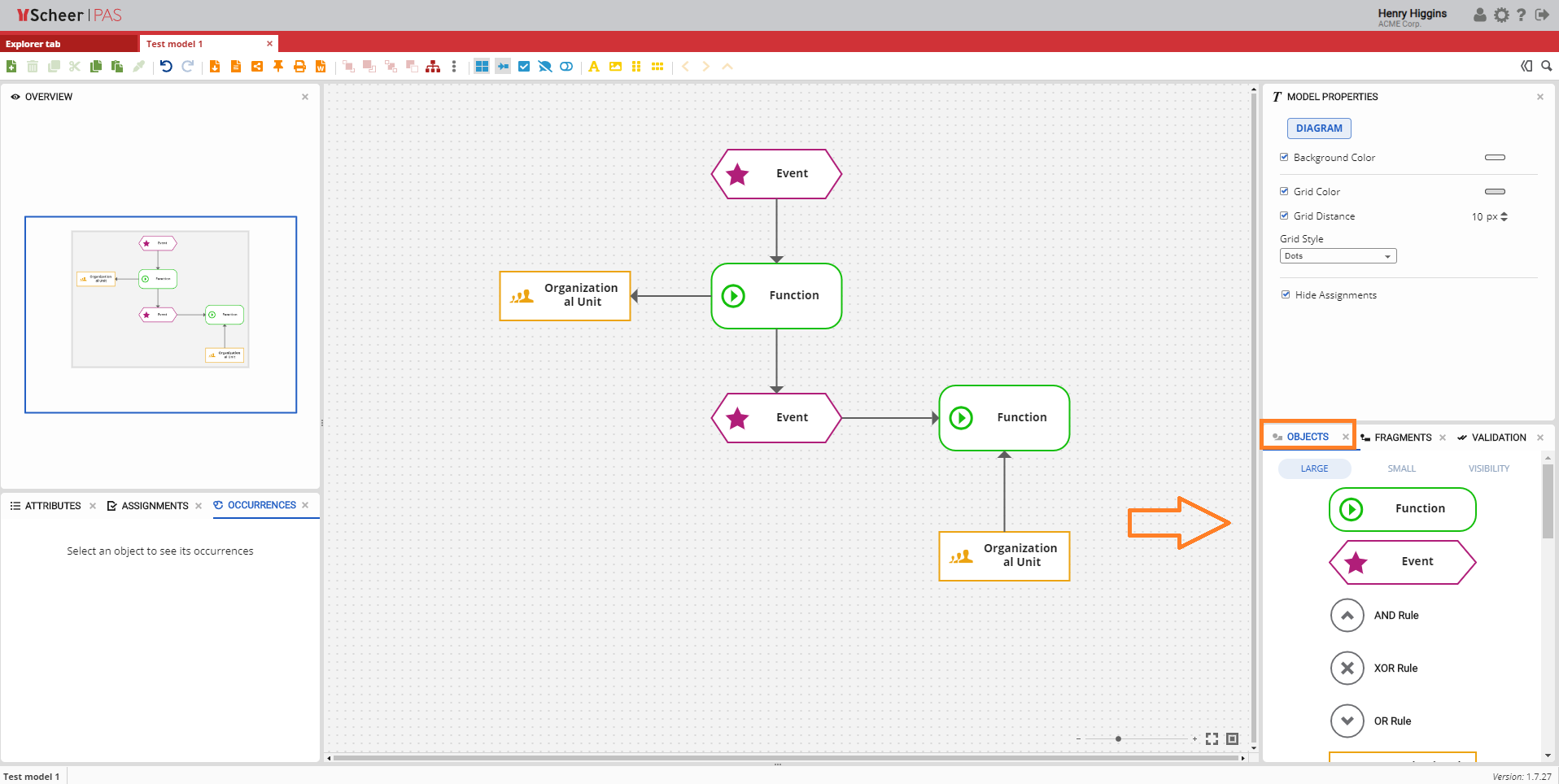
Objects Panel
The Objects panel provides access to all objects that can be placed on the Canvas. Objects are used to create and structure models and can be added to the Canvas using drag and drop.
By default, the Objects panel is located in the lower-right area of the Canvas, together with the Fragments, Validation, and Compare Model panels.
The set of available objects depends on the current model type.
Object Display Modes
The Objects panel offers several display modes. These modes control how objects are displayed or filtered within the panel.
They do not change the objects themselves and do not affect the underlying model or object definitions.
The following display modes are available:
-
Large
-
Small
-
Visibility
-
Role Visibility
-
Free Objects
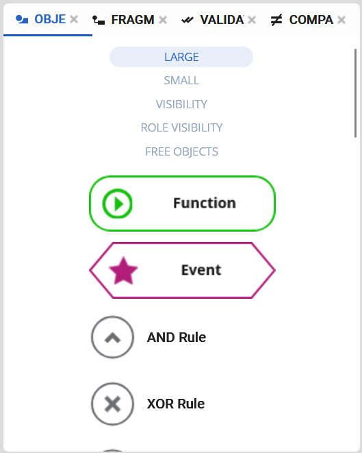
Large
In Large mode, objects are displayed in their full visual representation, exactly as they appear on the Canvas. This mode is useful when users want to clearly recognize object types and symbols.
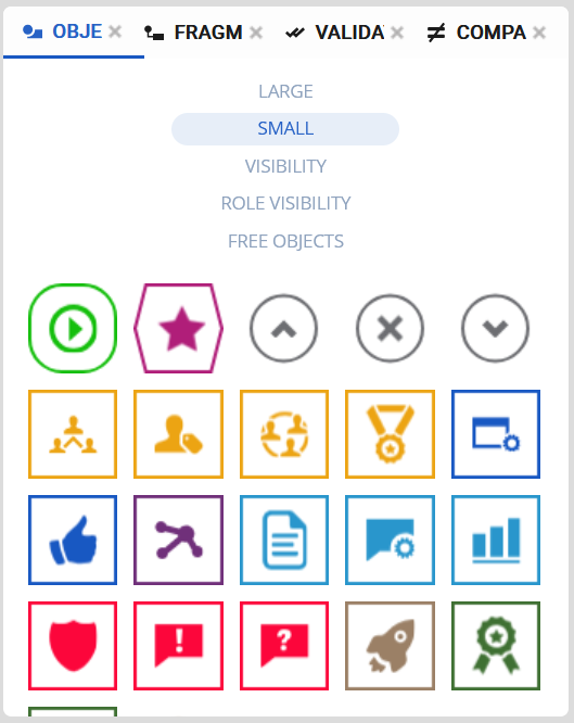
Small
In Small mode, objects are shown in a compact representation, allowing more objects to be displayed at once without scrolling.
When an object is dragged from the Objects panel onto the Canvas, it is automatically displayed in full size.
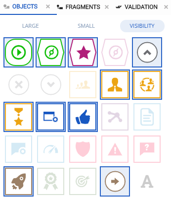
Visibility
The Visibility mode controls which object types can be shown or hidden on the Canvas. Visibility settings are applied in combination with the Toggle Surrounding Objects option in the Model Toolbar.
Within the Visibility mode, object types can be activated or deactivated by clicking on them:
-
Colored objects are marked as visible
-
Grayed-out objects are marked as hidden
These settings define which object types are affected when visibility filtering is applied.
Visibility filtering becomes active only when the Toggle Surrounding Objects option in the Model Toolbar is enabled:
-
When Toggle Surrounding Objects is enabled, only object types that are marked as visible in the Visibility mode are displayed on the Canvas. Object types marked as hidden are not shown.
-
When Toggle Surrounding Objects is disabled, all object types are displayed on the Canvas, regardless of their visibility state in the Visibility mode.
This mechanism allows users to dynamically control the visibility of object types on the Canvas and to reduce visual complexity by temporarily hiding irrelevant elements.
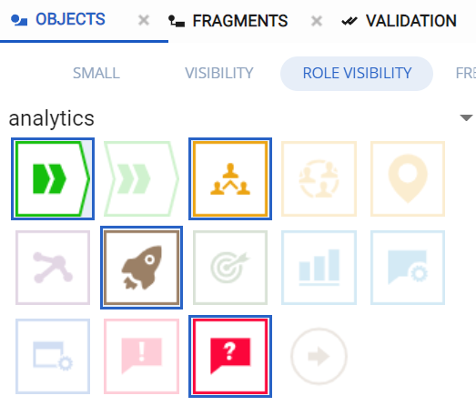
Role Visibility
The Role Visibility mode allows visibility settings to be defined per role or group. It works in the same way as the Visibility mode, with the key difference that visibility rules are applied specifically to a selected role.
First, select a role or group. Then, toggle the visibility of object types for that role:
-
Colored objects are marked as visible for the selected role
-
Grayed-out objects are marked as hidden for the selected role
These settings determine which object types are visible to users assigned to the selected role.
Role-based visibility filtering becomes active only when the Toggle Role Level Visibility option in the Model Toolbar is enabled:
-
When Toggle Role Level Visibility is enabled, users belonging to the selected role see only those object types that are marked as visible. Object types marked as hidden are not displayed on the Canvas.
-
When Toggle Role Level Visibility is disabled, all object types are displayed on the Canvas, regardless of the role-based visibility settings.
Users who have permission to view the model will see it according to the visibility configuration defined for their role. This allows model creators to restrict or simplify the visual representation of a model for specific roles without modifying the underlying model structure.
For more information about managing roles and permissions, see the Role Settings for Models and Objects section in the Administration documentation.
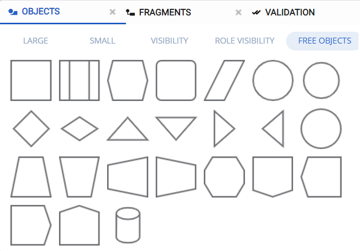
Free Objects
The Free Objects mode displays generic shapes from the Free Model. These objects are not bound to a specific modeling notation and can be freely customized.
Free Objects are typically used for annotations, additional visual elements, or informal modeling content.
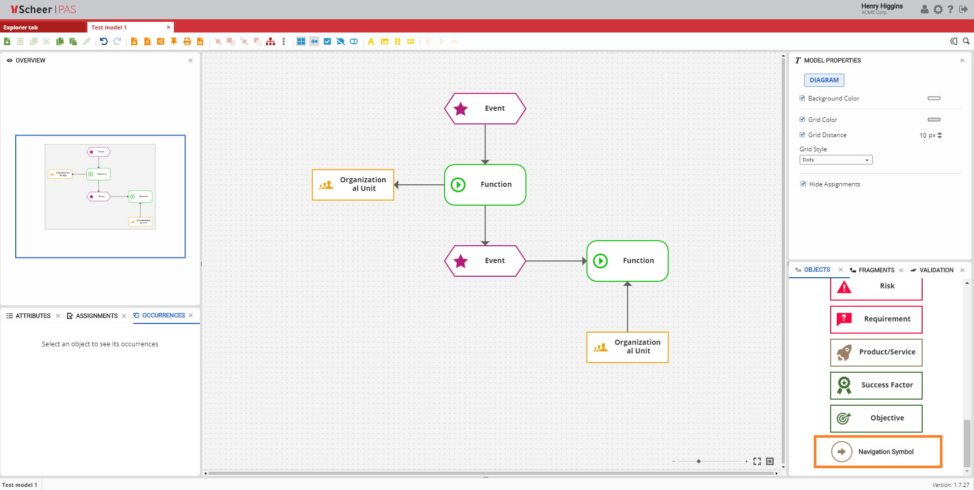
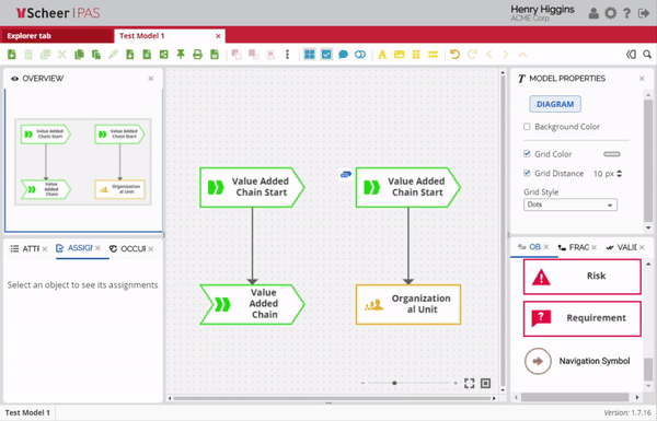
Navigation Symbol
The Navigation Symbol is a special object that is available in all model types. It is used to create an assignment between models and to establish hierarchical navigation.
Using the Navigation Symbol, the current model can be linked to another model, which then becomes the parent model in the hierarchy.
To create a model assignment using the Navigation Symbol:
-
Drag and drop the Navigation Symbol onto the Canvas.
-
Select the Navigation Symbol on the Canvas.
-
In the Assignments panel, choose Link New Model or Link Existing Model.
Once the assignment between the current model and another model is created, navigation options become available.
Model Navigation Behavior
Model navigation via the Model Toolbar supports different navigation mechanisms depending on how models are linked and accessed.
Navigation via Navigation Symbols and the Up Button
When a model is linked to another model using a Navigation Symbol, the Up icon in the Model Toolbar becomes enabled. Clicking this icon navigates from the current model to the model that is linked via the Navigation Symbol.
Note: The Up button is enabled only if exactly one Navigation Symbol with an assignment exists in the current model.
If two or more Navigation Symbols with assignments are present, the Up button is disabled, as the target model cannot be determined unambiguously.
In such cases, navigation must be performed directly via the Navigation Symbols on the Canvas.
Hierarchical Navigation (Forward and Backward)
In addition to navigation via the Up button, the Model Toolbar provides forward and backward navigation. This navigation allows users to move through previously visited models within a hierarchy.
Forward and backward navigation works when users:
-
navigate via Navigation Symbols, or
-
open linked models using the Assignments icon
This navigation is independent of the Up button and can be used regardless of whether Navigation Symbols are present or whether the Up button is enabled.
For more details on Assignments panel visit page Assignments.