Next to being able to use xUML UI to create rather complex layouts, the styling of the look and feel is the next step after the layout is set. The following chapters will introduce themes and possibilities to implement corporate designs and standards in a fast way.
Built-in Themes
The Builder offers a variety of predefined themes which can be chosen of. Theme pas-blue is designed to integrate best into the Scheer PAS environment.
The following themes are an excerpt to give an impression of what is available.
|
Theme Look |
Theme Name |
|---|---|
|
|
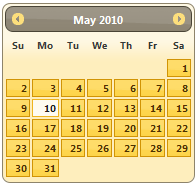
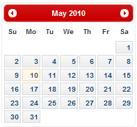
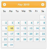
Runtime 2021.3 UI Theme pas-blue
|
|
|
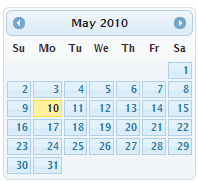
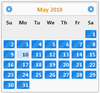
UI Theme blitzer |
|
|
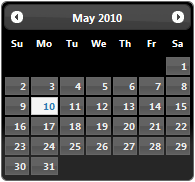
UI Theme cupertino |
|
|
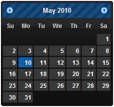
UI Theme sunny |
|
|
UI Theme ui darkness |
|
|
UI Theme dot luv |
|
|
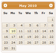
UI Theme ui lightness |
|
UI Theme eggplant |
|
|
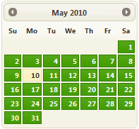
UI Theme exite bike |
|
|
UI Theme humanity |
|
|
UI Theme south street |
Creating a Custom Style
Next to the predefined and built-in themes it is often needed to create the own look and feel to match with corporate style guides. There are two ways of amending themes: directly edit an existing theme's CSS classes or use the ThemeRoller offered online by jQuery.
ThemeRoller
ThemeRoller is an online tool not only to browse the different default jQuery themes but also to visually build a theme. The ThemeRoller online tool is accessible via http://jqueryui.com/themeroller.
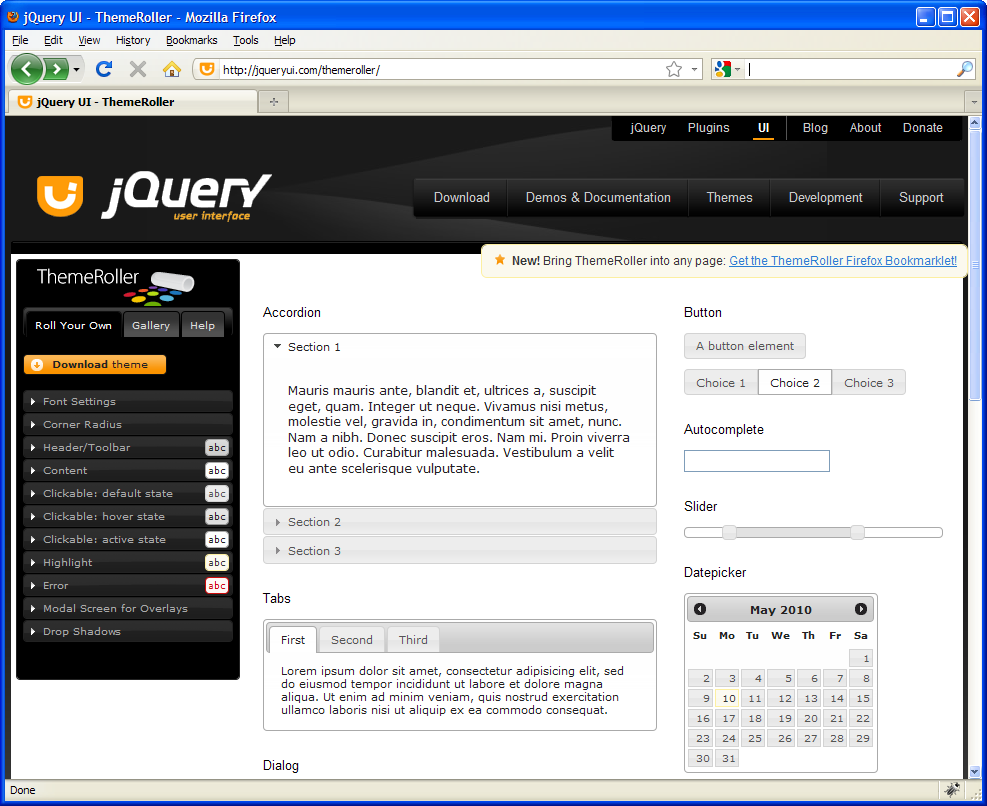
To create a unique and customized jQuery UI Theme, use the component navigation (Roll Your Own) located on the left of the screen as shown in the figure above. The parameters are grouped into topics e.g. Content or Header/Toolbar. By unfolding each group, the parameters become available for editing.
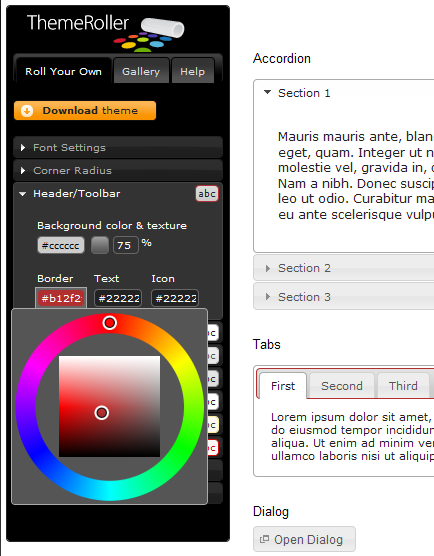
All the changes that are made to the parameters in the editing tree will be shown in real time within the content area of ThemeRoller. In the figure above, the Tabs border was changed to red. When the necessary amendments are done, a simple click on the Download Theme button will proceed to the download section of ThemeRoller.
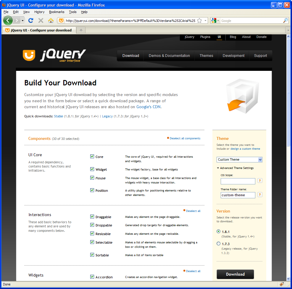
The Download Section of ThemeRoller allows to select each theme section separately to optimize the size of the theme e.g. the effect shake is not needed for user interface elements and does not need to be included. After de/selecting the components contents press the Download button to start the download of the custom theme file (jquery-ui-1.8.1.custom.zip). For the download make sure the Custom Theme is selected as well as the jQuery version 1.8.1. The optional Advanced Theme Settings can be used to change the theme folder name or define a scope on which the theme should have an effect on.
It is essential to know, that the settings within ThemeRoller are not saved and are lost after closing the browser window.
The Theme Package
The downloaded theme archive contains all the CSS, images and JavaScript files as well as a development package containing examples and documentation.
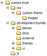
Within the folder structure there are the following files:
-
/custom style/css/custom-theme/jquery-ui-1.8.1.custom.css
This file holds all css classes defining the theme and which can be amended. Some classes also have image references to icon sets and other images which should be placed within the images sub-directory. Just changing the look and feel only requires doing amendments within this file and the images. For a description of the Theme css class API refer to the next chapter. -
/custom styles/js/jquery-1.4.2.min.js
The jQuery library. The content of this file is compressed and optimized JavaScript code and is ignored.
Theme API
jQuery offers next to the pre-defined themes and the ability to use ThemeRoller as a visual tool to create custom themes an API to its jQuery UI framework which enables more technically oriented designers to implement their own designs in pure CSS and JavaScript to e.g. add additional missing features not available in jQuery.
The jQuery UI framework API is straight forward and compact. The following list gives an overview description of the CSS classes which can be overridden. Knowledge of CSS is required.
|
CSS class name |
Description |
|---|---|
|
Layout Helpers |
|
|
.ui-helper-hidden |
Applies display: none to elements. |
|
.ui-helper-hidden-accessible |
Applies accessible hiding to elements (via abs positioning off the page) |
|
.ui-helper-reset |
A basic style reset for UI elements. Resets things such as padding, margins, text-decoration, list-style, etc. |
|
.ui-helper-clearfix |
Applies float wrapping properties to parent elements |
|
.ui-helper-zfix |
Applies iframe "fix" css to iframe elements when needed in overlays. |
|
Widget Containers |
|
|
.ui-widget |
Class to be applied on outer container of all widgets. Applies font family and font size to widget. Also applies same family and 1em font size to child form elements specifically, to combat inheritance issues in Win browsers. |
|
.ui-widget-header |
Class to be applied to header containers. Applies header container styles to an element and its child text, links, and icons. |
|
.ui-widget-content |
Class to be applied to content containers. Applies content container styles to an element and its child text, links, and icons. (can be applied to parent or sibling of header) |
|
Interaction States |
|
|
.ui-state-default |
Class to be applied to clickable button-like elements. Applies "clickable default" container styles to an element and its child text, links, and icons. |
|
.ui-state-hover |
Class to be applied on mouseover to clickable button-like elements. Applies "clickable hover" container styles to an element and its child text, links, and icons. |
|
.ui-state-focus |
Class to be applied on keyboard focus to clickable button-like elements. Applies "clickable hover" container styles to an element and its child text, links, and icons. |
|
.ui-state-active |
Class to be applied on mousedown to clickable button-like elements. Applies "clickable active" container styles to an element and its child text, links, and icons. |
|
Interaction Cues |
|
|
.ui-state-highlight |
Class to be applied to highlighted or selected elements. Applies "highlight" container styles to an element and its child text, links, and icons. |
|
.ui-state-error |
Class to be applied to error messaging container elements. Applies "error" container styles to an element and its child text, links, and icons. |
|
.ui-state-error-text |
An additional class that applies just the error text color without background. Can be used on form labels for instance. Also applies error icon color to child icons. |
|
.ui-state-disabled |
Applies a dimmed opacity to disabled UI elements. Meant to be added in addition to an already-styled element. |
|
.ui-priority-primary |
Class to be applied to a priority-1 button in situations where button hierarchy is needed. Applies bold text. |
|
.ui-priority-secondary |
Class to be applied to a priority-2 button in situations where button hierarchy is needed. Applies normal weight text and slight transparency to element. |
|
Icons |
|
|
.ui-icon |
Base class to be applied to an icon element. Sets dimensions to 16px square block, hides inner text, sets background image to "content" state sprite image. ui-icon class will be given a different sprite background image depending on its parent container. For example, a ui-icon element within a ui-state-default container will get colored according to the ui-state-default's icon color After declaring a ".ui-icon" class, you can follow up with a second class describing the type of icon you'd like. Icon classes generally follow a syntax of .ui-icon-{icon type}-{icon sub description}-{direction}. For example, a single triangle icon pointing to the right looks like this: .ui-icon-triangle-1-e |
|
Buttons |
|
|
.btn-accent |
Class to be applied to grey-out a button (theme pas-blue). |
|
.btn-warn |
Class to be applied to style the button in a warning-like fashion (theme pas-blue). |
|
Corner Radius helpers |
|
|
.ui-corner-tl |
Applies corner-radius to top left corner of element. |
|
.ui-corner-tr |
Applies corner-radius to top right corner of element. |
|
.ui-corner-bl |
Applies corner-radius to bottom left corner of element. |
|
.ui-corner-br |
Applies corner-radius to bottom right corner of element. |
|
.ui-corner-top |
Applies corner-radius to both top corners of element. |
|
.ui-corner-bottom |
Applies corner-radius to both bottom corners of element. |
|
.ui-corner-right |
Applies corner-radius to both right corners of element. |
|
.ui-corner-left |
Applies corner-radius to both left corners of element. |
|
.ui-corner-all |
Applies corner-radius to all 4 corners of element. |
|
Overlay & Shadow |
|
|
.ui-widget-overlay |
Applies 100% wxh dimensions to an overlay screen, along with background color/texture, and screen opacity. |
|
.ui-widget-shadow |
Class to be applied to overlay widget shadow elements. Applies background color/texture, custom corner radius, opacity, top/left offsets and shadow "thickness". Thickness is applied via padding to all sides of a shadow that is set to match the dimensions of the overlay element. Offsets are applied via top and left margins (can be positive or negative). |


For more detailed information refer to the JQuery documentation.
Adding customized Themes, CSS and JavaScript files
|
|
<your example path>\Advanced Modeling\UI\uml\uiCustomCSS.xml |
Customized jQuery Themes, CSS and the JavaScript files need to be imported using the Resource Importer. The resources will be added according to the type that is selected within the Resource Importers wizard.