In a table column, you do not always want to display the actual value, but replace it with another output value, for example to visualize the value by displaying a corresponding picture. To achieve this, you can define your own column type. Once the column type has been saved, it can be found and selected in the table configuration under the option Column Type.
Creating a Column Type
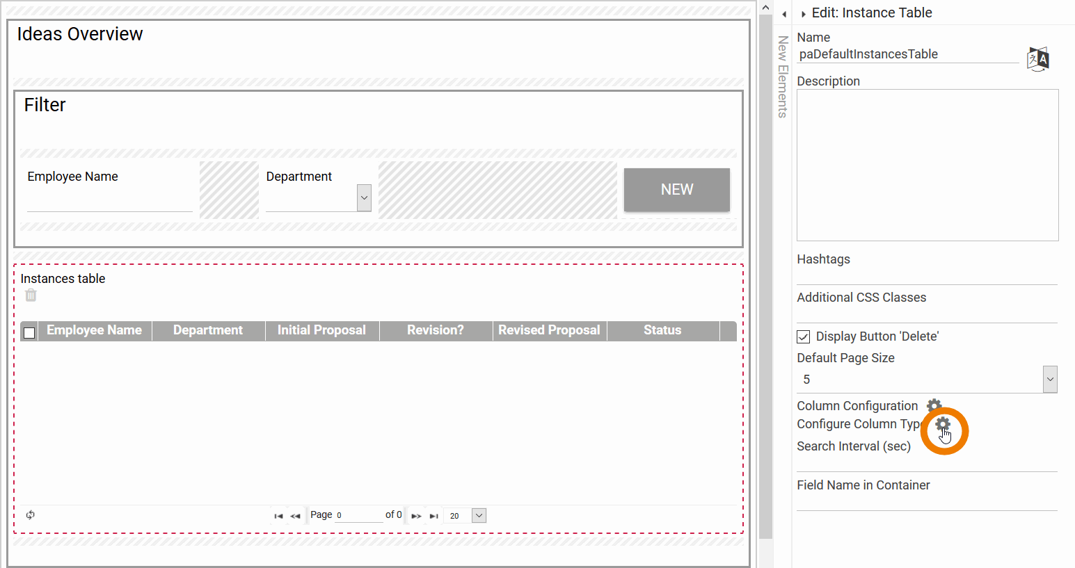
To configure your own column type, you need to use the option Configure Column Type. The option can be found in the Edit Sidebar of the form elements table, instance table and app link (multiple):
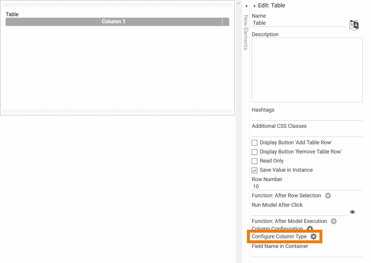
Click on the gear wheel to open the Column Type Configurator:
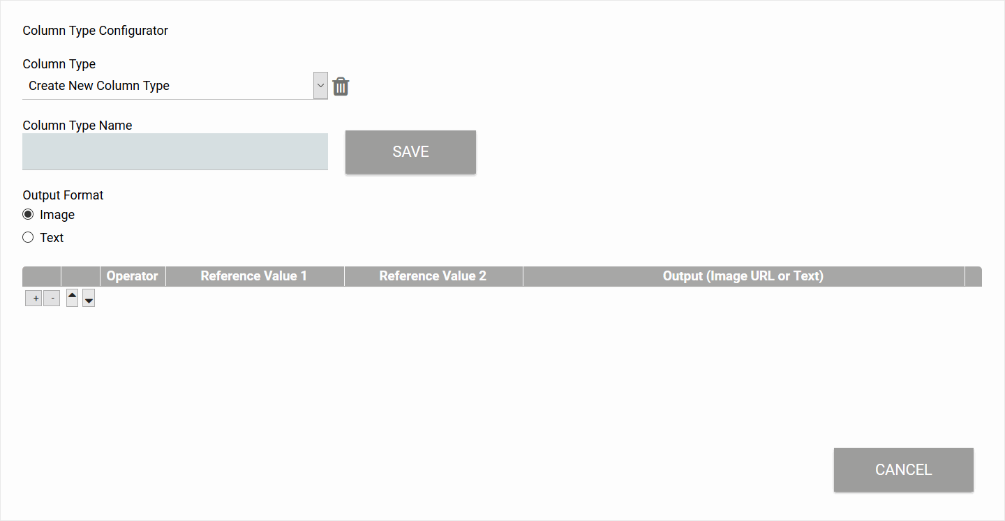
In the Column Type Configurator you can define new column types or manage already existing ones.
|
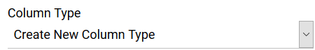
Column Type Choose a column type to be edited from the drop down menu or select Create New Column Type to create a new type. |
|
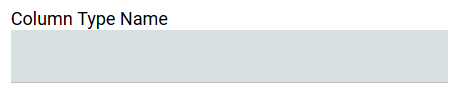
Column Type Name Once you created a new column type enter its name here. |

|
Save Once you have defined a new column type, make sure to save your specifications via the Save button. Now the new column type will automatically be added to the selection list of available Column Types. |
|
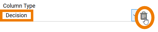
Trash Can To delete a previously created column type, you need to initially select it from the drop down menu, then click on the trash can button. |
|
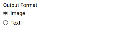
Output Format Select the desired output format (image or text display) here. When defining your own column type, you often want to replace text with suitable icons. On the website www.iconfinder.com you can find many icons for download, some of them for free. |

|
Add Table Rows Use the buttons + and - to add or delete rows. |

|
Change Order of Rows Use the arrow buttons to change the order of existing rows. The conditions are processed from top to bottom. Therefore, the lowest applicable rule is used for the replacement. |

|
Operator Select the desired operator from the list of available operators:
|
|
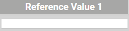
Reference Value 1 / Reference Value 2 Use the reference value 1 to compare it with the original value from the table. Reference value 2 is only needed in cooperation with the between operator. The between operator verifies if a value is larger than reference value 1 and smaller than reference value 2. Reference values can be character strings or numbers. Examples: != „Mustermann GmbH“ <= 28 |

|
Output (Image URL or Text) In this column, enter the content that is to replace the original value if the condition is fulfilled. If you have selected Image as output format, enter the URL of the image that is to be displayed in the table here.
The image or text is displayed if one of the specified conditions is fulfilled. If none of the defined conditions applies, no replacement is made. |

|
Cancel Use this button to leave the column type configurator. Attention: Unsaved data will be lost when clicking Cancel. |
If your column type may contain empty values also, define an additional blank condition. To do this, select the operator = and leave the Reference Value and Output fields empty.
Expert Advice
The size of the displayed image can be adjusted via the CSS, class: ui-widget-columnrendererwidget-tableimage.
Example: Creating an Image Column Type
"A picture is worth a thousand words": Users capture values faster if they are visualized by images, so in overviews it can be helpful to display column content as image. In our example, users should be able to see at a glance whether their application has been approved or rejected.
Example: Configuration of the column type Approval for the overview of ACME's Idea Management Process
Irene Adler wants to insert a column Approval in the overview indicating whether or not an idea has been approved or is still in review. The display is to be made by means of pictures:
|
Image |
Description |
|---|---|
|
Approved |
|
Rejected |
|
In review |
Irene initially marks the instance table in the overview form. She subsequently clicks on the option Configure Column Type:
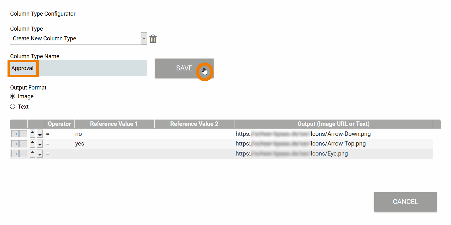
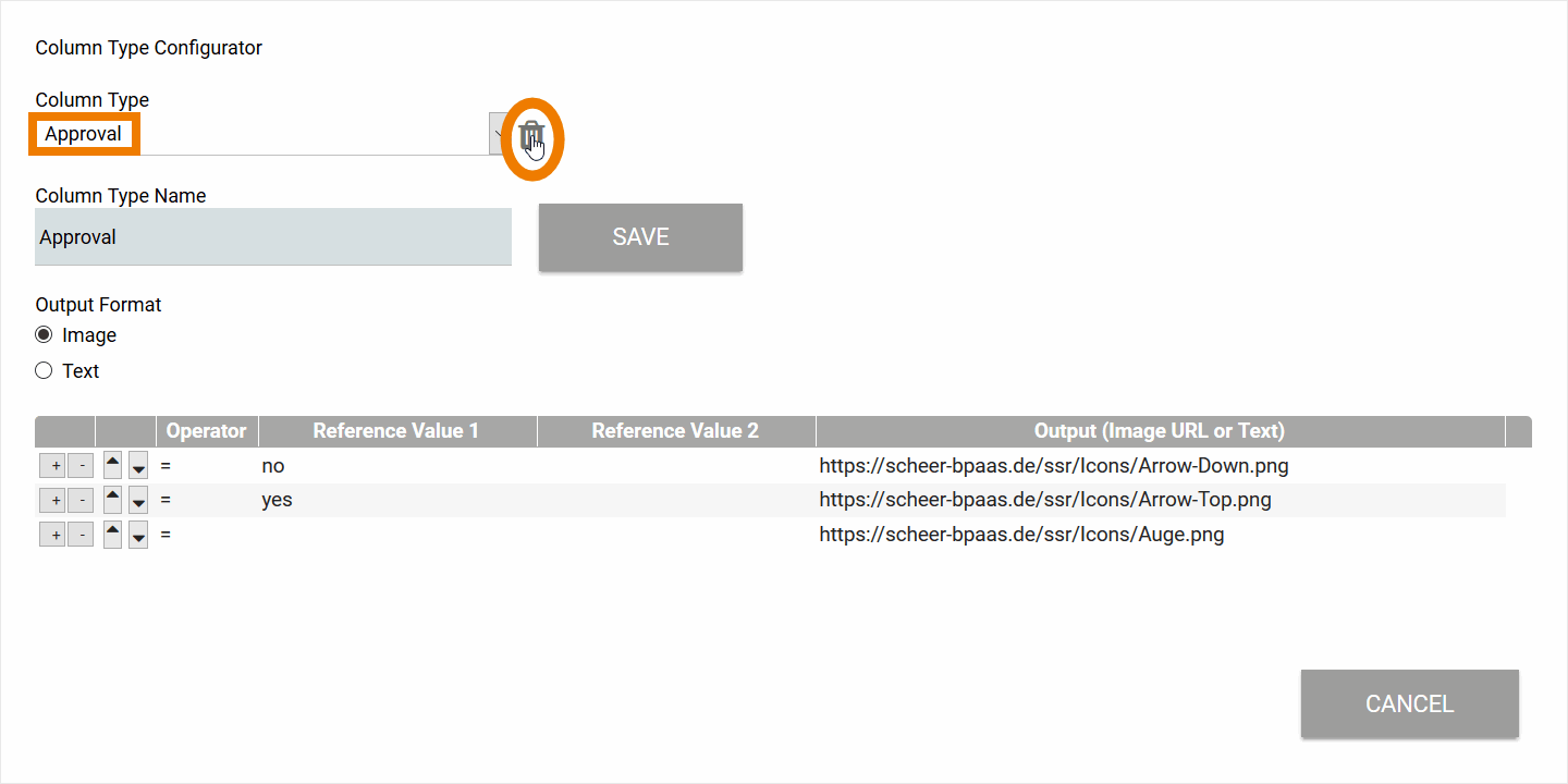
Irene creates the new column type Approval and sets the Output Format to Image.
She defines three possible cases:
-
Image Approved should be displayed if the value no is set.
-
Image Rejected should be displayed if the value yes is set.
-
Image In review should be displayed if neither value no nor value yes is set.
Then Irene saves the new column type.
Now Irene needs to create a new column in the overview table. Therefore she switches to the Column Configuration:
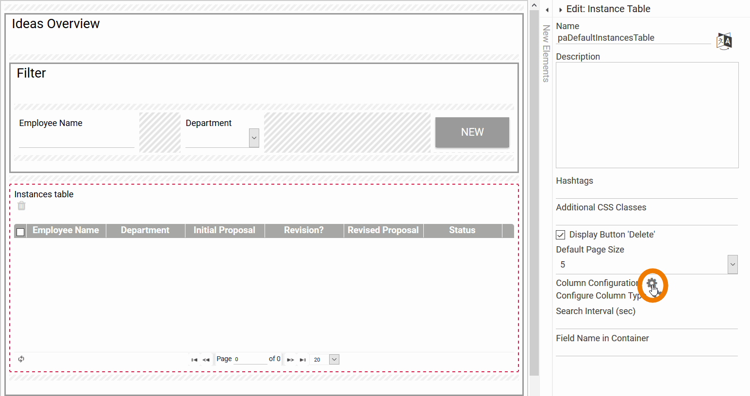
Here she adds the column Approval which refers to the content of the Fieldname in Container approved. In the selection list of the option Column Type the new type Approval is displayed so Irene can choose it for her new table column:
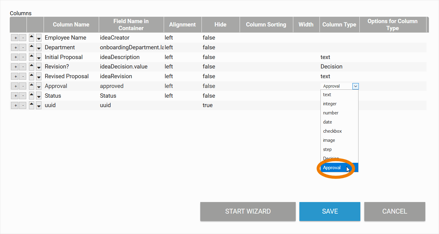
Then she saves her input.
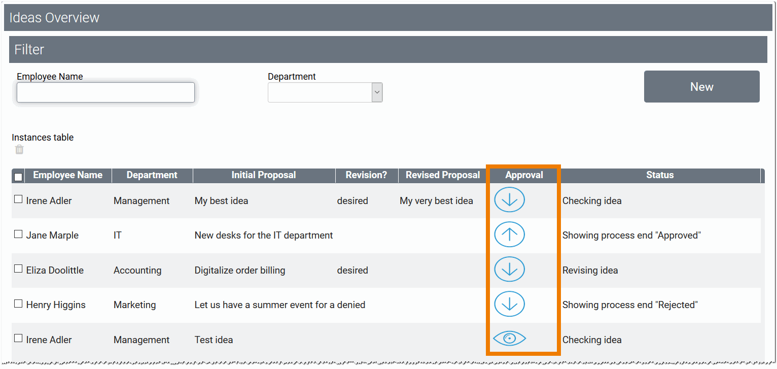
The overview contains the new column Approval. Instead of the text (no/yes) the images defined in the column type are displayed:
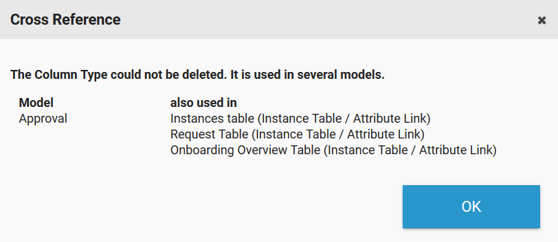
Deleting a Column Type
You can also delete your own column types. Select the desired Column Type from the drop down menu, then click on the trash can:
You will only be able to delete a column type if it is not used in other instance tables. If this is the case, then the user receives a pop-up informing in which models this column type is used: