Using the Dashboard
The standard xUML Services dashboard is read-only. You cannot change the data basis of the dashboard, but various functionalities help you to filter the data.
The retention period for data available in the resource monitor is currently 15 days.
|
Number |
Option |
Description |
|---|---|---|
|
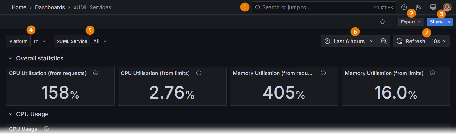
(1) |
Search |
Search for dashboards and other pages. |
|
(2) |
Export |
Use this option to copy or download a JSON file containing the JSON of the dashboard. |
|
(3) |
Share |
You have two options:
|
|
(4) |
System selection |
Platform (Kubernetes): Select the PAS platform you want to inspect (e.g. test, prod, qa…). |
|
Not applicable for Docker setups. |
||
|
(5) |
Service selection |
If you want to inspect a single xUML service only, select it from the list. |
|
(6) |
Time range |
Use this option to change the time range for which you want to inspect data. The retention period for data available in the resource monitor is currently 15 days. |
|
(7) |
Refresh |
Use this option to set the interval for reloading the data. |
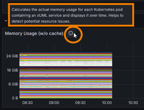
Hover over the info icon on the right-hand side of the metric’s name to display more information about the metric and its purpose:
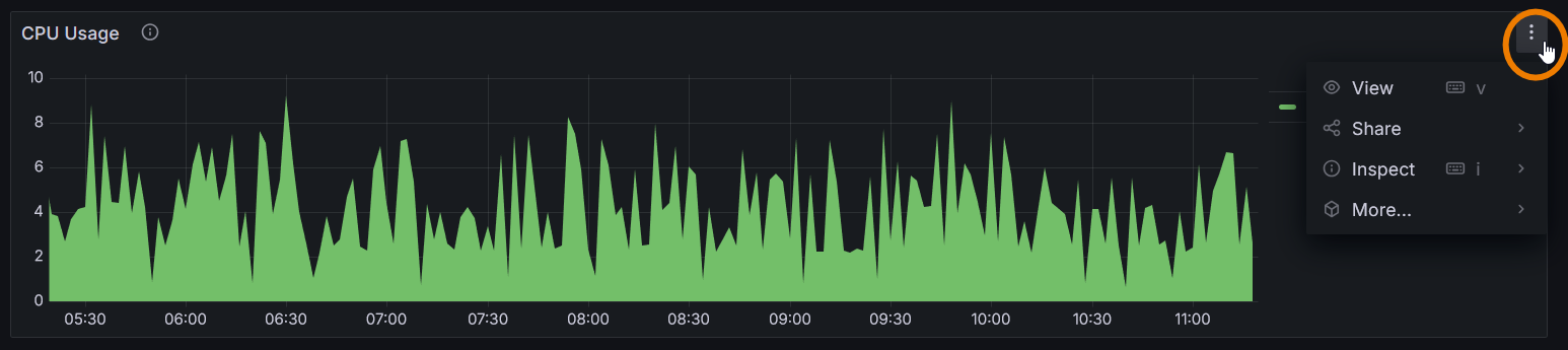
Every diagram has its own context menu on top right, containing further functionality:
|
Menu Option |
Descrption |
|---|---|
|
View |
Click View to maximize the diagram. Use option Back to dashboard on top right to return to the main view. |
|
Share |
You have two options:
|
|
Inspect |
You have two options:
|
|
More |
You have two options:
The option to create your own dashboard is disabled in this version.
|
The diagrams on the dashboard are interactive.
Click on a service name to display only the data for this service:
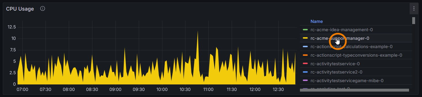
To return to the display of all services, click on the name of the service again.
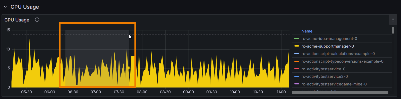
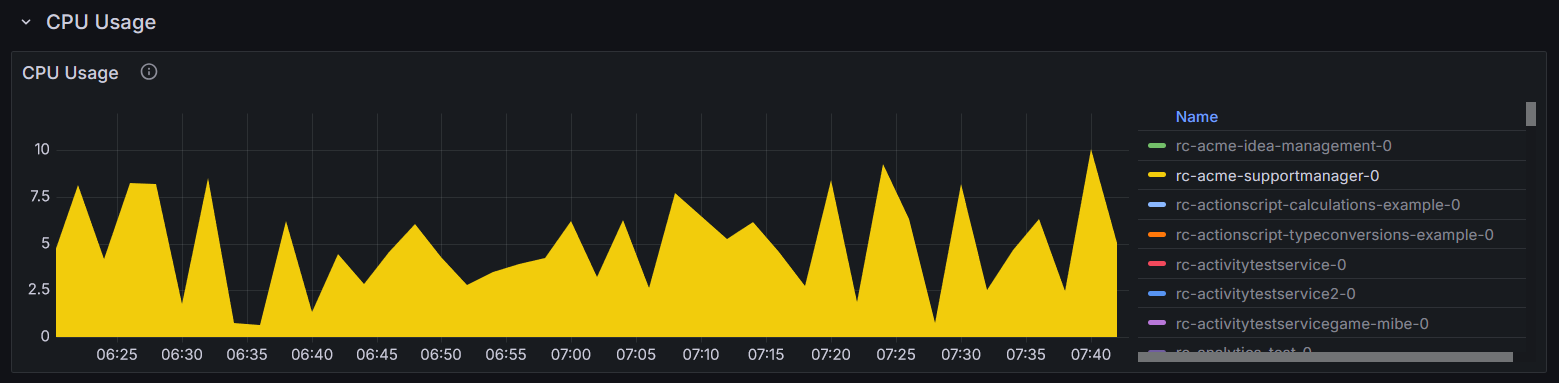
You can also break down the data by selecting the time range directly in the visualization:
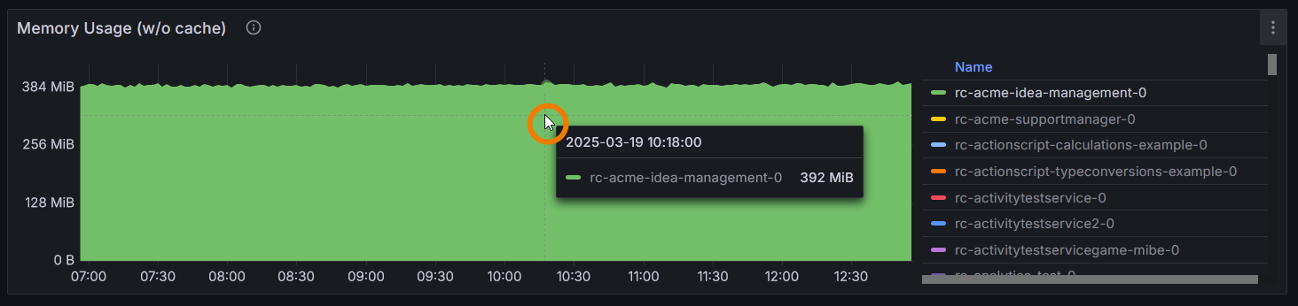
Click in the diagram to inspect the data for a specific point in time:
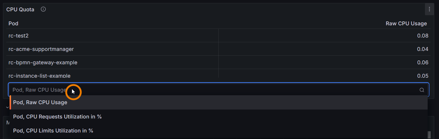
Some panels can show more than one metric. Click in the field below the data to open the selection list with all options:
Expert Advice
Use the service details in the PAS Administration to adapt the memory limit of a service.
Depending on your setup, refer to Docker: Adapting the Configuration of Containerized xUML Services or Kubernetes: Adapting the Configuration of Containerized xUML Services.
Related Content
Related Pages:
Related Documentation: