|
Element |
|
|---|---|
|
Icon |
|
|
Description |
The developer determines the contents of a Data Table. They can configure the data table contents according to their needs as long as text values are used. The values can be entered during execution either by the user, or via a mapping from the process data. |
|
Type |
String |
|
Prepopulation |
This element cannot be prepopulated during modeling in the form editor. |
|
Editing |
Refer to Modeling Forms for further information regarding editing of form elements using the context menu. The Instance List is a special form of the data table which is created for every BPMN model. Refer to Configuring the Instance List for detailed information. |
Data Table Configuration Options
Use the Attributes panel to edit the form element.
|
Attribute |
Description |
Allowed Values |
|---|---|---|
|
Name |
Technical identifier for data processing and not visible for the end user. |
Alphanumercial characters and underscore. It is not allowed to start the name with a number. |
|
Description |
A commentary field for the developer. The content is invisible to users and its sole purpose is internal documentation. |
Any string. |
|
Label |
Field name shown in the form. |
Any string. |
|
CSS Class |
Enables a field-acurate layout customization. |
A valid CSS class. |
|
Custom Attributes |
The attribute is used to activate Angular directives, that are created as development kit (devkit) library to expand the default functionality. For detailed information about Angular directives, visit the official Angular documentation. For details about the usage of the Custom Attributes, refer to Developing Custom Directives. |
|
|
Rows per Page |
Specify the number of rows that should be displayed by default in the executed table element. |
Any number. |
|
Column Configuration |
Displays the number of currently visible columns. Click on the displayed number or use option Open configuration to open the Column Configuration editor where you can define the contents of the data table. |
|
|
No Data Text |
In the executed form, this text will be displayed below the table header when the table contains no data rows. 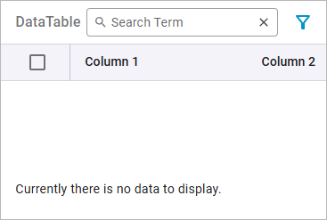
|
Any string. |
|
Add Row |
Enables the Plus icon in the executed form. The user can use it to add new rows to the table. |
enabled |
|
disabled |
||
|
Remove Row |
Enables the Delete icon in the executed form. The user can use it to delete rows from the table. |
enabled |
|
disabled |
||
|
Multiple Selection
|
Enables multiple row selection in the executed form. The user can select multiple rows in the table using a checkbox in front of each row. |
enabled |
|
disabled |
Column Configuration Options
Click Open configuration to open the Column Configuration editor:
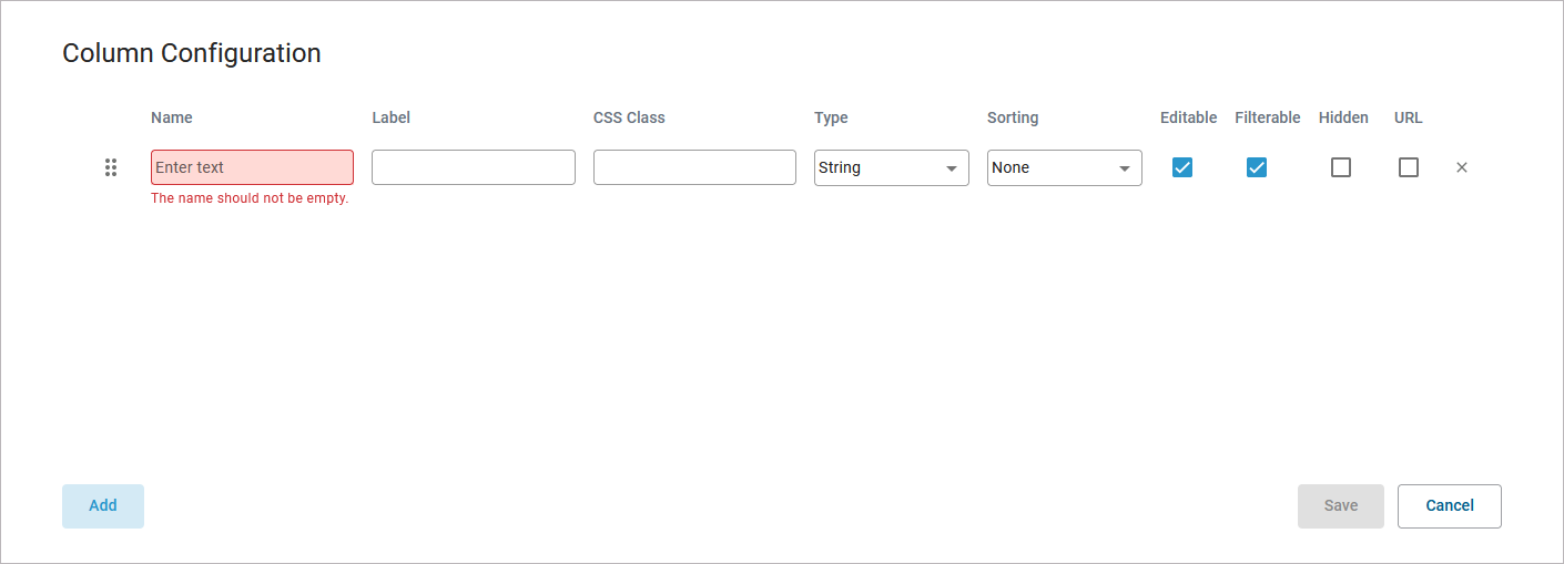
Use the editor to add data columns to your data table and configure the contents. Find below a list of editor and configuration options:
|
Editor Option |
Description |
||
|---|---|---|---|
|
Use Add to add a new column. |
||
|
Use Save to save your changes. |
||
|
Use Cancel to discard your changes. |
||
|
Use this area to move the columns by drag & drop. |
||
|
Click to delete a row. |
||
|
Configuration Option |
Description |
Values |
|
|
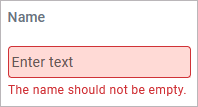
Technical identifier for data processing. Not visible for the end user. The input in this field is mandatory. |
|
|
|
The input in this field is displayed as header of the column. |
|
|
|
Enables a field-acurate layout customization. |
|
|
|
Select a data type for the particular column. |
Select one of:
|
|
|
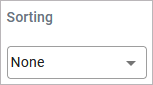
Specify whether the content of this column should be sorted. You can only select one column for sorting.
|
None |
No sorting (default). |
|
Ascending |
The column is sorted in ascending order. |
||
|
Descending |
The column is sorted in descending order. |
||

|
Specify whether the user can edit the content of this column during execution. |
checked |
The column content can be edited. |
|
unchecked |
The column content can not be edited (default). |
||

|
Specify whether the column should be usable as a filter in the executed form. |
checked |
The table data can be filtered by the contents of this column (default). |
|
unchecked |
No filtering enabled for this column. |
||

|
Activate this checkbox to hide this column during execution. |
checked |
The column content is populated but not displayed. |
|
unchecked |
The column and it's contents are displayed (default). |
||

|
Specify whether the content of this column should be presented as a clickable link in the executed form. If this checkbox is enabled,
|
checked |
The column content will be displayed as a link. |
|
unchecked |
The column does not contain links (default). |
||
Item Meta Data of Data Table Rows
You can get item meta data on data table rows during process execution that you can use when implementing your service. For data tables these are:
|
Meta Attribute |
Type |
Description |
Values |
|
|---|---|---|---|---|
|
lastClicked
|
Boolean |
Specifies whether the row has been clicked last. You can use this attribute together with the click event of data table rows to let the user click on rows to select data and continue with the process. This is described in detail on Handling the Click Event of Data Table Rows. |
true |
This row has been clicked last. |
|
false |
This row has not been clicked last. |
|||
|
selected
|
Boolean |
Specifies whether this row has been selected. |
true |
This row has been selected. |
|
false |
This row has not been selected. |
|||
|
added
|
Boolean |
Specifies whether this row has been added. |
true |
This row has been added. |
|
false |
This row has not been added. |
|||
|
removed
|
Boolean |
Specifies whether this row has been removed. |
true |
This row has been removed. |
|
false |
This row has not been removed. |
|||
|
modified
|
Boolean |
Specifies whether this row has been modified. |
true |
This row has been modified. |
|
false |
This row has not been modified. |
|||
You can evaluate them in the On Exit execution of user tasks (refer to Working with the Execution Editor for more information). The form data contains an array representing the data table and its rows. Each row has an additional attribute _meta that contains the listed attributes. Using action script and the select statement you can easily evaluate the meta data. The following example code snippet shows how to get all table rows that have been added:
select each from formData.table where element._meta.added = true
DataTable_Simple_Example
Click here to download a simple example model that shows how to use the data table element in Scheer PAS Designer.
DataTable_ClickAction_Example
Click here to download a simple example model that shows how you can use the clickAction trigger event for data tables in Scheer PAS Designer.