The Responsive Element
|
Element Icon in Sidebar |
|
|
Form Field |
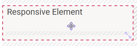
|
|
Function |
The responsive element helps you to arrange other form elements. Use the element to group fields that belong together, which allows moving or copying the entire block to reuse it elsewhere. On the other hand, you can use the responsive element to break up the grid of the responsive editor for example to arrange several form elements next to a single field in one line. |
|
Default |
Empty by default. The element's name is displayed as headline in the first row. |
|
Example |
In the example, several responsive elements were used to structure the form:
Example in Form Editor: 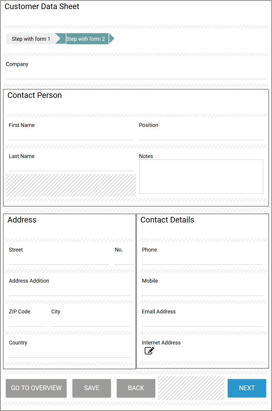
Example During Execution: 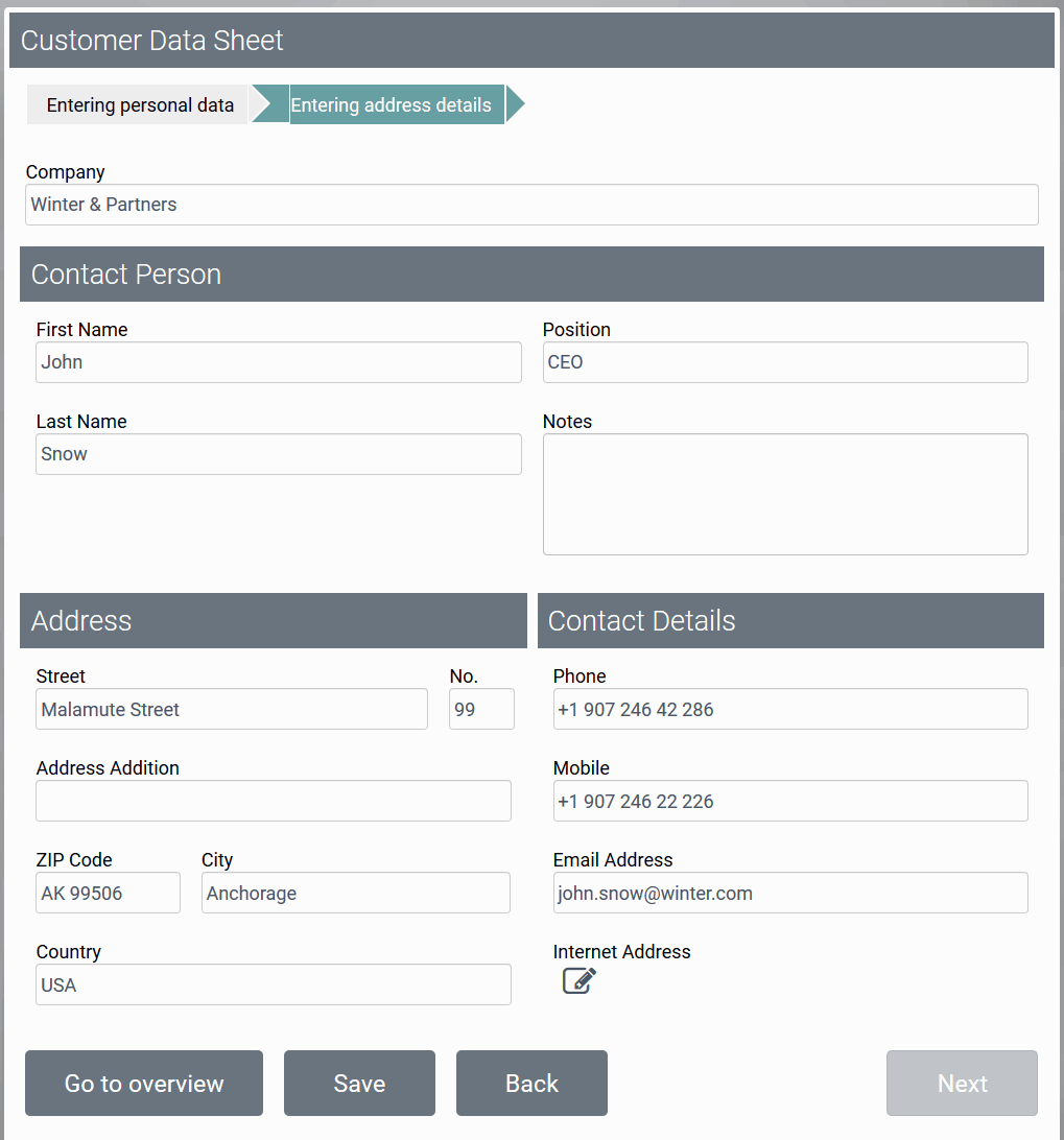
|
Configuration Options
The form element may be edited via the Edit Sidebar.

|
Name Field name shown in the form. |
|
|
ID The read-only field contains the model ID of the element. Designers can use the ID for example in the search to link the element in other models. |
|
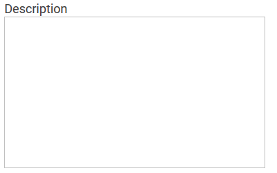
Description When a user hovers over a form element during execution, the content of the commentary field is shown as a quick info: 
|

|
Hashtags Possibility to insert your own key terms . The leading hashtag sign # (hash) will be inserted automatically. Use the spacebar to insert multiple hashtags: 
One hashtag may be issued for multiple elements: 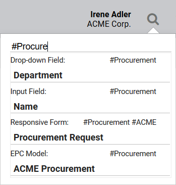
|

|
Additional CSS Classes Enables a field-acurate layout customization. |
|
|
Show Label If this option is activated, the name of the element will appear in the top row. |
Deletion Behavior of Responsive Elements
If you delete a responsive element, it is erased from your work area including all content. While the responsive element will also be erased from your database, its content can still be found and used via the search function.
If the responsive element was linked prior to deleting, then only the current element is erased. The linked elements remain intact and can be found via the search function.


