When you open a model from the service panel, a second tab will open, displaying the model on the diagram pane. This is where you design your BPMN model.
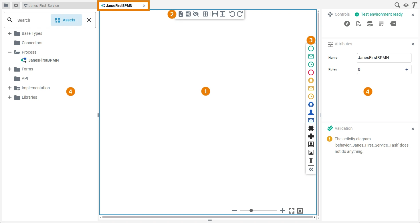
The diagram pane consists of different areas:
Customizing the Diagram Panel
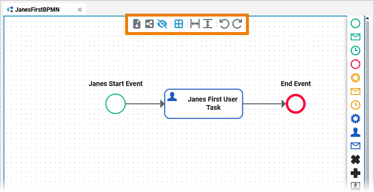
You have several options to adjust the diagram pane. When you open the pane for the first time, the default view is displayed:
-
The Diagram Pane is displayed in the centre at the top
(refer to chapter Modeling BPMN for further information) -
The Execution Pane is displayed below the diagram pane
(refer to chapter Modeling Execution for further information) -
Four Designer Panels are shown in the left and right sidebars
-
The Service Panel
-
The Controls Panel
-
The Attributes Panel
-
The Validation Panel
-
Refer to Customizing Editors and Panels for detailed information about panel management in general.
Modeling on the Diagram Pane
While modeling, some general functionalities help you to browse through your model, and to adjust your working location within the model. Refer to Customizing Editors and Panels for more details.
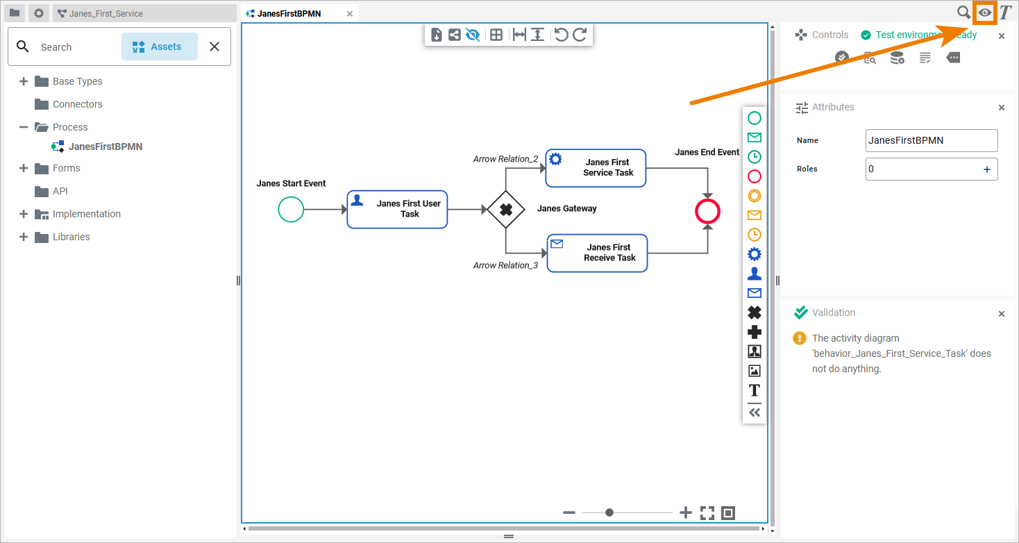
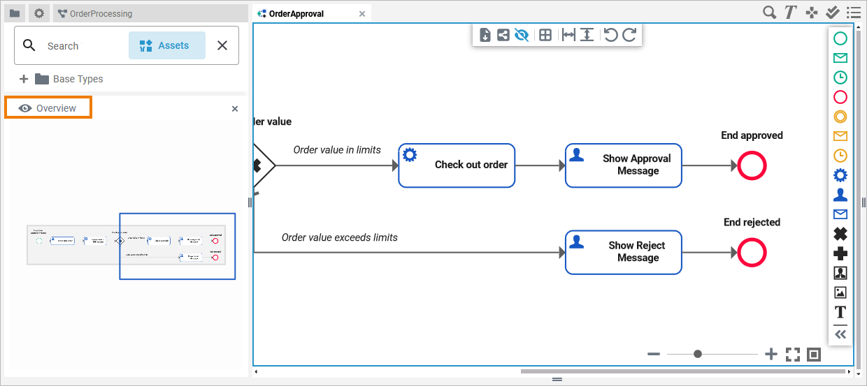
In addition to the standard panels that are active by default (like e.g. Attributes Panel or Validation Panel), the BPMN editor comes with an Overview panel. You can use this panel to navigate in your BPMN model. This is useful when the BPMN model is large and expands beyond the visible canvas.
The Overview panel is hidden by default. If you use the panel preset, you can find the icon of the overview panel in the right upper corner of the diagram pane. Click it to display the panel:
To return to the panel preset, go to the user preferences and use button Reset Panels.
The Overview Panel displays your model and a blue frame, representing the content shown on the diagram pane. If you wan to quickly change your working location in large models, you can move the frame to change the visible part of the model:
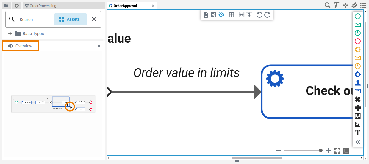
You can use the Overview panel to zoom in or out of the model. Hover over the right bottom corner of the blue frame. The cursor changes and you can resize the frame:
Refer to Customizing Editors and Panels for detailed information about panel management in general.
The Toolbars
Two toolbars are available for work on the diagram pane:
The Model Toolbar
The model toolbar assists you during modeling on the diagram pane:
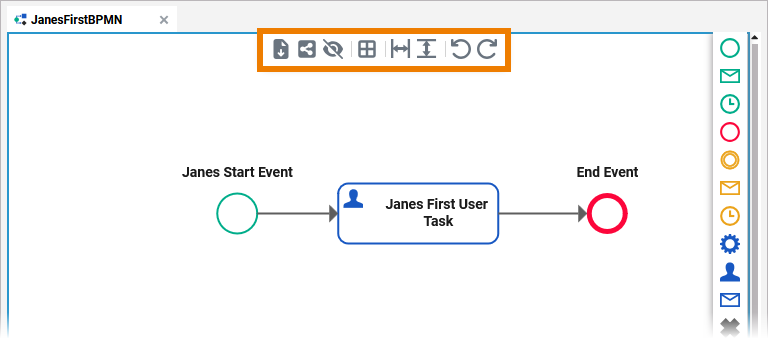
Enabled options are highlighted in blue:
The following table explains all available tools:
|
Tool Icon |
Tool Name |
Description |
|---|---|---|
|
Export |
Use this option to export your BPMN model in JSON format. |
|
Share |
If you use option Share, the URL of your BPMN model is copied to the clipboard and you can paste it elsewhere, for example in an email. |
|
Hide Execution Pane |
Use this option to hide the execution pane. This allows to gain more space during modeling. |
|
Toggle grid |
Use this option to enable or disable the grid on the diagram pane. The grid supports you during modeling: If the grid is enabled, elements snap to the grid points. |
|
Insert/Remove horizontal space |
Use this option if you need more or less space on the diagram pane. Click on the pane to display the start line, the second click marks the end line and defines the size of the area to be added. To add space, click from left to right to define the area. If you want to delete a horizontal space, click from right to left to define the area. |
|
Insert/Remove vertical space |
Use this option if you need more or less space on the diagram pane. Click on the pane to display the start line, the second click marks the end line and defines the size of the area to be added. To add space, click from top to bottom to define the area. If you want to delete a vertical space, click from bottom to top to define the area. |
|
Undo |
Undo the previous action you performed in...
If you click Undo in one of the Designer editors, this may also have an effect on the Implementation folder in the Service panel if you performed your previous action there. |
|
Redo |
Redo your previous action (after undo). |
The Elements Toolbar
The elements toolbar contains all BPMN elements that you can create on the diagram pane. By default, the elements toolbar only displays the icons of the available BPMN elements. But you can also expand the toolbar using option Collapse at the bottom. In its expanded version, the names of all elements are also displayed:
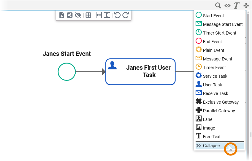
In chapter Supported BPMN Elements all elements and their specific properties are described.
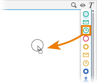
Drag the element you want to create from the toolbar and drop it on the diagram pane:
Another way to create a BPMN element is to click on the element in the toolbar, switch to the editor and click again. To cancel the operation, press the Esc key.
The Diagram Context Menus
Various context menus support the user during modeling on the diagram pane:
|
Elements Context Menu |
Icon |
Description |
|
|---|---|---|---|
|
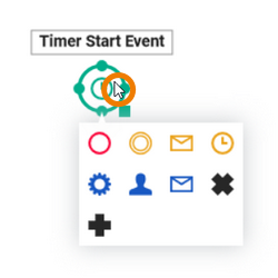
If you click on an element, the element context menu opens. You can use it to create new elements instead of using the elements toolbar. Choose one of the icons to create the corresponding element. If you create a new element using the context menu, the relation to the current element is drawn automatically. In addition to the BPMN elements listed in the context menu, you can create additional elements from the elements toolbar: These elements cannot be connected to others. |
|
|
|
|||
|
|||
|
|||
|
|||
|
|||
|
|||
|
|||
|
|||
|
Tools Context Menu |
Icon |
Description |
|
|
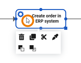
If you right click on an element, the tools context menu opens. Use it to edit the current element.
|
|
Delete the element. You can also use the Del or backspace key to delete an element. |
|
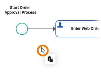
Copy the element. |
||
|
Cut the element. |
||
|
Paste format of the element. |
||
|
Bring the element to the front. |
||
|
Send the element to the background. |
||
|
Extended Tools Context Menu |
Icon |
Description |
|
|
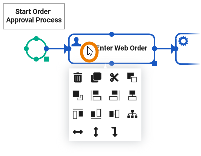
If you have selected more than one element on the pane, the tools context menu is enhanced with additional options. The number of displayed options depends on your selection on the diagram pane.
|
|
Align left |
|
Align right |
||
|
Align center |
||
|
Align top |
||
|
Align bottom |
||
|
Align middle |
||
|
Auto layout |
||
|
Distribute horizontally |
||
|
Distribute vertically |
||
|
Align relation |
||
|
Relation Context Menu |
Icon |
Description |
|
|
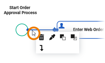
Right-click a relation to open the relation context menu. Only these options are applicable to relations. |
|
Delete the relation. |
|
|
Paste format of the relation. |
||
|
|
Bring the relation to the front. |
||
|
|
Send the relation to the background. |
||
|
|
Align the relation. |
||
|
Diagram Context Menu |
Icon |
Description |
|
|
With a right-click on the diagram pane itself, you open the diagram context menu. |
|
Paste a copied element. |
Shortcuts
|
Shortcut |
Description |
|---|---|
|
Arrow down |
Moves the selected element(s) downwards by increments of one gridline. If no elements are selected, the whole diagram pane is moved downwards. |
|
Arrow left |
Moves the selected element(s) to the left by increments of one gridline. If no elements are selected, the whole diagram pane is moved to the left. |
|
Arrow right |
Moves the selected element(s) to the right by increments of one gridline. If no elements are selected, the whole diagram pane is moved to the right. |
|
Arrow up |
Moves the selected element(s) upwards by increments of one gridline. If no elements are selected, the whole diagram pane is moved upwards. |
|
Backspace |
Removes the selected element(s) from the diagram pane. |
|
Ctrl + 1, 2, 3 ... 9 |
Opens the tab corresponding to the chosen number. The first nine opened models are offered for activation. Press a number to activate the corresponding model and bring it to the foreground. |
|
Ctrl + A |
Selects all elements on the diagram pane. |
|
Ctrl + Arrow down |
Moves the selected element(s) downwards by increments of one pixel. |
|
Ctrl + Arrow left |
Moves the selected element(s) to the left by increments of one pixel. |
|
Ctrl + Arrow right |
Moves the selected element(s) to the right by increments of one pixel. |
|
Ctrl + Arrow up |
Moves the selected element(s) upwards by increments of one pixel. |
|
Ctrl + C |
Copies the selected element(s) to the clipboard. |
|
Ctrl + D |
Closes the active model window. |
|
Ctrl + Mouse Wheel |
Reduces (scrolling down) or enlarges (scrolling up) the zoom factor of the model. |
|
Ctrl + Shift + D |
Closes all tabs and switches to explorer tab. |
|
Ctrl + V |
Generates copies of the selected element(s). |
|
Ctrl + X |
Cuts the selected element(s) and copies them to the clipboard. |
|
Ctrl + Y |
Repeats editing steps that have been undone. |
|
Ctrl + Z |
Undoes previous editing steps. |
|
Ctrl + left mouse button |
Allows you to add or remove individual elements from the selection one by one. |
|
Del |
Removes the selected element(s) from the diagram pane. |
|
Esc |
Pressing the Esc key aborts the following processes:
|
|
Mouse Wheel |
Moves the model up or down. |
|
Shift + Mouse Wheel |
Moves the model to the right (scrolling up) or left (scrolling down). |
|
Shift + Page down |
Switches to the next tab from left to right. |
|
Shift + Page up |
Switches to the next tab from right to left. |