When you open a form from the Service Panel, a second tab will open, displaying the form in the Form Editor. This is where you design your form:
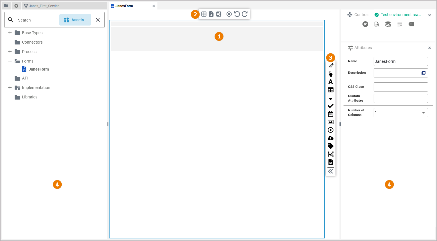
The form editor consists of different areas:
(1) Form Editor
(2) Form Toolbar
(3) Elements Toolbar
(4) Designer Panels
Customizing the Form Editor
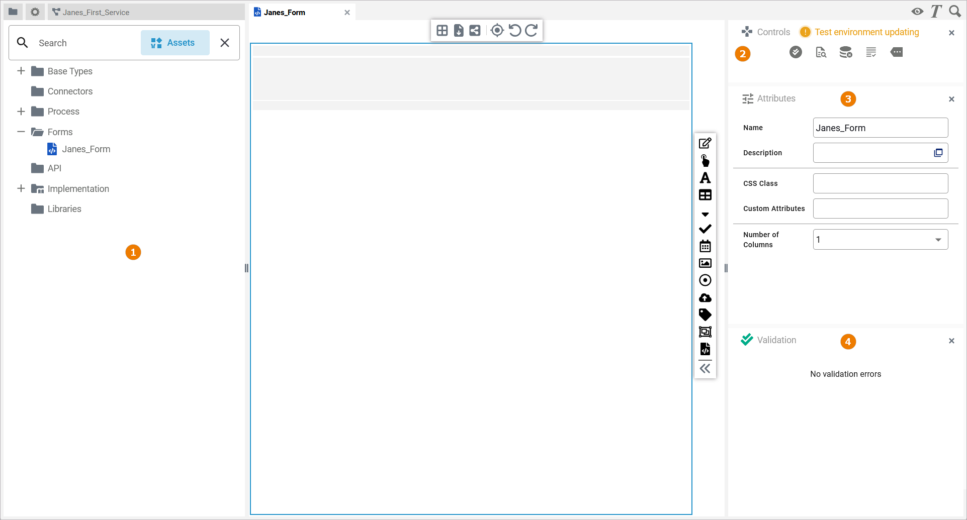
You have several options to adjust the form editor. When you open the editor for the first time, the default view is displayed:
-
The Form Editor is displayed in the center
-
Four Designer Panels are shown in the sidebars
(1) The Service Panel
(2) The Controls Panel
(3) The Attributes Panel
(4) The Validation Panel
Refer to Customizing Editors and Panels for detailed information about panel management in general.
The Toolbars
Two toolbars are available for working with the form editor:
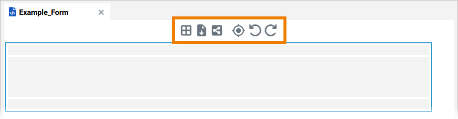
The Form Toolbar
The form toolbar assists you during modeling on the form editor:
The following table explains the available tools:
|
Tool Icon |
Tool Name |
Description |
|---|---|---|
|
Column layout |
Change the number of columns in the form. Split the form from one to six columns: 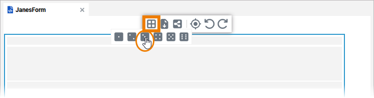
|
|
Export |
Use this icon to export your form in JSON format. |
|
Share |
When you click option Share, the URL of your form is copied to the clipboard, and you can paste it elsewhere, for example to an email. |
|
Select in service panel
|
Use this option to highlight the corresponding class in the Service panel. |
|
Undo |
Undo the previous action you performed in...
If you click Undo in one of the Designer editors, this may also have an effect on the Implementation folder in the Service panel if you performed your previous action there. |
|
Redo |
Redo your previous action (after undo). |
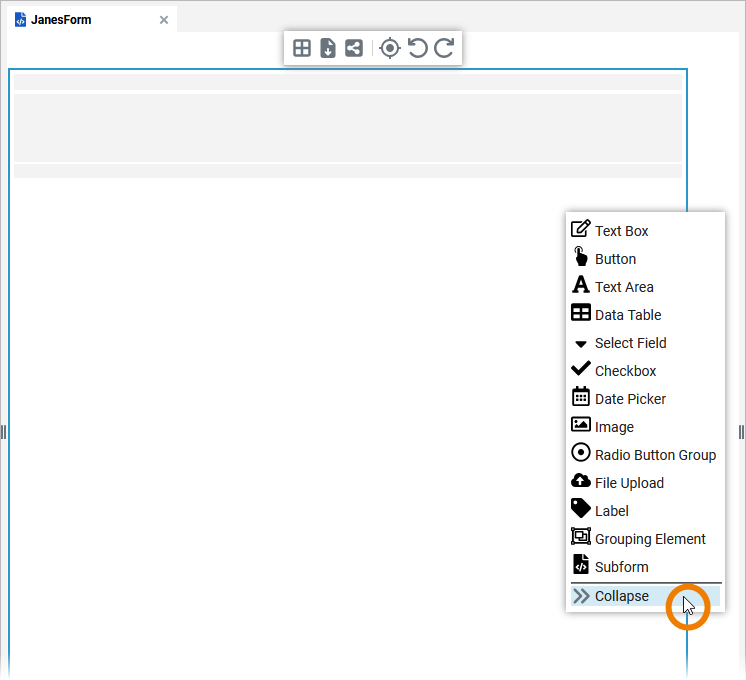
The Elements Toolbar
The elements toolbar contains all form elements that you can create on the form editor. By default, the elements toolbar only displays the icons of the available form elements. But you can also expand the toolbar using option Collapse at the bottom. In its expanded version, the names of all elements are also displayed:
In chapter Supported Form Elements all elements and their specific properties are described.
To add a new form element to your form, drag the element from the toolbar and drop it on the form editor:
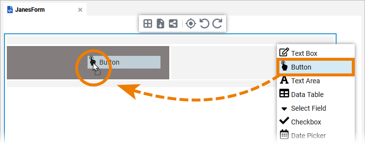
To cancel the operation, press the Esc key.
Refer to Adding Form Elements for further details.
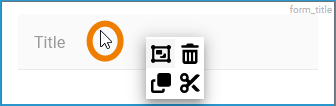
The Form Context Menu
A context menu supports the user during the creation of a form:
|
Tools Context Menu |
Icon |
Description |
|
|---|---|---|---|
|
If you right click on an element, the tools context menu opens. Use it to edit the current element.
|
|
Select all elements. |
|
Delete the selected element(s). You can also use the Del or backspace key to delete an element. |
||
|
Copy the selected element(s). |
||
|
Cut the selected element(s). |
||
|
Paste the selected element(s) to the form. |
||
Shortcuts
You can also use shortcuts on the form editor:
|
Shortcut |
Description |
|---|---|
|
Backspace |
Removes the selected element(s) from the diagram pane. |
|
Esc |
Pressing the Esc key aborts the following processes:
|
|
Del |
Removes the selected element(s) from the diagram pane. |
|
Ctrl + Shift + D |
Closes all tabs and switches to the Explorer tab. |
|
Ctrl + 1, 2, 3 ... 9 |
Opens the tab corresponding to the chosen number. The first nine opened models are offered for activation. Press a number to activate the corresponding form and bring it to the foreground. |
|
Ctrl + Z
|
Undoes previous editing steps. |
Related Content