|
Element |
|
|---|---|
|
Icon |
|
|
Description |
Use the Grouping element to arrange other form elements that belong together. You can use the element to break up the grid of the form editor for example to arrange several form elements next to a single field in one line. It can also be used to move and reuse whole sections. If you delete a Grouping element, all content of the element is deleted as well. |
|
Type |
n/a |
|
Prepopulation |
This element cannot be prepopulated. |
|
Editing |
Refer to Modeling Forms for further information regarding editing of form elements using the context menu. |
Configuration Options
Use the Attributes panel to edit the form element.
|
Attribute |
Description |
Allowed Values |
|
|---|---|---|---|
|
Name |
Technical identifier for data processing and not visible for the end user.
|
Alphanumercial characters and underscore. It is not allowed to start the name with a number.
|
|
|
Description |
A commentary field for the developer. The content is invisible to users and its sole purpose is internal documentation. |
Any string. |
|
|
CSS Class |
Enables a field-acurate layout customization. |
A valid CSS class. |
|
|
Custom Attributes |
The attribute is used to activate Angular directives, that are created as development kit (devkit) library to expand the default functionality. For detailed information about Angular directives, visit the official Angular documentation. For details about the usage of the Custom Attributes, refer to Developing Custom Directives. |
|
|
|
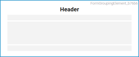
Header |
In this field you can enter a title. |
Any string. |
|
|
Show Header |
The header can be displayed or hidden. |
true |
If this option is activated, the element's header will appear in the top row. |
|
false |
If this option is disabled the name will not be displayed. |
||
|
Number of Columns |
Form elements can be arranged in several columns according to selection.
|
One to six columns. |
|
Form_Simple_Example
Click here to download a simple example model that shows how you can configure form elements in Scheer PAS Designer.
Related Content
Related Pages: