|
Element |
|
|---|---|
|
Icon |
|
|
Description |
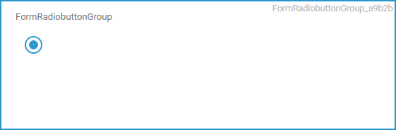
Only one single option can be selected from the displayed options. To choose an option, click on the corresponding button. The developer can set the default option. |
|
Type |
String |
|
Prepopulation |
This element can be prepopulated.
|
|
Editing |
Refer to Modeling Forms for further information regarding editing of form elements using the context menu. |
Configuration Options
Use the Attributes panel to edit the form element.
|
Attribute |
Description |
Allowed Values |
|
|---|---|---|---|
|
Name |
Technical identifier for data processing and not visible for the end user. |
Alphanumercial characters and underscore. It is not allowed to start the name with a number. |
|
|
Description |
A commentary field for the developer. The content is invisible to users and its sole purpose is internal documentation. |
Any string. |
|
|
Label |
Field name shown in the form. |
Any string. |
|
|
Read-only |
This field is write-protected. When you use the option, the label Read-only is added to the bottom right of the element: 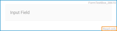
|
true |
User cannot enter values. |
|
false |
User can enter values (default). |
||
|
Mandatory |
The element must be filled or used if the checkbox is activated. |
true |
Element must be filled. |
|
false |
Element may remain empty (default). |
||
|
CSS Class |
Enables a field-acurate layout customization. |
A valid CSS class. |
|
|
Custom Attributes |
The attribute is used to activate Angular directives, that are created as development kit (devkit) library to expand the default functionality. For detailed information about Angular directives, visit the official Angular documentation. For details about the usage of the Custom Attributes, refer to Developing Custom Directives. |
|
|
|
Options |
Click Open configuration to open the Field Configuration editor. |
Any string. |
|
|
Layout Orientation |
Use this attribute to display the radio buttons horizontally or vertically. |
Horizontal |
Use this option to display the options next to each other (default). |
|
Vertical |
Use this option to display the options one below the other. |
||
Field Configuration Editor
If you use option Open configuration the Field Configuration editor opens:
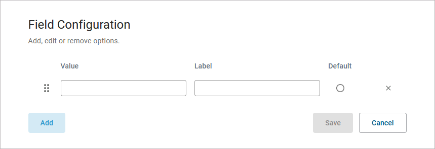
Use the editor to add and manage the content of your element:
|
Option |
Description |
|---|---|
|
Click Add to insert new rows. |
|
|
Use option Drag to change the order of the rows. |
|
You can enter the options for this element as value pairs. When entering value pairs, always the first value (Value) is saved as key in the data container. The second value (Label) is used as notification to the user. The label is displayed in the form.
|
|
|
Value |
Enter a Value for your element option. It is not possible to assign the same value to different labels. |
|
Label |
Enter a Label for your element option. The label is displayed in the form. |
|
|
Use this option to set the element option as default. |
|
|
Use this option to delete the element option. |
|
Click Save to save your changes. |
|
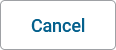
Click Cancel to discard your changes. |
Form_Simple_Example
Click here to download a simple example model that shows how you can configure form elements in Scheer PAS Designer.
Related Content
Related Pages: