The data table element enables you to structure the information in a form. It is useful if the user needs to enter similar information several times, for example different positions in one order form. The data table offers a number of configuration options, so that you can adapt it to your needs. Depending on your choice in the table configuration, the executed table offers the user different functionalities.
The Instance List is a special form of the data table which is created for every BPMN model. Refer to Configuring the Instance List for detailed information.
Table Configuration
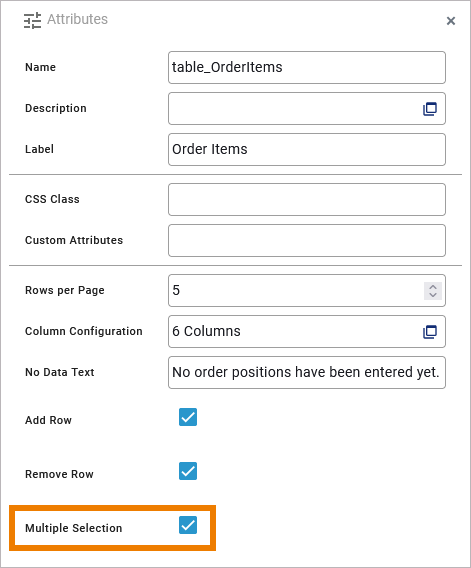
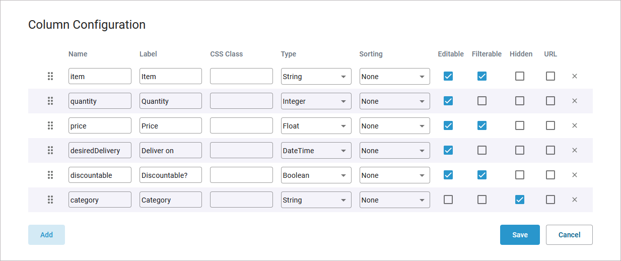
The configuration options of the data table and its column configuration options are explained in detail in this column.
Table Execution
In this column you can see the result of the selected table configuration.
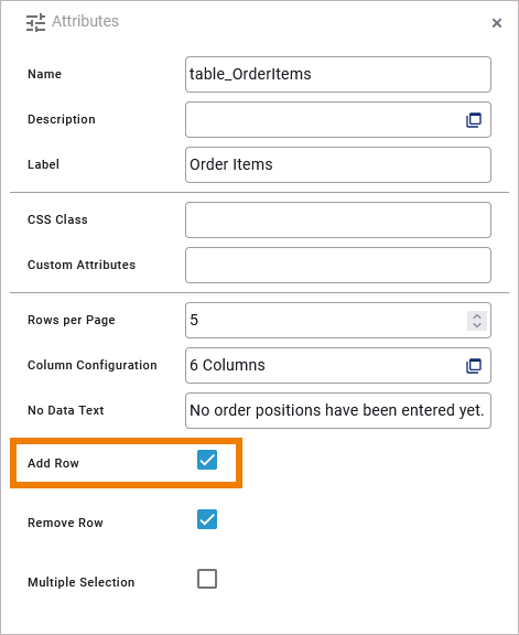
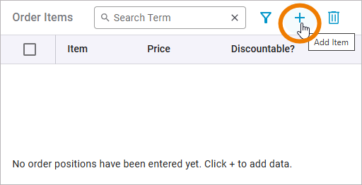
The user can add new rows to the table with option Plus:
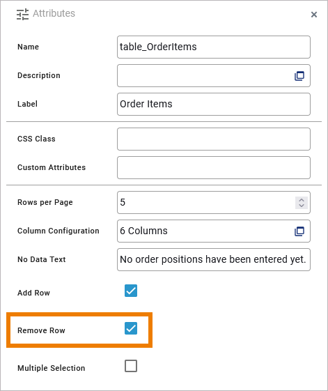
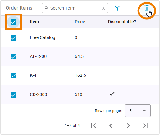
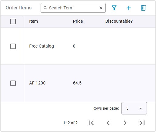
By selecting the checkbox of a table row and then clicking Delete, the corresponding row is deleted from the table.
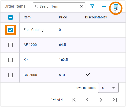
Selecting the checkbox in the header row selects all table rows. If you click Delete now, all selected rows are removed from the table:
Editable Content and Content Type
For each column you can specify whether the user should be able to edit the data. You must also specify the data type. Available types are:
-
String
-
DateTime
-
Boolean
-
Float
-
Integer
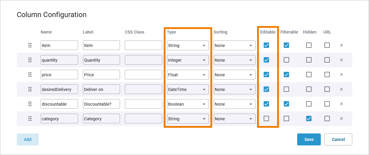
The type selection determines how the user can fill the respective columns if you marked them as editable:
|
Type |
Description |
Column in Executed Form |
|---|---|---|
|
String |
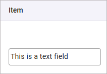
The column shows text fields where the user can enter content. |
|
|
DateTime |
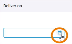
A date field displays a calender icon. The user can enter the date manually in the field or click on the icon to open a calendar from which he can select the date. |
|
|
Boolean |
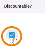
Columns with type Boolean show a checkbox (true = checkbox is activated). |
|
|
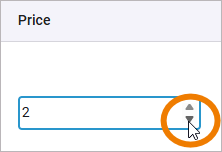
Float |
The user can enter numbers manually or count up and down using the displayed arrows. |
|
|
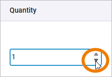
Integer |
The user can enter numbers manually or count up and down using the displayed arrows. |
|
Filtering the Table Content
For each column you can specify whether the content should be added to the additional filter:
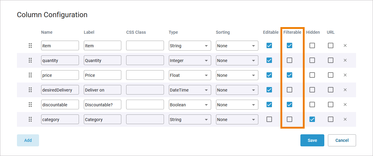
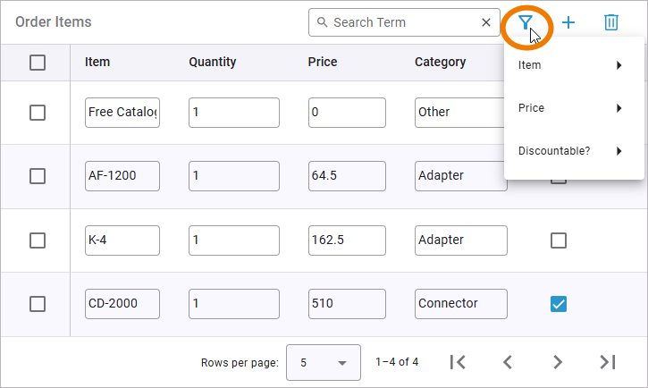
Your choice determines the content of the additional filter in the executed form. Click Filter to set an additional filter for the table:
Functionalities Available Only in the Executed Data Table
The following functionalities are available by default in the executed data table and cannot be turned off via the table configuration.
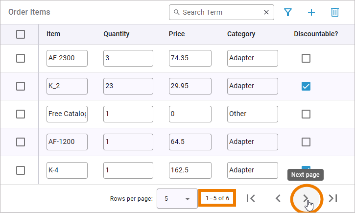
The counter of table elements is displayed in the table footer. It shows the currently displayed elements and the total number of elements. If the maximum number of rows per page is exceeded, the navigation will be activated, allowing you to change pages.
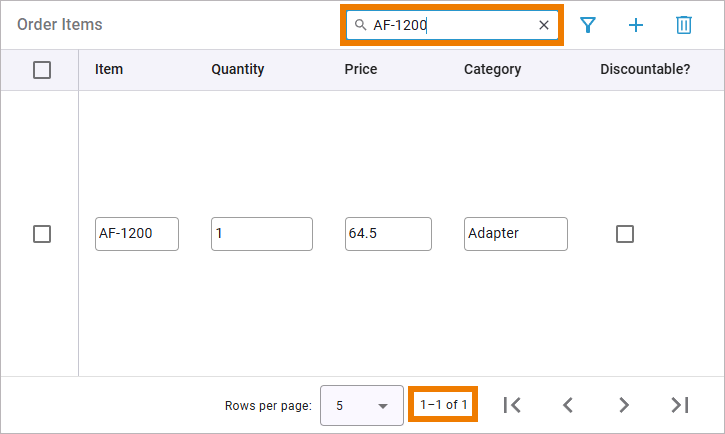
Use the search field to apply a full-text search to the content of the data table. The number of hits is displayed in the table footer:
DataTable_Simple_Example
Click here to download a simple example model that shows how to use the data table element in Scheer PAS Designer.
Instance_List_Example
Click here to download a simple example model that shows the usage of the instance list in Scheer PAS Designer.
DataTable_ClickAction_Example
Click here to download a simple example model that shows how you can use the clickAction trigger event for data tables in Scheer PAS Designer.
