The Styling panel is your tool for formatting the diagram pane and the contents of elements and attributes.
Depending on what you select on the pane, different tabs are available:
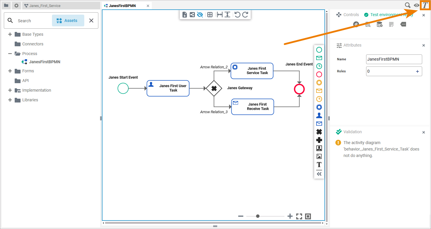
The Styling panel is hidden by default. If you use the panel preset, you can find the icon of the styling panel in the right upper corner of the diagram pane. Click it to display the panel:
To return to the panel preset, go to the user preferences and use the button Reset Panels.
Refer to Customizing Editors and Panels for detailed information about panel management in general.
Application Options
Use the styling panel to change the formatting of elements and attributes or of the diagram pane itself. Depending on what you click on the panes, different tabs are available:
|
Tab in Styling Panel |
Availability |
Options |
|---|---|---|
|
The Attributes tab is available for all BPMN elements and for the diagram pane itself. |
||
|
Tab Diagram is only available if you click on the diagram pane. |
||
|
The Shape tab is available for all BPMN elements. |
||
|
Tab Text is only available for the following elements: |
Options of Tab Attributes
Use the Attributes tab to change the styling of an element's attribute on the diagram pane:
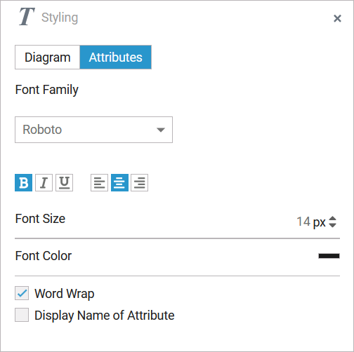
As soon as you have created an attribute of an element on the diagram pane, the Styling panel will show the tab Attributes. Open this tab to edit the formatting of the displayed attributes:
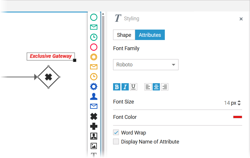
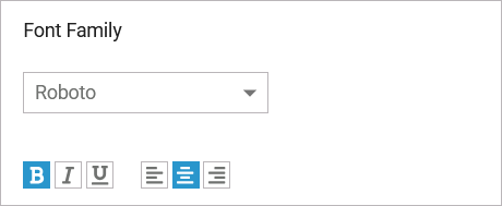
Use section Font to select the font for display of the element's attributes on the diagram pane. You have also several formatting options:
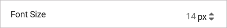
In section Font Size you can change the font size of the element's attributes on the diagram pane:
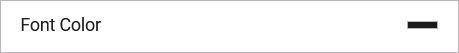
You can also adapt the font color of the element's attributes on the diagram pane. Click on the color placeholder:
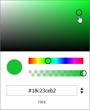
Then use the color picker to select a new color or enter the hexadecimal code of the desired color:
Section Word Wrap is helpful, when you want to display text on the diagram pane:
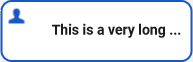
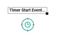
By default, the element's name is displayed in a single line on the diagram pane. When the word wrap option is disabled, a placeholder (...) indicates that more text is available but hidden:
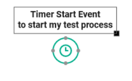
Activate the word wrap option to show more text:
A placeholder (...) indicates that more text is available but hidden. If you want to display the whole text, resize the attribute on the diagram pane. Refer to Resizing BPMN Elements for detailed information.
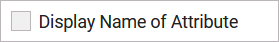
Activate the checkbox Display Name of Attribute if you also want to display the names of the attributes on the diagram pane:
Options of Tab Diagram
Tab Diagram is only available if you click directly on the diagram pane. It contains all layout options applicable to your workspace:
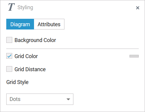
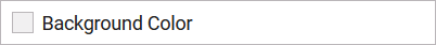
Use section Background Color to select a background color:
Activate the checkbox and click on the color placeholder that will appear. Then use the color picker to select a new color or enter the hexadecimal code of the desired color:

Option Grid Color is activated by default:
If you want to change the grid color, click on the color placeholder to display the color picker. Use the color picker to select a new color or enter the hexadecimal code of the desired color. If the checkbox is disabled, the grid is is not displayed, but it is still in use: Elements still snap to the grid.
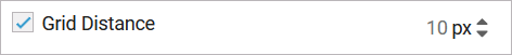
Option Grid Distance is activated by default:
Change the grid distance by changing the number of pixels. If the checkbox is disabled, the grid will neither be displayed nor used: Elements can be moved freely on the diagram pane.
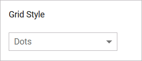
Attribute Grid Style is a drop-down list that offers two options to choose from:
-
Dots
-
Lines
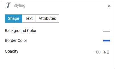
Options of Tab Shape
In tab Shape you find all options to change the appearance of an element on the diagram pane:
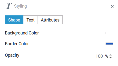
Tab Shape contains different options depending on your selection on the pane:
Shape Options for BPMN Elements
Use section Background Color to select a background color:
Activate the checkbox and click on the color placeholder that will appear. Then use the color picker to select a new color or enter the hexadecimal code of the desired color:
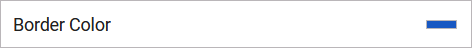
If you want to change the Border Color of the element, click on the color placeholder to display the color picker:
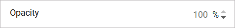
Changes of the Opacity apply equally to background and border color:
Shape Options for Relations
If you want to change the color of the arrow, use option Line Color.
Click on the color placeholder to display the color picker. Use the color picker to select a new color or enter the hexadecimal code of the desired color:
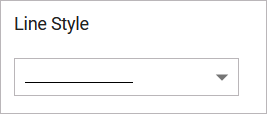
Section Line Style gives you three options for the style of the arrow line. Use the drop-down list to select the desired option:
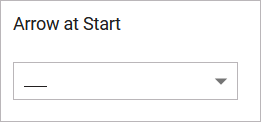
Open the drop-down list of option Arrow at Start to select the styling for the arrow head:
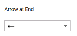
Open the drop-down list of option Arrow at End to select the styling for the arrow end:
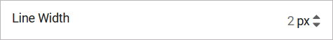
Use option Line Width to change the width of the arrow line:
Options of Tab Text
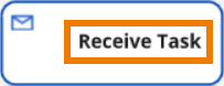
Tab Text is only available for the elements Service Task, User Task and Receive Task…
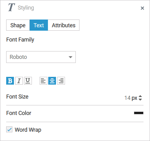
… because these elements contain text content:
Use section Font to select the font for the text within the element. You have also several formatting options:
In section Font Size you can change the font size of the text within the element:
You can also adapt the Font Color of text within the element. Click on the color placeholder:
Then use the color picker to select a new color or enter the hexadecimal code of the desired color:
Section Word Wrap is helpful, when you want to display text in BPMN elements:
By default, element names can only be displayed in a single line. When the word wrap option is activated, the text will fill the available space in the element:
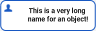
When the option is disabled, a placeholder (...) indicates that more text is available but hidden: