The instance table of a newly created overview initially contains only one example column. The design user must use the column configuration to define the columns in which the data created will later be displayed. The designer is free to choose which data is to be displayed in the overview and under which column name.
|
|
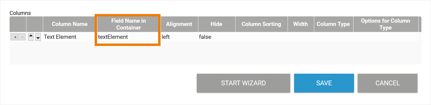
The instance table in an overview can only show one value per field.
Form Elements with Special Characteristics
Some form elements must be handled separately when configuring the overview table. These special cases are:
| Form Editor | Form Element | Configuration Note |
|---|---|---|
| BPaaS Editor | Generally the contents of responsive form elements can also be displayed in a Mobile Overview. During the configuration of your Mobile Overview, use the Field Name in Container of the responsive form elements. | |
| Mobile Editor | Generally the contents of mobile form elements can also be displayed in a Responsive Overview. During the configuration of your Responsive Overview, use the Field Name in Container of the mobile form elements. |
Address (Mobile)
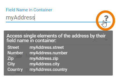
The form element Address only exists in the Mobile Editor. The field combines the following input fields in a single form element:
- Street
- Number
- Zip
- City
- Country
| Each of the input fields possesses its own Field Name in Container, which must be addressed in the overview. You can display the Field Names in Container of the individual input fields in the properties of the Address element. To do this, click the question mark in the Fieldname in Container setting. |
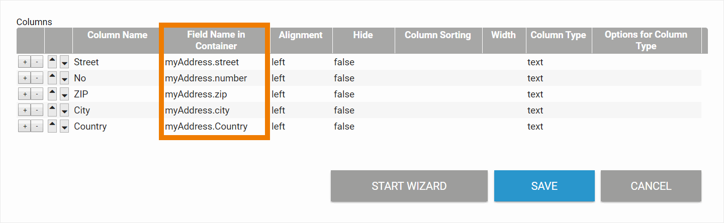
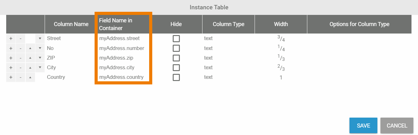
| When configuring the overview table, add a new line for every input field of the Address element and enter the corresponding Field Name in Container. |
| This also applies to the configuration of a Mobile Overview. |
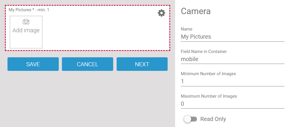
The Camera Elements
There is a significant difference between the elements Camera and Camera (Mobile):
- The responsive form element Camera stores only one image at a time. Only one value is stored in the container.
- The mobile form element Camera (Mobile) can store several images. The values of the element are stored in the container as array.
When configuring an overview form, the values of these elements must therefore be addressed differently.
Camera
The element Camera saves one image. The value of the element can be displayed in the overview as image or as text:
- Text (name): If you want to display the name of the uploaded file, you must add the extension .name to the Field Name in Container.
- Text (url): You can also display the URL under which the content is saved in the container. In this case, add the extension .url to the Field Name in Container and choose column type text.
- Image (url): If the value is to be displayed as an image, you must add the extension .url to the Field Name in Container and select image as column type.
| Example RESPONSIVE Overview Displaying an Image from the responsive Camera Element "My Picture" | |
|---|---|
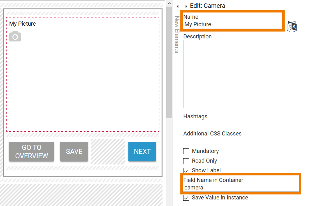
| A form contains the Camera element My Picture with the Field Name in Container camera. |
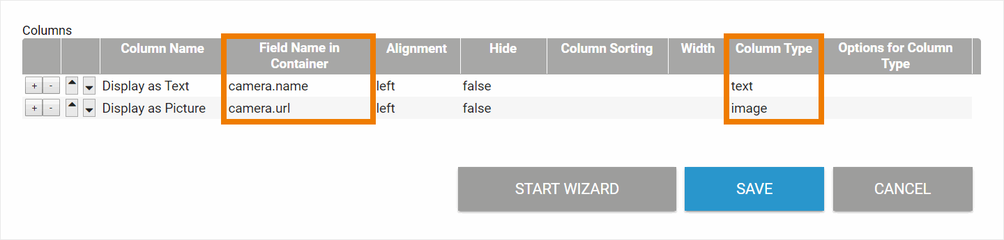
| Two columns are defined in the responsive overview form:
|
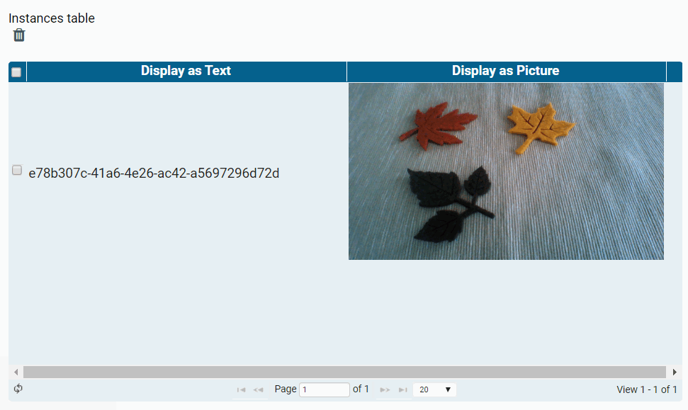
| The camera element has been used to take a picture. The image is displayed in the Responsive Overview as follows:
|
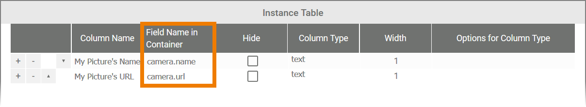
| Example MOBILE Overview Displaying an Image from the responsive Camera Element "My Picture" | |
The column type image in a Mobile Overview is configured to display the contents of an array only. As the responsive element Camera saves one image only, it's content cannot be displayed as image in a Mobile Overview. But you have two other options to show the content of the responsive Camera element:
In both cases use column type text. | |
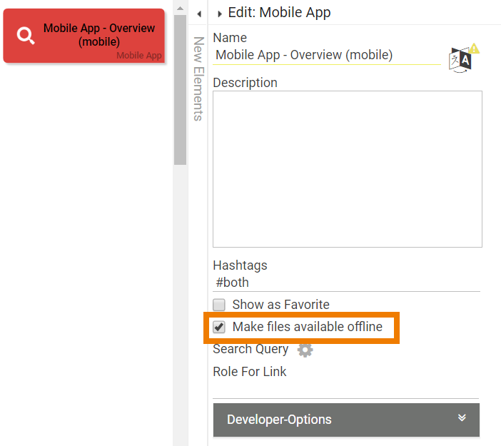
| In Mobile Apps, you can only access synchronized files/images if the option Make files available offline has been activated for the corresponding Mobile App - Overview element. |
| A form contains the Camera element My Picture with the Field Name in Container camera. |
| Two columns are defined in the Mobile Overview:
|
| The camera element has been used to take a picture. The image is displayed in the Mobile Overview as follows:
|

Camera (Mobile)
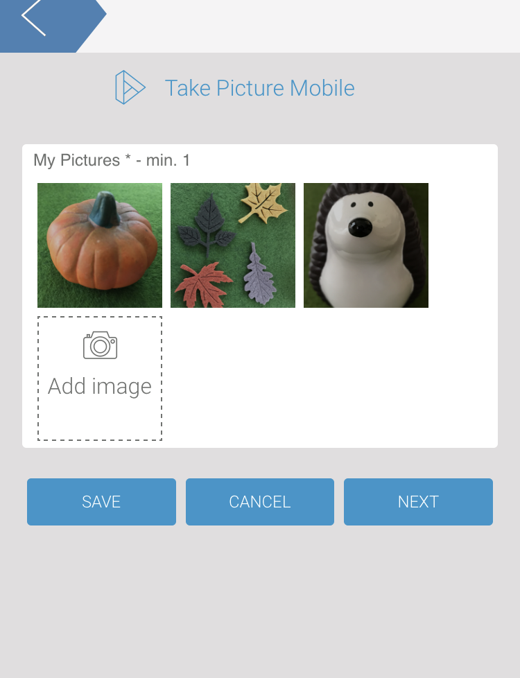
The element Camera (Mobile) can store any number of images, its values are therefore stored in the container as an array . In Mobile Overviews, the content of the array can be referenced directly with the element's Field Name in Container and column type image.
You have several options to display the contents of the Camera (Mobile) field in a Mobile Overview:
- Text (name): If you want to display the name of a file, you must add the extension .name to the Field Name in Container. You also need to reference a specific value from the array, so the necessary syntax is
fieldNameInContainer.0.name - Text (url): If the link of an image is to be displayed, the Field Name in Container has the extension .url. You also need to reference a specific value from the array, so the necessary syntax is
fieldNameInContainer.0.url
For each image whose name or URL is to be displayed, a separate column must be created in the instance table.
| Example MOBILE Overview Displaying an Image from the Camera (Mobile) Element "My Pictures" | |
|---|---|
| In Mobile Apps, you can only access synchronized files/images if the option Make files available offline has been activated for the corresponding Mobile App - Overview element. |
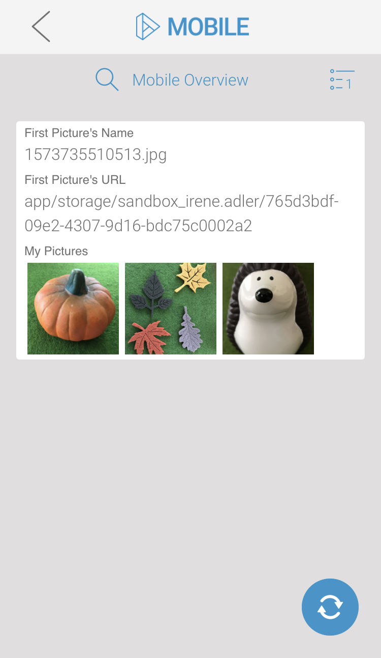
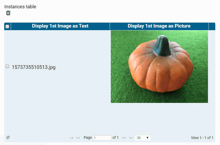
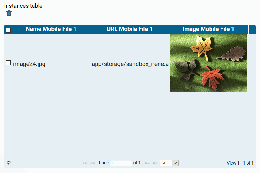
| A mobile form contains the form element Camera (mobile) My Pictures with the Field Name in Container mobile. |
| In the Mobile Overview the content should be displayed as follows:
It is not necessary to specify the array value when using the column type image in a Mobile Overview. |
| The Mobile Overview now shows the content of the Camera (Mobile) element My Pictures as follows:
|
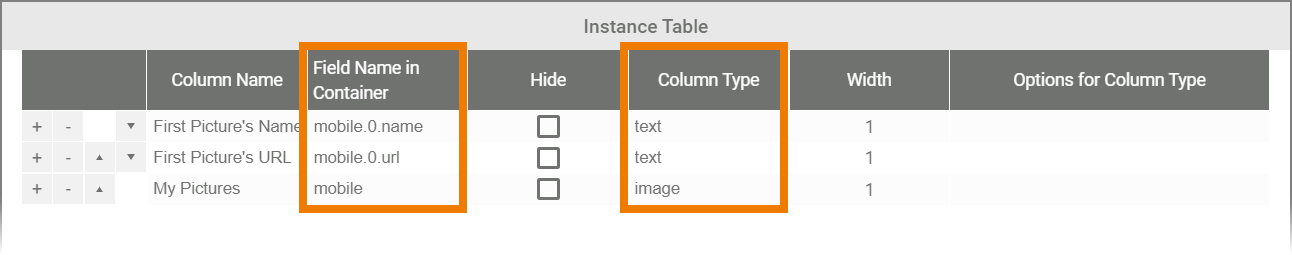
| Example RESPONSIVE Overview Displaying an Image from the Camera (Mobile) Element "My Pictures" | |
The element Camera (Mobile) can store any number of images, its values are therefore stored in the container as an array . However, in an instance table only one value can be displayed per table field. If you want to display the content of the Camera (Mobile) element in a Responsive Overview, you must specify which value from the array you want to show. We recommend that you reference the first value by default. The first value of an array is addressed with the number 0. | |
 | A mobile form contains the form element Camera (mobile) My Pictures with the Field Name in Container mobile. |
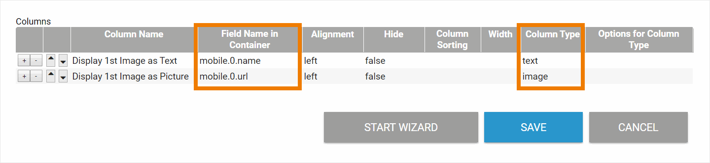 | Two columns are defined in the responsive overview form. Both should display the first image of the mobile camera element:
|
| The form is executed on a mobile device, three pictures are taken. The data is then synchronized and transferred to the database. |
| The first image is displayed in the Responsive Overview:
|
Elements with Value Pairs
The content of some elements is not stored as a single value, but as a pair of values. This applies to the following elements:
- Drop-down Field/Radio Button: These two elements provide possible values from which to select when filling out the form. Both form elements can contain value pairs: One value and one label per selection option.
- A Search Field references a list of possible values. The list is created in the container using JavaScript code. When an entry is made in the search field, the stored values are compared with the input and hits are displayed in a list.
- In addition to the URL (url), a different label can be entered in a URL element (see section URL Field on this page for detailed information about the configuration of the URL element in an overview).
The contents of drop-down fields, radio buttons, search fields and URL fields are therefore always stored as value;label pairs, even if the designer has entered only one value or only one label. This special feature is described in detail in chapter Possible Values: Value and Label.
For the column configuration it is important to know that the keys of these form fields must be provided with the appropriate addition:
-
fieldNameInContainer.value fieldNameInContainer.label-
fieldNameInContainer.url(only for URL Field)
This logic applies to both the responsives and the mobile form elements. If you use the Column Wizard to configure the overview, the input for these elements is automatically enhanced by .label.
Example RESPONSIVE Overview | |
|---|---|
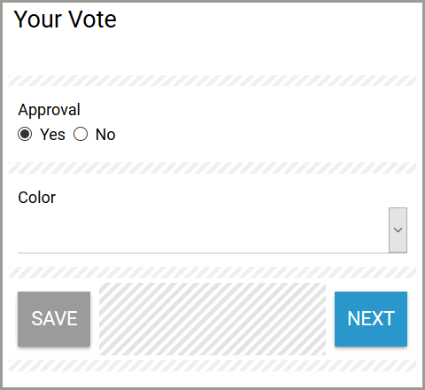
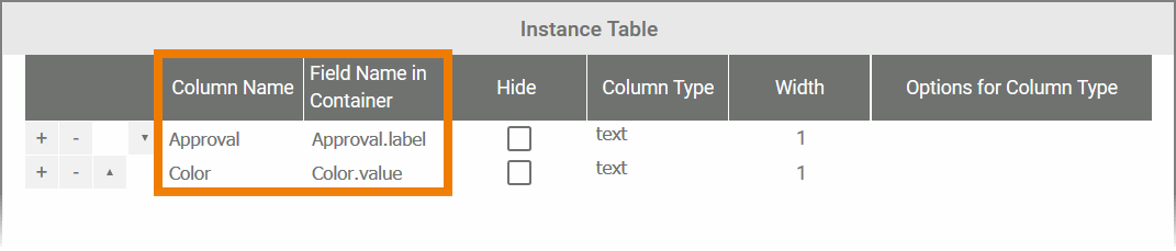
| Two form elements have been created in the form Your Vote :
|
| The Radio Button Approval contains the following possible values inserted as value pair:
|
| The Drop-down Field Color contains the following possible values inserted as value pair:
|
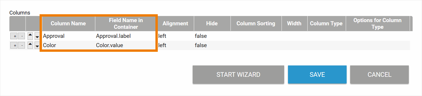
| The overview should display the content of both elements and is configured as follows:
|
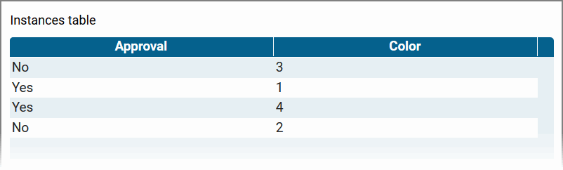
| The overview is executed and shows the label of the value pair saved in Approval. In the column Color, the value of the value pair is referenced. Therefore 1, 2, 3 or 4 is displayed here. If you use the Column Wizard to configure the overview, the input for drop-down fields and radio buttons is automatically enhanced by .label. |
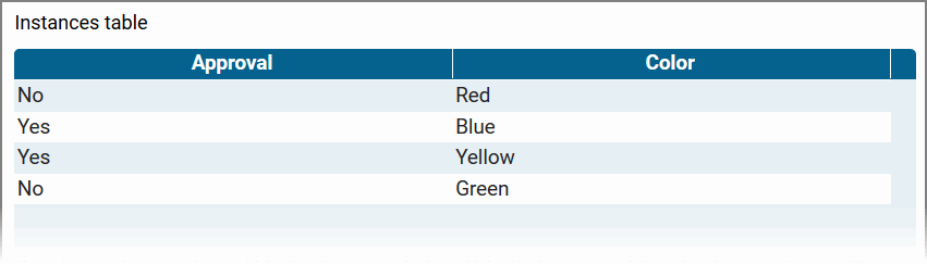
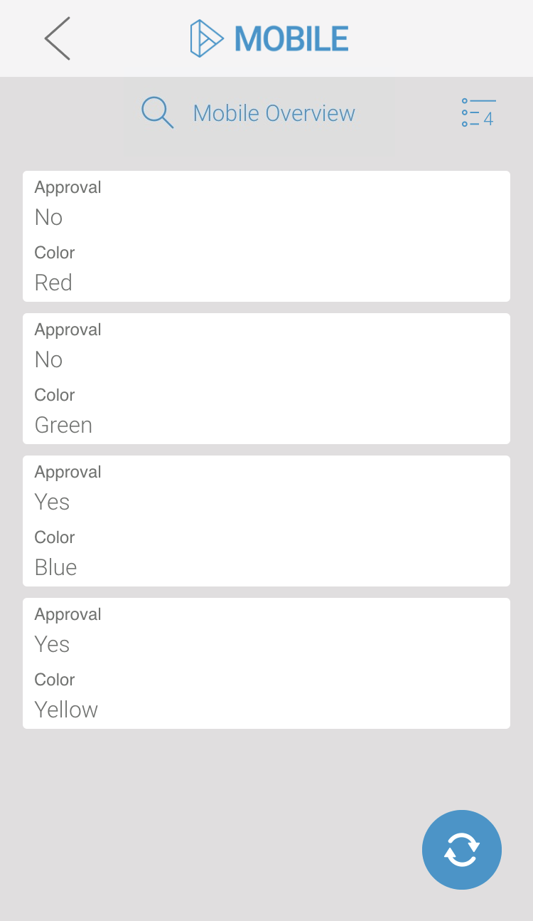
| Display of the overview after the Field Name in Container has been changed to Color.label in the column configuration. |
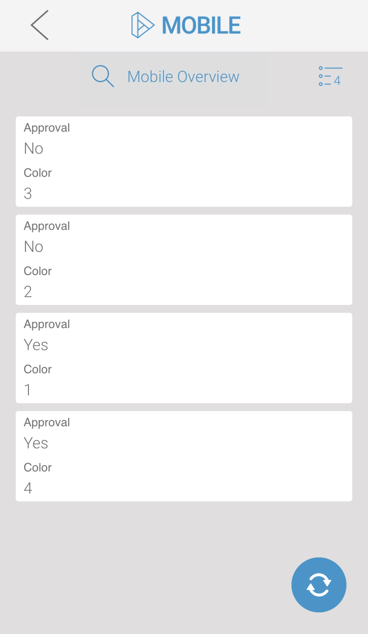
| Example MOBILE Overview Form "Your Vote" with Radio Button "Approval" and Drop-down Field "Color" | |
| The overview should display the content of both elements and is configured as follows:
|
| The overview is executed on a mobile device and shows the label of the value pair saved in Approval. In the column Color, the value of the value pair is referenced. Therefore 1, 2, 3 or 4 is displayed here. |
| Display of the Mobile Overview after the Field Name in Container has been changed to Color.label in the column configuration. |


The Files Upload Elements
There is a small difference between the elements Files Upload and Files Upload (Mobile):
- The responsive form element Files Upload allows the upload of multiple files. This field's content is saved as array.
- The mobile form element Files Upload (Mobile) is also able to store multiple files and its values are also saved as array.
But if the user is really able to upload more than one file depends on operating system of the used mobile device.
The content of both elements is an array of objects. However, in an instance table only one value can be displayed per table field. If you want to display several values (files) from the upload element in your instance table, you must specify which value(s) from the array you want to show. We recommend that you reference the first value by default. The first value of an array is addressed with the number 0.
There are three options to display the content of a Files Upload element:
- Text (name): If you want to display the name of the uploaded file, you must add the extension .name to the Field Name in Container. Choose text as the column type.
- Text (url): You can also display the URL under which the file is saved in the container. To do so, add the extension .url to the Field Name in Container and coose column type text.
- Picture (url): If the file is to be displayed as an image, you must add the extension .url to the Field Name in Container. Select image, as column type in this case.
Files Upload
Example RESPONSIVE Overview | |
|---|---|
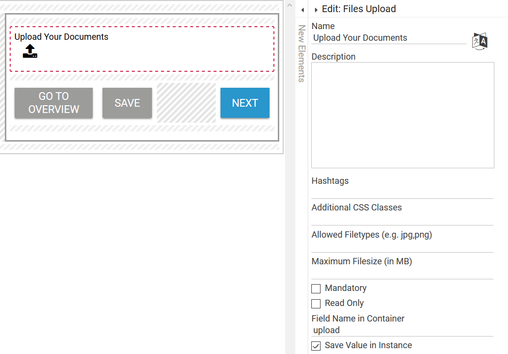
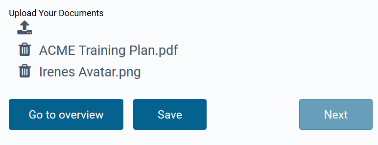
| A responsive form contains the Files Upload element Upload Your Documents with the Field Name in Container upload. |
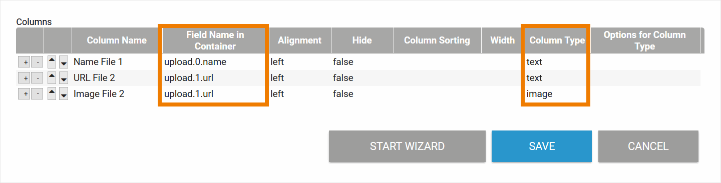
| Three columns are defined in the responsive overview form:
|
| The form is executed, two files will be uploaded:
|
| The uploaded files are displayed in the Responsive Overview as follows:
|
| Example MOBILE Overview Displaying Files from the Responsive Element "Upload Your Documents" | |
| In Mobile Apps, you can only access synchronized files/images if the option Make files available offline has been activated for the corresponding Mobile App - Overview element. |
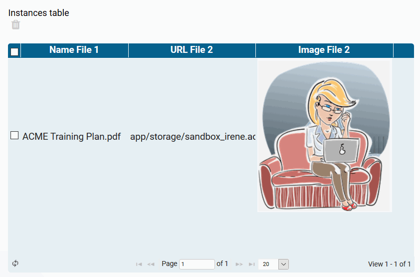
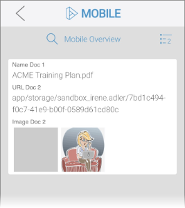
| A responsive form contains the Files Upload element Upload Your Documents with the Field Name in Container upload. |
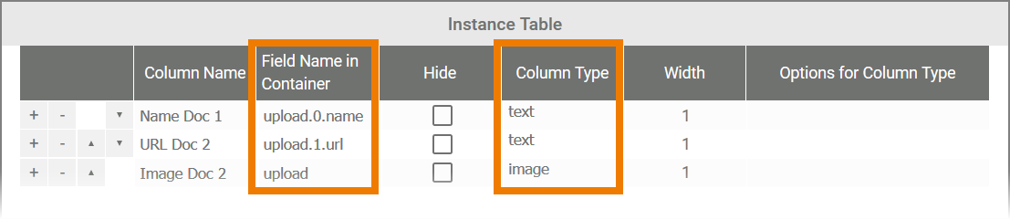
| Three columns are defined in the Mobile Overview:
It is not necessary to specify the array value when using the column type image in a Mobile Overview. |
| The form is executed, two files will be uploaded:
|
| The files are displayed in the Mobile Overview as follows:
|
Files Upload (Mobile)
| Example MOBILE Overview Displaying Files from the Mobile Element "Your Mobile Upload" | |
|---|---|
| In Mobile Apps, you can only access synchronized files/images if the option Make files available offline has been activated for the corresponding Mobile App - Overview element. |
| A mobile form contains the element Files Upload (Mobile) Your Mobile Upload with the Field Name in Container mobileUpload. |
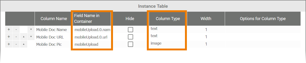 | Three columns are defined in the Mobile Overview.
It is not necessary to specify the array value when using the column type image in a Mobile Overview. |
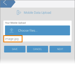
| During form execution, a photo has been uploaded to the mobile element Your Mobile Upload. |
 | The file is displayed in the Mobile Overview as follows:
|
| Example RESPONSIVE Overview Displaying Files from the Mobile Element "Your Mobile Upload" | |
| A mobile form contains the element Files Upload (Mobile) Your Mobile Upload with the Field Name in Container mobileUpload. |
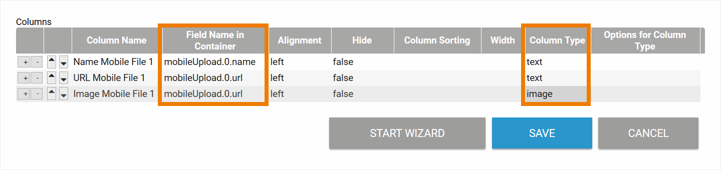 | Three columns are defined in the responsive overview form.
|
 | During form execution, a photo has been uploaded to the mobile element Your Mobile Upload. |
| The file is displayed in the Responsive Overview as follows:
|
File Upload
Deprecated with BPaaS 17.2
The use of the form element File Upload is no longer recommended. It has been replaced by the element Files Upload. Click on the following link to display information about the File Upload element anyway:
The File Upload element allows you to upload one file, such as an image or a Word file, to a form. If you want to show the element's content in the overview, you have two options:
- If the name of the uploaded file is to be displayed, you must add the extension .name to the Field Name in Container.
- If you want the link to the uploaded file to be displayed, add the extension .url to the Field Name in Container.
Example: Display of an uploaded image in the overview
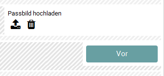 | A form contains the File Upload element Passbild hochladen. |
 | The overview shall contain the name of the uploaded image. Therefore Passbild hochladen .name is entered in the column Field Name in Container. |
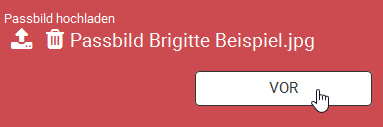 | During form execution the image PassbildBrigitteBeispiel.jpg is uploaded. |
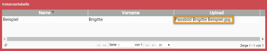 | In the overview the name of the uploaded file is displayed. |
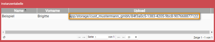 | After changing the field name in the container from to Passbild hochladen .url, the link under which the file is stored in the container is displayed in the overview. |
If you are using the Column Wizard for the configuration of the overview, the addition .url is automatically added for a File Upload.
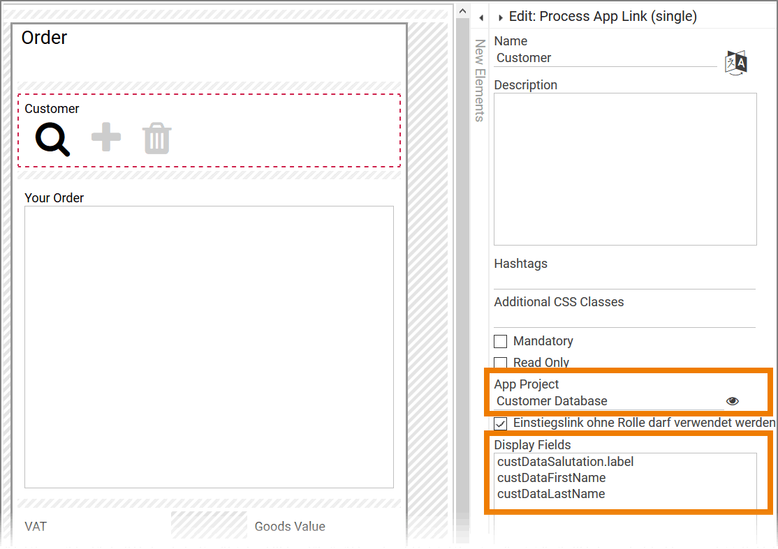
Process App Link (single)
The form element Process App Link (single) links to one instance of another app. Since an instance can consist of several values, you have to specify which values from the linked instance should be taken over.
In each field of an instance table, only one value can be displayed. If you want to display several values of an Process App Link (single) in an instance table, you have to create a separate column for each value and reference the values individually using the following syntax:
Name_of_AppLink.fieldNameInContainer_of_formElement
The syntax changes if you want to reference values from one of the following form fields (see Elements with Value Pairs ):
- Drop-down Field
- Radio Button
- Search Field
- URL Field
Values created using one of these four elements must be referenced using the following syntax:
-
Name_of_AppLink.fieldNameInContainer_of_formElement.label -
Name_of_AppLink.fieldNameInContainer_of_formElement.value -
Name_of_AppLink.fieldNameInContainer_of_formElement.url(only for URL Field)
Although the form element Process App Link (single) exists only in responsive forms, its contents can also be displayed in a Mobile Overview.
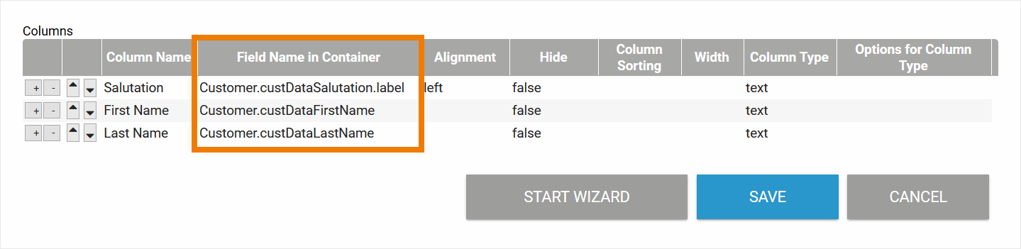
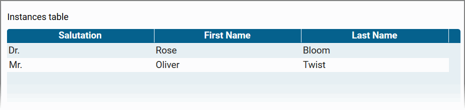
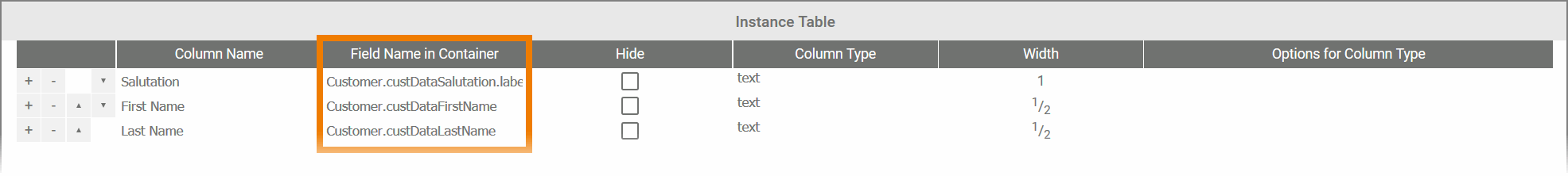
| Example RESPONSIVE Overview App "Orders" contains the Process App Link "Customer" linking the app "Customer Database" | |
|---|---|
| In the responsive form of the app Orders the Process App Link (single) Customer was inserted. The element links to the app Customer Database. From the Customer Database app, the salutation, first name and last name of the customer should be displayed.
|
| The contents of the app link Customer should be displayed in the overview. In the instance table of the overview, the columns Salutation, First Name and Last Name are configured as follows:
|
| The overview then displays the values of the app link Customer in the Salutation, First Name, and Last Name columns. If you use the Column Wizard, the first entry from the Display Fields list is automatically added to the instance table. |
| Example MOBILE Overview App "Orders" contains the Process App Link "Customer" linking the app "Customer Database" | |
| In the responsive form of the app Orders the Process App Link (single) Customer was inserted. The element links to the app Customer Database. From the Customer Database app, the salutation, first name and last name of the customer should be displayed.
|
| The contents of the app link Customer should be displayed in the overview. In the instance table of the overview, the columns Salutation, First Name and Last Name are configured as follows:
|
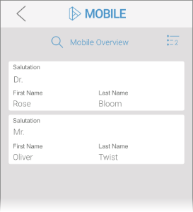 | If you open the Mobile Overview on your device, the three contents of the app link are displayed as individual values. |
Process App Link (multiple)
The form element Process App Link (multiple) exists in two versions:
- For responsive forms
- For mobile forms
The following applies to both variants: The content of a Process App Link (multiple) is an instance table.
But a table column can only be configured for one value at a time. Therefore, the contents of an instance table cannot be displayed in the column of an overview table.
The content of a Process App Link (multiple) cannot be displayed in an overview.
The Signature Elements
The signature field gives the user the possibility to sign a form. There is a small difference between the elements Signature and and Signature (Mobile):
- The content of the responsive form element Signature is saved as a single image file.
- The content of the form element Signature (Mobile) is saved as image file within an array.
Signature
The content of the responsive signature field can be displayed in overview forms in different variants:
- File Name (name): If you want to display the name of the file, you must add the extension .name to the Field Name in Container. Choose the column type text.
- URL (url): You can also display the path under which the signature is stored in the container. To do so, add the extension .url to the Field Name in Container. Choose the column type text.
- Image (url): If the signature is to be displayed as an image, you must add the extension .url to the Field Name in Container and choose the column type image.
Please note that the content of the responsive Signature element cannot be displayed as image in a Mobile Overview.
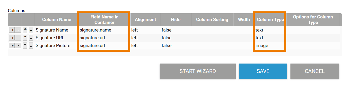
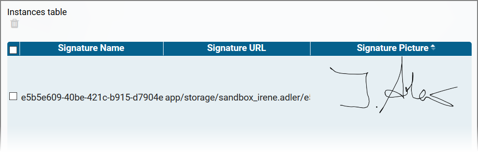
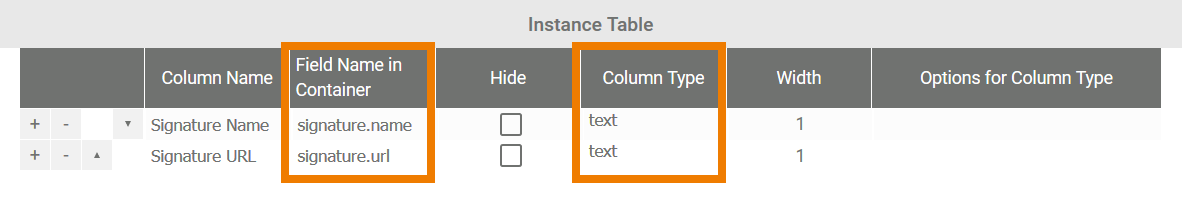
| Example RESPONSIVE Overview Displaying the responsive Signature Element "Please sign" as Text and Image | |
|---|---|
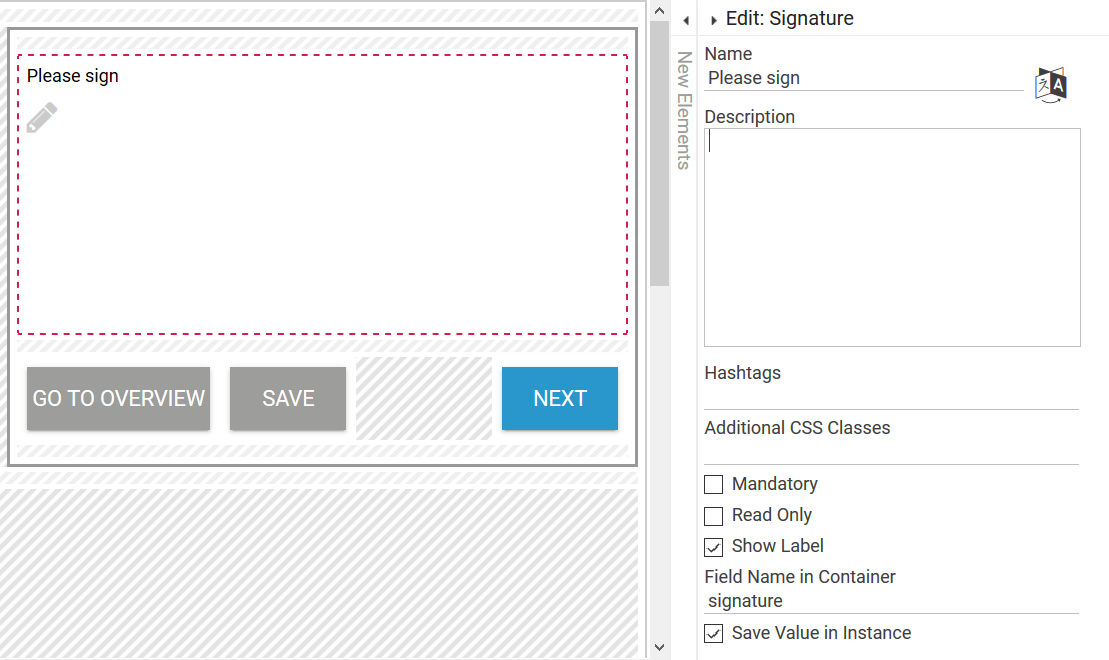
| A responsive form contains the Signature element Please sign with the Field Name in Container signature. |
| Three columns are defined in the responsive overview form:
|
| A user has signed the form. The content of the Signature element is displayed in the Responsive Overview as follows:
|
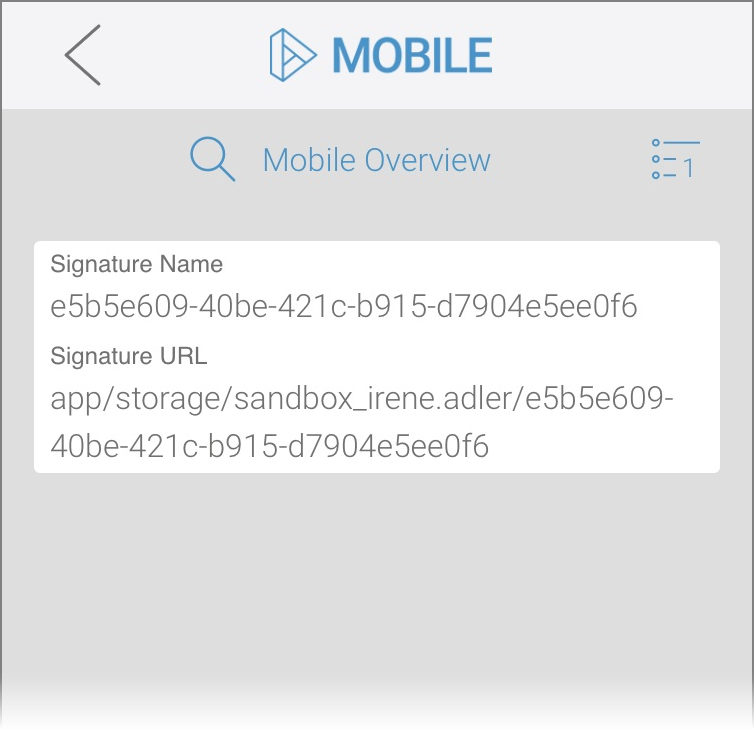
| Example MOBILE Overview Displaying the responsive Signature Element "Please sign" as Text | |
| A responsive form contains the Signature element Please sign with the Field Name in Container signature. |
| Two columns are defined in the Mobile Overview:
Please note that the content of the responsive Signature element cannot be displayed as image in a Mobile Overview. |
| A user has signed the form. The content of the Signature element is displayed in the Mobile Overview as follows:
|
Visit page Using the Signature Element for more detailed information.
Signature (Mobile)
The content of the element Signature (Mobile) can be displayed in overview forms in different variants. Since the content of the mobile signature field is saved in an array, you have to add the position in the array to the Field Name in Container when referencing it:
- File Name (name): If you want to display the name of the file, you must add the extension .0.name to the Field Name in Container. Choose the column type text.
- URL (url): You can also display the path under which the signature is stored in the container. To do so, add the extension .0.url to the Field Name in Container. Choose the column type text.
- Image (url): If the signature is to be displayed as an image, do as follows:
- Mobile Overview: Enter the Field Name in Container of the signature field and choose the column type image.
- Responsive Overview: Add the extension .0.url to the Field Name in Container and choose the column type image.
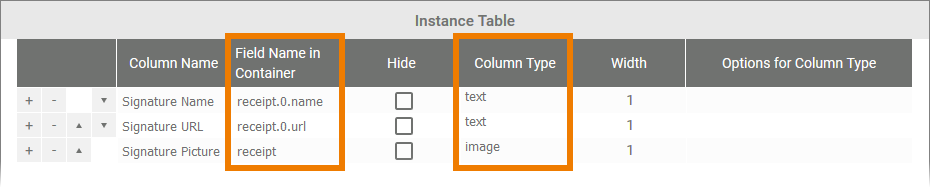
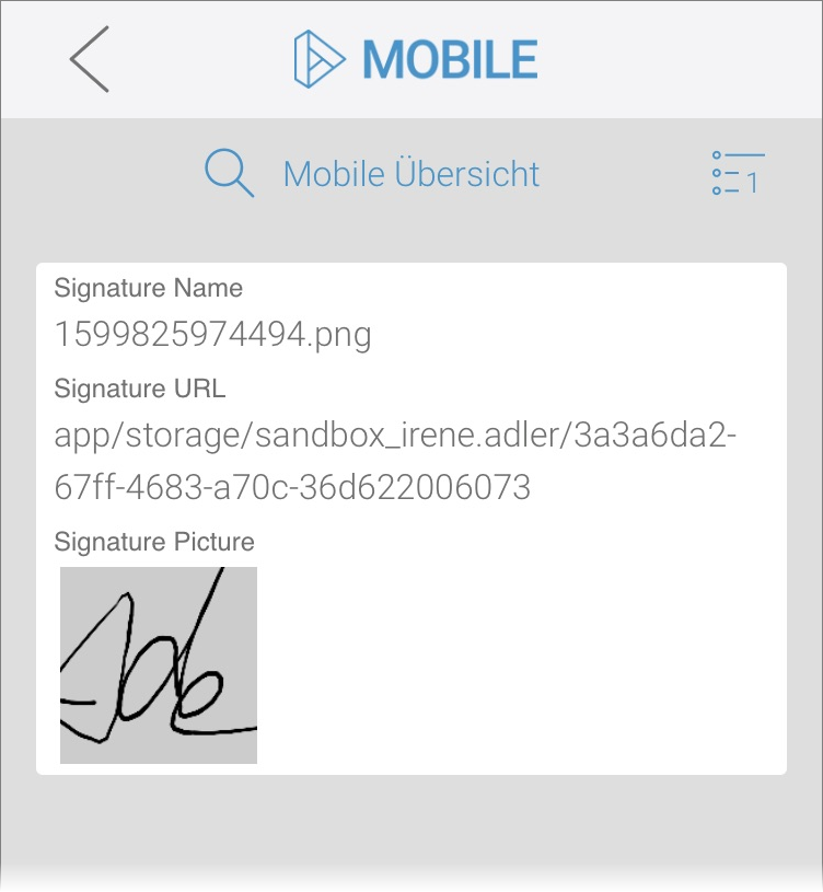
| Example MOBILE Overview Displaying the Element Signature (Mobile) Confirm receipt as Text and Image | |
|---|---|
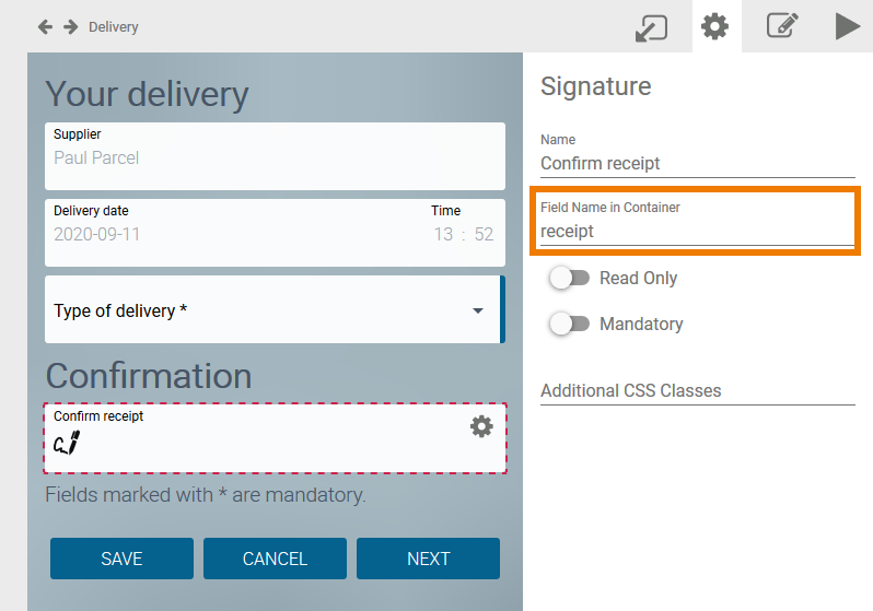 | A Mobile form contains the Signature element Confirm receipt. Its Field Name in Container is receipt. |
| Three columns are defined in the Mobile Overview form:
|
| A user has signed the form. The content of the Signature element is displayed in the Mobile Overview as follows:
|
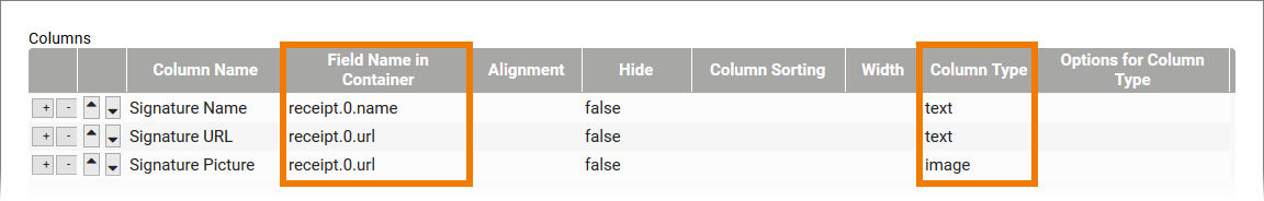
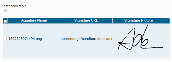
| Example RESPONSIVE Overview Displaying the Element Signature (Mobile) Confirm receipt as Text and Image | |
| A Mobile form contains the Signature element Confirm receipt. Its Field Name in Container is receipt. |
| Three columns are defined in the Responsive Overview form:
|
| A user has signed the form. The content of the Signature element is displayed in the Responsive Overview as follows:
|
Visit page Unterschrift-Feld verwenden (German) for more detailed information.
URL Field
| The URL Field consists of two fields:
The content of the URL element therefore also contains a pair of values (see Elements with Value Pairs):
|
| Example RESPONSIVE Overview Displaying Label and URL of the URL Field "Your URL" | |
|---|---|
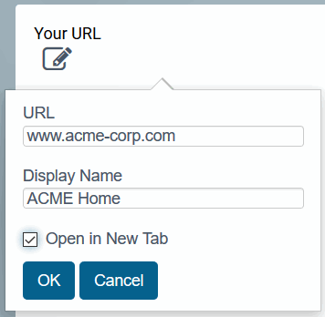
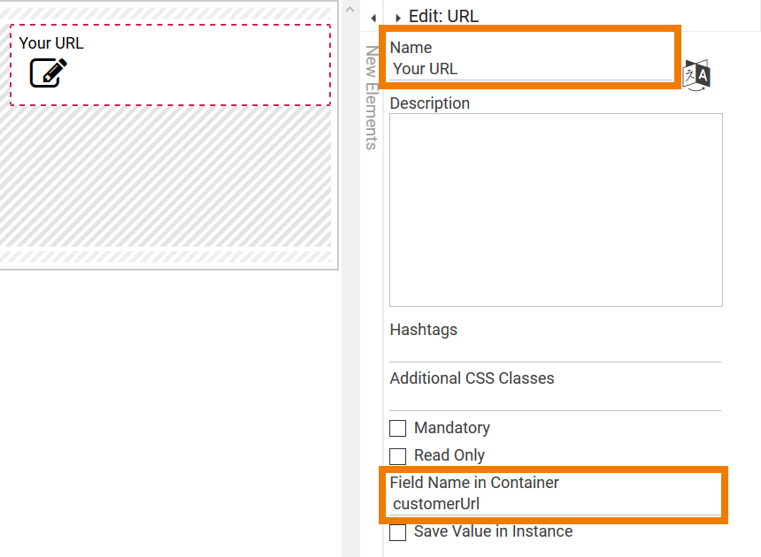
| In a form, the URL Field Your URL is created. Its Field Name in Container is customerUrl. |
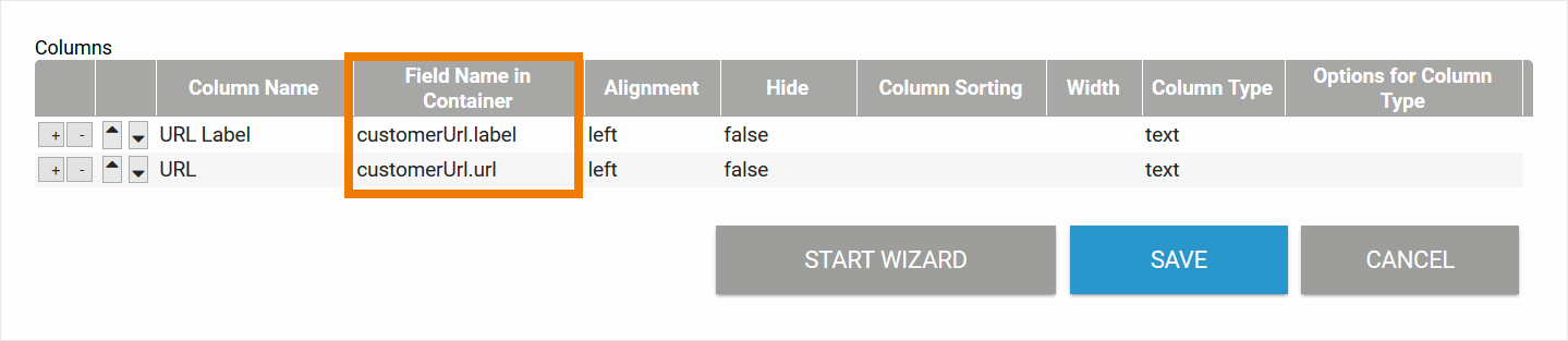
| In the overview table, the URL and the display name of the URL element should be displayed.
|
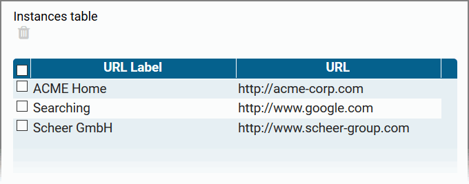
| In the overview, the display name and URL are displayed as configured. |
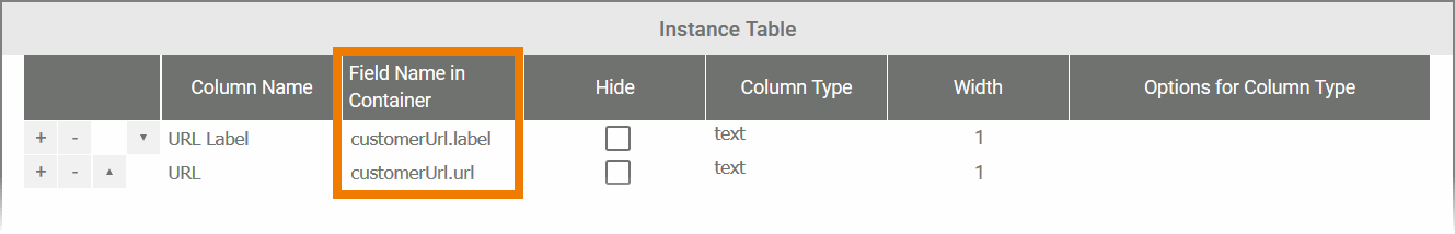
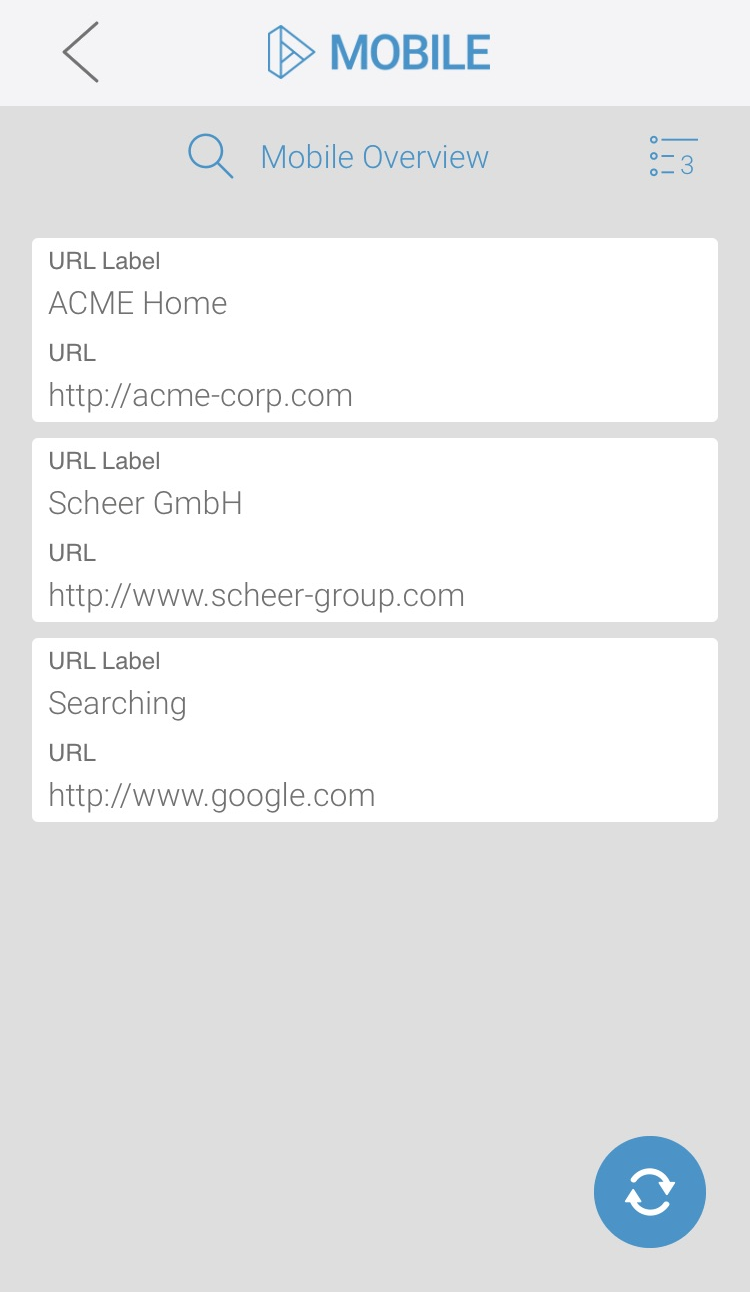
| Example MOBILE Overview Displaying Label and URL of the URL Field "Your URL" | |
| Although the URL field can only be used in responsive forms, stored values can also be displayed in a Mobile Overview. The columns are configured in the same way as for a responsive overview:
|
| The data is displayed in the Mobile Overview as configured. |
Example of a Responsive Overview Configuration
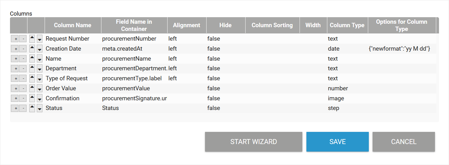
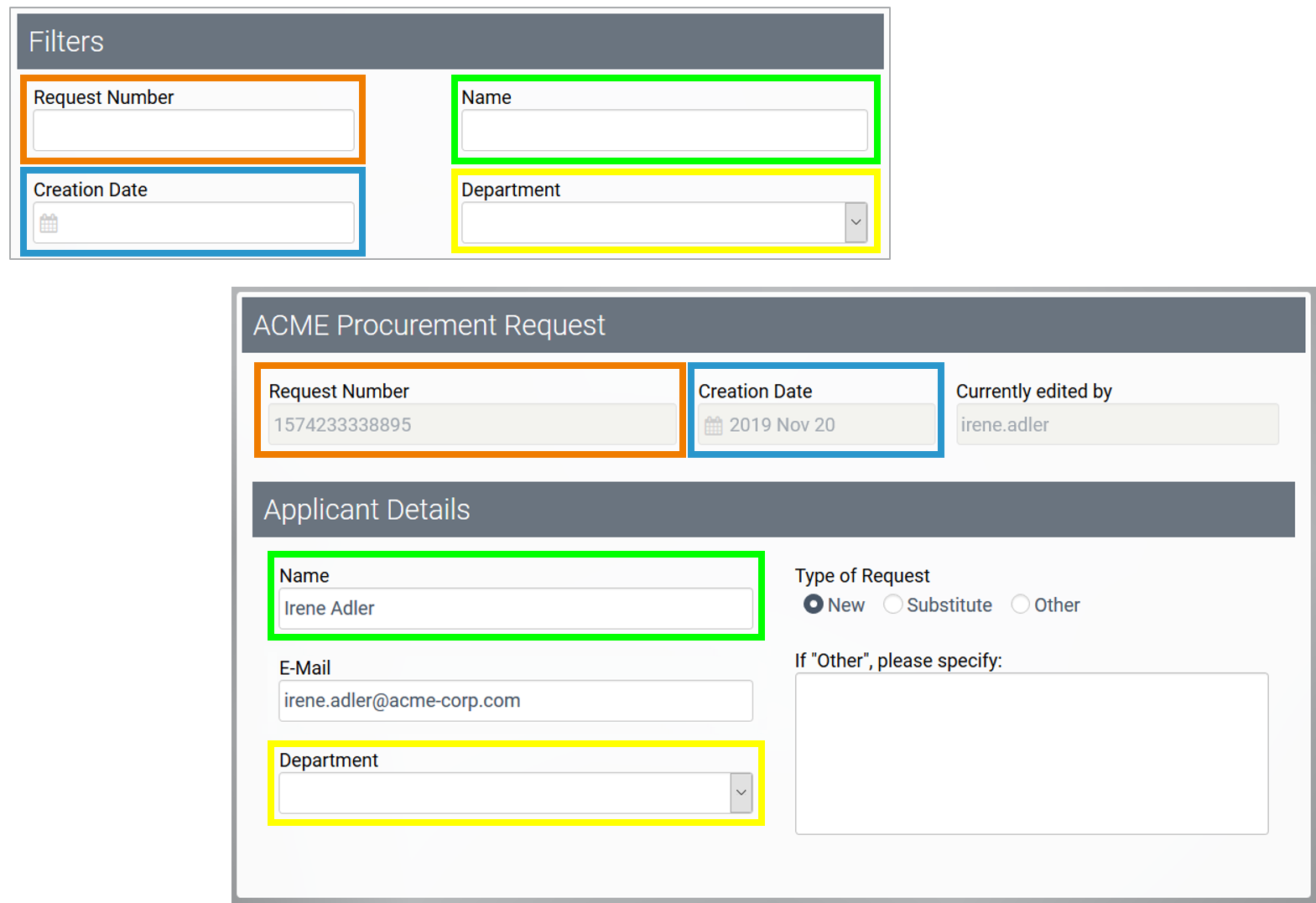
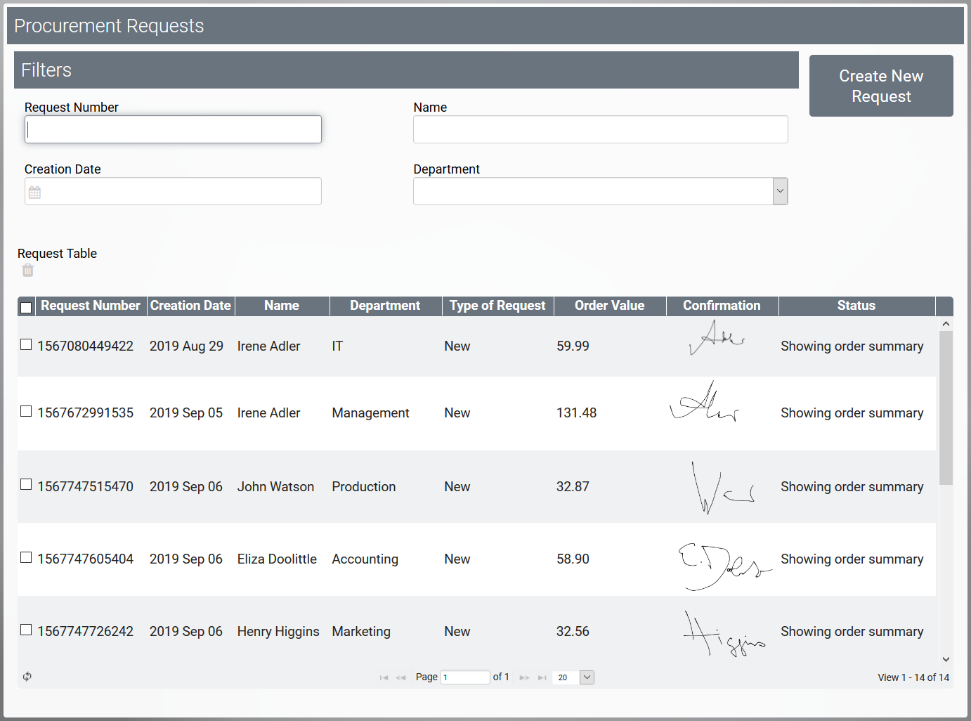
| Example RESPONSIVE Overview Configuration of the Overview in ACME's Procurement Process | |
|---|---|
| The following columns are created for the instance table of the overview:
No form entry is used for the columns Creation Date and Status :
|
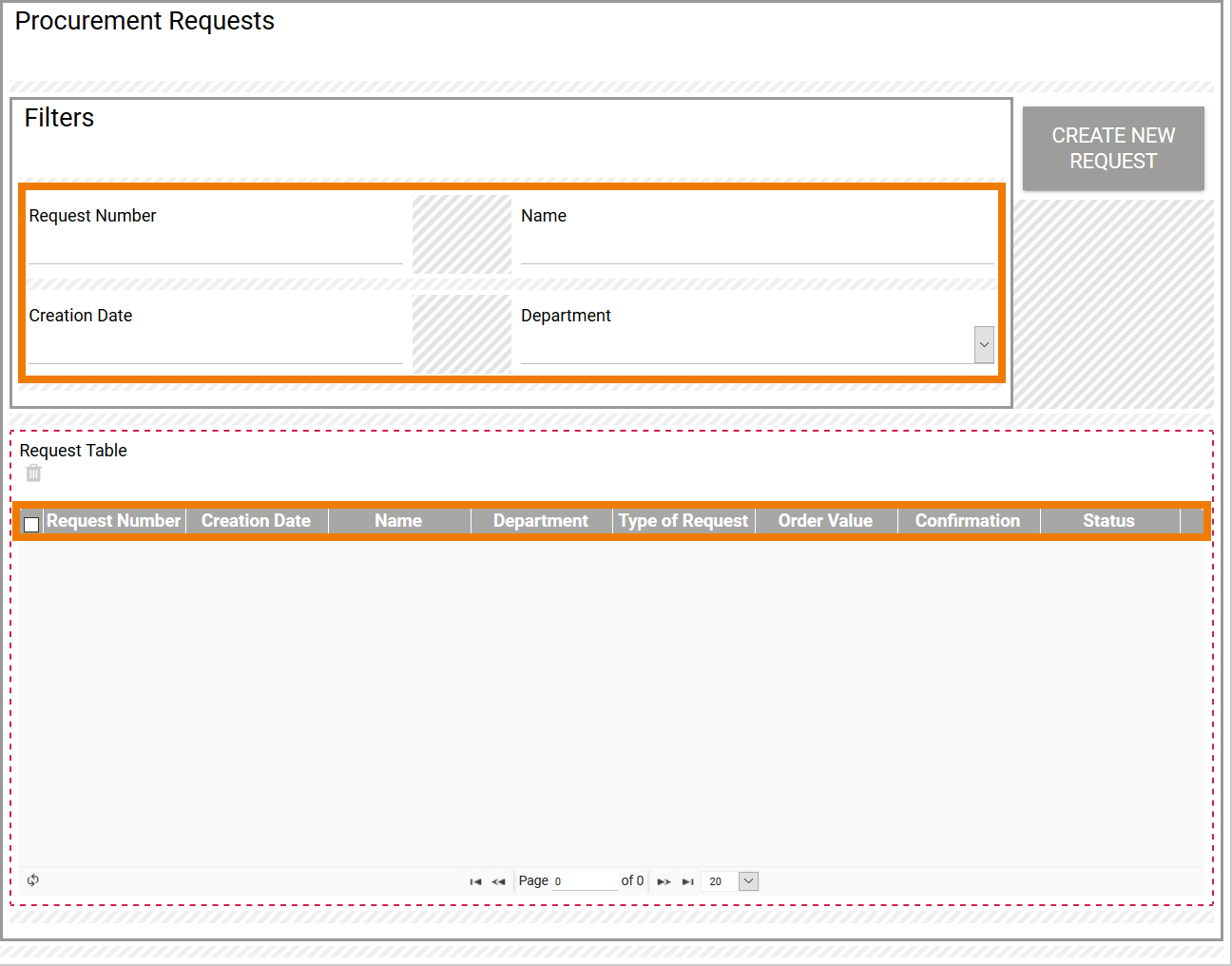
| The overview form contains the filter fields
The instances are displayed later in the Request Table containing the following values from the respective data record:
|
| The filter fields are links to the form elements used in the corresponding responsive form. |
| If the overview is executed, the data records are displayed according to the configuration. |
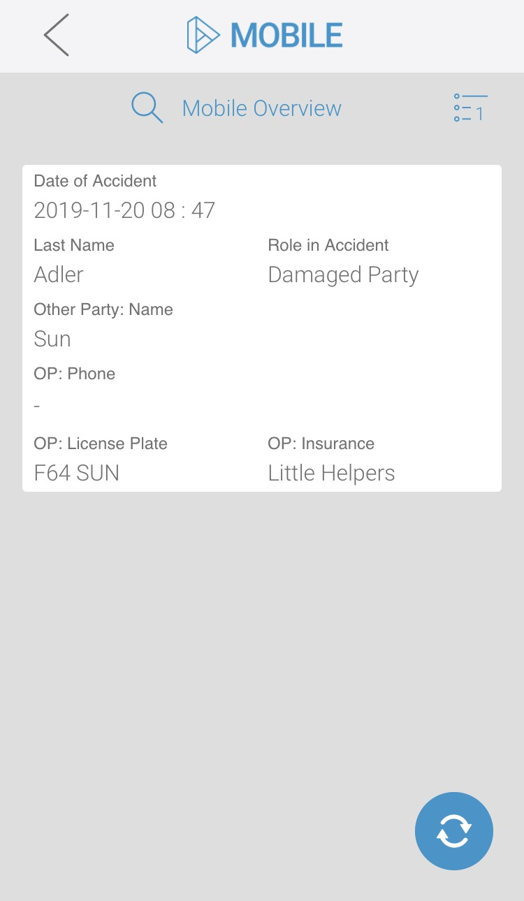
Example of a Mobile Overview Configuration
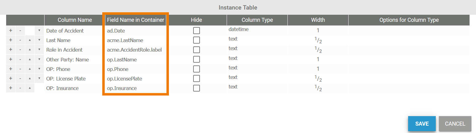
| Example MOBILE Overview Configuration of the Overview in ACME's Damage Reporting Process | |
|---|---|
| The following columns are created for the instance table of the overview:
Last Name and Role in Accident values ate to be displayed in the same line, so width 1/2 is entered for these columns. This also applies for the values OP: License Plate and OP: Insurance. |
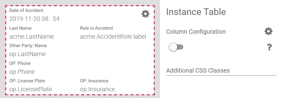
| The configured instance table is displayed in the form of the Mobile Overview. |
| When you execute the overview on a mobile device, stored instances are displayed one below the other. The values are displayed for each instance as configured:
|
On this Page:
Related Pages:
Related Documentation:
- MOBILE (German)
Overview
Content Tools