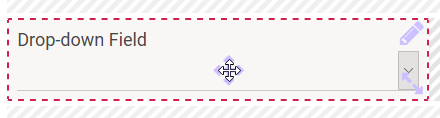
The Element Drop-down Field
Element Icon | |
| Form Field |
|
| Function | Click to open a list of available options. One of the displayed options must be chosen to continue. Alternate names are Select Box or Drop-down List. To choose an option as default setting, click |
| Default | The first value entered in field Possible Values is automatically displayed as default. If an empty option is desired, you have to add it manually to the list. |
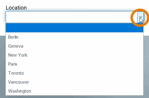
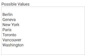
| Example | A city shall be selected from a Locations l ist:
|
Configuration Options
The form element may be edited via the Edit Sidebar.
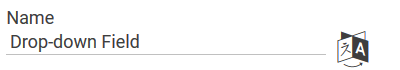
| Name Field name shown in the form. |
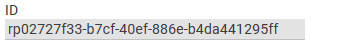
| ID ( PAS 19.2 ) The read-only field contains the model ID of the element. Designers can use the ID for example in the search to link the element in other models. |
| Description When a user hovers over a form element during execution, the content of the commentary field is shown as a quick info: |
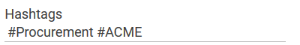
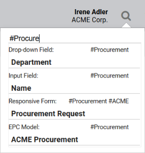
| Hashtags Possibility to insert your own key terms . The leading hashtag sign # (hash) will be inserted automatically. Use the space bar to separate multiple hashtags: One hashtag may be issued for multiple elements: |
| Additional CSS Classes Enables a field-acurate layout customization. |
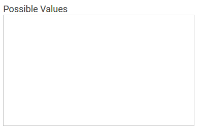
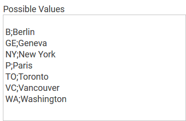
| Possible Values Enter the values to be displayed in the Drop-down Field here. Each value needs to be inserted into its own line (leave a blanc line if the list shall not immediately start with a value):
You may also enter value pairs separated by semicolon <value>;<label>:
When entering value pairs, it is always the first value (<value>) which will be saved as key in the data container. The second value (<label>) can be used as notification to the user. Value pairs may also contain numbers, so that a user can chose a text option, but in the background a calculation is carried out. It is not possible to assign the same value to different labels. If in the field Possible Values a pair of values with same content was entered, for example 2;2 or yes;yes then one of these values will be deleted from the field display during saving. This value will be saved to the database as both value and label. For more information please see page Possible Values: Value and Label. |
| Mandatory The marked element must be filled or used. |
| Read Only This field is write-protected. Possible use case: An existing form is copied for users who shall receive read-only authorization. The added write protection however also affects you as a designer. If you would like to preset a different value, you have to initially reverse the read-only setting. Only then you can select a different value. Afterwards you can reinstate the write protection. |
| Focus on Element This field is ready for input and will be visually enhanced during form completion. |
| Field Name in Container Defines the name under which the form element will be saved in the data container. If the Field Name in Container remains empty, then the field identifier (name) will be used. If two form elements share the same Field Name in Container, then both will access the same value. The Field Name in Container is a technical identifier. It is often used for extended coding. Therefore the Field Name in Container should not contain any spaces, special characters or umlaut. For further information please visit page The Container Principle. |
| Field Name for Possible Values Possible values can not only be entered manually, one can also reference data objects from the container. In this case, enter the reference to the object which is defined in the container into the field Field Name for Possible Values . The settings' field Possible Values remains empty. |
| Save Value in Instance If this checkbox is marked, the value entered in this field will be saved to the database during form execution. |


On this Page:
Related Pages:
Related Documentation:
Overview
Content Tools