| Chapter | Name | Excerpt | Usage | |||||||||||||||||||||||||||||||||||||||||||||||||||||||||
|---|---|---|---|---|---|---|---|---|---|---|---|---|---|---|---|---|---|---|---|---|---|---|---|---|---|---|---|---|---|---|---|---|---|---|---|---|---|---|---|---|---|---|---|---|---|---|---|---|---|---|---|---|---|---|---|---|---|---|---|---|
| Designer Panel Overview | search_panel | The Search panel helps you to find elements on the panes. Enter your search term in the box.
| ||||||||||||||||||||||||||||||||||||||||||||||||||||||||||
| Designer Panel Overview | search_panel_bpmn | Click on a match in the list to focus the element on the pane. This applies to elements on the diagram pane... | ||||||||||||||||||||||||||||||||||||||||||||||||||||||||||
| Designer Panel Overview | search_panel_execution | ... as well as to elements on the execution pane. | ||||||||||||||||||||||||||||||||||||||||||||||||||||||||||
| Designer Panel Overview | search_panel_hit_list | Enter your search term in the box. The results are displayed in a hit list below. The list displays the results in the following sections:
| ||||||||||||||||||||||||||||||||||||||||||||||||||||||||||
| Designer Panel Overview | show_panels | To show a hidden panel again, click on its icon. Hover over an icon to show the name of the corresponding panel. The panel is inserted at the position where it was last visible. | ||||||||||||||||||||||||||||||||||||||||||||||||||||||||||
| Designer Panel Overview | use_attribute_panel | Use the Attributes panel to edit the attributes or to make them visible on the diagram pane. | ||||||||||||||||||||||||||||||||||||||||||||||||||||||||||
| Diverse | add_bpmn_model | In the Models folder you can create your BPMN model which is equivalent to an executable service. To create a model, right click on the Models folder and choose the option Add Model from the context menu. |
| |||||||||||||||||||||||||||||||||||||||||||||||||||||||||
| Diverse | bpmn_created | If you switch back to the explorer tab, the new BPMN model is also displayed in the tree. To open a BPMN model from the explorer tree, use the |
| |||||||||||||||||||||||||||||||||||||||||||||||||||||||||
| Diverse | bpmn_new_tab | When you create a new model, it opens automatically in a new tab and you can directly start modeling. |
| |||||||||||||||||||||||||||||||||||||||||||||||||||||||||
| Diverse | clear_compiler_cache | Do not forget to clear the compiler cache when you have updated a library. You will find the button to clear the cache in the Model Toolbar. Example:
|
| |||||||||||||||||||||||||||||||||||||||||||||||||||||||||
| Diverse | create_bpmn | Enter a name for the BPMN model in the pop-up window Create New Model. Click Save. |
| |||||||||||||||||||||||||||||||||||||||||||||||||||||||||
| Diverse | create_form | Enter a name for the form in the pop-up window Create New Form. Click Save. |
| |||||||||||||||||||||||||||||||||||||||||||||||||||||||||
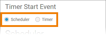
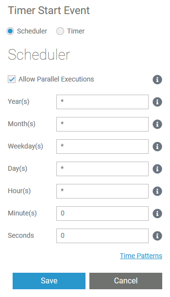
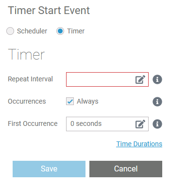
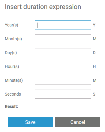
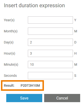
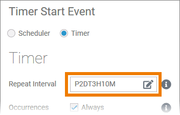
| Diverse | define_timer | To define the timer settings, click the icon |
| |||||||||||||||||||||||||||||||||||||||||||||||||||||||||
| Diverse | enlarge_pane | If you want to enlarge the editor, use icon |
| |||||||||||||||||||||||||||||||||||||||||||||||||||||||||
| Diverse | explorer_search | On top of the explorer tree you can find a search box. You must select any content in the tree to enable the search box. |
| |||||||||||||||||||||||||||||||||||||||||||||||||||||||||
Diverse | fit_model_to_pane | If you want your model to fit to the screen, use the |
| |||||||||||||||||||||||||||||||||||||||||||||||||||||||||
| Diverse | form_created | If you switch back to the explorer tab, the new form is also displayed in the tree. To open a form from the explorer tree, use the |
| |||||||||||||||||||||||||||||||||||||||||||||||||||||||||
| Diverse | form_new_tab | When you create a new form, it opens automatically in a new tab and you can directly start designing. |
| |||||||||||||||||||||||||||||||||||||||||||||||||||||||||
| Diverse | hide_sidebar | With a click on the |
| |||||||||||||||||||||||||||||||||||||||||||||||||||||||||
| Diverse | how_to_use_the_timer |
|
| |||||||||||||||||||||||||||||||||||||||||||||||||||||||||
| Diverse | library_documentation | If documentation is available, it will be displayed in a separate pop-up. |
| |||||||||||||||||||||||||||||||||||||||||||||||||||||||||
Diverse | note_element_restrictions | Restrictions on Element Names
|
| |||||||||||||||||||||||||||||||||||||||||||||||||||||||||
Diverse | panel_management | Managing Panels
|
| |||||||||||||||||||||||||||||||||||||||||||||||||||||||||
Diverse | scale_model | Click icon |
| |||||||||||||||||||||||||||||||||||||||||||||||||||||||||
| Diverse | second_sidebar | You can open a second sidebar on the right side of the editor. Use both sidebars to manage the Designer Panels. |
| |||||||||||||||||||||||||||||||||||||||||||||||||||||||||
| Diverse | set_timeout | To set the duration of the timer, the event should be trigged by a persisted property of type integer or datetime. You have two options to set the timeout in the attributes panel:
|
| |||||||||||||||||||||||||||||||||||||||||||||||||||||||||
| Diverse | show_library_doc | Use the documentation icon to display the documentation of a library. |
| |||||||||||||||||||||||||||||||||||||||||||||||||||||||||
| Diverse | state_of_pane | The state of the editor is saved for each user. |
| |||||||||||||||||||||||||||||||||||||||||||||||||||||||||
| Diverse | tip_panel_management | Go to page Working with the BPMN Editor > Managing Panels for detailed information about the panel management. |
| |||||||||||||||||||||||||||||||||||||||||||||||||||||||||
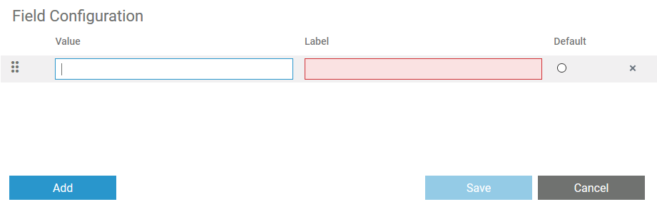
| Form Elements | field_config_editor | If you click icon
Use the editor to add and manage the content of your element:
| ||||||||||||||||||||||||||||||||||||||||||||||||||||||||||
| Form Elements | form_elements_cssClass | Enables a field-acurate layout customization. | ||||||||||||||||||||||||||||||||||||||||||||||||||||||||||
| Form Elements | form_elements_cssClass_value | A valid CSS class. | ||||||||||||||||||||||||||||||||||||||||||||||||||||||||||
| Form Elements | form_elements_description | A commentary field for the developer. The content is invisible to users and its sole purpose is internal documentation. | ||||||||||||||||||||||||||||||||||||||||||||||||||||||||||
| Form Elements | form_elements_editing | Go to page Modeling Forms for further information regarding editing of form elements using the context menu. | ||||||||||||||||||||||||||||||||||||||||||||||||||||||||||
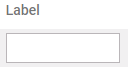
| Form Elements | form_elements_label | Field name shown in the form. | ||||||||||||||||||||||||||||||||||||||||||||||||||||||||||
| Form Elements | form_elements_mandatory | The element must be filled or used if the checkbox is activated. | ||||||||||||||||||||||||||||||||||||||||||||||||||||||||||
| Form Elements | form_elements_mandatory_false | Element may remain empty (default). | ||||||||||||||||||||||||||||||||||||||||||||||||||||||||||
| Form Elements | form_elements_mandatory_true | Element must be filled. | ||||||||||||||||||||||||||||||||||||||||||||||||||||||||||
| Form Elements | form_elements_name | Technical identifier for data processing and not visible for the end user. | ||||||||||||||||||||||||||||||||||||||||||||||||||||||||||
| Form Elements | form_elements_name_value | Alphanumercial characters and underscore. It is not allowed to start the name with a number. | ||||||||||||||||||||||||||||||||||||||||||||||||||||||||||
| Form Elements | form_elements_read-only | This field is write-protected. | ||||||||||||||||||||||||||||||||||||||||||||||||||||||||||
| Form Elements | form_elements_read-only_false | User can enter values (default). | ||||||||||||||||||||||||||||||||||||||||||||||||||||||||||
| Form Elements | form_elements_read-only_true | User cannot enter values. | ||||||||||||||||||||||||||||||||||||||||||||||||||||||||||
| Form Elements | form_elements_symbolType | Displays the type of the form element in read-only mode. | ||||||||||||||||||||||||||||||||||||||||||||||||||||||||||
| Form Elements | form_elements_text | In this field, you can enter text. | ||||||||||||||||||||||||||||||||||||||||||||||||||||||||||
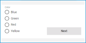
| Form Elements | form_elements_vertical_alignment | The attribute is used to adjust the position of a form element in context to a bigger neighboring element. Example: The Radio Button Group Color is much bigger than the Button Next, but the button should be shown at the bottom of the form. Therefore, the button's attribute Vertical Alignment is set to Bottom. | ||||||||||||||||||||||||||||||||||||||||||||||||||||||||||
Form Elements | form_elements_vertical_alignment_bottom | Align the element at the bottom of the element cell. | ||||||||||||||||||||||||||||||||||||||||||||||||||||||||||
| Form Elements | form_elements_vertical_alignment_center | Align the element in the middle of the element cell. | ||||||||||||||||||||||||||||||||||||||||||||||||||||||||||
| Form Elements | form_elements_vertical_alignment_top | Align the element on top of the element cell (default). | ||||||||||||||||||||||||||||||||||||||||||||||||||||||||||
Modeling BPMN | attribute_description | If you want to insert a description for your element, click here to enable edit mode and enter your text. |
| |||||||||||||||||||||||||||||||||||||||||||||||||||||||||
Modeling BPMN | attribute_name | Click here to insert or change attribute Name. |
| |||||||||||||||||||||||||||||||||||||||||||||||||||||||||
| Modeling BPMN | attributes_display_name_of_attribute | Display Name of Attribute Activate the checkbox if you also want to display the names of the attributes on the diagram pane. |
| |||||||||||||||||||||||||||||||||||||||||||||||||||||||||
| Modeling BPMN | attributes_font | Font Use this section to select the font for display of the element's attributes on the diagram pane. You have also several formatting options. |
| |||||||||||||||||||||||||||||||||||||||||||||||||||||||||
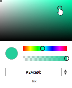
| Modeling BPMN | attributes_font_color | Font Color You can also adapt the font color of the element's attributes on the diagram pane. Click on the color placeholder, then use the color picker to select a new color or enter the hexadecimal code of the desired color:
|
| |||||||||||||||||||||||||||||||||||||||||||||||||||||||||
| Modeling BPMN | attributes_font_size | Font Size In this section you can change the font size of the element's attributes on the diagram pane. |
| |||||||||||||||||||||||||||||||||||||||||||||||||||||||||
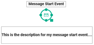
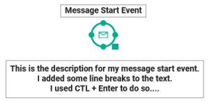
| Modeling BPMN | attributes_word_wrap | Word Wrap By default, the element's attributes are displayed in a single line on the diagram pane. When the word wrap option is disabled, a placeholder (...) indicates that more text is available but hidden:
In the attribute Description you can also enter line breaks using CTL + Enter. To show the text including your line breaks, activate the word wrap option:
A placeholder (...) indicates that more text is available but hidden. If you want to display the whole text, resize the attribute on the diagram pane. Go to page Resizing BPMN Elements for detailed information. |
| |||||||||||||||||||||||||||||||||||||||||||||||||||||||||
| Modeling BPMN | bpmn_elements_config_options | Open the Styling panel to use the configuration options of the element. | ||||||||||||||||||||||||||||||||||||||||||||||||||||||||||
| Modeling BPMN | bpmn_elements_font | Font Use this section to select the font for the text within the element. You have also several formatting options. |
| |||||||||||||||||||||||||||||||||||||||||||||||||||||||||
| Modeling BPMN | bpmn_elements_font_color | Font Color You can also adapt the font color of text within the element. Click on the color placeholder. Then use the color picker to select a new color or enter the hexadecimal code of the desired color:
|
| |||||||||||||||||||||||||||||||||||||||||||||||||||||||||
| Modeling BPMN | bpmn_elements_font_size | Font Size In this section you can change the font size of the text within the element. |
| |||||||||||||||||||||||||||||||||||||||||||||||||||||||||
| Modeling BPMN | bpmn_elements_shape_tab |
|
| |||||||||||||||||||||||||||||||||||||||||||||||||||||||||
| Modeling BPMN | bpmn_elements_toolbar | The elements toolbar contains all BPMN elements that you can create on the diagram pane.
|
| |||||||||||||||||||||||||||||||||||||||||||||||||||||||||
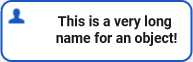
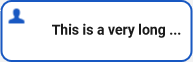
| Modeling BPMN | bpmn_elements_word_wrap | Word Wrap By default, element names can only be displayed in a single line. When the word wrap option is activated, the text will fill the available space in the element:
When the option is disabled, a placeholder (...) indicates that more text is available but hidden:
|
| |||||||||||||||||||||||||||||||||||||||||||||||||||||||||
| Modeling BPMN | create_bpmn_elements |
|
| |||||||||||||||||||||||||||||||||||||||||||||||||||||||||
| Modeling BPMN | displaying_attributes | You can display the attributes of an element on the diagram pane: Select the attribute you want to show in the Attributes panel and move it to the pane by using drag & drop. |
| |||||||||||||||||||||||||||||||||||||||||||||||||||||||||
| Modeling BPMN | editing_attributes | As soon as you have created an attribute of an element on the diagram pane, the Styling panel will show the tab Attributes. Open this tab to edit the formatting of the displayed attributes. |
| |||||||||||||||||||||||||||||||||||||||||||||||||||||||||
| Modeling BPMN | info_styling_attributes_tab | The tab is displayed by default only for the elements Message Start Event, Timer Start Event, End Event and Exclusive Gateway as well as for a Relation of an exclusive gateway. These elements are already created on the diagram pane including their attribute Name. For the other elements the Attributes tab is displayed as soon as you create one of its attributes on the diagram pane. | ||||||||||||||||||||||||||||||||||||||||||||||||||||||||||
| Modeling BPMN | model_toolbar | The model toolbar assists you during modeling on the diagram pane:
The following table explains the available tools:
|
| |||||||||||||||||||||||||||||||||||||||||||||||||||||||||
| Modeling BPMN | other_background_color | Background Color If you want to select a background color, activate the checkbox and click on the color placeholder that will appear. Then use the color picker to select a new color or enter the hexadecimal code of the desired color:
|
| |||||||||||||||||||||||||||||||||||||||||||||||||||||||||
| Modeling BPMN | rearrange_panel_new | You can also arrange the panels individually. The dashed frame indicates the new position of the panel. | ||||||||||||||||||||||||||||||||||||||||||||||||||||||||||
| Modeling BPMN | rearrange_panel_tab | Use drag & drop to rearrange panels. You can move panels to already existing columns. The new panel is then shown as a new tab. | ||||||||||||||||||||||||||||||||||||||||||||||||||||||||||
| Modeling BPMN | relations_shape_tab |
|
| |||||||||||||||||||||||||||||||||||||||||||||||||||||||||
| Modeling BPMN | resize_panels | It is also possible to resize panels by dragging the vertical or horizontal panel borders. | ||||||||||||||||||||||||||||||||||||||||||||||||||||||||||
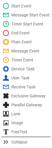
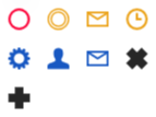
Modeling BPMN | panel_icons | The availability of the panels varies depending on the editor your are using. The following icons represent the corresponding panels:
| ||||||||||||||||||||||||||||||||||||||||||||||||||||||||||
Modeling Data Mapping | model_toolbar_clear_compiler_cache | Use this icon to clear your Compiler cache. Example:
|
| |||||||||||||||||||||||||||||||||||||||||||||||||||||||||
| Modeling Data Mapping | model_toolbar_deploy_service | Use this icon to deploy the service. |
| |||||||||||||||||||||||||||||||||||||||||||||||||||||||||
Modeling Data Mapping | model_toolbar_export_repository | Create an export of the Designer service repository by clicking this icon. Use the export: |
| |||||||||||||||||||||||||||||||||||||||||||||||||||||||||
Modeling Data Mapping | model_toolbar_open_bridge | Open your Scheer PAS Bridge with a click on this icon. |
| |||||||||||||||||||||||||||||||||||||||||||||||||||||||||
Modeling Data Mapping | model_toolbar_show_invalid | Activate the icon to highlight all invalid elements. |
| |||||||||||||||||||||||||||||||||||||||||||||||||||||||||
Modeling Data Mapping | model_toolbar_start_service | Click on this icon to start your service. |
| |||||||||||||||||||||||||||||||||||||||||||||||||||||||||
| Modeling Data Mapping | model_toolbar_stop_service | Stop the service by clicking on this icon. |
| |||||||||||||||||||||||||||||||||||||||||||||||||||||||||
| Modeling Execution | default_value_attribute | A persisted variable can have a default value. If this is the case, you can find the field Default Value in the Attributes panel. Use the field if you want to change the initial value. | ||||||||||||||||||||||||||||||||||||||||||||||||||||||||||
| Modeling Execution | execution_preliminaries | You need to perform two steps to implement executional parts to your model:
|
| |||||||||||||||||||||||||||||||||||||||||||||||||||||||||
| Modeling Execution | info_message_section | Section Message is shown for all BPMN elements that need an incoming message: See page Modeling Execution for further details. | ||||||||||||||||||||||||||||||||||||||||||||||||||||||||||
| Modeling Execution | local | Variables created in section Local are only available for use within the current execution. |
| |||||||||||||||||||||||||||||||||||||||||||||||||||||||||
| Modeling Execution | persisted | Variables created in section Persisted are usable in all executions of the BPMN model. |
| |||||||||||||||||||||||||||||||||||||||||||||||||||||||||
| Modeling Execution | persisted_variable_added | The variable is added to the execution pane. | ||||||||||||||||||||||||||||||||||||||||||||||||||||||||||
| Modeling Execution | second_persisted_variable | Once a variable has been added to the Persisted section, it is available in all executions of the BPMN model. If you add the variable again from within the library, a second persisted variable is created that is independent of the first. This is indicated by a new name. | ||||||||||||||||||||||||||||||||||||||||||||||||||||||||||
| Modeling Forms | form_elements_placeholder | The content of this attribute is displayed in the element when attribute Text has not been filled. The placeholder is a sample value, it is not saved in the database. When a user overwrites the placeholder, it disappears and the user's input is saved in attribute Text. If content is added to both attributes Text and Placeholder, the content of Text is displayed in the element. |
| |||||||||||||||||||||||||||||||||||||||||||||||||||||||||
| Other Elements | execution_other_elements | The content of this element is ignored during execution. | ||||||||||||||||||||||||||||||||||||||||||||||||||||||||||
| Other Elements | other_border_color | Border Color To select a background color for the element, activate the checkbox and click on the color placeholder that will appear. Then use the color picker to select a new color or enter the hexadecimal code of the desired color. | ||||||||||||||||||||||||||||||||||||||||||||||||||||||||||
| Searching in the Designer | panels_general_description | The Designer panels can be displayed on the left and right side of the panes and support the user during modeling. |
| |||||||||||||||||||||||||||||||||||||||||||||||||||||||||
| Structuring Your Work | add_library | To add an unused library to the project, click on the |
| |||||||||||||||||||||||||||||||||||||||||||||||||||||||||
| Structuring Your Work | cockpit_tip | Further information about the Cockpit, tiles and groups can be found in the BPaaS Guide. |
| |||||||||||||||||||||||||||||||||||||||||||||||||||||||||
| Structuring Your Work | create_folder | Enter a name for the folder in the pop-up window Create New Folder. Click Save. |
| |||||||||||||||||||||||||||||||||||||||||||||||||||||||||
| Structuring Your Work | create_project | Enter a name for the service in the pop-up window Create New Service. Click Save. |
| |||||||||||||||||||||||||||||||||||||||||||||||||||||||||
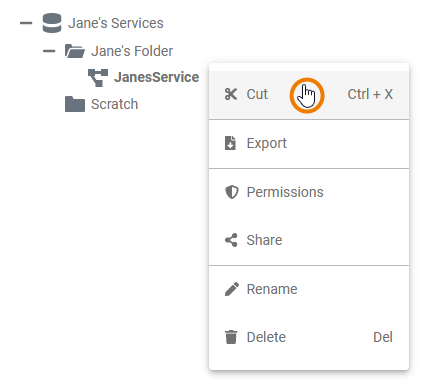
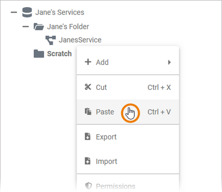
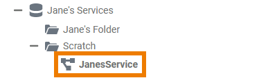
| Structuring Your Work | cutting_and_pasting | Cutting and Pasting
|
| |||||||||||||||||||||||||||||||||||||||||||||||||||||||||
| Structuring Your Work | description_editor | Enter your text in the editor. Various formatting tools are provided. |
| |||||||||||||||||||||||||||||||||||||||||||||||||||||||||
| Structuring Your Work | description_editor_save | Click Save and Close to confirm your text or Cancel to abort the action. |
| |||||||||||||||||||||||||||||||||||||||||||||||||||||||||
Structuring Your Work | folder_created | The new folder is created and displayed in the tree. |
| |||||||||||||||||||||||||||||||||||||||||||||||||||||||||
Structuring Your Work | info_libraries_mandatory | The folders Libraries, Models and Forms are mandatory parts of a Service folder, therefore users cannot delete them. |
| |||||||||||||||||||||||||||||||||||||||||||||||||||||||||
| Structuring Your Work | manage_libraries | The dialog Manage Libraries opens. Currently unused libraries are displayed on the left side of the window, the libraries that are already available in this project are shown on the right side. Expand the drop-down list to display the details of the library such as versions and dependencies. |
| |||||||||||||||||||||||||||||||||||||||||||||||||||||||||
Structuring Your Work | paste_url | You are now able to paste the URL, for example in an email. |
| |||||||||||||||||||||||||||||||||||||||||||||||||||||||||
| Structuring Your Work | project_content | Each newly created service contains already the folders Libraries, Models and Forms. |
| |||||||||||||||||||||||||||||||||||||||||||||||||||||||||
| Structuring Your Work | project_created | The new service is created and displayed in the tree. |
| |||||||||||||||||||||||||||||||||||||||||||||||||||||||||
| Structuring Your Work | remove_libraries | You can also remove libraries from the list of used libraries. Open the dialog Manage Libraries again and click the The library will switch back to the Unused Libraries column. |
| |||||||||||||||||||||||||||||||||||||||||||||||||||||||||
| Structuring Your Work | tip_profiles_admin_guide | Go to the Administration Guide for further information on the creation of namespaces. |
| |||||||||||||||||||||||||||||||||||||||||||||||||||||||||
Structuring Your Work | toast_confirmation | The action is confirmed by a toast message. |
| |||||||||||||||||||||||||||||||||||||||||||||||||||||||||
| Structuring Your Work | tree_export | Export
|
| |||||||||||||||||||||||||||||||||||||||||||||||||||||||||
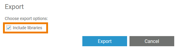
| Structuring Your Work | tree_export_with_library | Export
|
| |||||||||||||||||||||||||||||||||||||||||||||||||||||||||
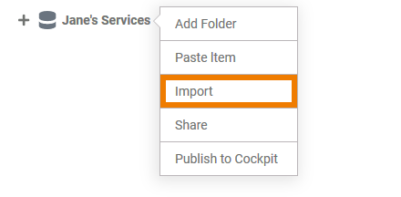
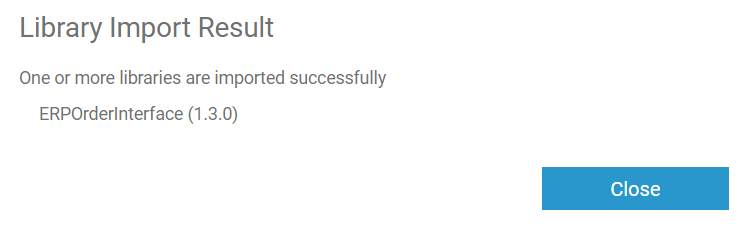
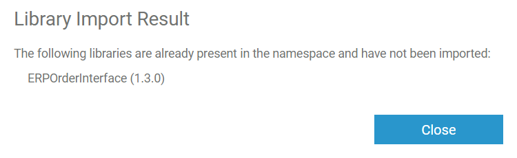
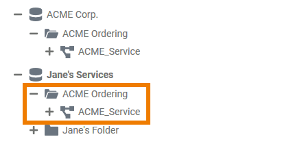
Structuring Your Work | tree_import | Import
|
| |||||||||||||||||||||||||||||||||||||||||||||||||||||||||
| Structuring Your Work | used_libraries | The library is now displayed in the column Used Libraries. If you have finished, do not forget to Save. |
| |||||||||||||||||||||||||||||||||||||||||||||||||||||||||
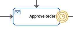
| Supported BPMN Elements | boundary_events | Intermediate Event, Message Intermediate Event and Timer Intermediate Event can be used as boundary events along with User Task and Receive Task. When using the events as boundary events, attach the element directly to the border of the corresponding task:
| ||||||||||||||||||||||||||||||||||||||||||||||||||||||||||
| Supported BPMN Elements | creation_of_start_events | A start event can only be created via the elements toolbar. | ||||||||||||||||||||||||||||||||||||||||||||||||||||||||||
| Supported BPMN Elements | editing_and_styling |
| ||||||||||||||||||||||||||||||||||||||||||||||||||||||||||
| Tips | click_to_see_gif | Click the image to see an animated version. | ||||||||||||||||||||||||||||||||||||||||||||||||||||||||||
| Tips | click_to_see_gif_above | Click the image above to see an animated version. | ||||||||||||||||||||||||||||||||||||||||||||||||||||||||||
| Working With Libraries | bridge_base | The Bridge Base library is supplied as standard in the Designer and cannot be deleted from the library panel. The library contains the Bridge base types:
Most of these base types are only able to hold one single piece of information, like text in a string, true or false in a boolean, or binary data in a blob. If you wish to associate several bits of information, you have to define a complex type that combines a number of independent base types and possibly other complex types. Such complex types are modeled as classes in UML. To use your own classes, define them in a library and upload this customized library to the Designer. How to upload your own libraries is explained on page Designer Administration > Libraries. |
| |||||||||||||||||||||||||||||||||||||||||||||||||||||||||
| Working With Libraries | tip_library_administration | Open menu Libraries in the Designer administration to upload your own libraries. |
| |||||||||||||||||||||||||||||||||||||||||||||||||||||||||
| X_DEPRECATED | hide_panels | You can hide panels that you do not currently need. The icons of hidden panels are displayed in the right upper corner of the editor. | ||||||||||||||||||||||||||||||||||||||||||||||||||||||||||
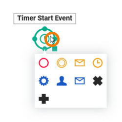
| X_DEPRECATED | open_bpmn_elements_menu | Click on the element to open the element context menu which supports you in creating new elements:
For detailed information see page Working with the BPMN Editor > The Diagram Context Menus. | ||||||||||||||||||||||||||||||||||||||||||||||||||||||||||
| X_DEPRECATED | open_relation_menu | If you right click an arrow, the relation context menu opens allowing you to edit the relation:
For detailed information see page Working with the BPMN Editor > The Diagram Context Menus. | ||||||||||||||||||||||||||||||||||||||||||||||||||||||||||
| X_DEPRECATED | open_tools_menu | If you right click an element, the tools context menu opens allowing you to edit the current element:
For detailed information see page Working with the BPMN Editor > The Diagram Context Menus. | ||||||||||||||||||||||||||||||||||||||||||||||||||||||||||


Overview
Content Tools