
Deploying a project is only possible via the projects catalog. Refer to Deploying a Project for detailed information.
The deployment detail page is where you monitor and manage a project deployment and its components. You open it from the Deployments view by selecting the name of a project deployment.
The page consists of the following parts:
The Component Deployment Detail View
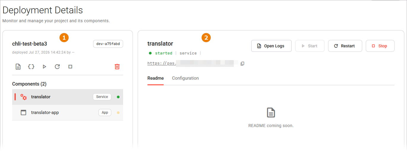
The deployment panel stays on the left. The component deployment detail view on the right changes when you select a component from the list.
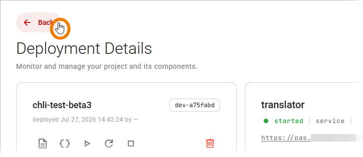
Use the back button in the navigation header to return to the Deployments view:
The Deployment Panel
The deployment panel on the left identifies the project deployment, shows its components, and holds its actions. The name of the deployment and its version are displayed at the top of the panel. Below that, you'll find information about when the deployment was last performed and by whom:
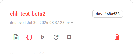
The following actions are available for a project deployment:
|
UI Element |
Name |
Description |
|---|---|---|

|
Open Logs |
Opens the deployment logs. Refer to Inspecting Logs for more information. |

|
Project Configuration |
Opens the configuration editor for the project deployment in the window on the right. Refer to Configuring a Deployment for more information, |

|
Start, Restart, Stop |
Use the options to control the lifecycle of the project deployment. Refer to Operating a Deployment for more information. |

|
Delete |
Deletes the project deployment. Refer to Deleting a Deployment for more information. |
The Component List
Below the actions, the panel lists the component deployments. Each component deployment is displayed with its name, type and status. Select a component deployment to open it in the component deployment detail view on the right. In the component list, the selected component deployment is highlighted:
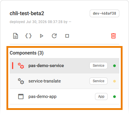
Refer to Key Concepts for the component types, and to Working With the Deployments View for details on the status values.
The Component Deployment Detail View
When you select a component deployment in the list, the window on the right shows its details. The header shows the component deployments name, and below it the current status, the type, and the endpoint when the component has one.
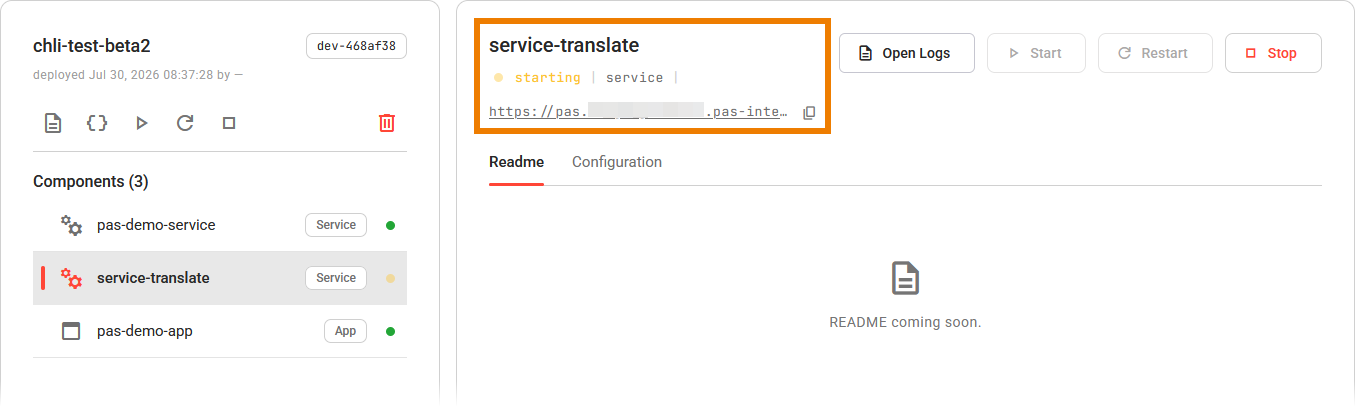
The component deployment detail view also holds the Open Logs, Start, Restart, and Stop buttons for the component deployment. Refer to Operating a Deployment for more details on the lifecycle actions.
The view has no delete action. If you want to delete a single component deployment, use the Deployments view (refer to Deleting a Deployment for details).
Following a Component Endpoint
Click the endpoint link to open the running component in a new browser tab. An app opens its user interface, a service opens its interface description. A component without an endpoint shows no link. An agent, for example, is reached through the service that provides it and therefore has no endpoint of its own.
You can also use the option Copy endpoint to copy the endpoint URL to the clipboard. The Control Hub confirms with the message Endpoint copied to clipboard.
Component Readme and Configuration
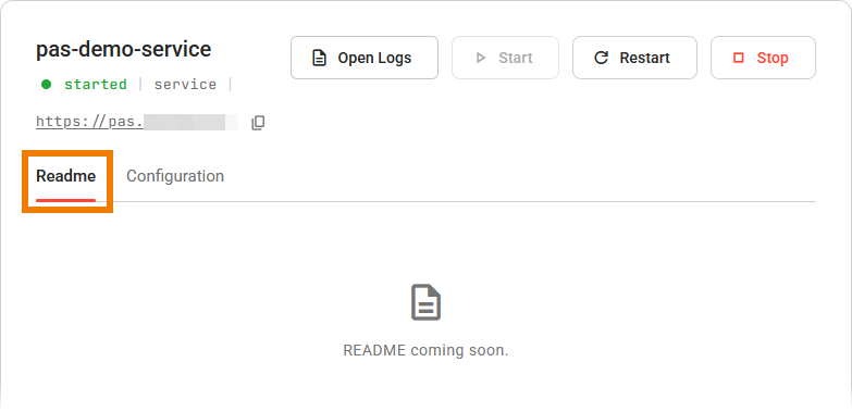
If there is a Readme file for the component deployment, its contents are displayed in this tab:
To edit the configuration of the component deployment, use its Configuration tab:
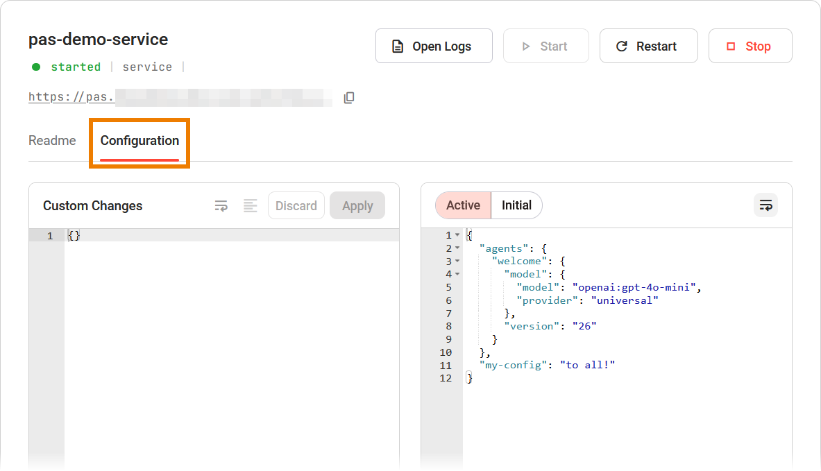
Refer to Configuring a Deployment for a detailed explanation of the configuration editor.