Analyzes are created via the Analyses Sidebar and shown as charts in the content area. When creating a new analysis, the user must determine which process data should be analyzed, how the data should appear and whether the data should be filtered. A user-friendly wizard guides the user through these steps.
A Process Mining user is authorized to create analyses for all processes that are saved in their profiles. If a user's authorization for a profile is revoked, they can no longer analyze the processes from this profile. If they have already created analyses prior to the loss of authorization, the analysis in the content area is shown with the message No authorization to analyse this process.
Note for administrators: The allocation of authorizations and profiles is explained in detail in the Administration Guide.
Creating a new Analysis
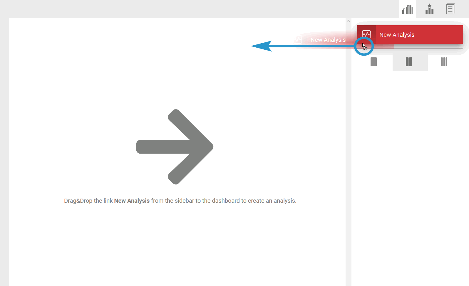
To create a new analysis, open the Analysis Sidebar.
| Drag the New Analysis link into the Process Analyzer active dialog window. |
| The Create New Analysis wizard opens in a separate window. Follow the wizard step by step through the configuration process. Use the buttons at the bottom to navigate through the wizard:
|
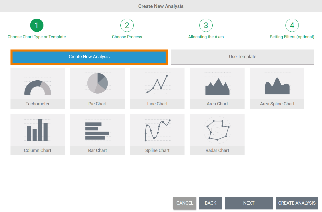
| First decide how you want to create the new analysis:
|
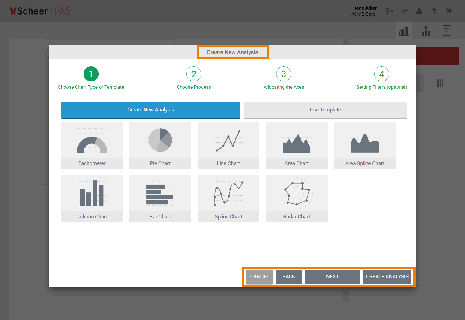
Step 1: Choosing a Chart Type
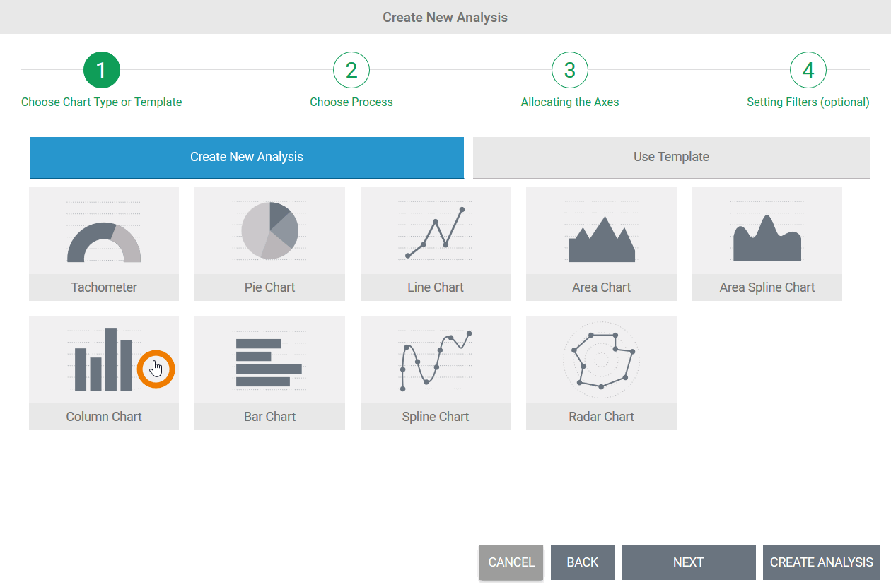 | Choose a chart type for your analysis. The chart type selected is marked with a colored frame. There are nine chart types to choose from:
Once a chart type has been selected, you can use the button Next to proceed to the next step. |
Step 2: Selecting a Process
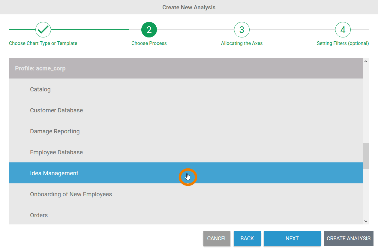 | In the second step, the process on which the analysis is to be based is specified. The wizard automatically lists all processes that deliver data to Scheer PAS Process Mining. The processes are sorted alphabetically in accordance with profiles and within a profile. Select the process you want to analyze and click Next. Is the process you are looking for not showing in the list? In order for data from the integration or BPaaS component to be transferred to process mining, the corresponding process must have been run at least once. |
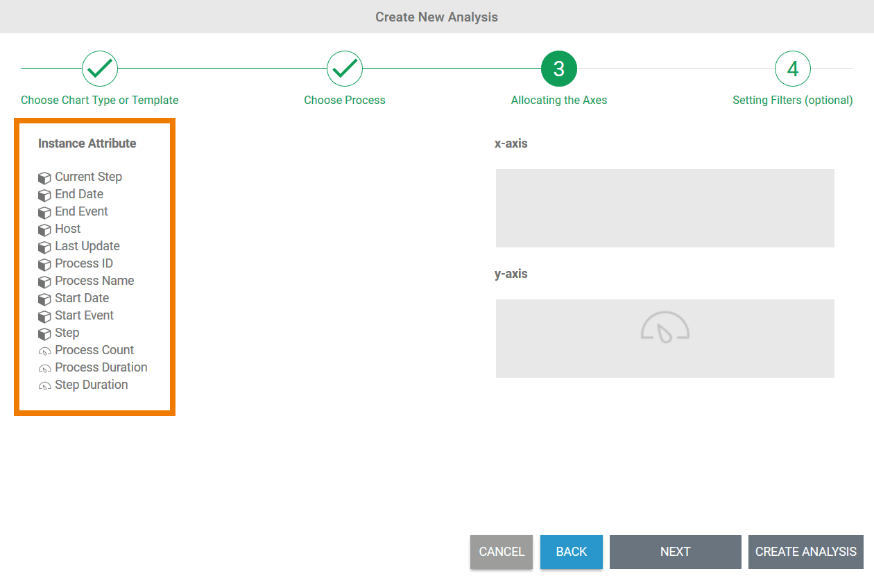
Step 3: Allocating Axes
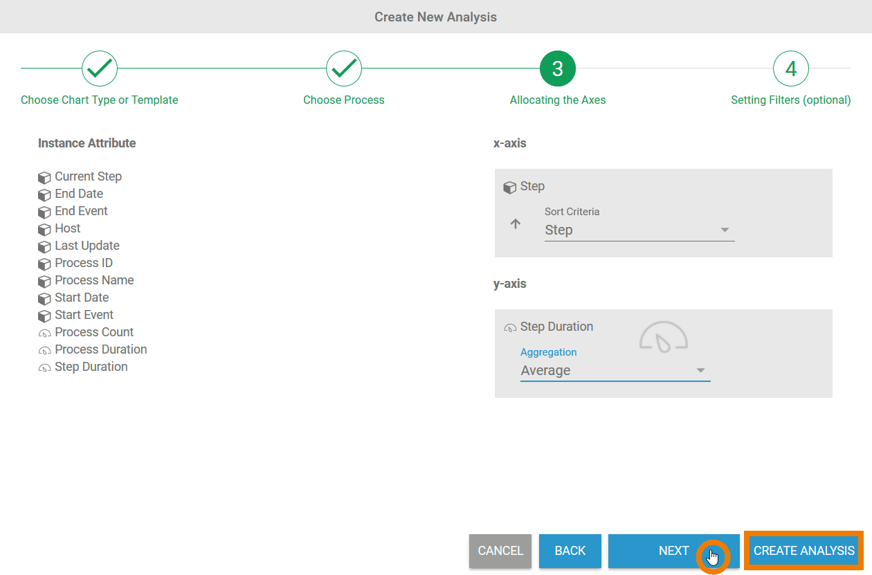
| The two areas for the content of the x and y axis are located on the right hand side of the dialog. In distribution charts (all chart types except tachometer), key indicators can also be displayed as a dimension on the x-axis. Refer to Configuring Axis Allocation for detailed explanations on the possible settings for axis allocation. |
| Once all the necessary instance attributes have been defined, the chart can be created using the Create Analysis button. If you wish to save data filters, select Next at this point to open the wizard in step 4. |


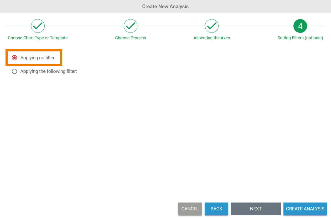
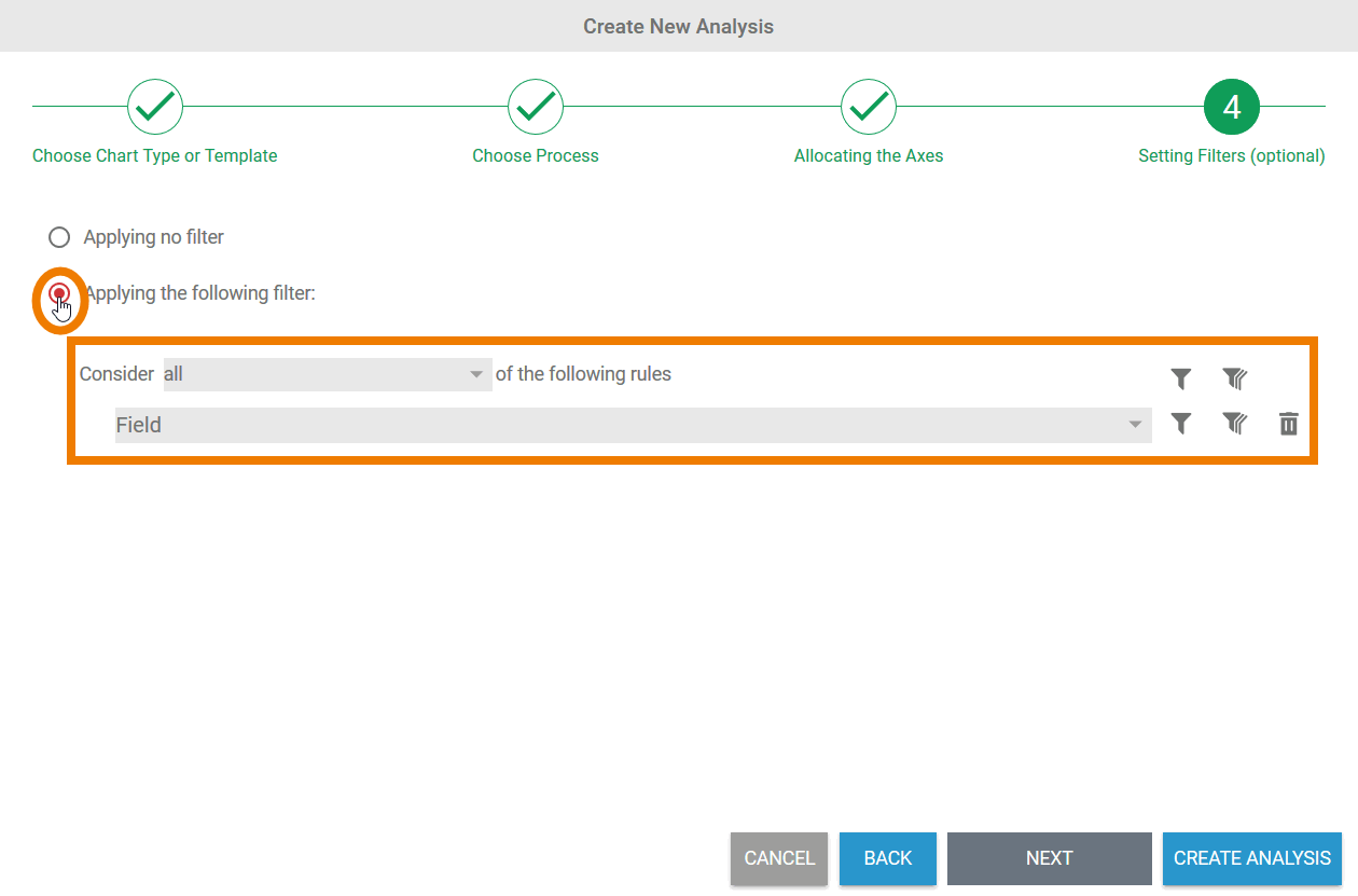
Step 4: Creating Filters
Only the first three steps for the creation of an analysis are obligatory. The creation of a filter is optional.
| In step 4, the option Applying no filter is selected by default. You can still create an analysis directly without a filter using the Create Analysis button. |
| If you change the option on the create following filter function, the filter entry is displayed. Refer to Configuring Filters for detailed information about all filter settings. When you have created the filters you want, use the Create Analysis button to create the chart in the content area. |
| The chart is created in the Process Analyzer. The analysis settings are shown in the sidebar. |
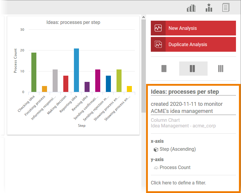
Use the sidebar to assign the analysis a name and a description. The axis allocation and filter settings can also be edited via the sidebar: Clicking on the properties in the sidebar opens a dialog box in which the settings can be changed.
It can be the case when creating an analysis that the axis allocation selected or the filter settings do not deliver any results. In such cases, the message No data found matching your configuration is shown instead of a chart:
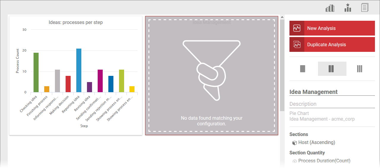
The settings can be adjusted via the sidebar.
Overview
Content Tools