The Element Drop-down Field
Element Icon | |
| Form Field |
|
| Function | Click to open a list of available options. One of the displayed options must be chosen to continue. Alternate names are Select Box or Drop-down List. |
| Default | The first value entered in field Possible Values is automatically displayed as default. If an empty option is desired, you have to add it manually to the list. |
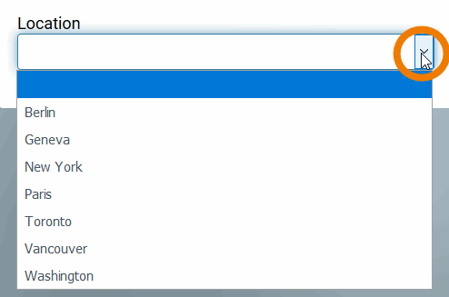
| Example | A city shall be selected from a Locations l ist:
|
Configuration Options
| |
| |
| |
| |
| |
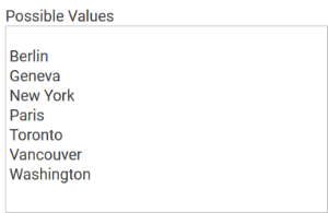
| Possible Values Enter the values to be displayed in the Drop-down Field here. Each value needs to be inserted into its own line (leave a blanc line if the list shall not immediately start with a value):
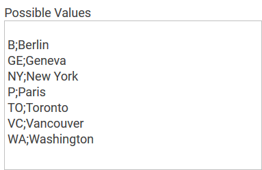
You may also enter value pairs separated by semicolon <value>;<label>:
When entering value pairs, it is always the first value (<value>) which will be saved as key in the data container. The second value (<label>) can be used as notification to the user. Value pairs may also contain numbers, so that a user can chose a text option, but in the background a calculation is carried out. |
| |
| Possible use case: An existing form is copied for users who shall receive read-only authorization. The added write protection however also affects you as a designer. If you would like to preset a different value, you have to initially reverse the read-only setting. Only then you can select a different value. Afterwards you can reinstate the write protection. |
| |
| |
| |
|


