Configure Table Columns
Three form elements contain tables, whose content requires individual configuration:
To configure table content, you need to use the option Column Configuration. Click on the gear wheel to open the configuration editor:
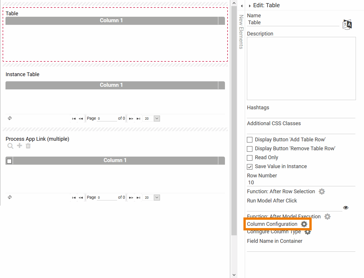
In the editor, the table column options are displayed. The differences between the three form elements are minimal:
Table
Instance Table
App Link (multiple)
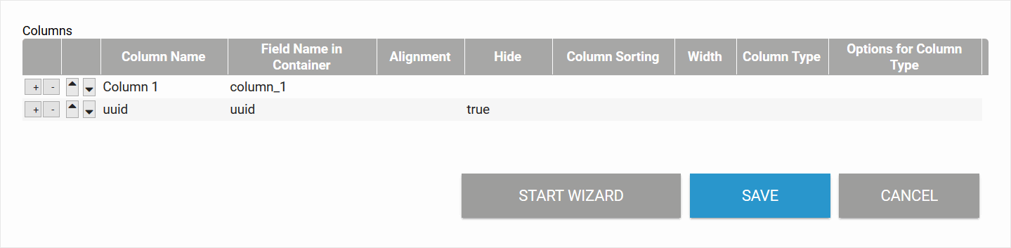
Purpose of Column "UUID" Each instance is assigned a UUID in the database to enable explicit identification. Instance tables contain a by default hidden column uuid. Unhide the column in order to show instance identification numbers. This information is helpful for example when contacting BPaaS Support with a support request regarding faulty instances.
Configuration Options
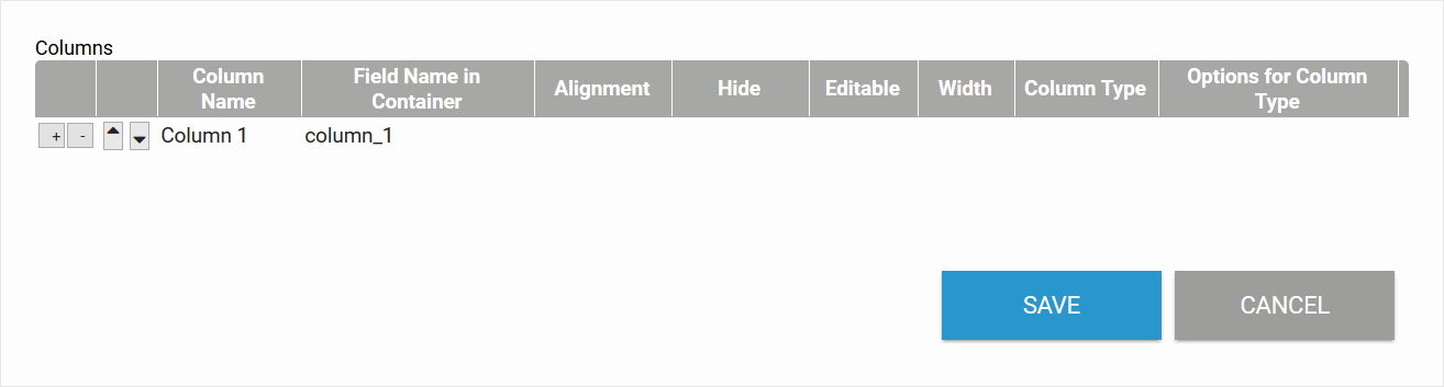
In the first row of the table displayed in the editor you create the first column of your table. The column will later be displayed on the far left of the table. All other columns line up to the right of the previous column.
| Add Table Rows You may add columns via the + button and delete columns via the - button. BPaaS 17.3 In the configuration editor of Process App Links (multiple) you can also add new columns in addition to the cloumns from the linked app (see Custom Field). Values of these user-defined columns are stored under the Field Name in Container you enter here. |
| Change Order of Rows You can use the arrow buttons to change the sequence of already created columns. If you move a column upwards, it is displayed further to the left. If you move the column down, it moves to the right in the table. |
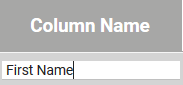
| Column Name Defines the display name of the column. If the field remains empty, the Field Name in Container is used as default. |
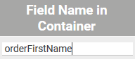
| Field Name in Container Specify the Field Name in Container of the form element, whose contents are to be displayed in this table column. If the field remains empty, the Column Name is used as Field Name in Container. |
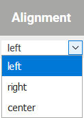
| Alignment In this field, you can choose between left, right and center alignment of the column contents. |
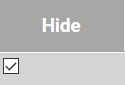
| Hide The Hide option can be activated via the checkbox. If Hide is activated (true), this column is not displayed in the table during execution. |
| Editable Defines whether this column should be write-protected or editable. If the checkbox is activated (true), the user is able to fill the field with content. Editable columns are only available in tables. |
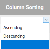 | Column Sorting Option Column Sorting allows you to choose between the options Ascending and Descending. Column sorting is only available in instance tables. |
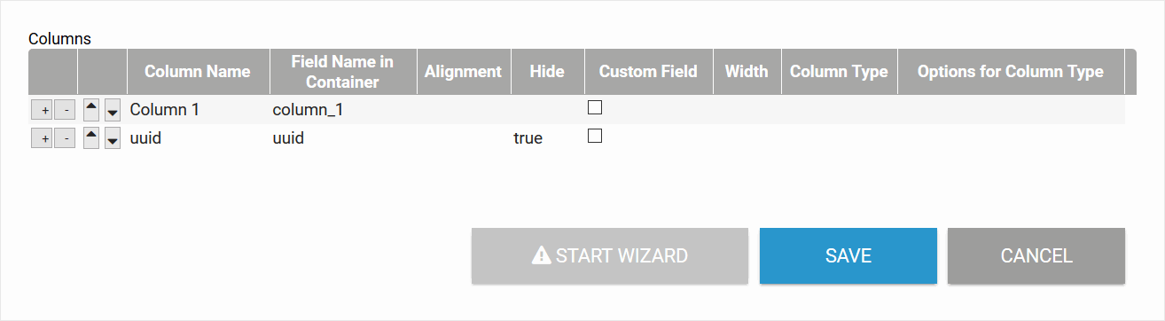
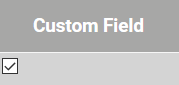
| Custom Field Activate the checkbox to create a Custom Field which is not filled by the linked app, but can be filled out by the user. This option is only available in Process App Links (multiple). For additional information regarding custom fields in app links please visit page Extending the App Link (multiple). |
| Width Defines the width of the column in pixels. The input can be a pure number or include the unit of measurement px. Example: Specifying the width of 150 pixels
|
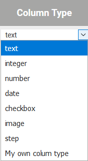
| Column Type The appropriate option can be selected from a list of standard column types:
|
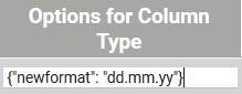 | Options for Column Type In field Options for Column Type you can specify the the column types' settings. Entering an option: Multiple options can be listed by comma: Multiple values of an option can be nested: Possible column type options are:
Allowed Date Formats:
|
| At the bottom of the configuration editor you will find three buttons: | |
| Click on the Save button to save your input. |
| Use the Cancel button to exit the configuraton window. Attention: Unsaved data will be lost when clicking Close. |
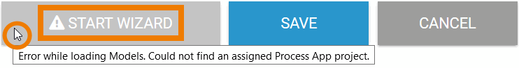
| The button Start Wizard opens the column wizard. The column wizard is only available for instance tables. |
| You can only use the column wizard if the model was assigned to a process app. Otherwise the button remains inactive: |


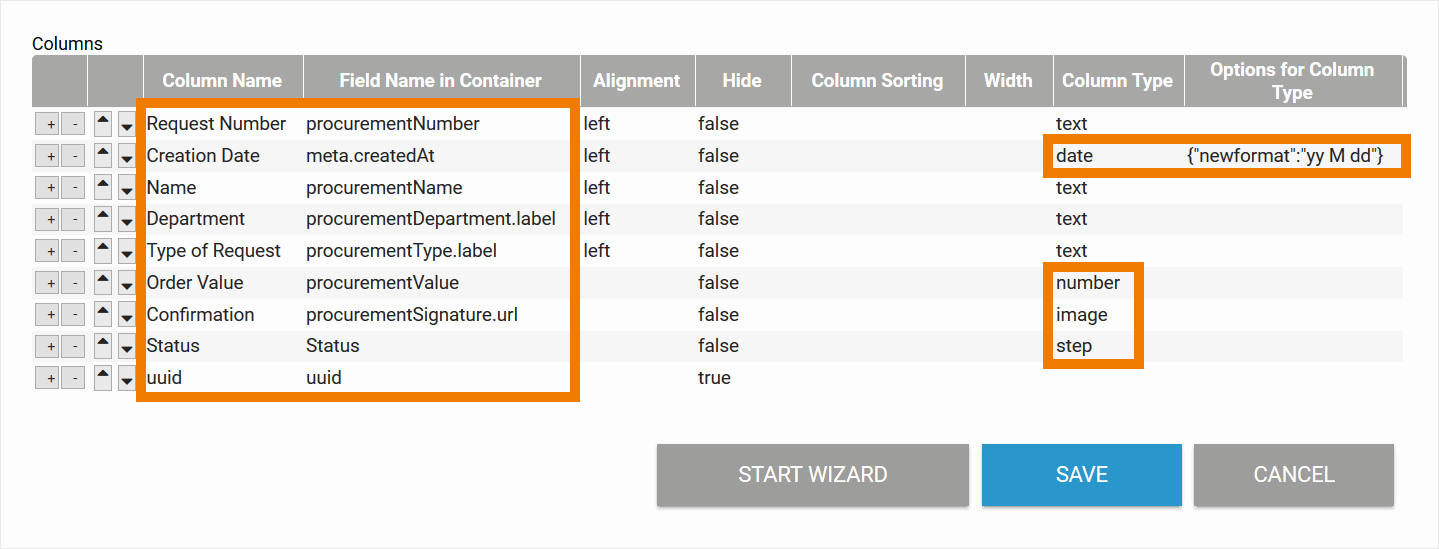
Example of a Column Configuration
Column Configuration of the Overview in ACME's Procurement Process
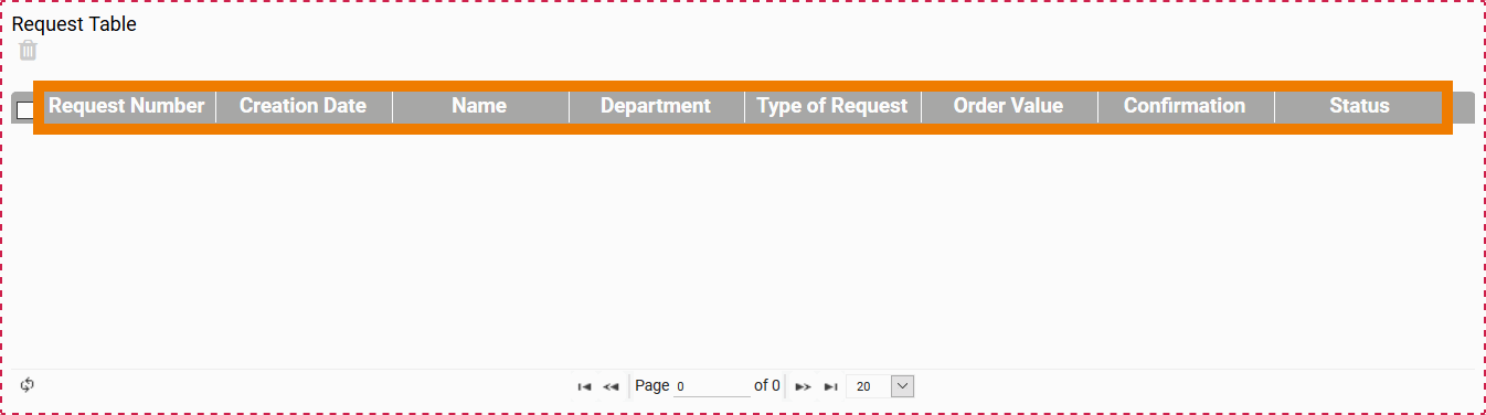
Display of Corresponding Instance Table in Forms Editor
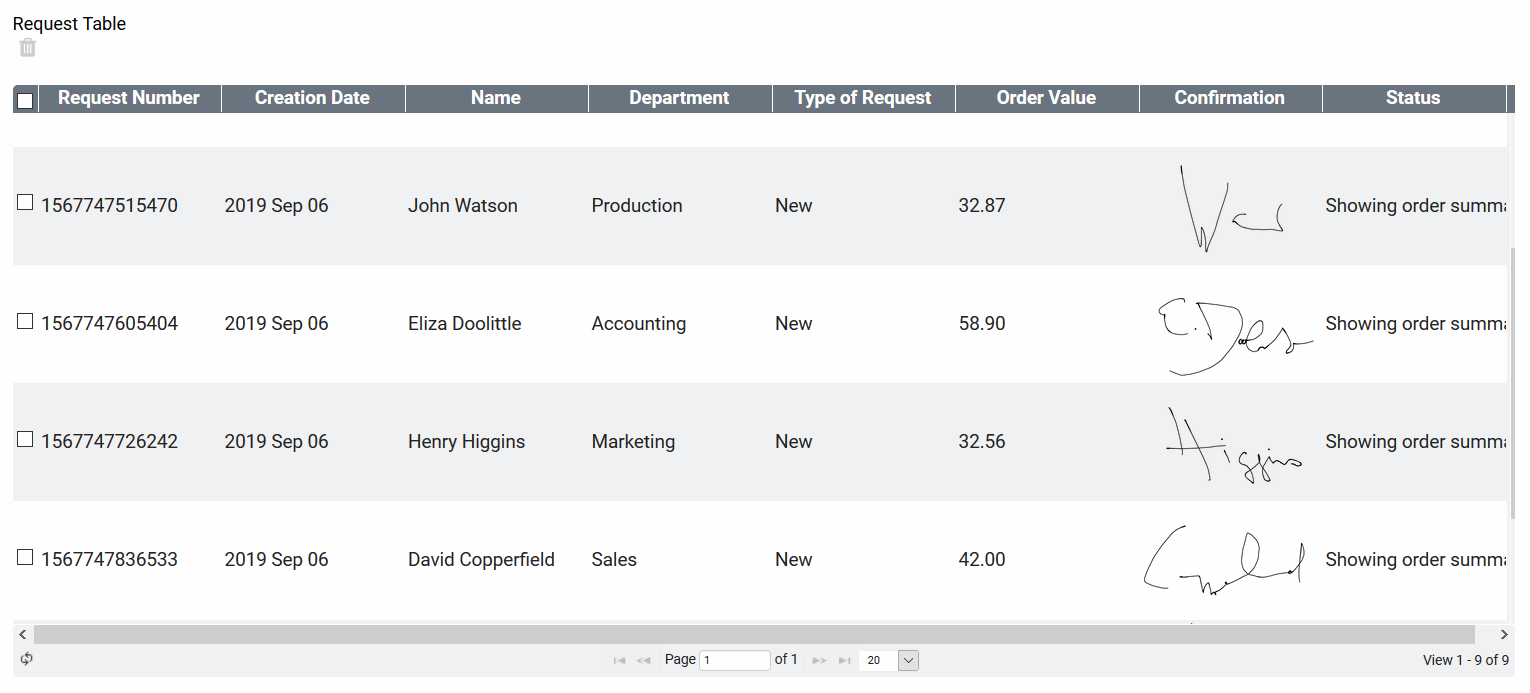
Display of Executed Process App Overview
Overview
Content Tools