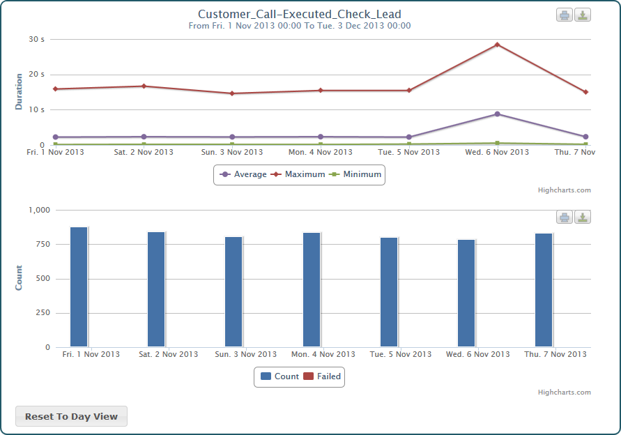
The Chart View presents the collected data in a graphical way.
Figure: The Chart View
You can either switch to the Chart View directly by clicking the Chart tab. In this case, you can browse through the collected items using the Tree View and select an item to see the corresponding charts.
Or, you can inspect the collected data using the Table View and branch to the Chart View by selecting an item that you want to inspect from a table.
The name of the selected element (service operation, state transition or backend) is displayed in the chart title as well as the selected time range.
Presentation of the Data
The Chart View consists of two graphs that present the request duration and the request count (y-axis) in dependency of the time (x-axis).
- The Duration chart presents the average, maximum and minimum request time in curve diagrams.
- The Count chart presents the count of successful and failed requests in a bar diagram.
Browsing Through the Data
Concerning the time, you can browse the charts in three levels of detail:
- day
- hour
- minutes
Just click a point of the curve or a bar and the collected information will scale to a finer measure. Measure will switch from day to hour, from hour to minutes and from minutes back to day. You can also reset the measure by clicking the Reset to Day View button at the bottom of the chart.
Making a Snapshot of a Chart
Each chart has to icons in the top right:
- Icon
 is for printing the chart.
Please set your printer properties to landscape printing when printing a chart. - Icon
 is for downloading the chart.
The Chart View supports the following formats:- PNG image
- JPEG image
- PDF document
- SVG vector image
On this Page:
Related Pages:
Overview
Content Tools