The Element Date Picker
Element Icon |
|
| Form Field |
|
| Function | Date field with the options of manual or calendar supported input. The date in a date picker always contains the date at midnight. |
Default | By default the field is empty, this can however be adjusted by the designer. In order to preset a date in the default settings click on 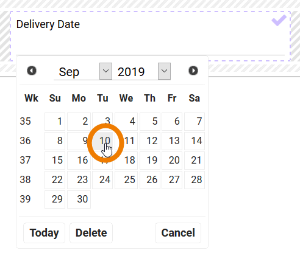 Now you may choose the default date. Use the Today button to enter the current date. A click on
|
Example | A preset Delivery Date is changed via the calendar:
By choosing the Today button, the default date is set to the date, when this configuration was saved. Internally the date is saved in amount of milliseconds from 01.01.1970. Any date previous to this will be displayed internally with a negative sign. Each language has its own preset format. A manual entry has to therefore comply with the logic of the preset user language:
If the manual input does not comply with the expected format, then the entry is set to the current date. |


Configuration Options
The form element may be edited via the Edit Sidebar.
| Name Field name shown in the form. |
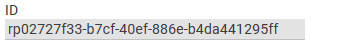
| ID ( PAS 19.2 ) The read-only field contains the model ID of the element. Designers can use the ID for example in the search to link the element in other models. |
| Description When a user hovers over a form element during execution, the content of the commentary field is shown as a quick info: |
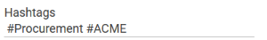
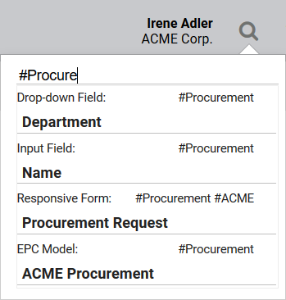
| Hashtags Possibility to insert your own key terms . The leading hashtag sign # (hash) will be inserted automatically. Use the space bar to separate multiple hashtags: One hashtag may be issued for multiple elements: |
| Additional CSS Classes Enables a field-acurate layout customization. |
| Current Value This field can be used to insert default settings for the form element. The field Current Value contains a default value, which appears during form completion. If not overwritten by the user, this value will be transfered to the container while saving. |
| Date Format Use this field to define the format, in which the date shall be displayed in the form. See Date Format for an overview of available placeholders and fill characters. |
| Display Current Date by Default If you activate this option during date field configuration, then the current date is inserted in the date field automatically during app execution. |
| Mandatory The marked element must be filled or used. |
| Read Only This field is write-protected. |
| Focus on Element This field is ready for input and will be visually enhanced during form completion. |
| Show Label Inline The field identifier is shown within the field and can be overwritten. |
| Field Name in Container Defines the name under which the form element will be saved in the data container. If the Field Name in Container remains empty, then the field identifier (name) will be used. If two form elements share the same Field Name in Container, then both will access the same value. The Field Name in Container is a technical identifier. It is often used for extended coding. Therefore the Field Name in Container should not contain any spaces, special characters or umlaut. For further information please visit page The Container Principle. |
| Save Value in Instance If this checkbox is marked, the value entered in this field will be saved to the database during form execution. |


Date Format
In two elements design users can specify the output of a date format: The two elements do not use the same placeholders for the date format. EPC Element E-Mail The following place holders may be used to specify the date format in the EPC element E-Mail: yy yyyy two-digit year figure four-digit year figure dd.mm.y dd.mm.yyyy 01.02.19 01.02.2019 m mm mmm mmmm month digit without leading 0 month digit with leading 0 month abreviated month written-out d.m.yyyy dd.mm.yyyy dd. mmm. yyyy d. mmmm yyyy 1.2.2019 01.02.2019 01. Feb. 2019 01. February 2019 d dd ddd dddd day digit without leading 0 day digit with leading 0 week day abreviated week day written-out d.mm.yyyy dd. mmmm yyyy ddd dd.mm.yyyy dddd, dd. mmmm yyyy 1.02.2019 01. February 2019 Mon 01.02.2019 Monday, 01. February 2019 Form Field Date Picker yy yyyy four-digit year figure dd.mm.yy dd.mm.yyyy 01.02.2019 01.02.2019 m mm M MM month digit without leading 0 month digit with leading 0 month abreviated month written-out d.m.yy dd.mm.yy dd. M. yyyy d. MM yyyy 1.1.2019 01.02.2019 01. Feb. 2019 1. February 2019 d dd D DD day digit without leading 0 day digit with leading 0 week day abreviated week day written-out d.mm.yy dd. MM yy D dd.mm.yyyy DD, dd. MM yy 1.02.2019 01. February 2019 Mon 01.02.2019 Monday, 31. February 2019 Fill Characters The place holders may be combined with a fill character, for example blank space, dot, comma, hyphen, horizontal line. Date format placeholders may not be used as fill characters. fill word Tuesday, the 31. January 2017Date Format Place Holder Display Date Format Input Display in Date Field
(example date 01.02.2019)Year Month Day Date Format Place Holder Display Date Format Input Display in Date Field
(example date 01.02.2019)Year Month Day Fill Character Date Format Input Display in Form Field Date Picker
(example date 31.01.2017)dot dd.mm.yyyy 31.01.2017 hyphen dd-mm-yyyy 31-02-2017 horizontal line yyyy/dd/mm 2017/31/01 blank space d. MM yyyy 31. January 2017 comma DD, d. MM yyyy Tuesday, 31. January 2017 DD, the dd. MM yyyy
On this Page:
Related Documentation:
Overview
Content Tools