The Element Date Picker

Element Icon
in Sidebar

Form Field

Function

Date field with the options of manual or calendar supported input.

The date in a date picker always contains the date at midnight.


Default

By default the field is empty, this can however be adjusted by the designer. In order to preset a date in the default settings click on to access the form field's edit mode, where a calendar opens automatically:
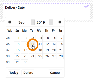

Now you may choose the default date. Use the Today button to enter the current date. A click on ends the edit mode and the chosen date is displayed as default:

Example

A preset Delivery Date is changed via the calendar:

By choosing the Today button, the default date is set to the date, when this configuration was saved.


Internally the date is saved in amount of milliseconds from 01.01.1970. Any date previous to this will be displayed internally with a negative sign.

Each language has its own preset format. A manual entry has to therefore comply with the logic of the preset user language:

  • English format: mm/dd/yy
    Example: 09/30/2016
  • German format: yy-mm-dd
    Example: 2016-09-30
  • French format: dd.mm.yy
    Example: 30.09.2016

If the manual input does not comply with the expected format, then the entry is set to the current date.


Configuration Options


Date Format

Use this field to define the format, in which the date shall be displayed in the form. See Date Format for an overview of available placeholders and fill characters.

Display Current Date by Default

If you activate this option during date field configuration, then the current date is inserted in the date field automatically during app execution.

If the option Show Label Inline is used simultaneously, the field identifier remains visible until the user adds his entry or until a value different from the blank string is inserted from the Container.

Date Format