The Control Hub consists of the following areas:
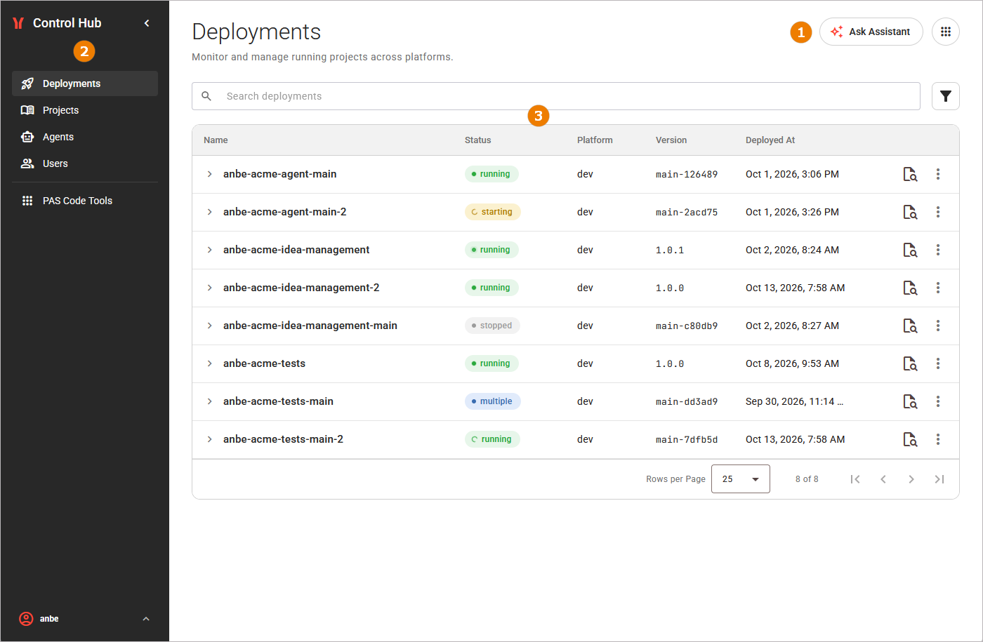
The navigation header and the sidebar stay in place as you move around. Only the content area changes.
The Navigation Header
The navigation header sits above the content area and contains various functionalities:

|
UI Element |
Name |
Description |
|---|---|---|
|
|
Back |
Returns you to the previous page.
|
|
|
Ask Assistant |
Opens the AI assistant panel. You can ask the Platform Assistant questions about your deployments, refer to Ask the Platform Assistant! for details. |
|
|
About PAS Code |
Opens a panel that contains:
|
The Platform Assistant
The Control Hub includes an AI assistant that you can open from any page. The Platform Assistant answers questions about your projects, components, deployments, and logs based on the current state of your deployments.
The assistant is read-only: it reports information but never starts, stops, deploys, or deletes anything, and it respects your permissions, so it can only report what you are allowed to see.
When you open the AI assistant with Ask Assistant in the navigation header, its panel slides in from the side of the screen. You can keep working while the panel is open, and close it when you are done.
Refer to Ask the Platform Assistant for further details.
The Sidebar
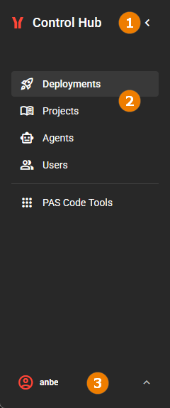
Use the sidebar to move around the Control Hub. From top to bottom, it contains the following elements:
|
UI Element |
Name |
Description |
|---|---|---|
|
|
Collapse |
Use the toggle to collapse the sidebar to icons only, or to expand it again. |
|
|
Navigation |
Use the tabs to switch between the different contents of the control hub. The selected content is highlighted. |
|
|
User Settings |
Open the user settings to manage your user profile and to log out from the Control Hub. Refer to Getting Started With the Control Hub > User Settings for details. |
Managing the Sidebar
You can adapt the size of the sidebar. Click the collapse toggle at the top of the sidebar to collapse it to icons only. Click it again to expand the sidebar.
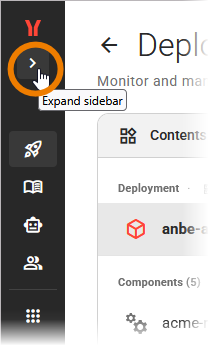
Drag the right edge of the sidebar to set its width:
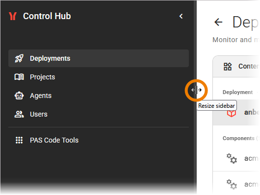
Double-click the right edge to reset the sidebar to its default width. The Control Hub remembers your sidebar width and collapsed state for your next visit.
The Content Area
You reach all Control Hub views from the sidebar:
-
Deployments: This is the landing page. Use it to monitor and manage the projects and components running across your platforms. Refer to chapter Deployments for details.
-
Projects: Use this view to browse published projects and their versions, and to deploy them to a plaform. Refer to chapter Projects for details.
-
Agents: Use this view to see the agents that have been deployed across your platforms, their status, and how much they are used. Refer to chapter Agents for details.
-
Users: Use this view to manage users on the different platforms. Refer to chapter Users for details.
-
PAS Code Tools: Use this link collection to access the tools that run on your PAS Code platform next to the Control Hub. Refer to page PAS Code Tools for details.
Searching and Filtering Content
In all Control Hub views, you can use a search bar for full-text search. The search is not case sensitive:
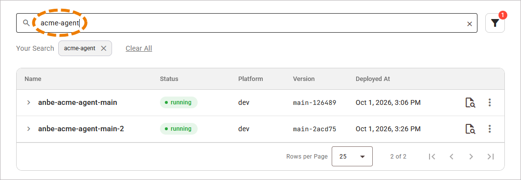
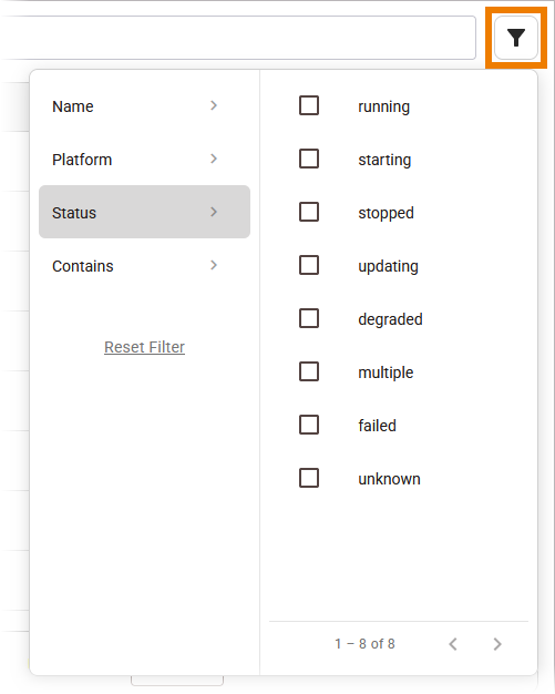
In some views, an additional filter option is available. It contains various filter options that help to narrow down the displayed content:
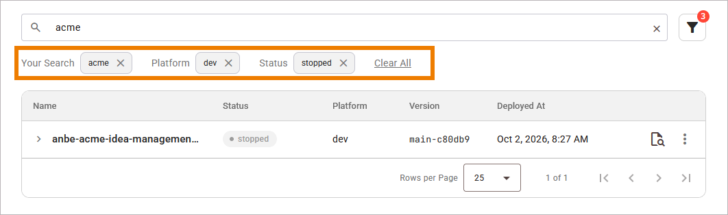
Search, filters, and sorting (see below) apply together:
Sorting Content
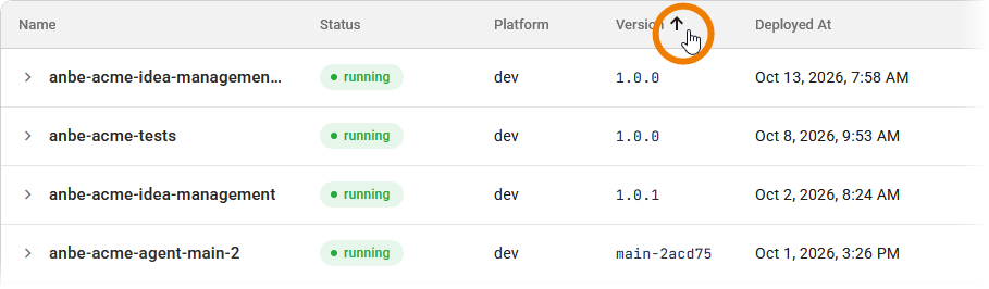
Click a column header to sort the list by that column. Click the same header again to reverse the order between ascending and descending.
Using the Pagination
The pagination controls below the table split the list into pages. They appear when at least one entry in a content table exists. The following controls are available:
|
UI Element |
Description |
|---|---|
|
Rows per page |
Select here how many rows you want to display per page: 10, 25, 50, or 100. The default is 25. |
|
Range |
Shows the range of the current page, for example 25 of 137. |
|
Page buttons |
These options allow you to go to the first, previous, next, and last pages. |