| Element |  |
|---|---|
| Icon |  |
| Description | Buttons are necessary to leave a form and access the next process step. |
| Type | Boolean |
| Prepopulation | This element cannot be prepopulated. |
| Editing | Refer to Modeling Forms for further information regarding editing of form elements using the context menu. |
Configuration Options
Use the Attributes panel to edit the form element.
| Attribute | Description | Allowed Values | |
|---|---|---|---|
| Name | Technical identifier for data processing and not visible for the end user. | Alphanumercial characters and underscore. It is not allowed to start the name with a number. | |
| Description | A commentary field for the developer. The content is invisible to users and its sole purpose is internal documentation. | Any string. | |
| Label | Field name shown in the form. | Any string. | |
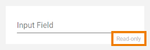
| Read-only | This field is write-protected. When you use the option, Read-only is added to the bottom right of the element:
| true | User cannot enter values. |
| false | User can enter values (default). | ||
| Primary | The button will be highlighted in blue to distinguish it from other buttons. Use this attribute to indicate to the user that this button is the default button. | true | Button is highlighted. |
| false | Button is not highlighted (default). | ||
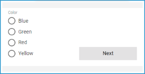
| Vertical Alignment | The attribute is used to adjust the position of a form element in context to a bigger neighboring element. Example: The Radio Button Group Color is much bigger than the Button Next, but the button should be shown at the bottom of the form. Therefore, the button's attribute Vertical Alignment is set to Bottom. | Top | Align the element on top of the element cell (default). |
| Center | Align the element in the middle of the element cell. | ||
| Bottom | Align the element at the bottom of the element cell. | ||
| CSS Class | Enables a field-acurate layout customization. | A valid CSS class. | |
| Symbol Type | Displays the type of the form element in read-only mode. | _ | |
Simple_Form_Example
 | Click the icon to download a simple example model that shows how you can configure form elements in Scheer PAS Designer. |
Related Pages:
Overview
Content Tools