| Element |
|
|---|---|
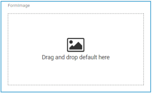
| Icon |
|
| Description | Use the image element if you want to upload a picture for example a photo, a company logo etc. |
| Type | n/a |
| Prepopulation | This element can be prepopulated.
|
| Editing | Refer to Modeling Forms for further information regarding editing of form elements using the context menu. |
Configuration Options
Use the Attributes panel to edit the form element.
| Attribute | Description | Allowed Values | ||
|---|---|---|---|---|
| Name | Technical identifier for data processing and not visible for the end user. | Alphanumercial characters and underscore. It is not allowed to start the name with a number. | ||
| Description | A commentary field for the developer. The content is invisible to users and its sole purpose is internal documentation. | Any string. | ||
| Label | Field name shown in the form. | Any string. | ||
| Text | You can enter a text here. | Any string. | ||
| Image | If you want to display a default picture in the executed form, you can upload it here. | Supported formats:
| ||
| Target URL | In this field you can enter the URL of a website that should be opened when the user clicks on the image. | Any URL. | ||
| Open in a New Tab | Applies only if you have entered a Target URL. | true | When clicking the image, the URL specified under Target URL opens in a new browser tab. | |
| false | When clicking the image, the URL specified under Target URL opens in the active browser tab. | |||
| Keep Aspect Ratio | Decide whether you want to keep the aspect ratio or resize the image to fit the size of the element. | true | The image is displayed in the original size. | |
| false | The image is adjusted to the size of the element. | |||
| Horizontal Alignment | The attribute is used to adjust the position of the image within the element. Example: Centered alignment of an image 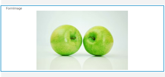 | Left | Left-aligns the image. | |
| Center | Positions the image in the middle of the element. | |||
| Right | Right-aligns the image. | |||
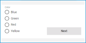
| Vertical Alignment | The attribute is used to adjust the position of a form element in context to a bigger neighboring element. Example: The Radio Button Group Color is much bigger than the Button Next, but the button should be shown at the bottom of the form. Therefore, the button's attribute Vertical Alignment is set to Bottom. | Top | Align the element on top of the element cell (default). | |
| Center | Align the element in the middle of the element cell. | |||
| Bottom | Align the element at the bottom of the element cell. | |||
| CSS Class | Enables a field-acurate layout customization. | A valid CSS class. | ||
| Custom Attributes | The attribute is used to activate Angular directives, that are created as development kit (devkit) library to expand the default functionality. For detailed information about Angular directives, visit the official Angular documentation. For details about the usage of the Custom Attributes, refer to Developing Custom Directives. |
| ||
| Symbol Type | Displays the type of the form element in read-only mode. | _ | ||
On this Page:
Simple_Form_Example
 | Click the icon to download a simple example model that shows how you can configure form elements in Scheer PAS Designer. |
Related Pages:
Overview
Content Tools