| Attribute | Description | Allowed Values |
|---|
| Name | Technical identifier for data processing and not visible for the end user. | Alphanumercial characters and underscore. |
| Description | A commentary field for the developer. The content is invisible to users and its sole purpose is internal documentation. | Any string. |
| Label | Field name shown in the form. | Any string. |
| Mandatory | The element must be filled or used if the checkbox is activated. | true | Element must be filled. |
| false | Element may remain empty (default). |
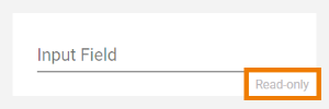
| Read-only | This field is write-protected. When you use the option, Read-only is added to the bottom right of the element: 
| true | User cannot enter values. |
| false | User can enter values (default). |
| Text | In this field, you can enter text. Content added to attribute Text is shown in the element. If the user does not change the content of the field during form execution, the content of Text will be saved to the database. | Any string. |
| Placeholder | The content of this attribute is displayed in the element when attribute Text has not been filled. The placeholder is a sample value, it is not saved to the database. When a user overwrites the placeholder, it disappears and the user's input is saved to attribute Text. | Any string. |
| Max Length | Use this attribute to limit the number of characters that can be entered in the Text Area .
The default value is 0. | Any integer. |
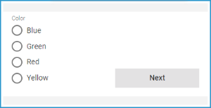
| Vertical Alignment | The attribute is used to adjust the position of a form element in context to a bigger neighboring element. Example: The Radio Button Group Color is much bigger than the Button Next, but the button should be shown at the bottom of the form. Therefore, the button's attribute Vertical Alignment is set to Bottom.  | Top | Align the element on top of the element cell (default).
|
| Center | Align the element in the middle of the element cell. |
| Bottom | Align the element at the bottom of the element cell.
|
| CSS Class | Enables a field-acurate layout customization. | A valid CSS class. |
| Custom Attributes | The attribute is used to activate Angular directives, that are created as development kit (devkit) library to expand the default functionality. | - empty attribute
- attribute with value (e.g. color="red")
- multiple entries separated by space (e.g. color="red" multiline max="5")
|
| Symbol Type | Displays the type of the form element in read-only mode. | _ |