Example File (Builder project Advanced Modeling/UI):
 | <your example path>\Advanced Modeling\UI\uml\uiForm.xml |
In classic web development a form was defined using a HTML <form> tag enclosing all the needed input tags like text input fields, textareas or select lists to just name a few. xUML UI uses AJAX to send out form data and the way this is done is a different approach. When using AJAX the form data is not submitted using the classic HTML form, the data is collected from the input elements and placed as an object which is then sent via an AJAX call. The AJAX call itself then is sent using HTTP POST method to a server side handler.
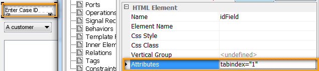
Tab Order
It is frequently necessary to control the order of going through the input fields when pressing tab. This can be done by setting the HTML attribute tabindex. Apply the <<HTMLElement>> stereotype to the input fields and set the tabindex attribute:
The tabindex attribute controls both whether an element is tabbable and/or focusable. The tabindex attribute takes a number. Depending on whether the number is positive or negative defines the element's behavior.
Setting the tabindex to a positive number defines where the element falls in the tab order (and can receive the focus). Defining the tabindex to -1 causes the element to be skipped in the tab order but allows the element to receive the focus. In both cases, setting the tabindex causes the element to fire both onFocus and onBlur events. As you would expect, invisible elements can neither receive the focus nor be tabbed to.
When specifying the tab index on visible elements, the order is defined as follows:
- Elements with tabindex=0 are ordered based on the source
- Any element with tabindex >0 appears before all elements with tabIndex=0
- Any Elements with the same tabindex are ordered based on the source order
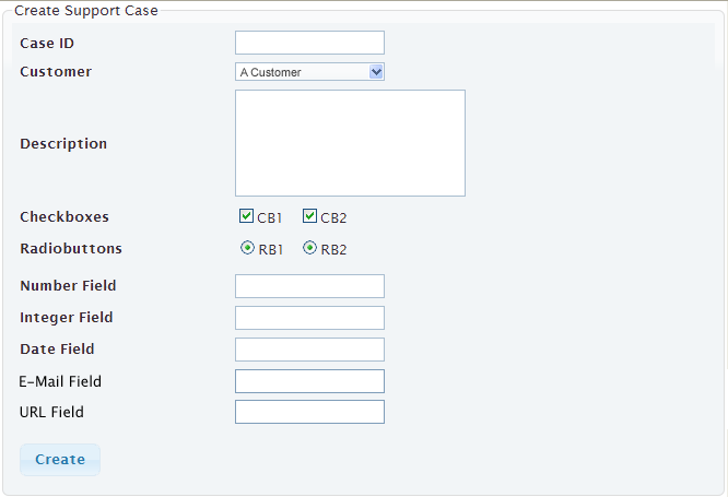
Form Definition
In xUML UI Forms are designed using the standard form input elements which are placed within a container (Panel, Frame, etc.). The actual Form is modeled then in the Binding diagram where each form input element then is bound to a services request input object.
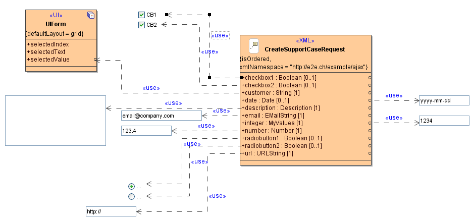
As seen in above figure, the use dependencies from the different input elements are bound to the CreateSupportCaseRequest class. This class is the input of the service which is then sending the populated request object.
Hidden Text Elements
Next to the normal form input elements, there is the possibility to define custom validation messages. These messages consist of a text label with the stereotype <<UIMessage>> applied to them. These <<UIMessage>> elements are not visible on the page itself, but can be accessed via e.g. JavaScript or they can be bound to a specific custom error message.
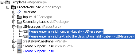
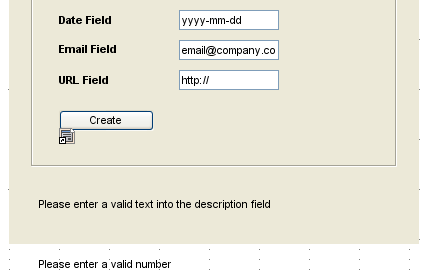
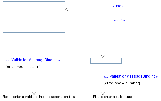
To have a greater flexibility, <<UIMessage>> labels are visible or invisible depending on their location. If a <<UIMessage>> is placed within a container element e.g. a Panel, then the message will be visible on the screen. If the <<UIMessage>> label is drawn outside of the container, then it will be hidden. In the below figure, the label Please enter a valid text into the description field will be displayed on the page while the label Please enter a valid number is hidden and not visible to the user. As a rule, everything modeled on a container UI element will be displayed.
These <<UIMessages>> are localized which means, that they are handled as normal labels, although they are not visible to the user. The message text will change therefore the language.
Form Validation
By using the jQuery forms plugin the Bridge gets a powerful form validation mechanism. The validation will give direct user feedback in form of a corresponding error message displaying next to the UI component. Whether a form is validated depends on the tagged value onlyIfValid given on a <<UITransition>>. If it is true, the transition takes place only if the form could be validated successfully. If it false, no validation takes place. This is the default. When using a form which is validated (onlyIfValid set to true), the <<UIState>> can not be left until the form input data is verified and valid.
The validation rules are by default derived from the types of the UML attributes bound to the input fields. The following sections describe how the attribute types influence the validation. If the rules become more complex - for example by depending on the values of other fields - it is possible to define them by using JavaScript. How this is done is explained in CustomComplexValidation.
Email Address
The email address is validated on the correct syntax name@domain.ch by giving the request class attribute the input field binds to the type EMailString. In case the email address does not meet the email address pattern the warning message will appear.

URL
As with the email address validation a url can be forced to be checked to the url syntax by binding the input field to the request class attribute having the type URLString.

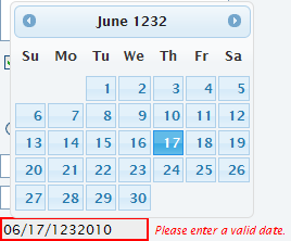
Date
When using the date chooser the date will be inserted in the corresponding valid format. But nevertheless it is validated to the format and to the date itself.
Integer Values
Integer values are generally validated to meet their rule of being a digit number only.

Float Values
As with integer values, the float value is validated against being a digit number.

Custom Value Validation
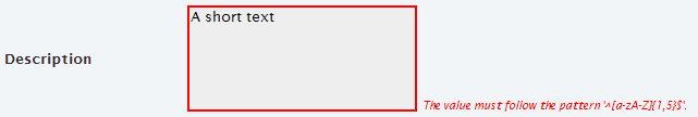
The above basic validation mechanisms are often not enough for real world scenarios. This is why it is possible to extend the existing validation mechanism with own custom types. These custom types need to be a generalization of a Base Type e.g. String.
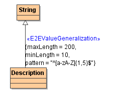
In the above figure the custom type named Description is a generalization of the Base Type String. Important for having rules to be defined on the generalization itself, the stereotype <<E2EValueGeneralization>> needs to be applied. The following parameters can then be defined:
| Parameter | Description |
|---|---|
| Length | The length of a the input value |
| Max Length | The maximal length of the input value is allowed to have, e.g. the description should not exceed 200 characters |
| Min Length | The minimal length the input value must have, e.g. the description should have at least 20 characters |
| Max Value | The maximal value the input value is allowed to have, e.g. the number should be not bigger than 1000 |
| Min Value | The minimal value the input value must have, e.g. the number must be at least 100 and above |
| Pattern | The pattern parameter allows to define a regular expression to which the input value has to match. |
The custom type Description will validate as: the description text needs to have at least 10 characters, but not more than 200 and needs to match the regular expression as defined.
Custom Complex Validation
It is also possible to define custom JavaScript based validation rules. The model compiler uses a jquery validation plug-in to validate forms. This plug-in offers functions to declare and apply validation methods. For example, the following JavaScript expression declares the noEmptyDropDownList validation rule. If this rule is invoked a anonymous function is being called checking whether the value of the element is empty or not:
$.validator.addMethod(
	"noEmptyDropDownList",
	function(value, element) {
		try {
			return value != "";
		} catch(err) {
			return false;
		}
	},
	"must not be empty!"
)
The parameters of the addMethod operation are:
- name: The name of the method, used to identify and referencing it, must be a valid JavaScript identifier
- method: The actual method implementation, returning true if an element is valid. First argument: Current value. Second argument: Validated element. Third argument: Parameters.
- message: The default message to display for this method.
Typically, the rule definition is put into a JavaScript method called right at the initialization transition to the first UI state. Afterwards, the rule definition can be attached to HTML elements by applying rules("add", <rule name>) to a jQuery result set. For example:
// Add Rules to Elements - being evaluated after changing the field myid
$("#ID::myid").rules("add", "noEmptyDropDownList");
Besides adding rules it is also possible to remove them using rules("remove", <rule name>) (for more details see http://docs.jquery.com/Plugins/Validation/rules).
After the rules have been attached to HTML elements, they are checked following the same pattern as all built-in rules. However, sometimes it is useful to enforce the validation. This can be done by applying valid() onto the form element. For instance:
// Enforce rule validation - being evaluated immediately (assumption: myid is part of the formid form)
if (!($("#ID::formid").valid())) {
	// do something
}
Custom Error Messages
In most cases the default jQuery framework error messages are not really describing enough for users to understand them properly. Further, certain error messages have to be more business related. xUML UI offers a way to model custom error messages for any of the form input elements which are available. These custom error messages are <<UIMessages>> which are bound via a <<UIValidationMessageBinding>> dependency. As it is an error message which will appear in case a validation returns an error, the rules need to be set on the dependency connecting the <<UIMessage>> and the form input value as shown in the below figure.
The following error types are supported and can be configured on the <<UIValidationMessageBinding>> dependency:
| Error Type | Example of the allowed text format |
|---|---|
| required | This field is required. |
| Please enter a valid email address. | |
| url | Please enter a valid URL. |
| date | Please enter a valid date. |
| number | Please enter a valid number. |
| phoneUS | Please enter a valid phone number. |
| digits | Please enter only digits. |
| creditcard | Please enter a valid credit card number. |
| maxLength | Please enter no more than {0} characters. |
| minLength | Please enter at least {0} characters. |
| maxValue | Please enter a value less than or equal to {0}. |
| minValue | Please enter a value greater than or equal to {0}. |
| pattern | Please enter a valid account number (dd-dddd-ddd-dd) |
Overview
Content Tools