After having queried the data of a process as described in Querying Process Data, you can inspect the selected data in predefined process charts as described in Predefined Process Charts. The predefined process charts present the the data that is logged to the database as per default: process duration, start event, end event and state duration.
Now you may have logged some additional information to the dashboard database, such as customer name, price, and so on (see Logging Custom Values to the Dashboard Database). In tab Custom, you can generate charts for all those of the additional fields that contain float values.
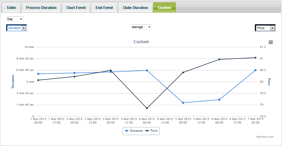
Figure: Custom Chart
All charts may be printed or exported to different formats (PNG, JPEG, PDF and SVG). Use the context menu button ![]() of the chart for that.
of the chart for that.
Selecting the Values to Display
The custom chart consists of a x-axis representing the selected timeline and to y-axes on the left and right displaying the values of the selected fields (in the figure above these are Duration and Price).
Figure: Selecting the Values to Display in the Custom Chart
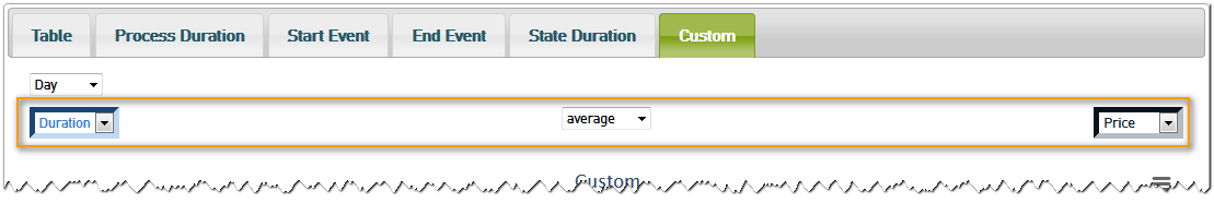
With the drop-down lists just above the chart, you can customize the y-axes of the chart. Just select the field you want to see the values of from the drop-down list. The chart will refresh automatically.
Using the drop-down box in the middle, you can customize the type of curve you want to see:
- average
- maximum
- minimum
- sum
Selecting the Granularity of Time
As per default, the custom chart presents the values per day.
Figure: Selecting the Granularity of Time in the Custom Chart
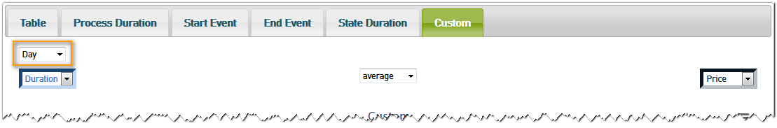
With the drop-down box in the upper left corner of the chart, you can choose between six temporal views:
- second
- minute
- hour
- day
- month
- year
Just select a view - the chart will refresh automatically.
On this Page:
Related Pages:
Overview
Content Tools