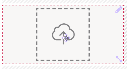
The Element Icon
Element Icon |
|
| Form Field |
|
| Function | By clicking on an icon another process can be started. This can be a program or model, or a combination of both. Alternatively, a headline (division) or a tooltip (entered in the Description field) can indicate that the displayed icon is clickable. |
| Default | By default, nothing happens unless the user clicks on the image. |
Example |
The tooltip is displayed to the user as soon as he moves the mouse cursor over the image. Now he knows that this is a clickable image. If he clicks on the logo, the homepage of the PAS documentation opens in the browser:
|
Configuration Options
The form element may be edited via the Edit Sidebar.
| Name Field name shown in the form. |
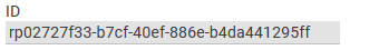
| ID ( PAS 19.2 ) The read-only field contains the model ID of the element. Designers can use the ID for example in the search to link the element in other models. |
| Description When a user hovers over a form element during execution, the content of the commentary field is shown as a quick info: |
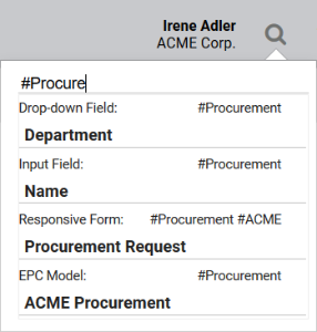
| Hashtags Possibility to insert your own key terms . The leading hashtag sign # (hash) will be inserted automatically. Use the space bar to separate multiple hashtags: One hashtag may be issued for multiple elements: |
| Additional CSS Classes Enables a field-acurate layout customization. |
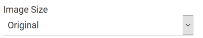
| Image Size You can use the selection list to set the size of the image. Possible options are:
For files in .gif format, image size selection is not supported. |
| Image (URL) Enter here the URL of the desired image you want to display by default during execution. Alternatively you may upload a file using the Supported formats for image files are *.bpm, *.gif, *.jpeg, *.jpg, *.png and *.tiff. |
 | Inactive Image (URL) If an image's URL is entered in this field, then this image is displayed after the user clicks on the standard image Active Image. Alternatively you may upload a file using the Supported formats for image files are *.bpm, *.gif, *.jpeg, *.jpg, *.png and *.tiff. |
| Disabled Image (URL) If you define an image URL in this field, the image is only displayed if the option Read Only is activated. Alternatively you may upload a file using the Supported formats for image files are *.bpm, *.gif, *.jpeg, *.jpg, *.png and *.tiff. |
| Field Name in Container for Active Image (URL) In this field, you can reference a URL that is located in the container. The field Active Image (URL) remains empty in this case. |
| Field Name in Container for Inactive Image (URL) In this field, you can reference a URL that is located in the container. In this case, the field Inactive Image (URL) remains empty. |
| Field Name in Container for Disabled Image (URL) In this field, you can reference a URL that is located in the container. In this case, the field Disabled Image (URL) remains empty. |
 | Show Active / Inactive Icon If this option is active, the image changes after click. Before the click, the image stored in field Image (URL) is shown, after click the image stored in field Inactive Image (URL) is displayed. If you deactivate this option, the image stored in field Image (URL) remains after a click on the icon. |
| Hide The element remains in the form, but is no longer visible. This option is useful if the element is currently not needed and its relatively complex settings should not be lost. |
| Read Only The image is still displayed but is no longer clickable. If the field Disabled Image (URL) contains content, this picture will be displayed. |
| Target After Click (URL) In this field, enter the internet address that shall open once the image is clicked on. |
| Open Target After Click in New Tab If this option is active, the target page is opened in a new browser tab. Otherwise, the internet address specified in field Target After Click (URL) is opened in the active browser tab. |
Empty:
Containing Content:
| Function: After Click A click on the gear wheel opens an editor. The coding stored here is executed immediately after clicking on the image and before any stored model is started. The color of the gear wheel shows, whether an element is empty (light grey) or if content has already been saved (dark grey). |
| Run Model After Click Option to insert a different EPC model from a current BPaaS project. |
Empty:
Containing Content:
| Function: After Model Execution A click on the gear wheel opens an editor. The coding stored here is executed at the very end, only after the execution of any stored entry in field Run Model After Click. The color of the gear wheel shows, whether an element is empty (light grey) or if content has already been saved (dark grey). The testing possibilities of a form are limited within play mode. To test the interaction between multiple apps, start the apps using the tiles in the Scheer PAS Cockpit or use the process app's start link in the Project Editor. |
| Field Name in Container Defines the name under which the form element will be saved in the data container. If the Field Name in Container remains empty, then the field identifier (name) will be used. If two form elements share the same Field Name in Container, then both will access the same value. The Field Name in Container is a technical identifier. It is often used for extended coding. Therefore the Field Name in Container should not contain any spaces, special characters or umlaut. For further information please visit page The Container Principle. |


On this Page:
Overview
Content Tools