Buttons are important helpers in forms, because in most cases the user decides at the push of a button how the process will continue. Without a button, the user can only close the form window, data is not saved and the next process steps cannot be triggered. As a rule, a form therefore always contains at least one button.
Modelers can use the standard buttons, or create and configure own buttons.
The Standard Buttons
Since buttons are an important part of every form, a new Responsive Form (EPC) as well as a new Responsive Form (subform) already contains three default buttons:
- Next
- Save
- Go to Overview
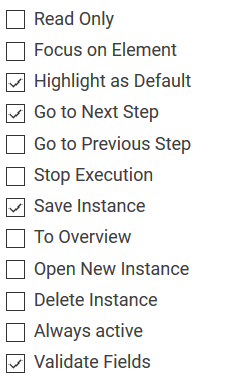
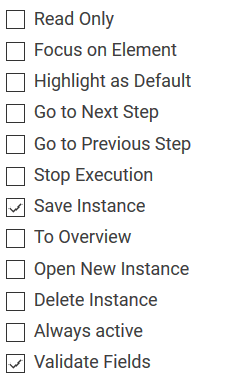
Next The following default options have been assigned to the Next button: One click on this button saves the form entries and progresses the instance to the next process step. If form elements were provided with regular expressions, then an additional check for entry validity is issued. Further information about the use of regular expressions can be found on page Validating Form Fields. Save The default settings for the Save button are: Use this button to safe your input. If form elements were provided with regular expressions, then an additional check for entry validity is issued. Further information about the use of regular expressions can be found on page Validating Form Fields. Go to Overview The default setting for the Go to Overview button is: With a click on this button the user is transferred from the current form to the coresponding overview. Form input will not be saved. Button Activated Button Options Description 
(colored in contrast to the buttons Save and Overview)


Configuring Your Own Buttons
If the standard buttons are not sufficient for your application scenario, you can create your own buttons and configure them according to your requirements.
| Drag a new button from the Sidebar New Elements to the work area. |
| Use the settings in the Edit Sidebar to rename the button and provide it with the required properties. |


Frequently Used Buttons
The following table offers an overview of frequently used buttons:
| Button | Button Properties | Description |
|---|---|---|
|
| Cancel The necessary setting for a Cancel button is:
If this button is clicked, the process stops at this point. Entries made in the current form are discarded. If the current entries are to be saved before the abort, also activate the option:
If you are using regular expressions to validate entries in form elements, activate also:
|
|  | Send Email You have several options for sending an email at the push of a button. The simplest option is to model an EPC, the only process step of which is to send the desired mail. You can then refer to this model in the field Run Model After Click. |
|  | Save & Close If you want form entries to be saved and to close the form afterwards, create a Save & Close button. Activate the following settings for this button:
If this button is clicked, the process stops at this point and the form is closed. However, the form entries are saved before closing the form. If you have used validation expressions for input fields that are to be checked, also activate the option:
|
|
| Back The following setting must be selected for a Back button:
If this button is clicked, the user switches back to the previous process step. Entries made in the current form are discarded. If the current entries are to be saved before the abort, also activate the option:
If you have used validation expressions for input fields that are to be checked, also activate the option:
|


On this Page:
Related Pages:
Related Documentation:
Overview
Content Tools