| Element |
|
|---|---|
| Icon |
|
| Description | The developer determines the contents of a Data Table. He can configure the data table contents according to his needs as long as text values are used. The values can be entered during execution either by the user, or via a mapping from the process data. |
| Type | String |
| Prepopulation | This element cannot be prepopulated during modeling in the form editor. |
| Editing | Refer to Modeling Forms for further information regarding editing of form elements using the context menu.
The Instance List is a special form of the data table which is created for every BPMN model. Refer to Configuring the Instance List for detailed information.
|
Configuration Options
Use the Attributes panel to edit the form element.
| Attribute | Description | Allowed Values | |
|---|---|---|---|
| Name | Technical identifier for data processing and not visible for the end user. | Alphanumercial characters and underscore. It is not allowed to start the name with a number. | |
| Description | A commentary field for the developer. The content is invisible to users and its sole purpose is internal documentation. | Any string. | |
| Rows per Page | In this field you can set the number of rows displayed by default in the executed table element. | Any number. | |
| Label | Field name shown in the form. | Any string. | |
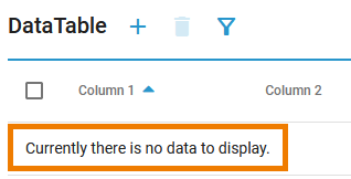
| Column Configuration | Displays the number of currently visible columns. Clicking on the displayed number or | ||
| No Data Text | In the executed form, this text will be displayed below the table header as long as no rows have been created.
| Any string. | |
| Add Row | Enables the | ||
| Remove Row | Enables the | ||
| Multiple Selection | Enables multiple row selection in the executed form. The user can select multiple rows in the table using the checkbox in front of each row. | ||
| CSS Class | Enables a field-acurate layout customization. | A valid CSS class. | |
| Symbol Type | Displays the type of the form element in read-only mode. | _ | |
Column Configuration
If you click icon  the Column Configuration editor opens:
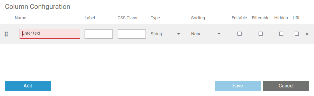
Use the editor to add and manage the content of your table:
| Option | Description |
|---|---|
| Use Add to add a new column. |
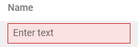
| Technical identifier for data processing. Not visible for the end user. The input in this field is mandatory. |
| The input in this field is displayed as header of the column. |
| Enables a field-acurate layout customization. |
| Use this option to select a data type for the particular column. The following types are available:
|
| Use this option to specify whether the content of this column should be sorted. You have two options:
|
| If you activate this checkbox, the user can edit the content of this column during execution. |
| With this option you can define if the column should be usable in the additional filter in the executed form. |
| Activate this checkbox to hide this column during execution. |
| Use the icon to delete a row. |
| Use this area to move the columns by drag and drop. |
 | Use Save to save your changes. |
| Use Cancel to discard your changes. |


On this Page:
Simple_Data_Table_Example
 | Click the icon to download a simple example model that shows how to use the data table element in Scheer PAS Designer. |
DataTable_ClickAction_Example
|
Click the icon to download a simple example model that shows how you can use the clickAction trigger event for data tables in Scheer PAS Designer. |
Overview
Content Tools