| Element |
|
|---|---|
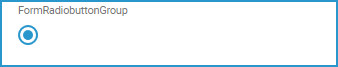
| Icon |
|
| Description | Only one single option can be selected from the displayed options. To choose an option, click on the corresponding button. The developer can set the default option. |
| Editing | Refer to Modeling Forms for further information regarding editing of form elements using the context menu. |
Configuration Options
Use the Attributes panel to edit the form element.
| Attribute Name | Description | Allowed Values? | |
|---|---|---|---|
| Name | Technical identifier for data processing and not visible for the end user. |
Alphanumercial characters and underscore. It is not allowed to start the name with a number.
| |
| Description | A commentary field for the developer. The content is invisible to users and its sole purpose is internal documentation. | Any string. | |
| Label | Field name shown in the form. | Any string. | |
| Mandatory | The element must be filled or used if the checkbox is activated. | true | Element must be filled. |
| false | Element may remain empty (default). | ||
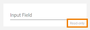
| Read-only |
This field is write-protected. When you use the option, Read-only is added to the bottom right of the element:
| true | User cannot enter values. |
| false | User can enter values (default). | ||
| Options | Click | Any string. | |
| Layout Orientation | Use this attribute to display the radio buttons horizontally or vertically. | Horizontal | Use this option to display the options next to each other (default). |
| Vertical | Use this option to display the options one below the other. | ||
| CSS Class | Enables a field-acurate layout customization. | A valid CSS class. | |
| Symbol Type | Displays the type of the form element in read-only mode. | _ | |
Field Configuration Editor
MultiExcerpt named field_config_editor was not found -- Please check the page name and MultiExcerpt name used in the MultiExcerpt-Include macro
Overview
Content Tools