Versions Compared

Key

  • This line was added.
  • This line was removed.
  • Formatting was changed.
Comment: Published by Scroll Versions from space WBRIDGE and version 24.0

MagicDraw offers a selection of basic and also complex widgets and user interface objects which cover most of any screen design needs. As a matter of fact, not all MagicDraw UI elements can be used for designing screens that work with xUML service UIs.

As a reference the following catalog will describe and at the same time indicate that they can be used.

Supported UI Elements

Table Filter
hideControlstrue
inverse,,
sparkNameSparkline
columnType,Name
disableSavetrue
separatorPoint (.)
labels‚‚
default,,
isFirstTimeEntertrue
cell-width,,
datepatterndd M yy
globalFiltertrue
id1604323798756_-273568464
worklog365|5|8|y w d h m|y w d h m
isORAND
order0,1,2
TypeNameElementDescription
Container


Panel

Image Modified

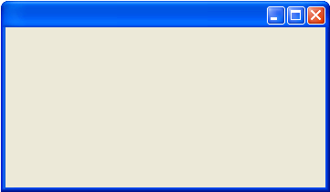
The Panel container (Image Modified) is the most basic container and is the base for any screen modeling.

Frame

Image Modified

The Frame container (Image Modified) is used for modal dialogs and screens that open within the same browser window (e.g. detail view or table records). A Frame has by default a close button in the window title bar. It is important to know, that despite of the creating a web application, the Frame container does not represent the HTML frames.

Tabbed Pane

Image Modified

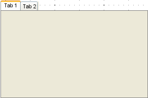
The Tabbed Pane container (Image Modified) is an ideal way to consolidate multiple screens on little space.
Refer to Tabs for more information.

Group Box

Image Modified

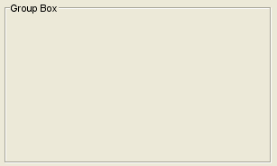
The Group Box container (Image Modified) is ideal for grouping UI elements into different groups belonging together.

UI Element


Label
Image Modified
The Label element (Image Modified) is for placing static text on a Panel container.
Text Field
Image Modified

The Text Field element (Image Modified) is used to give the user the possibility to input text to the application.

  • If a text field is bound to a data attribute having a UI Date type, it a Date Chooser is available automatically.
  • A text field can be extended by an autocompletion widget as described on Auto complete.
  • A text field can be made required by setting the multiplicity:
    • required: multiplicity undefined or 1
    • not required: multiplicity 0..1
Password Field
Image Modified
The Password Field element (Image Modified) is a Text Field with the difference, that the input is not shown in plain text but each character is replaced and hidden with the * symbol.
Checkbox
Image Modified

The Checkbox element (Image Modified) is used to indicate a on or off state.
Refer to Checkbox for more information.

Radio Button
Image Modified

The Radio Button element (Image Modified) is used in a similar way as the Check Box element but with the difference, that only one option within a group of options can be selected.

Refer to Radio Button Group for more information.

Combo Box
Image Modified

The Combo Box element (Image Modified) allows to select one option of a list that opens up when clicking with the cursor onto the element.
Refer to Combo Box for more information.

With some additional changes to the tagged values the Combo Box element can change to a Multiselect List. How to implement this is described in the following chapters.
Refer to Multi-select Lists for more information.

Table
Image Modified
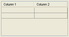
The Table element (Image Modified) is used to render data within a table grid.
Tree
Image Modified
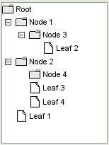
The Tree element (Image Modified) can be used to display hierarchical trees like folder structures or catalog indices.
List
Image Modified
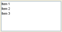
The List element (Image Modified) enables to select one or more options from a list.
Separator
Image Modified
The Separator element (Image Modified) can be used to visually separate one area of a screen with another one.
Button
Image Modified
The Button element (Image Modified) is used to submit an action by the application user e.g. send a form or open a dialog window.
File Selector
Image Modified

The File Selector, used for selecting files to bind them to an file upload form consists of a normal button element (Image Modified) element with the open icon applied to it. The open icon is specified in the buttons specifications. The file selector will be displayed as follows:

Image Modified

Unsupported UI Elements

NameElementRemark
Slider  ()

Progress Bar ()

Menu Bar ()


Scroll Bar ()


Info
iconfalse
Scrollbars are added automatically to the container elements if necessary.
Spinner ()

Toolbar ()

Close Toolbar button ()

Panel
titleOn this Page:
Table of Contents
Panel
titleRelated Pages:

Otp
Floatingfalse

rp

Usage of the UI Widgets:

Children Display
depth1