MagicDraw offers a selection of basic and also complex widgets and user interface objects which cover most of any screen design needs. As a matter of fact, not all MagicDraw UI elements can be used for designing screens that work with xUML service UIs.
As a reference the following catalog will describe and at the same time indicate that they can be used.
Supported UI Elements


Unsupported UI Elements
| Name | Element | Remark |
|---|---|---|
Slider (  ) ) | 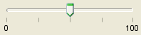 | |
Progress Bar (  ) ) |  | |
Menu Bar ( | 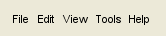 | |
Scroll Bar ( |  | |
Spinner (  ) ) | 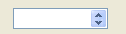 | |
Toolbar (  ) ) |  | |
Close Toolbar button (  ) ) |  |
On this Page:
Related Pages:
Usage of the UI Widgets:
Overview
Content Tools