- Created by Kirstin Seidel-Gebert, last modified by Annegret Bernhardt on Jan 26, 2024
MagicDraw offers a selection of basic and also complex widgets and user interface objects which cover most of any screen design needs. As a matter of fact, not all MagicDraw UI elements can be used for designing screens that work with xUML service UIs.
As a reference the following catalog will describe and at the same time indicate that they can be used.
Supported UI Elements
Oops, it seems that you need to place a table or a macro generating a table within the Table Filter macro.
The table is being loaded. Please wait for a bit ...
| Type | Name | Element | Description |
|---|---|---|---|
| Container | Panel |
| The Panel container ( |
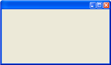
| Frame |
| The Frame container ( | |
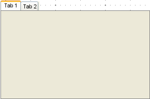
| Tabbed Pane |
| The Tabbed Pane container ( | |
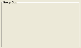
| Group Box |
| The Group Box container ( | |
| UI Element | Label |  | The Label element ( |
| Text Field |  | The Text Field element (
| |
| Password Field |  | The Password Field element ( | |
| Checkbox |  | The Checkbox element ( | |
| Radio Button |  | The Radio Button element ( Refer to Radio Button Group for more information. | |
| Combo Box |  | The Combo Box element ( With some additional changes to the tagged values the Combo Box element can change to a Multiselect List. How to implement this is described in the following chapters. | |
| Table | 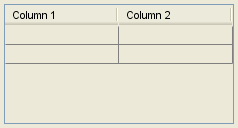 | The Table element ( | |
| Tree | 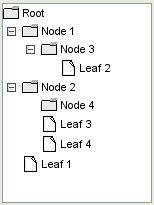 | The Tree element ( | |
| List | 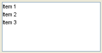 | The List element ( | |
| Separator |  | The Separator element ( | |
| Button |  | The Button element ( | |
| File Selector |  | The File Selector, used for selecting files to bind them to an file upload form consists of a normal button element (  |
Unsupported UI Elements
| Name | Element | Remark |
|---|---|---|
Slider ( |  | |
Progress Bar ( |  | |
Menu Bar ( |  | |
Scroll Bar ( |  | Scrollbars are added automatically to the container elements if necessary. |
Spinner ( |  | |
Toolbar ( |  | |
Close Toolbar button ( |  |
Usage of the UI Widgets:
- No labels
