Versions Compared
Key
- This line was added.
- This line was removed.
- Formatting was changed.
Otp |
---|
A very common user interface element for displaying data is a Table. Next to presenting data in a grid, the
...
xUML UI Table offers a lot of additional functionality which comes out-of-the-box and does not require any further scripting or development. The features are: Table sorting on every column, full text search on the grid data, on the fly definition of the amount of entries to show within the grid and pagination.
Multiexcerpt include | ||||||
---|---|---|---|---|---|---|
|
...
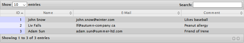
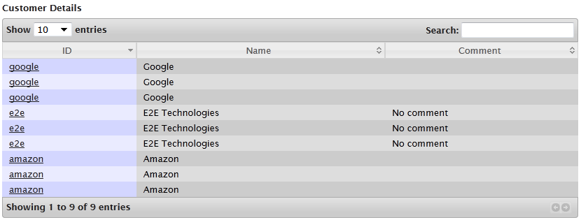
See below the UI of the SimpleTableExample.
Image Modified
Service Data Binding setup
A table holds a grid of data columns giving information on what data is displayed and rows which hold the actual data. For the Table widget to be able to render the data coming from e.g. a database query, the data needs to be prepared and bound to the widget in a special way.
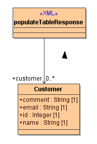
The data structure is a complex type holding 0..* rows. For example, the following Customer class is the Data Model of the Table widget for this particular case. Note, Data Models should be kept in a top level package DataModels.
Figure: Data Structure for Table Widget
Image Modified
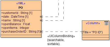
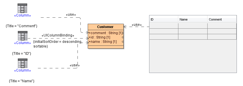
The binding is done on the Table user interface element itself by connecting it to the Customer record element. This alone is not enough, because the table widget does not know which of the Customer objects attributes (id, name, email, comment) are mapped to which column in the Table (ID, Name, E-Mail, Comment). As shown in the figure below, each <<Column>> element is mapped to the corresponding attribute using a <<use>> dependency.
Figure: E2E UI Table Data Binding
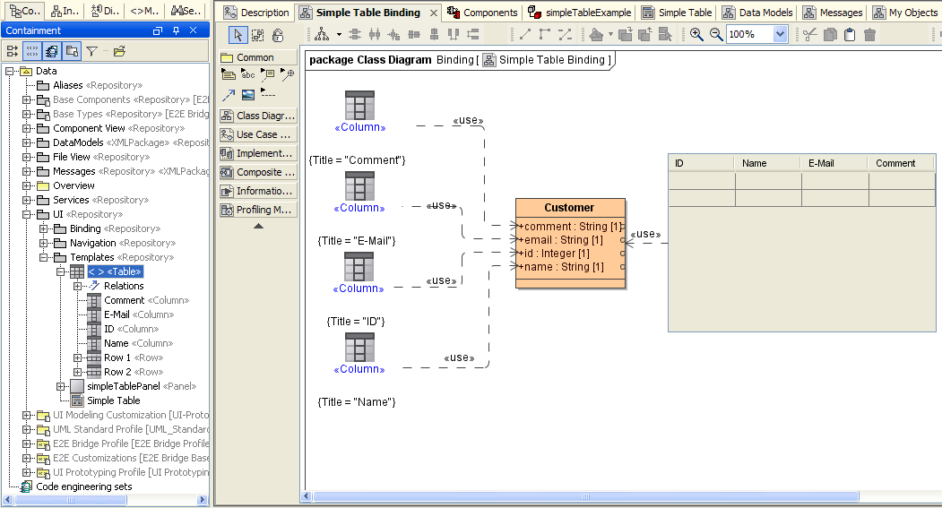
Image Modified
Table Properties
The Table widget does not only show table data but also bears functionality which is practical and does not need additional JavaScript programming or modeling. The typical table functionality is sorting of columns, searching the table content, making column visible or hide them or defining a specific width.
The <<UITableBinding>> stereotype allows to set base table properties. The stereotype is applied on the <<use>> dependency connecting the user interface table element with the data providing class.
...
Image Modified
The following tagged values can be set on the <<UITableBinding>> dependency.
Tagged value | Description | Allowed Values | |
---|---|---|---|
Name |
...
Enter a name |
...
for the dependency (optional). | any string | |
Filter | Enable or disable filtering of visible table data. Filtering in DataTables is "smart" in that it allows the end user to input multiple words (space separated) and will match a row containing those words, even if not in the order that was specified (this allows matching across multiple |
...
columns). | true | Enable data filtering. |
false | No data filtering (default). | |
Paginate |
...
Enable or disable table pagination. | true | Enable pagination. |
false | No pagination (default). | |
Pagination Type |
...
Select how the user should be able to navigate through the pages. | two_button |
...
Navigate through the pages with two arrow |
...
buttons (default). |
full_numbers |
...
Navigate through the pages using full page numbers with |
...
buttons for |
...
next, previous, first, and last page. |
Length Change |
...
Define if the |
...
user should be allowed to |
...
change the |
...
count of visible table rows manually. As per default, the user can only select default counts from a drop down box if pagination is enabled (see Paginate). | true | The user can manually enter a count of visible table lines. |
false | The user can only use the values provided in the drop down list (default). | |
Display Length |
...
Specify how many |
...
rows should be displayed initially on table load. This setting also changes the steps of the drop down list where the user can change |
...
the count of visible table rows (default values are 10, 25, 50, and 100). The new sizes are calculated by multiples of Display Length. | a valid integer | ||
10 | Default. | ||
Info | Enable or disable the table information display. This shows information about the data that is currently visible on the page, including information about filtered data if that action is being performed | true | Show table information. |
false | Do not show table information (default). | ||
Sort | Enable or disable sorting of columns. Sorting of individual columns can be disabled by |
...
the sort |
...
option for each column. | true | Enable column sorting. | |
false | Column sorting disabled (default). | ||
Auto Width | Enable or disable automatic column width calculation. | true | Enable automatic column width. |
false | Automatic column width disabled (default). | ||
Server Side Processing | Enable this tagged value for using server side pagination. For each processing event (draw, pagination, sort, filter, etc.) the data is fetched from the server. | true | Enable server side pagination. |
false | Server side pagination disabled (default). | ||
Layout | This tagged value allows you to specify exactly where in the DOM the various table controls should be injected. For example the pagination controls at the top of the table. DIV elements can also be used to add additional styling. |
...
The following options are allowed:
...
The following |
...
Constant | Description |
---|---|
H | jQueryUI theme header classes |
F | jQueryUI theme footer classes |
...
syntax is expected:
Examples:
| Options | ||
l | length changing | ||
f | filtering input | ||
t | the table | ||
i | information | ||
p | pagination | ||
r | processing | ||
T | export/copy buttons | ||
Constants | |||
H | jQueryUI theme header classes | ||
F | jQueryUI theme footer classes | ||
State Save | Enable state saving. When enabled, a cookie will be set to save the table display information such as pagination, display length or sorting. In case of the end user reloading the page, the table will remain with the settings as before. | true | Enable state saving. |
false | State saving disabled (default). | ||
Scroll X | Enable horizontal scrolling. When a table is too wide to fit in a certain layout, x-scrolling can be enabled showing the table within a scrollable viewport. | none | Horizontal scrolling disabled (default). |
a value | Enable horizontal scrolling. The value can be any CSS unit or a number (in which case it will be treated like pixel measurement) |
...
. |
...
Scroll Y | Enable vertical scrolling. Vertical scrolling will constrain the DataTable to the given height, and enables scrolling of any data which overflows the current viewport. This can be used as an alternative to paging to display a lot of data in a small area (although paging and scrolling can both be enabled at the same time). |
...
none | Vertical scrolling disabled (default). | |
a value | Enable vertical scrolling. The value can be any CSS unit or a number (in which case it will be treated like pixel measurement). |
Column Properties Binding
The <<UIColumnBinding>> stereotype allows to set table column properties. The stereotype is set on the <<use>> dependency connecting the column classes to the data providing class attributes.
Figure: Table Column Binding
Image Modified
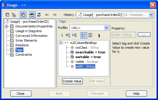
The column settings which influence the widgets behavior are set on the <<UIColumnBinding>> stereotype. The column settings are set in the tagged value section of the Usage dependency specification window.
Figure: Table Column Binding Settings
Image Modified
Tagged value | Description | Allowed Values | |
---|---|---|---|
cssClass | Allows to define a custom CSS class to the column. |
...
a string | |||
searchable | Define whether this column should be search by the search functions. | true | Search the contents of this column (default). |
false | Disable search for this column. | ||
sortable | Specify whether this column should be sortable |
...
by clicking on the column title. |
...
true | Column is sortable (default). | |
false | Disable sorting for this column. | |
visible | Specify whether this column should be visible. |
...
An example can be found here. | true | Column is visible (default). | |
false | Column is not rendered. | ||
width | By default the columns width depends on the content. To have more control over the columns width behavior, the width can be manually set. | an integer | |
Initial Sort Order |
...
Specify the sort order of the column when being rendered for the first time. | ascending | Sort column data ascending (default). |
descending | Sort column data descending. |
Table Column/Row Order
To set or change the order of the table columns or rows, proceed as follows:
Image Modified | 
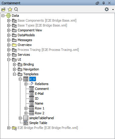
Select the table in the Containment tree and expand the table node. |
Image Modified | 
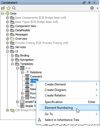
Select a column or row and select Element Numbering from the context menu. |
Image Modified | 
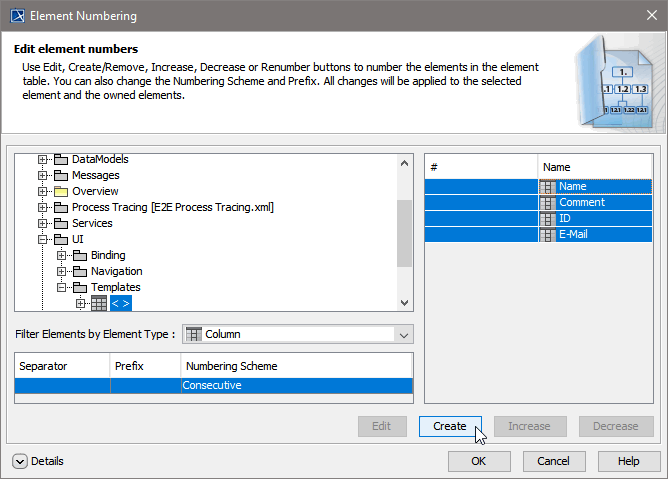
Select all columns or rows and click Create to insert Column numbering. |
Image Modified | 
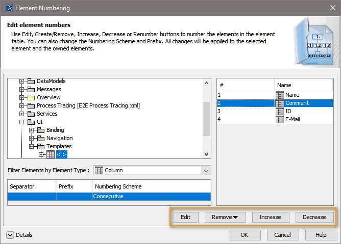
Now, you can use four buttons to change the column or row order:
|
...
Click OK, to save your changes. |
Table Row Binding and Event Context
Multiexcerpt include | ||||||
---|---|---|---|---|---|---|
|
Data held by a table row can be accessed by the click event of an
...
embedded button or link element
...
as described further below. However, if the whole row is to be selectable, use event=click and eventSource=<TableReference> as shown below:
Figure: Table Row Events
Image Modified
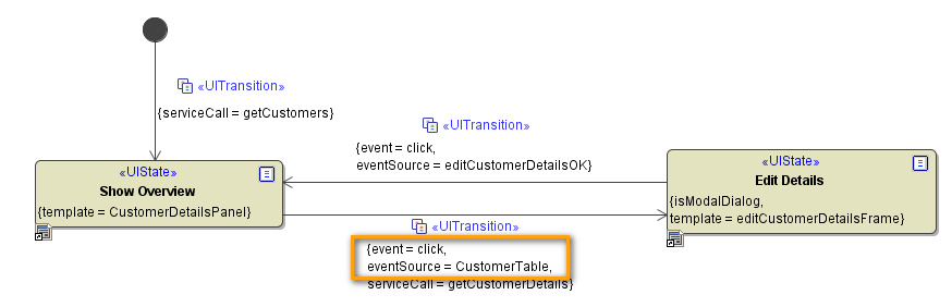
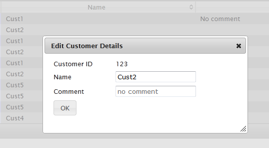
As result of the above state machine, a modal dialog is opened if the user clicks on a row
...
:
...
Image Modified
The service being called when clicking on a row is getCustomerDetails. The input of the service is the Customer object in the current example. Thus, one needs a binding between the Customer class and the table columns
...
:
...
Image Modified
Besides triggering service calls by table events it is also possible to call JavaScript operations. The following example shows a list of links in the first column
...
. When clicking on one of these links the application is left but before doing so a pop-up prints a warning. The warning shall contain the actual URL of the links. In order to store this information we use a hidden column
...
.
Figure: Example for JavaScript Operations and Links in a Table
Image Modified
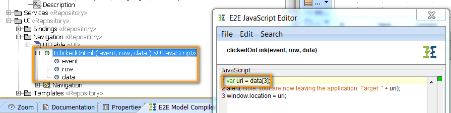
The UI state machine of this model is shown below. Basically, it calls the JavaScript operation clickedOnLink for the event=click on the eventSource=IDlink:
Figure: Calling a JavaScript Operation in a Table
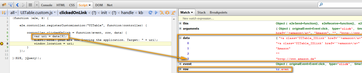
If a JavaScript operation is called within the table context, the signature of the operation contains three parameters:
- event: the W3C event having triggered the transition
- row: the HTML row (<tr>) on which the event has been triggered. This row contains only the visible elements.
- data: the data of the row on which the event has been triggered. This row contains all elements including the hidden columns.
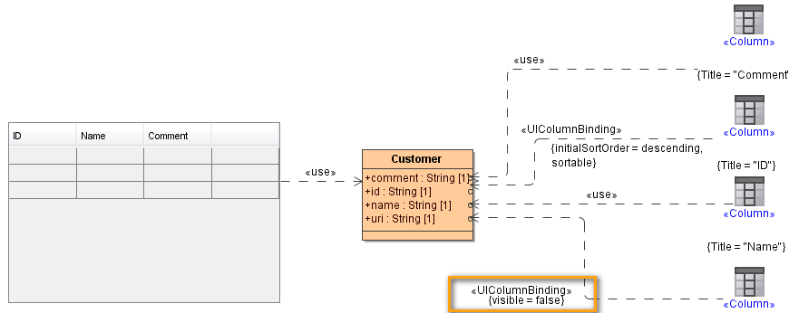
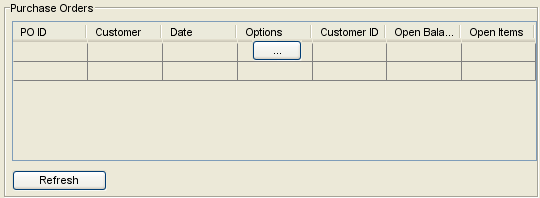
In the current example, the hidden column contains the actual URL of the link display in the first column. A table column is hidden
Anchor | ||||
---|---|---|---|---|
|
Figure: Hidden Column Binding
Image Modified
In order to access the hidden column data in JavaScript operation, the data parameter has to be used as depicted below:
Image Modified
At runtime, the Firebug debugger can be used to show the content of the data parameter:
Image Modified
UI Elements Nested in Table Cells
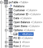
It is possible to nest user interface elements in a table cell. This is commonly used to provide the user with an option to view more detailed information within a dialog window. This nested element is mostly a button or a link object.
...
Image Modified
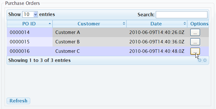
The button in the above figure is modeled within a table column called Options. The button element needs to be nested within the column element. This is important for the element to get the rows context.
Figure: Button nested in Table Column
Image Modified Image Modified
An example of a link nested in table can be found
...
in Table Row Binding and Event Context above.
Panel | ||
---|---|---|
| ||
|
Panel | ||||||
---|---|---|---|---|---|---|
| ||||||
Usage of the UI Widgets:
|
...