| Element |
|
|---|---|
| Icon |
|
| Description | Use the subform element to integrate other existing form pages into the current one. The element thus enables forms to be nested. Use the element's attribute Form to choose which of the existing forms you want to include. |
| Type | n/a |
| Prepopulation | This element cannot be prepopulated. |
| Editing | Refer to Modeling Forms for further information regarding editing of form elements using the context menu. |
Configuration Options
Use the Attributes panel to edit the form element.
| Attribute | Description | Allowed Values | |
|---|---|---|---|
| Name | Technical identifier for data processing and not visible for the end user. | Alphanumercial characters and underscore. It is not allowed to start the name with a number. | |
| Description | A commentary field for the developer. The content is invisible to users and its sole purpose is internal documentation. | Any string. | |
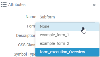
| Form | A drop-down field to select an existing form to nest.
| Any available form including the overview form of the process. | |
| CSS Class | Enables a field-acurate layout customization. | A valid CSS class. | |
| Custom Attributes | The attribute is used to activate Angular directives, that are created as development kit (devkit) library to expand the default functionality. For detailed information about Angular directives, visit the official Angular documentation. For details about the usage of the Custom Attributes, refer to Developing Custom Directives. |
| |
| Symbol Type | Displays the type of the form element in read-only mode. | _ | |
On this Page:
Form_Simple_Subform_Example
 | Click the icon to download a simple example model that shows how you can use subforms to display a standard header and footer in several forms. |
Related Pages:
Overview
Content Tools