After having queried the data of a process as described in Querying Process Data, the Process Dashboard presents a Table view of the selected data.
In the table view, click the chart icon next to a column heading.
Figure: Selecting a Distribution Chart
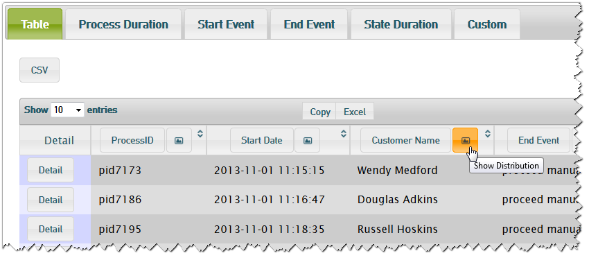
The Process Dashboard will show a distribution chart based on the selected column and display the process instance count per value.
Distribution Chart of Alphanumeric Values
Figure: Distribution of Process Instances per Customer
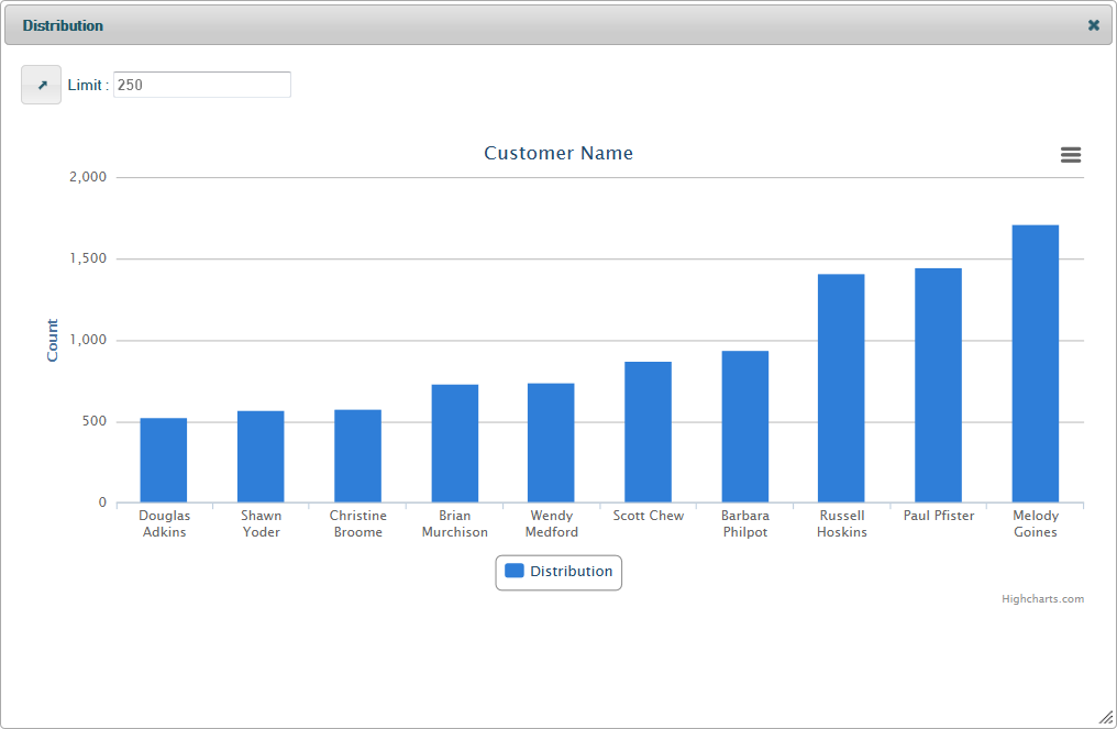
In distribution charts that are based on alphanumeric values (e.g. customer name), you can change two settings in the top left of the chart:
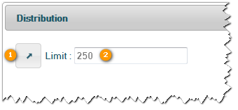
Using the arrow button you can change the order of the bars from ascendant to descendant.
Using the Limit setting you can limit the count of bars displayed in the chart. If you set the limit to e.g. 5, the chart will show the first or the last 5 bars of the chart - depending on the order setting.
Distribution Chart of Numeric Values
Figure: Distribution of Process Instances per Price
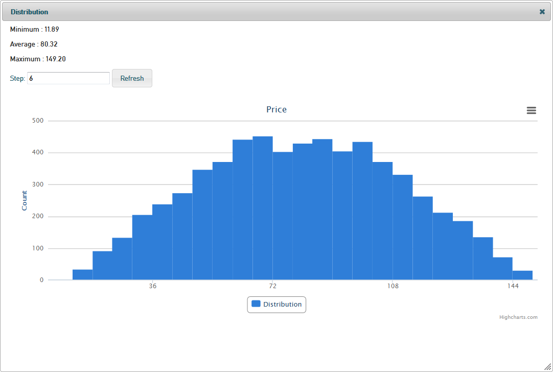
In distribution charts that are based on numeric values (e.g. price), you will see the minimum, average and maximum value in the top left of the chart.
You can change the step width of the values on the x-axis to get a more granular or more overall view on the data.
Enter a step width and click Refresh to apply it and redraw the chart.
The distribution chart of Duration is exceptional in that it allows to change the time unit as well (between seconds and weeks).
Distribution Charts of Date Values
Figure: Distribution of Process Instances per Start Date
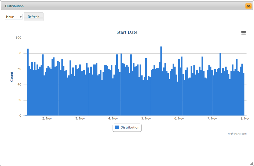
In distribution charts that are based on date values (e.g. start date), you can change the time unit in the top left of the chart.
Change it between seconds and weeks and click the Refresh button to apply your changes to the chart.
On this Page:
Overview
Content Tools