Layout of Orthogonal States
Example Files (Builder project Advanced Modeling/UI):
 | <your example path>\Advanced Modeling\UI\uml\uiLayout.xml |
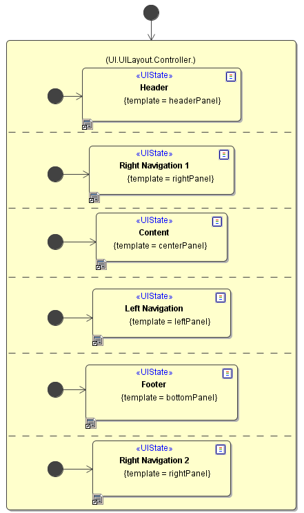
In some cases it can be necessary to create a more complex layout consisting of a combination of different user interface areas. This is usually seen on portal sites where there are different areas like a news ticker a navigation and a content part.
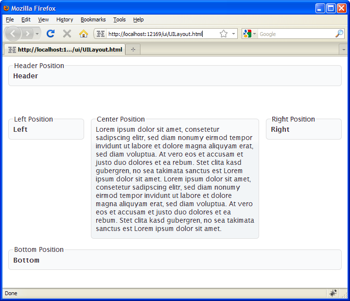
xUML UI offers the possibility to create a complex layout structure by using orthogonal states having different templates assigned to the <<UIStates>>. The layout is defined in regions which can be defined in the <<UIRegion>>.
Grid, Float and Fixed Layout
xUML UI offers three layout options, the grid layout, the flow layout and the fixed layout. All of these layout types have their weakness and strengths.
The layout is defined on the user interface elements of type container having the additional stereotype <<UIContainer>>. This would be the Panel ( ), Frame (
 ), Group Box (
 ) and Tabbed Pane (
 ).
).
Which layout is chosen depends largely on the type of design that will be implemented and the target audience. The following table lists some pro's and con's which both layout managers have:
Flow Layout
With Flow Layout mode, there are no precise positions for controls specified. There are no top or left properties, nor are there any references to x, y, or z coordinates. Controls are placed relative to other controls. It can be specified that a text box can be placed next to a label, or underneath a label, but the browser will make the final decision on the precise positioning based on the space available. Tables and panels are often used to ensure sets of related controls are grouped together. They are frequently used in complex combinations, such as nesting a table inside the cell of another table. Common sets of controls are often converted into user controls so they can be reused on many pages within a project.
| Pro | Contra |
|---|---|
| Compatible with every Web browser and many hand held devices. | Content may look decent, but you can not generally ensure it will look great. |
| Content is dynamically positioned so it should always look decent. Easy to layout using external style sheets. | Hard to predict how the content will look to all your users. |
Grid Layout
A grid layout simply uses a table to achieve its results, and most browsers will support this. There is no absolute positioning using CSS pixel values implemented. For this reason, most web based user interface use the flow layout in combination with tables to fixate the design as needed.
| Pro | Contra |
|---|---|
| Simple concept based table layouting. | Limited compatibility with hand held devices in some cases, due to the inability to flow the layout. Designs must be specifically designed for small screen resolutions. |
| All content will display exactly where it was specified. | - |
Fixed Layout
The fixed layout translates the actual position of the design modeled in Magic Draw. The positioning of the elements is done with CSS and therefore uses the CSS coordinate system from top left corner or an element.
| Pro | Contra |
|---|---|
| The layout precisely controllable and flexible in changing positioning | Older browsers will not support this features |
| Keeps the HTML/text ratio at a low level, thus decreasing load time |
CSS Container Elements and Nested DIV
Example File (Builder project Advanced Modeling/UI):
| <your example path>\Advanced Modeling\UI\uml\uiDivElements.xml |
When designing pages purely with CSS, a container for page elements is needed. This is done by using <div> tags. Choosing this approach allows full control of the layout and look and feel leaving HTML table grids away. To be able to create more complex layouts the <div> tags need to be nested. xUML UI supports this way of designing, by generating container tags for each container element (Frame, Panel, ScrollPane etc.) which is modeled in the Magic Draw Interface Modeling Diagram.
There are two container elements generated by the compiler, where the top level container element is always a <form> tag and all following container elements, nested or not, are <div> tags.
The generated code will clearly shows how the tags are nested in each other as well as the top level container <form> element. To be able to set a CSS class name to an element container the container in Magic Draw needs the <<UIContainer>> stereotype assigned. Then it is possible to set a CSS Class in the tagged values section of the element.
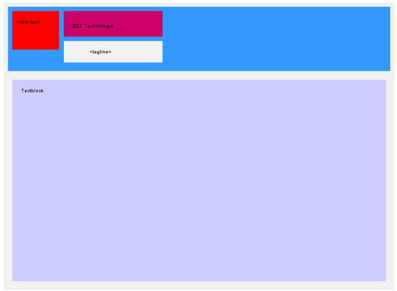
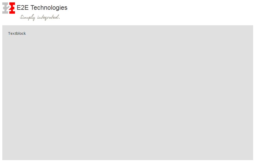
<body id="e2e_main">
       <form id="UITemplate_mainPanel" class="e2e-content ui-widget">
          <div class="e2e-row">
             <div id="UITemplate_headerPanel" class="headerPanel">
                <div class="e2e-row">
                   <div id="UITemplate_logoPanel" class="logoPanel">
                      <img id="UITemplate_e2elogo" class="logo" src="e2e_logo.png"></img>
                   </div>
                   <div id="UITemplate_textPanel" class="textPanel">
                      <span id="UITemplate_e2e_Label1">E2E Technologies</span>
                   </div>
                </div>
                <div class="e2e-spacer10"></div>
                <div class="e2e-row">
                   <div id="UITemplate_taglinePanel" class="taglinePanel">
                      <img id="UITemplate_tagline" class="tagline" src="e2e_tagline.png"></img>
                   </div>
                   <div class="e2e-separator"></div>
                </div>
                <div class="e2e-spacer10"></div>
             </div>
          </div>
          <div class="e2e-spacer10"></div>
          <div class="e2e-row">
             <div id="UITemplate_textblockPanel" class="textblockPanel">
                <span id="UITemplate_e2e_Label2">Textblock</span>
             </div>
          </div>
          <div class="e2e-spacer10"></div>
     </form>
 </body>
Grouping UI Elements in the UIPackage
The <<UIPackage>> is a way to group certain UI elements together and define a layout type for each package. This enable to combine flow and table layouts to be more flexible with the design. The <<UIPackage>> is meant to replace the <<Repository>> stereotype on Packages within the UI <<Repository>>.
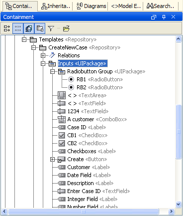
Figure: <<UIPackage>> Usage
The <<UIPackage>> has the following parameters which can be set:
| Parameter | Description |
|---|---|
| Name | The name of the <<UIPackage>> |
| CSS Class | A custom CSS class definition styling or influencing the behavior of the UI package element or its children. |
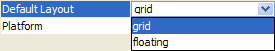
| Layout | The layout which should be used for the elements within the <<UIPackage>>. This can be float or grid. |
| Group | This defines a name for the elements grouped by the <<UIPackage>> e.g. radio or checkbox groups. |
| Vertical Group | When layouting the UI elements they are normally organized in row and columns. The model compiler will put all UI elements that are in a horizontal line into a row and per row each UI element in its own column. However, sometimes two elements (e.g. radio buttons) shall be put in the same column to group them graphically. This can be achieved giving them the same Vertical Group number. |
Further, next to the ability to combine different layout types, the <<UIPackage>> is also needed to group Radio Buttons to Radio Button Groups. See the corresponding details within the UI Widgets chapter.
On this Page:
Overview
Content Tools