On this Page:
Example File (Builder project Advanced Modeling/UI):
 | <your example path>\Advanced Modeling\UI\uml\uiTabs.xml |
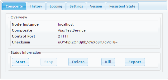
Figure: Tabbed Pane Runtime
Tabbed Pane Widget Specifications
The actual Tabbed Pane element is needed as a main template organizing the single tabs and their order and position. It is later assigned to the <<UITabState>>. The way the tabs are organized is defined in the tabbed panes specifications.
Figure: Tabbed Pane Main UI Element
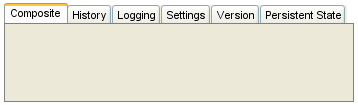
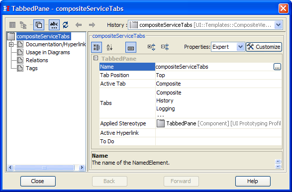
Figure: Tabbed Pane Specifications
| Property | Description |
|---|---|
| Name | Name of the Tabbed Pane container |
| Active Tab | Defines which tab is initially active when the page is loaded. |
Tabbed Pane Navigation
Figure: Main Tabbed Pane Navigation
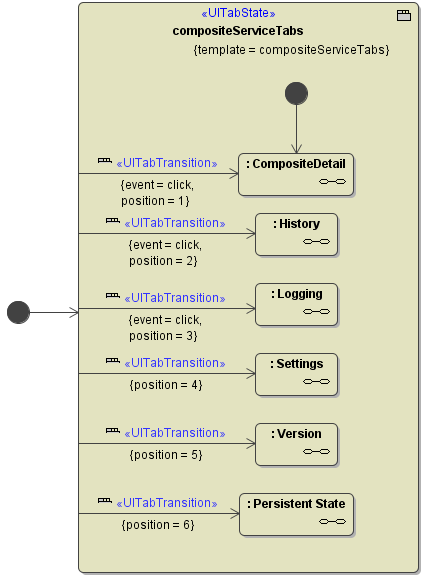
The E2E Compiler enforces some rules when creating a Tabbed Pane Navigation (<<UITabState>>
- There must be exactly one start bubble within the <<UITabState>>
- A <<UITabTransition>> can only have one target state.
- The <<UITabState>> needs a template defined to be able to validate whether all positions could be found.
Overview
Content Tools