Page History
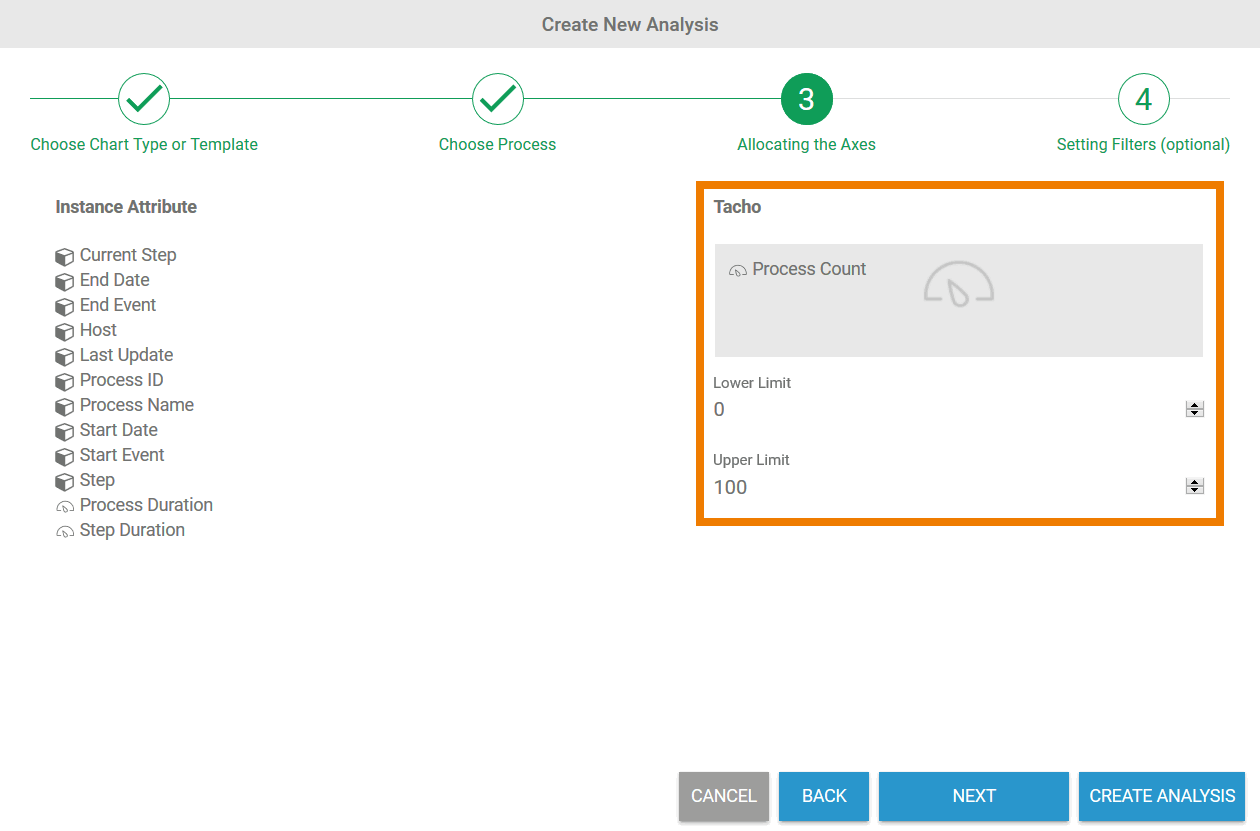
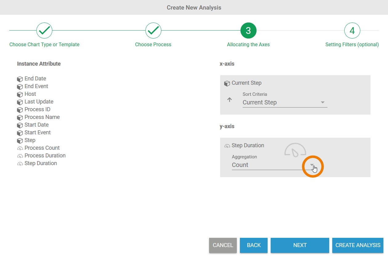
The Create New Analysis Wizard supports you during the creation of an analysis.
- In step 1 the user must select a chart type.
- In step 2 the process to be analyzed is selected
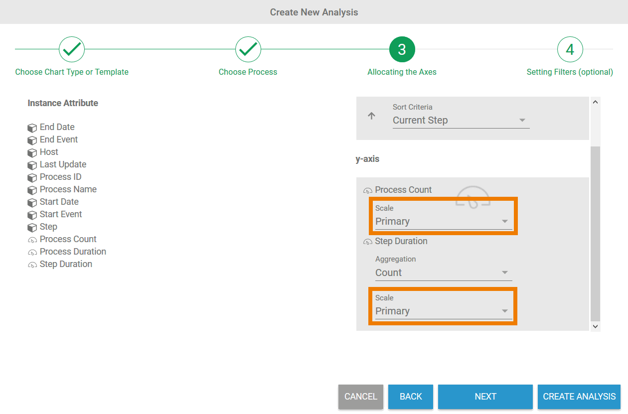
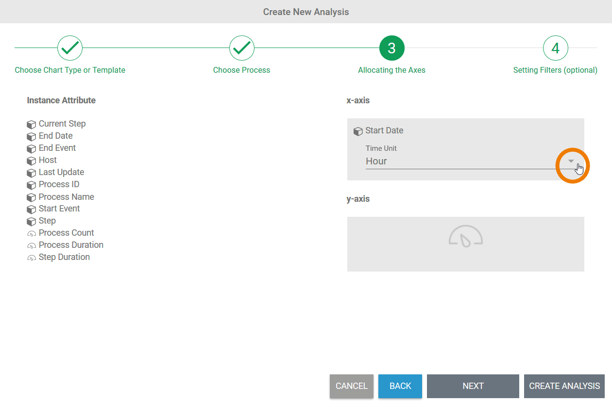
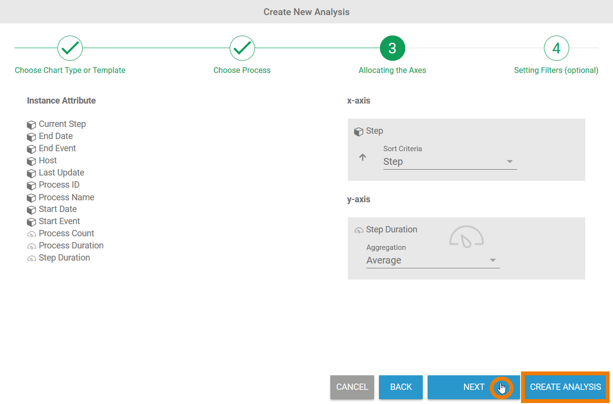
- In step 3 the axis allocation for the analysis is configured.
- In step 4 the user can finally create filtersfor their analysis.
Only the first three steps are mandatory, the creation of a filter is optional.
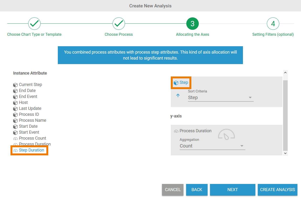
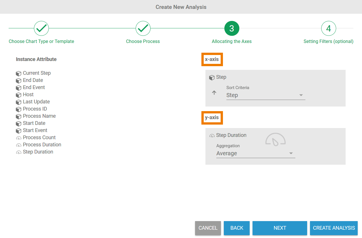
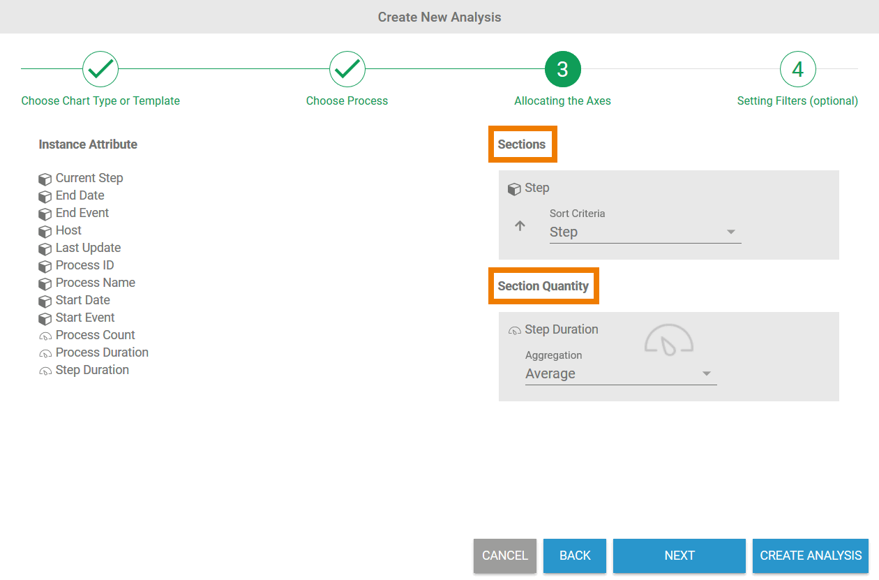
The allocation of axes differs depending on the chart type selected and offers different configuration options depending on the instance attributes chosen.
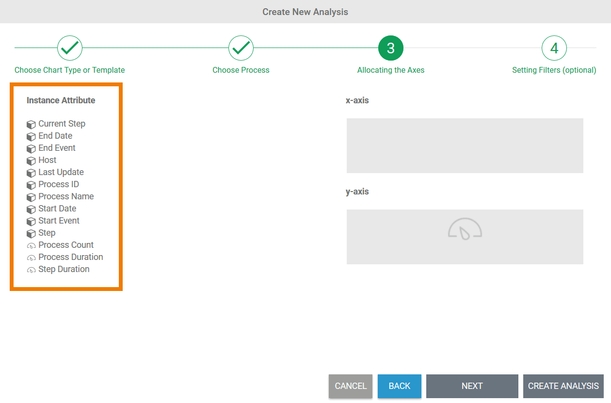
Selecting Instance Attributes
| Multiexcerpt include | ||||||
|---|---|---|---|---|---|---|
|
|
| ||||||||
|
| ||||||||
|
| ||||||||
|
| ||||||||
|
|
Specific Differences Depending on Chart Type
The division of a chart into x and y axes is not applicable for all chart types. When selecting instance attributes, there are slight differences depending on the chart type.
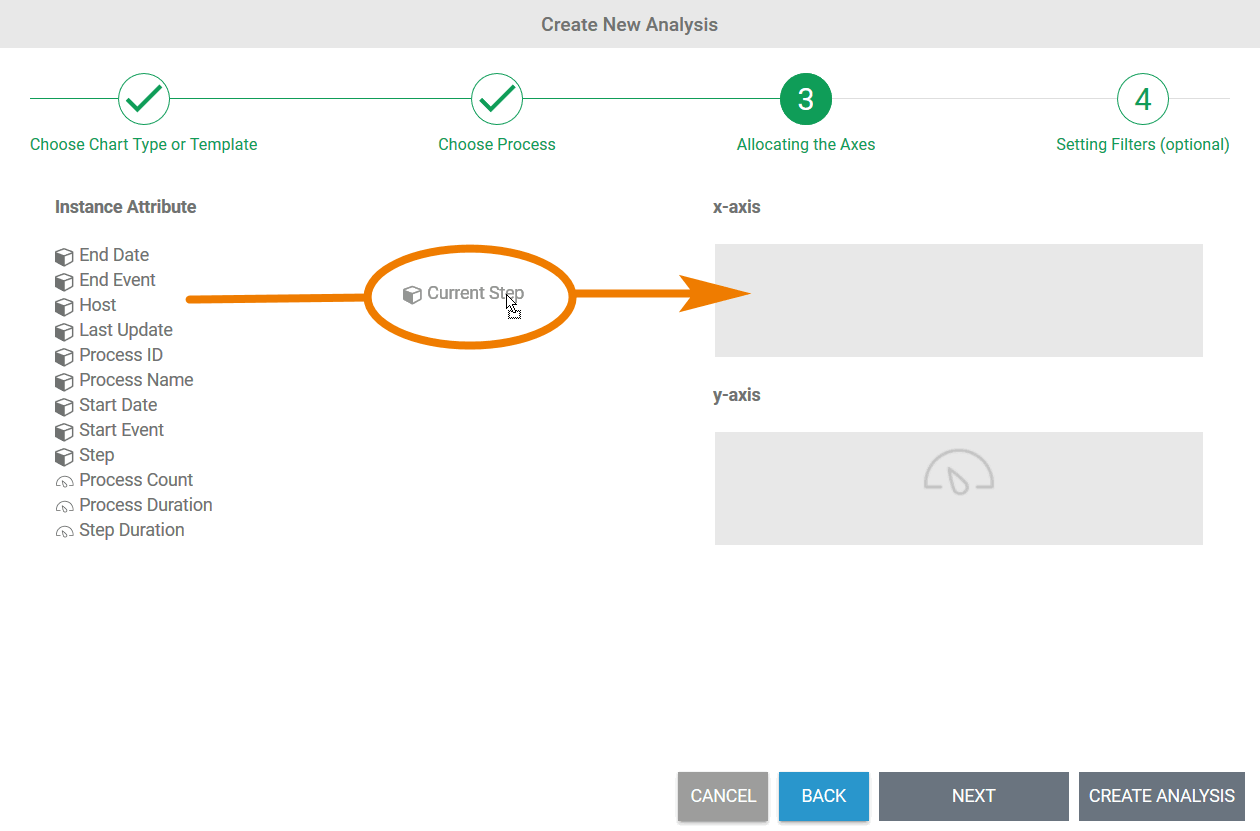
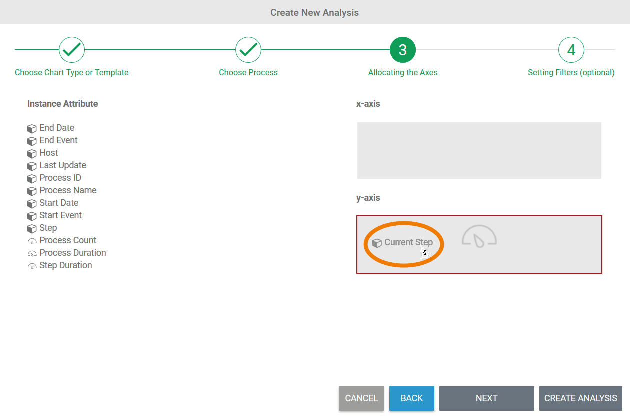
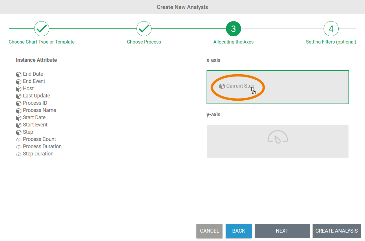
x-Axis and y-Axis
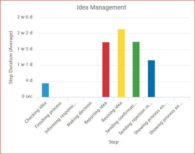
| For the following chart types, instance attributes can be distributed on an x-axis (
|
| In the chart, the allocated attributes are displayed on the x and y axes. |
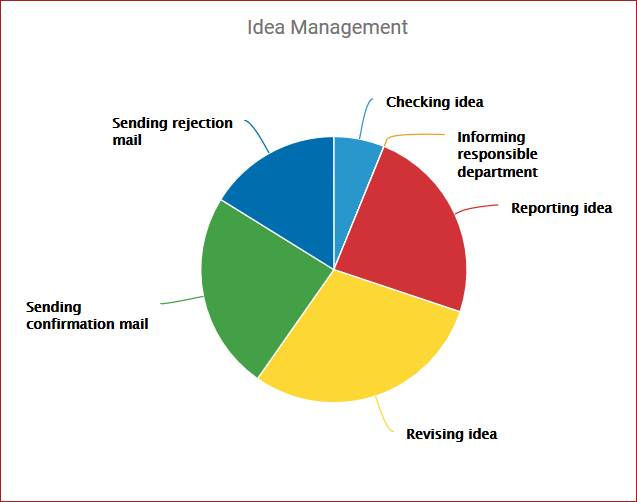
Pie Chart
| You can also select a dimension and a key indicator in the pie chart. Due to the representation as a circle or pie, we speak of circle sections for the dimensions ( |
| The circle sectors are differentiated in color in the chart, the sector sizes determine the size of the "piece of the pie". |
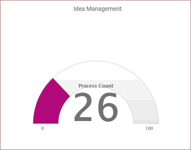
Tachometer
| The tachometer chart can only represent one key indicator. Rather than a second axis, corresponding upper and lower limits must be defined here. The entry of a time period can be carried out in weeks, days, hours, minutes and seconds. |
| The tachometer shows the current value between the lower and upper limit. |
Configuration Options for Instance Attributes
The way in which instance attributes are displayed can be configured with a variety of setting options:
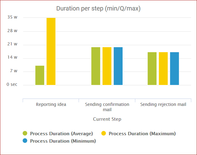
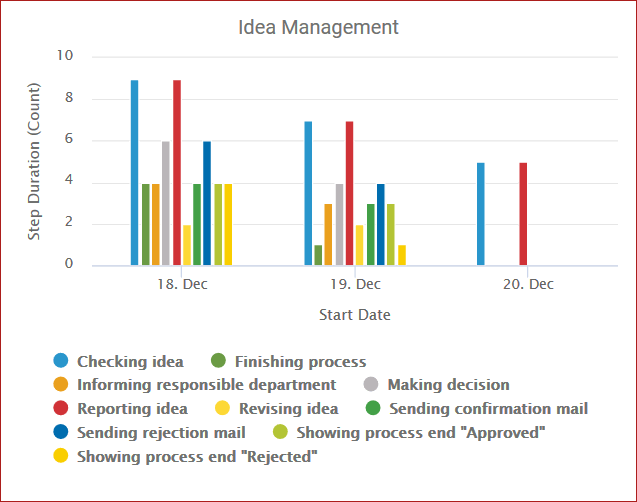
- Displayable Number of Attributes: It is possible to display several key indicators and dimensions in one analysis. A key indicator can also be displayed several times in an analysis, for example to be able to compare minimum and maximum directly.
- Measure Scales: In order to compare key indicators with different value ranges, you can select the display scale for key indicators.
- Sorting Attributes: You can also select sort criteria for different dimensions, which can be displayed in ascending or descending order.
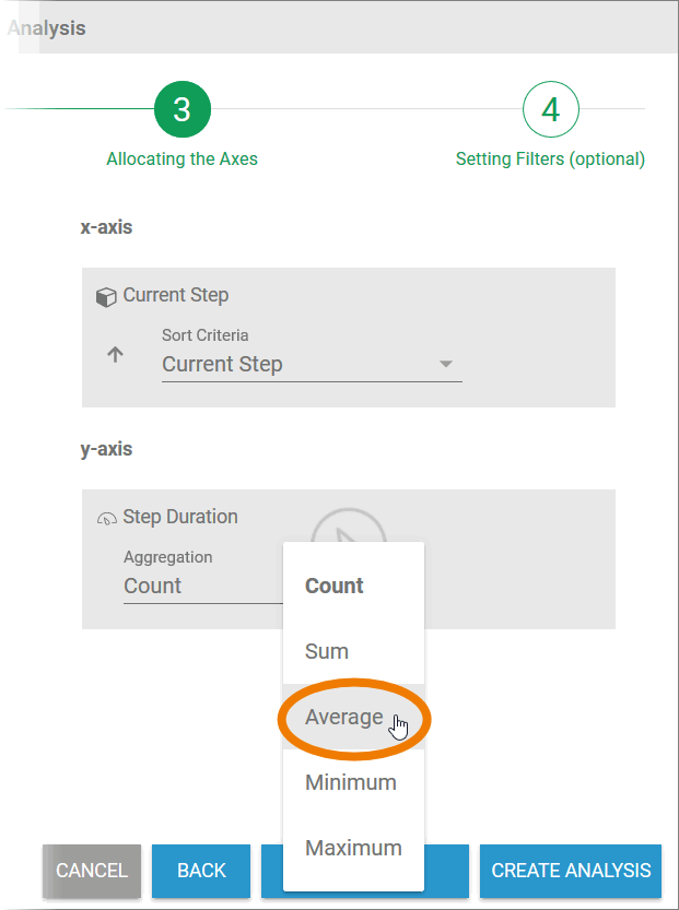
- Aggregation of Measures: You can set the desired aggregation for key indicators.
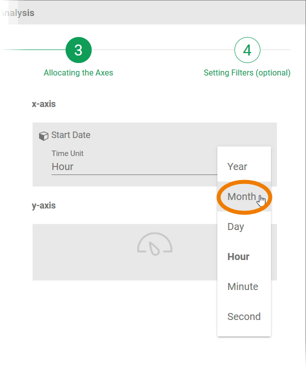
- Configuring Time-based Instance Attributes: You can freely select the units for time-based instance attributes.
Anchor attribute_number attribute_number
Displayable Number of Attributes
The number of instance attributes to be shown in an analysis is up to the user. However, the following restrictions apply to the configuration of an analysis:
| Chart Type | Possible Number of Dimensions | Possible Number of Key indicators |
|---|---|---|
| 1 | 1 - n° |
| 2* | 1 | |
1 | 1 - n° | |
| 2* | 1 | |
| 1 | 1 |
| 1 | 1 - n° |
| 2* | 1 | |
| 1 | 1 - n° |
| 1 | 1 - n° |
| 2* | 1 | |
| 0 | 1 |
| Info |
|---|
* If two dimensions are selected, the combinations of time + category (e.g. Last Update + Step) and category + category (e.g. Step + Host) are allowed. ° A key indicator can be assigned several times. This enables the comparison of several aggregations of the same key indicator, such as minimum and maximum, in one analysis. |
| Examples | |
|---|---|
| One Dimension:
One Key Indicator:
|
| One Dimension:
One Key Indicator:
|
| One Dimension:
Two Key Indicators:
|
| Two Dimensions:
One Key Indicator:
|
Measure Scales
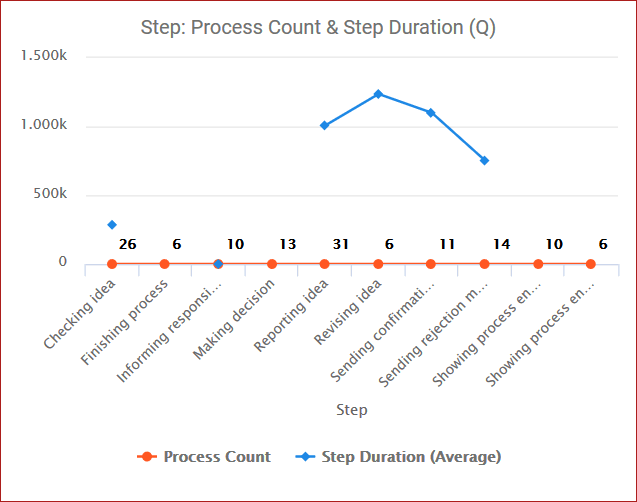
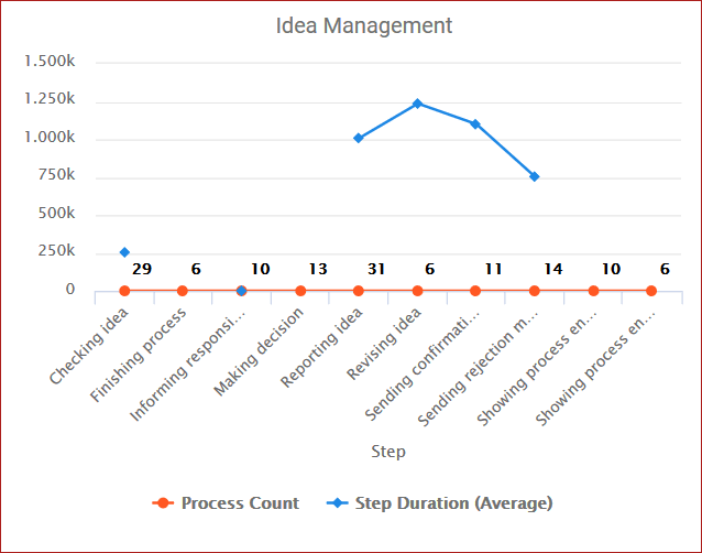
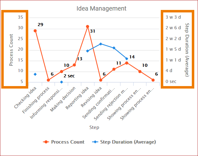
If several key indicators are to be shown in one chart, you can choose between different types of representation. It is possible to show all key indicators on one axis or to display the scales separately. This is particularly helpful if the value ranges of key indicators differ or are measured in different units such as time and quantity.
| Info |
|---|
The setting of scales is not available for tachometer, pie charts and radar charts. |
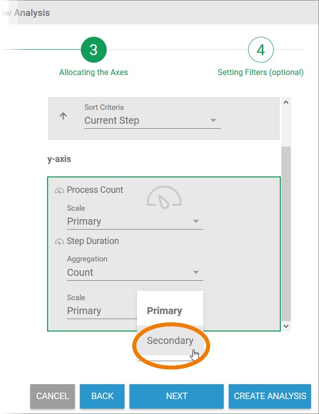
| After allocating key indicators, the scale desired can be set in the wizard using a selection list. The default setting for all key indicators assigned is primary. |
| Open the selection list to change the setting of the scale. |
| Examples | |
|---|---|
| Key Indicator Selection:
|
| Key Indicator Selection:
|
| Info |
|---|
The more key indicators allocated to an axis, the greater the number of scales which can be set. Up to five scales can be displayed simultaneously in one analysis. The subordinate scales are shown in the analysis on the right. |
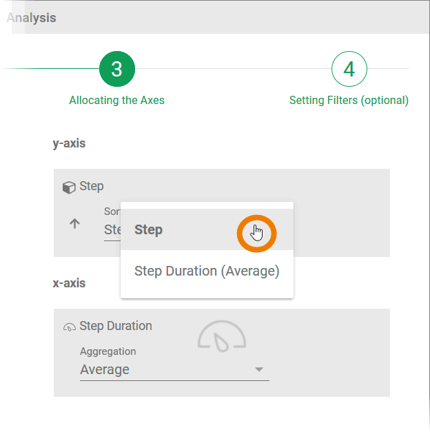
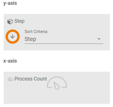
Sorting Attributes
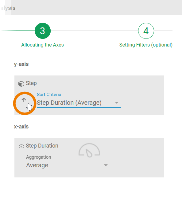
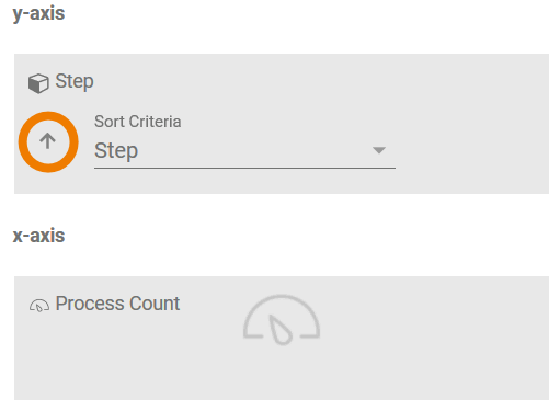
The analysis can be sorted in accordance with the attributes shown. Depending on the dimensions and key indicators allocated, the available sorting criteria can be set on the dimension axis using a selection list. With the help of the arrow that appears to the left of the sort criteria, you can amend the sorting direction to ascending or descending order.
| Info | ||
|---|---|---|
| ||
|
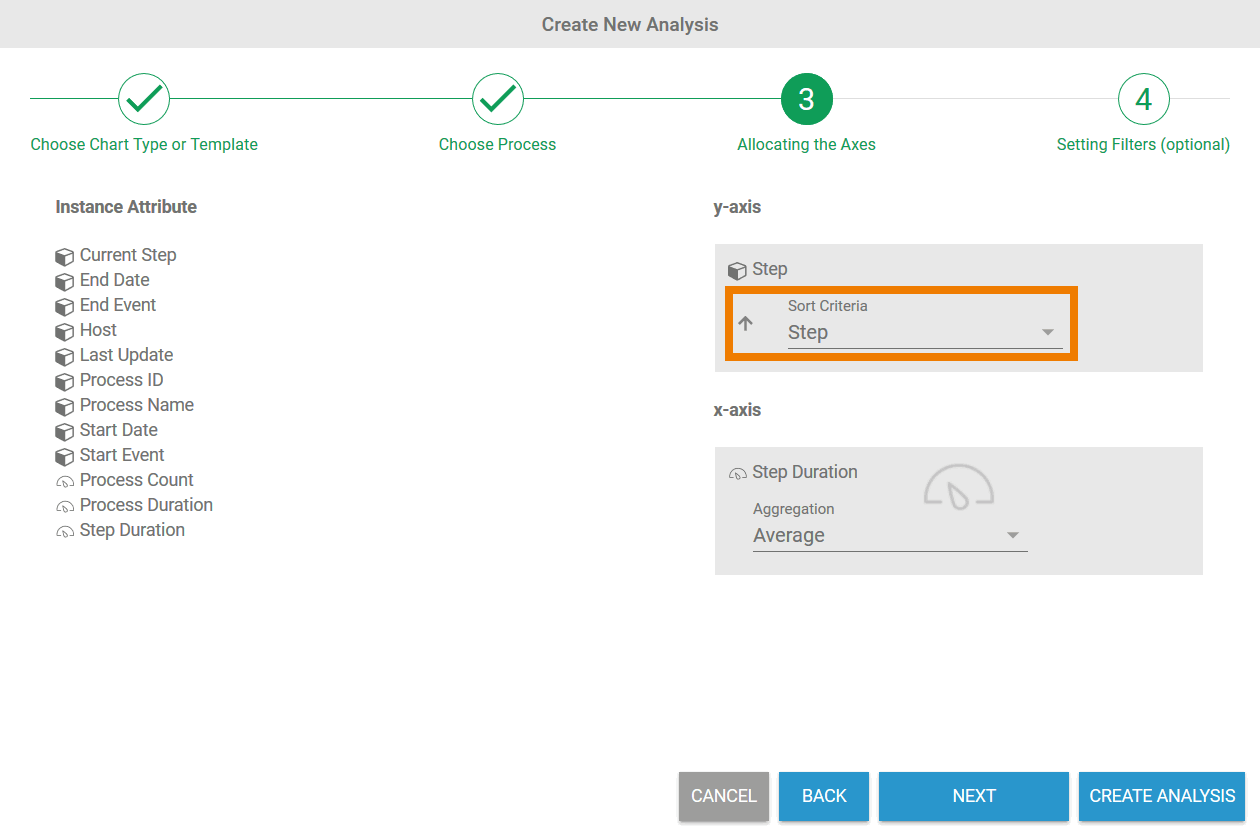 | Once an instance attribute has been selected for the dimension axis, the Sort Criteria selection list will also be displayed. |
| The instance attribute according to which sorting is to take place can be set via the list. |
| Use the arrow to the left of the selection list to set the sorting direction. The arrow shows the current sorting direction:
|
| Examples | |
|---|---|
| Setting in the Wizard
|
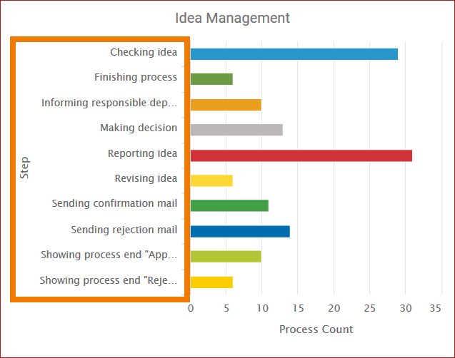
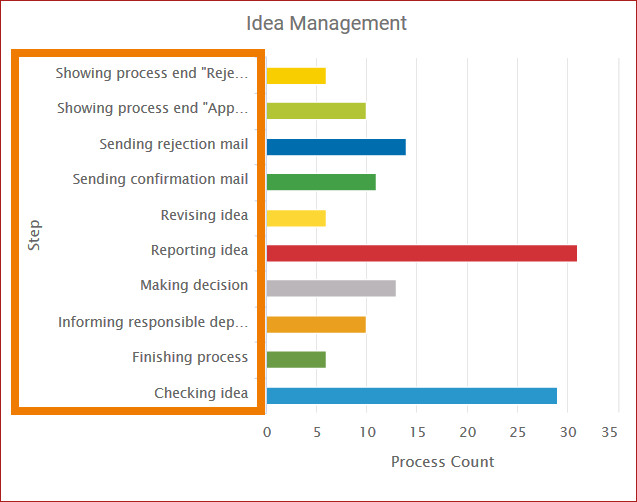
| In the analysis, the steps are displayed alphabetically by the name of the step in ascending order. |
| Setting in the Wizard
|
| In the analysis, the steps are displayed alphabetically by the name of the step in descending order. |
Aggregation of Measures
| Anchor | ||||
|---|---|---|---|---|
|
|
| ||||||
|
|
Configuring Time-based Instance Attributes
|
| ||||||
|
|
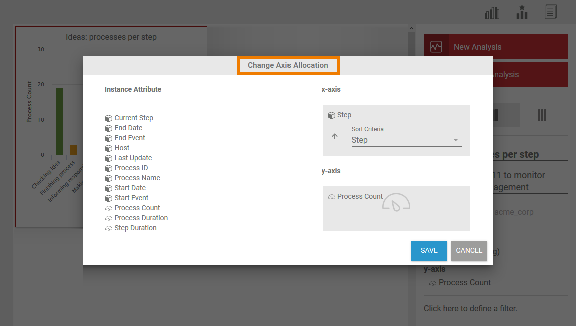
Completing and Changing Axis Allocation
| Once you have defined all the necessary instance attributes, use the click Create Analysis button to create the chart in teh the content area (see page refer to Creating an Analysis for details). If you wish to save filters for the data, select Next at this point to open the wizard in step 4.
|
The chart is created in the content area, the analysis settings are shown in the Analyses Sidebarsidebar:
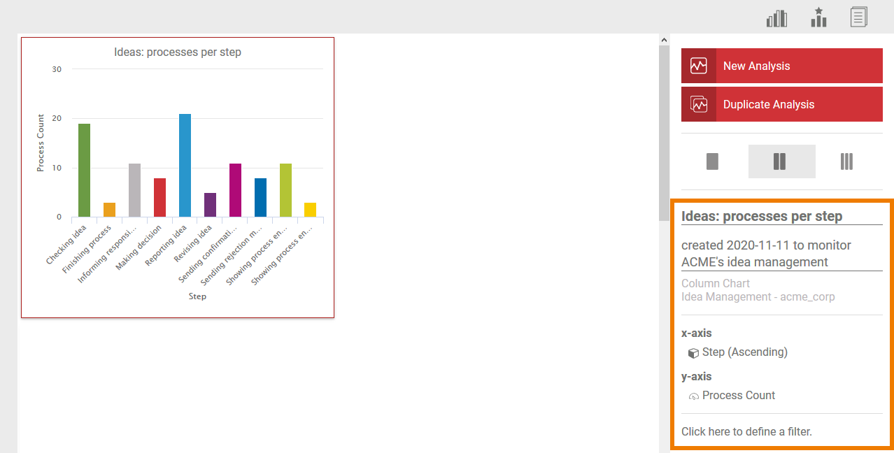
Use the sidebar to assign a name and a description to the analysis. You can also edit the axis allocation via the sidebar. Click the x-axis / y-axis section in the sidebar to open a pop-up window in which you can adapt the axis allocation:
| Panel | ||
|---|---|---|
| ||
|
| Panel | ||
|---|---|---|
| ||
...
Overview
Content Tools