The Date Chooser widget is a built-in jQuery UI Datepicker widget and is automatically available when binding a Text Field user interface element to a data attribute having a UI Date type.
The UI date type is
- Date, to enter a date
- DateTime, to enter date and time
| Multiexcerpt include |
|---|
| MultiExcerptName | uiForm |
|---|
| nopanel | true |
|---|
| PageWithExcerpt | INTERNAL:_examples_BRIDGE |
|---|
|
Example
The Date Selector widget looks like the following:
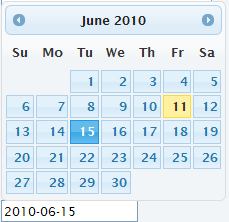
This is how the binding is defined:
The date format is given by the language and locale. It can be explicitly switched by setting the URL query parameter lang. For example, http://localhost:12461/ui/UIForm.html?lang=de-DE. The supported datepicker localizations can be found at the jQuery UI Datepicker localization page.
However, it is sometimes necessary to set the date format explicitly because a company might adhere to its own standards. This can then be achieved by calling JavaScript operations before the widget is being used. The following call sets the date validation and formatting options for the current language:
| Code Block |
|---|
|
e2e.localization.setCurrentDateSettings({
     dateFormat: "d-M-yy",
monthNamesShort: [`JAN`, `FEB`, `MAR`, `APR`, `MAY`, `JUN`, `JUL`, `AUG`, `SEP`, `OCT`, `NOV`, `DEC`]}); |
The operation parameter object may contain the following attributes: dateFormat, closeText, prevText, nextText, currentText, monthNames, monthNamesShort, dayNames, dayNamesShort, dayNamesMin, weekHeader, firstDay, isRTL, showMonthAfterYear, and yearSuffix.
For more details see the jQuery UI Datepicker options.