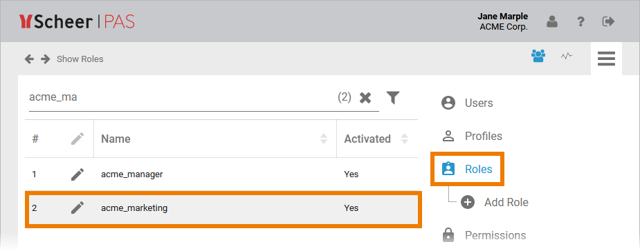
adding_a_role
| Multiexcerpt |
|---|
| MultiExcerptName | adding_a_role |
|---|
|
| If When you open the role editor, it already contains an empty line already. Start typing the name of the role your are seaching for in field Role. The field has an autocomplete function: As soon as you start inserting, a drop-down list is displayed containing all available roles that match your input. Select the role you want to use. | 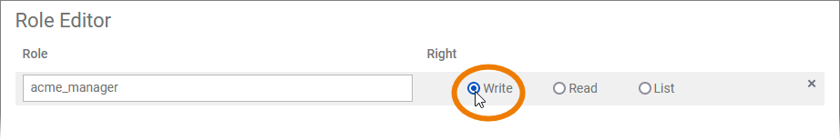 | In the next step you need to assign the rights that will be granted to the role owner. Available options are: | Right | Description |
|---|
| Write | A user assigned to this role will be able to see and change the instance data for all process steps in the current lane. | | Read | A user assigned to this role will be able to display the instance data for all process steps in the current lane. This right is assigned by default. | | List | A user assigned to this role will only be able to see the instances in the instance table for all process steps in the current lane. |
| 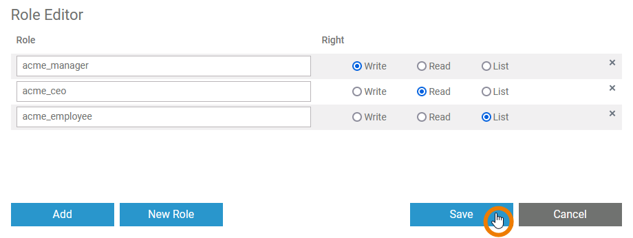 | You can continue to add further roles (or create new ones, see below) as multiple roles can be assigned to one lane. When you have finished, save your changes to apply them to the lane. | 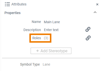 | The number of roles assigned to a lane is displayed in the attributes panel. |  | You have to open the user management, to assign the new role to users. |
|
create_connector
| Multiexcerpt |
|---|
| MultiExcerptName | create_connector |
|---|
| shouldDisplayInlineCommentsInIncludes | false |
|---|
|
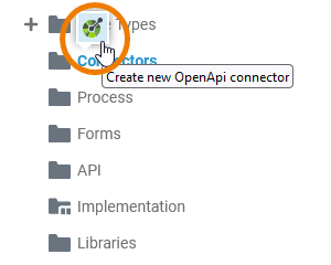
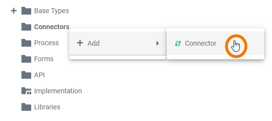
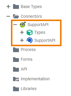
| Hover with your mouse over the Connectors tree node inthe service panel. Click the icon  to create a new connector. to create a new connector. | | Alternatively, you can open the context menu of the Connectors folder and click Add > OpenApiConnector. | 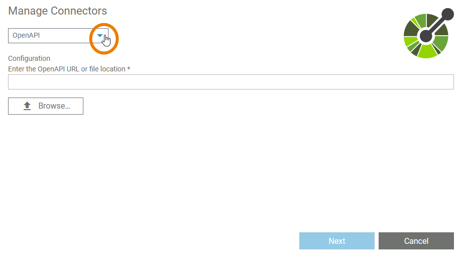 Image Modified Image Modified | The Manage Connectors dialog is displayed. Select a type of connector from the dropdown list. | 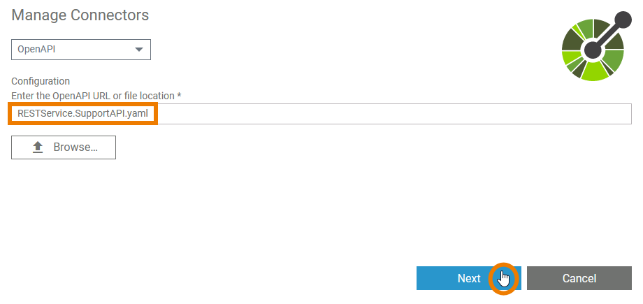 Image Modified Image Modified
| Configure the connector in the Configuration section, e.g. OpenAPI connectors can be configured by simply importing a JSON or YAML description file. | Info |
|---|
Supported OpenAPI versions are 2.0, 3.0.0, 3.0.1, 3.0.2, and 3.0.3. The OpenApi version 3.1 is not supported at the moment. |
Find Refer to Adapters for more information about adapters and their related connector configuration on Adapters pp. When you have selected an appropriate file, click Next. | Info |
|---|
The Next button is enabled only when you have selected a file. |
| 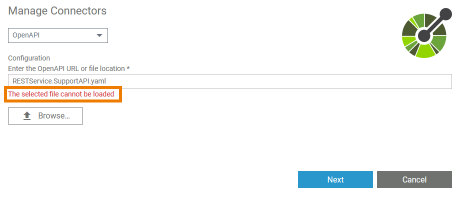 Image Modified Image Modified
| If the selected file cannot be loaded, a corresponding error message is displayed in the dialog. | Additionally a (more detailed) toast message is displayed. The following error messages are possible: | The OpenAPI version 'x.y.z' is not supported. Versions 2.0.0, 3.0.0, 3.0.1, 3.0.2, and 3.0.3 are supported. | - You have selected a file in a version that is not supported.
| - Select a file in a version that is supported.
| | The property 'swagger' or 'openapi' is missing. | - The mentioned properties are missing from the file or are misspelled.
| - Check if the basic structure of the file is correct.
For more detailed information about the basic structure of an OpenAPI file refer to OpenAPI Basic Structure.
| The file cannot be loaded.
| - The selected file is corrupt.
| | - The selected file has the wrong file type.
| - Select a file of a supported file type, e.g. a YAML description file.
|
| 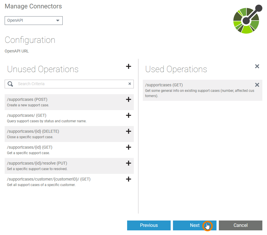 | After the selected file has been successfully imported, you can start the actual configuration of the connector. When everything is configured to your needs, click Next to save the connector. | | The connector, his types and interfaces, have been added to your service with the given configuration. |
|
creating_a_role
| Multiexcerpt |
|---|
| MultiExcerptName | creating_a_role |
|---|
|
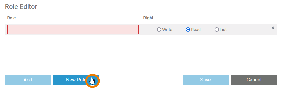
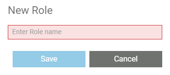
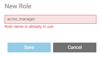
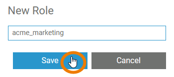
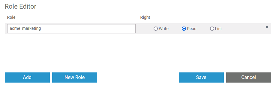
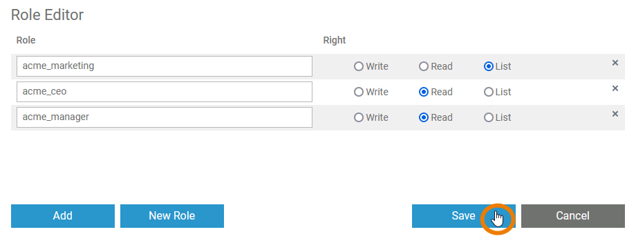
| Click button New Role to create a new role and assign it to the lane element. | | Enter the name of the new role in the pop-up window. The input is mandatory. | | If the role name is already in use, you will not be able to save. Use the existing role instead (see Adding an Existing Role below). | | Save to create the role. | | The new role is now added to the role editor and assigned to the current lane. | | In the next step you need to assign the rights that will be granted to the role owner. Available options are: | Right | Description |
|---|
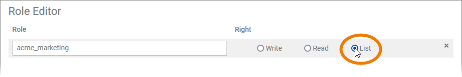
| Write | A user assigned to this role will be able to see and change the instance data for all process steps saved in the current lane. | | Read | A user assigned to this role will be able to display the instance data for all process steps saved in the current lane. This right is assigned by default. | | List | A user assigned to this role will only be able to see the instances in the instance table for all process steps saved in the current lane. |
| | You can continue to create further roles (or add already existing ones, see below) as multiple roles can be assigned to one lane. When you have finished, save your changes to apply them to the lane. | | The number of roles assigned to a lane is displayed in the attributes panel. | | The new role has also been added to the user management.
You have to open the user management, to assign the new role to users. |
|
cuttingcreating_
anda_
pasting_explorerservice
| Multiexcerpt |
|---|
| MultiExcerptName | cuttingcreating_anda_pasting_explorerservice |
|---|
|
Image Modified | If you want to use an element at a different position in the tree, select the context menu option Cut. | Image Removed | Open the context menu of the element in which you want to insert the cut element and select Paste. | Info |
|---|
The option Paste is only enabled if the elements to be inserted fit into the tree hierarchy. Pasting elements is only possible in the same namespace. |
 Image Removed Image Removed | The element is now displayed on its new place in the tree. | |
designer_development_process
| Multiexcerpt |
|---|
| MultiExcerptName | designer_development_process |
|---|
|
With PAS 23.1, the development process in the Designer has been optimized. To speed up and simplify the development process, we have decoupled development from deployment: Developers now work in a test environment where they can get constant feedback on their changes and can test them directly against the service preview.
The new approach also improves the work of fusion teams on a microservice: Developers can now make a finished feature or an intermediate state of a service available to other team members for testing while continuing to work independently on the same service.
Add a service to manage the necessary settings for your microservice. A service can only be created in folders. To add a service to a folder, right click on the folder and select option Add > Service from the context menu. | Image Added Image Added | | Multiexcerpt include |
|---|
| MultiExcerptName | create_project |
|---|
| PageWithExcerpt | _designer_excerpts |
|---|
|
If you want to deploy the service to a container later, please note that on container deployment the service name is automatically changed according to certain rules. | Note |
|---|
| title | Naming of Services for Container Deployment |
|---|
| Example:
Service Name: Janes_First_Service
Container Name: janes-first-service - The two services in this example would get the same container name...
- ... so they would overwrite each other.
|
| | Multiexcerpt include |
|---|
| SpaceWithExcerpt | INTERNAL |
|---|
| MultiExcerptName | note_explorer_name_restrictions |
|---|
| PageWithExcerpt | _designer_excerpts |
|---|
|
| Image Added | | Multiexcerpt include |
|---|
| SpaceWithExcerpt | INTERNAL |
|---|
| MultiExcerptName | project_created |
|---|
| PageWithExcerpt | _designer_excerpts |
|---|
|
| Image Added | | Multiexcerpt include |
|---|
| MultiExcerptName | open_a_service |
|---|
| DisableCaching | true |
|---|
| PageWithExcerpt | _designer_excerpts |
|---|
|
|
|
cutting_and_pasting_explorer
| Multiexcerpt |
|---|
| MultiExcerptName | cutting_and_pasting_explorer |
|---|
|
Image Added | If you want to use an element at a different position in the tree, select the context menu option Cut. | Image Added | Open the context menu of the element in which you want to insert the cut element and select Paste. | Info |
|---|
Option Paste is only enabled if the elements to be inserted fit into the tree hierarchy. Pasting elements is only possible in the same namespace. |
| Image Added | The element is now displayed on its new place in the tree. |
|
designer_development_process
| Multiexcerpt |
|---|
| MultiExcerptName | designer_development_process |
|---|
|
With PAS 23.1, the development process in the Designer has been optimized. To speed up and simplify the development process, we have decoupled development from deployment: Developers now work in a test environment where they can get constant feedback on their changes and can test them directly against the service preview. The new approach also improves the work of fusion teams on a microservice: Developers can now make a finished feature or an intermediate state of a service available to other team members for testing while continuing to work independently on the same service.  Image Added Image Added
| Your benefits: - You can access a preview of your service without having to deploy it, which speeds up testing and process optimization.
- Your test service is constantly compiled and validated. Errors and warnings are displayed in the validation panel and help you create a flawless service.
- You only need to deploy your service...
- if you want to give other team members the opportunity to test dedicated features or versions of the service.
- if you want to run regeression tests against your test server.
- In the meantime, you continue to develop the service independently of the deployed version.
|
|
designer_deployed_service
| Multiexcerpt |
|---|
| MultiExcerptName | designer_deployed_service |
|---|
|
Deployed Service  Image Added Image Added
| The tester opens the deployed service. |  Image Added Image Added
| The tester starts the process to create a new instance. |  Image Added Image Added
| The deployed version of the form opens. |
|
designer_test_service
| Multiexcerpt |
|---|
| MultiExcerptName | designer_test_service |
|---|
|
Test Service  Image Added Image Added
| The developer opens the test service. | Image Added | The developer starts the process to create a new instance. |  Image Added Image Added
| The adapted form opens. |
|
designer_test_environment_status
| Multiexcerpt |
|---|
| MultiExcerptName | designer_test_environment_status |
|---|
|
 Image Added Image Added
| When you create a new service or open an existing one, you are automatically working in the test environment. Its status is displayed in the Controls panel. The test environment is automatically started and stopped: - It is started...
- when you open a service and start working on it.
- when you select option Open application Image Added.
- when you trigger a manual validation via option Start validation Image Added .
- It is stopped...
- when you have not worked on your service for a certain amount of time. Default setting is 2 hours.
- when the corresponding project is deleted.
|
| Status Message | Description |
|---|
 Image Added Image Added
| The test environment has not yet been started or has expired.
|  Image Added Image Added
| The Designer is preparing the test environment. |  Image Added Image Added
| The test environment is ready. You can access the application preview. |
|
designer_test_service_preview
| Multiexcerpt |
|---|
| MultiExcerptName | designer_test_service_preview |
|---|
|
Accessing the test service is possible without deployment. Open the service preview via the controls panel and the service start page will open in a new tab:  Image Added Image Added
Image Added | You have direct access to your service(s): - Start your process Image Added and create a new instance.
- Open the instance overview Image Added.
|  Image Added Image Added
| The preview is fully operational. Use it to check functionality, layout and design of your process and its forms. |
|
deployment
| Multiexcerpt |
|---|
| MultiExcerptName | deployment |
|---|
|
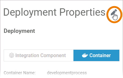 Image Added Image Added
| Select your deployment target the first time you deploy. | Info |
|---|
| - Container deployment: Your user must be assigned the xuml_container_admin profile.
- Integration (Bridge) deployment: You user must be assigned the integration_user profile and he must have an integration user account created by an integration administrator.
Refer to Administration Guide > Overview of Standard Profiles. |
Enable edit mode Image Added of the deployment properties and choose between Integration Component or Container. | 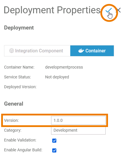 Image Added Image Added
| We recommend to enter a version number and increase the number with each deployment. | Multiexcerpt include |
|---|
| SpaceWithExcerpt | INTERNAL |
|---|
| MultiExcerptName | tip_increasing_version_number |
|---|
| PageWithExcerpt | _designer_excerpts |
|---|
|
Save Image Added the deployment properties to continue. | 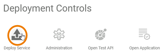 Image Added Image Added
| Now use the deployment controls to deploy the service to your chosen target:
|
|
differences_opening_applications
| Multiexcerpt |
|---|
| MultiExcerptName | differences_opening_applications |
|---|
|
Test and deployed service are both fully functional. The handling of an application is the same for both service types. The only difference is the way how to access the applications start page: | Test Service | Deployed Service |
|---|
Open the application via the Controls Panel :  Image Added Image Added
| Open the application via the Deployment Controls on the service details page: 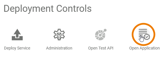 Image Added Image Added
Of course, to open the deployed service, you must first deploy it. Refer to Deploying a Service for more information. |
|
executing_deployed_service
Image Removed | Your benefits: - You can access a preview of your service without having to deploy it, which speeds up testing and process optimization.
- Your test service is constantly compiled and validated. Errors and warnings are displayed in the validation panel and help you create a flawless service.
- You only need to deploy your service...
- if you want to give other team members the opportunity to test dedicated features or versions of the service.
- if you want to run regeression tests against your test server.
- In the meantime, you continue to develop the service independently of the deployed version.
|
designer_deployed_service
| Multiexcerpt |
|---|
| MultiExcerptName | designer_deployed_service |
|---|
|
Deployed Service
Image Removed | The tester opens the deployed service. |
Image Removed | The tester starts the process to create a new instance. |
Image Removed | The deployed version of the form opens. |
designer_test_service
| Multiexcerpt |
|---|
| MultiExcerptName | designer_test_service |
|---|
|
Test Service
Image Removed | The developer opens the test service. |
Image Removed | The developer starts the process to create a new instance. |
Image Removed | The adapted form opens. |
designer_test_environment_status
| Multiexcerpt |
|---|
| MultiExcerptName | designer_test_environment_status |
|---|
|
Image Removed | When you create a new service or open an existing one, you are automatically working in the test environment. Its status is displayed in the Controls panel. The test environment is automatically started and stopped: - It starts...
- when you open a service and start working on it.
- when you click on the preview icon Image Removed.
- It stops...
- when you have not worked on your service for a certain amount of time. Default setting is 2 hours.
- when the corresponding project is deleted.
- when the test environment has no connection to a project.
|
| Status Message | Description |
|---|
Image Removed | The test environment has not yet been started or has expired.
| Info |
|---|
The test environment must be initialized every time you open a service. So if you open a service that should already be operational, but the offline message still appears, just wait some time until the test environment is established. |
Image Removed | The test environment is saving your work and preparing the preview. |
Image Removed | The test environment is ready. You can access the application preview. |
designer_test_service_preview
| Multiexcerpt |
|---|
| MultiExcerptName | designerexecuting_testdeployed_service_preview |
|---|
|
The deployed service is accessible via option Open Application in the deployment controls section. The start page of the deployed service looks exactly the same as that of the test serviceAccessing the test service is possible without deployment. Open the service preview via the controls panel and the service start page will open in a new tab:
| You have direct access to your service(s): - Start your process Image Removed and create a new instance.
- Open the instance overview Image Removed.
| Image Removed | The preview is fully operational. Use it to check functionality, layout and design of your process and its forms. | |
deployment
The handling of the deployed service is also the same: - Users can create new instances and execute the process.
- Users can access the instance overview.
|
The difference is: The deployed version does not change, even if the developer changes the service in the test environment. |
executing_deployed_service_example
| Multiexcerpt |
|---|
| MultiExcerptName | deployment |
|---|
|
Image Removed | Select your deployment target the first time you deploy. | Info |
|---|
| - Container deployment: Your user must be assigned the xuml_container_admin profile.
- Integration (Bridge) deployment: You user must be assigned the integration_user profile and he must have an integration user account created by an integration administrator.
Refer to Administration Guide > Overview of Standard Profiles. |
Enable edit mode Image Removed of the deployment properties and choose between Integration Component or Container. |
Image Removed | We recommend to enter a version number and increase the number with each deployment. | Multiexcerpt include |
|---|
| SpaceWithExcerpt | INTERNAL |
|---|
| MultiExcerptName | tip_increasing_version_number |
|---|
| PageWithExcerpt | _designer_excerpts |
|---|
|
Save Image Removed the deployment properties to continue. |
Image Removed | Now use the deployment controls to deploy the service to your chosen target:
| Icon | Description |
|---|
Image Removed | Use this icon to deploy the service to the selected deployment target. |
| Image Removed | Use this icon to open the management UI of the selected deployment target: |
| Image Removed | Use this icon to open the test UI for the service-related API. |
| Image Removed | Use this icon to open the deployed service in a new browser tab. |
differences_opening_applications
| Multiexcerpt |
|---|
| MultiExcerptName | differences_opening_applications |
|---|
|
Test and deployed service are both fully functional. The handling of an application is the same for both service types. The only difference is the way how to access the applications start page:
| Test Service | Deployed Service |
|---|
Open the application via the Controls Panel: Image Removed | Open the application via the Deployment Controls on the service details page: Image Removed Of course, to open the deployed service, you must first deploy it. Refer to Deploying a Service for more information. |
executing_deployed_service
| Multiexcerpt |
|---|
| MultiExcerptName | executing_deployed_service |
|---|
|
The deployed service is accessible via the Open Application button in the deployment controls section. The start page of the deployed service looks exactly the same as that of the test service:
Image Removed
Image Removed | The handling of the deployed service is also the same: - Users can create new instances and execute the process.
- Users can access the instance overview.
|
The difference is: The deployed version does not change, even if the developer changes the service in the test environment.
Example: Test Service vs. Deployed Service
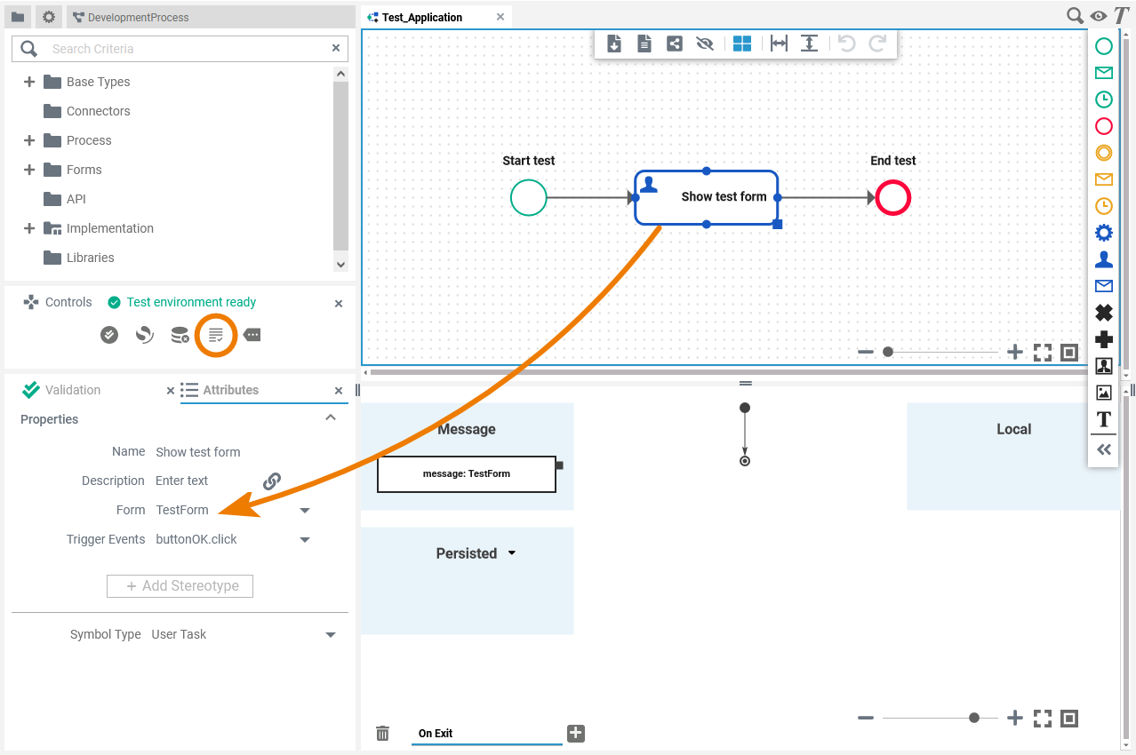 Image Removed Image Removed
| A developer created a simple test application, containing only a user task with an assigned test form. |
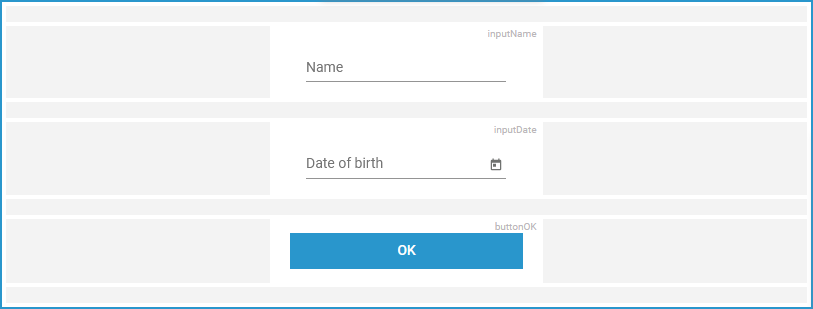 Image Removed Image Removed
| The test form contains two input fields and a button. |
Image Removed | The developer deploys this version. |
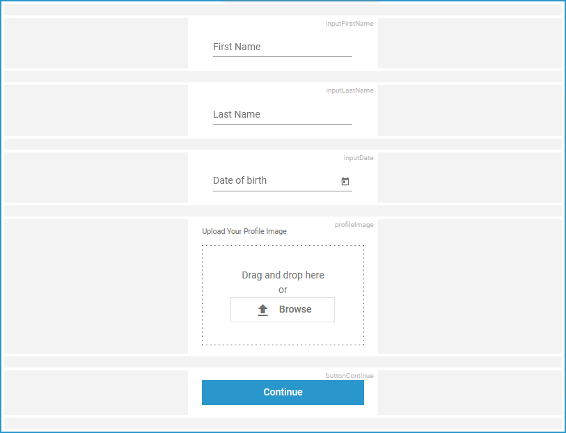 Image Removed Image Removed
| After the deployment of this version, he starts to extend the test form. |
field_config_editor
| Multiexcerpt |
|---|
| MultiExcerptName | field_config_editor |
|---|
|
If you click icon Image Removed the Field Configuration editor opens:
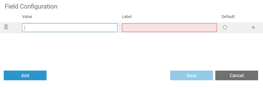 Image Removed
Use the editor to add and manage the content of your element:
| Option | Description |
|---|
Image Removed | Use the Add button to insert new rows. |
Image Removed | Use icon Drag to change the order of the rows. |
| Info |
|---|
You can enter the options for this element as value pairs. When entering value pairs, always the first value (Value) is saved as key in the data container. The second value (Label) is used as notification to the user. The label is displayed in the form.
Value pairs may also contain numbers, so that a user can chose a text option, but in the background a calculation is carried out. |
Image Removed | Enter a Value for your element option.
| Note |
|---|
It is not possible to assign the same value to different labels. |
Image Removed | Enter a Label for your element option. The label is displayed in the form. |
Image Removed | Click on this icon to set the option as default. |
Image Removed | Use this icon to delete the option. |
Image Removed | Use the Save button to save your changes. |
Image Removed | Use the Cancel button to discard your changes. |
how_to_use_the_timer
| Multiexcerpt |
|---|
| MultiExcerptName | how_to_use_the_timer |
|---|
|
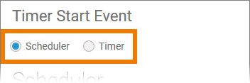 Image Removed Image Removed | If you click icon Image Removed in the attribute panel, a separate editor will open. Here you can define the settings of your Timer Start Event. You have two options with different settings: |
 Image Removed Image Removed | Scheduler | Anchor |
|---|
scheduler | scheduler | Use the scheduler if you want to define a pattern for your Timer Start Event, for example to start the model every monday, every hour etc.
| Setting | Description | Default |
|---|
| Allow Parallel Executions | If checked, each time a scheduler pattern matches, the scheduler activity diagram is executed - even if another execution is already running.
If not checked, the next execution cycle is suppressed if an execution diagram is already being run. | Checked |
| Year(s) | Insert a positive integer or a pattern. | * |
| Month(s) | Use numbers 1 to 12 or a pattern. | * |
| Weekdays(s) | Valid input: - Mon or Monday
- Tue or Tuesday
- Wed or Wednesday
- Thur or Thursday
- Fri or Friday
- Sat or Saturday
- Sun or Sunday
- a pattern
| * |
| Day(s) | Depending on the month, valid input are numbers from 1 to 31 or a pattern. | * |
| Hours(s) | Use 0 to 23 or a pattern. | * |
| Minute(s) | Use 0 to 59 or a pattern. | 0 |
| Seconds | Use 0 to 59 or a pattern. | 0 |
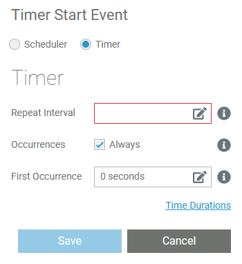 Image Removed Image Removed | Timer | Anchor |
|---|
timer | timer | Select the timer if you want to define a cycle for example to start the model after one week, after two hours etc.
| Setting | Description | Default |
|---|
| Repeat Interval | Enter a valid time duration expression (see page Time Durations in the BRIDGE documentation for detailed information).
This setting defines the time interval between two calls of the timer action. | - |
| Occurrences | Insert a positive integer to define the count of repetitions. If you want the timer to be endless, check Always (default). | Always |
| First Occurrence | Enter a valid time duration expression (see page Time Durations in the BRIDGE documentation for detailed information).
This setting defines the wait interval after service start before the timer is executed for the first time. | 0 seconds |
| executing_deployed_service_example |
|
Image Added | A developer created a simple test application, containing only a user task with an assigned test form. | Image Added | The test form contains two input fields and a button. | Image Added | The developer deploys this version. | Image Added | After the deployment of this version, he starts to extend the test form. |
|
field_config_editor
| Multiexcerpt |
|---|
| MultiExcerptName | field_config_editor |
|---|
|
If you click icon Image Added the Field Configuration editor opens: Image Added Use the editor to add and manage the content of your element: | Option | Description |
|---|
Image Added | Click Add to insert new rows. | Image Added | Use option Drag to change the order of the rows. |
| Info |
|---|
You can enter the options for this element as value pairs. When entering value pairs, always the first value (Value) is saved as key in the data container. The second value (Label) is used as notification to the user. The label is displayed in the form.
Value pairs may also contain numbers, so that a user can chose a text option, but in the background a calculation is carried out. |
| Image Added | Enter a Value for your element option. | Note |
|---|
It is not possible to assign the same value to different labels. |
| Image Added | Enter a Label for your element option. The label is displayed in the form. | Image Added | Use this option to set the element option as default. | Image Added | Use this option to delete the element option. | Image Added | Click Save to save your changes. | Image Added | Click Cancel to discard your changes. |
|
how_to_use_the_timer
| Multiexcerpt |
|---|
| MultiExcerptName | how_to_use_the_timer |
|---|
|
| Image Added | If you click option Image Added in the attribute panel, a separate editor will open where you can define the settings of your Timer Start Event. You have two options with different settings: - Scheduler (see below)
- Timer (see below)
| | Image Added | Scheduler Use the scheduler if you want to define a pattern for your Timer Start Event, for example to start the model every monday, every hour etc. | Setting | Description | Default |
|---|
| Allow Parallel Executions | If checked, each time a scheduler pattern matches, the scheduler activity diagram is executed - even if another execution is already running.
If not checked, the next execution cycle is suppressed if an execution diagram is already being run. | Checked | | Year(s) | Insert a positive integer or a pattern. | * | | Month(s) | Use numbers 1 to 12 or a pattern. | * | | Weekdays(s) | Valid input: - Mon or Monday
- Tue or Tuesday
- Wed or Wednesday
- Thur or Thursday
- Fri or Friday
- Sat or Saturday
- Sun or Sunday
- a pattern
| * | | Day(s) | Depending on the month, valid input are numbers from 1 to 31 or a pattern. | * | | Hours(s) | Use 0 to 23 or a pattern. | * | | Minute(s) | Use 0 to 59 or a pattern. | 0 | | Seconds | Use 0 to 59 or a pattern. | 0 |
| Image Added | Timer Select the timer if you want to define a cycle for example to start the model after one week, after two hours etc. | Setting | Description | Default |
|---|
| Repeat Interval | Enter a valid time duration expression (see below). Refer to Time Durations in the Bridge documentation for detailed information.
This setting defines the time interval between two calls of the timer action. | - | | Occurrences | Insert a positive integer to define the count of repetitions. If you want the timer to be endless, check Always (default). | Always | | First Occurrence | Enter a valid time duration expression (see below). Refer to Time Durations in the Bridge documentation for detailed information.
This setting defines the wait interval after service start before the timer is executed for the first time. | 0 seconds |
| 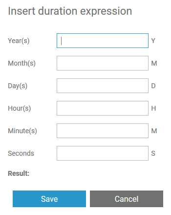 Image Added Image Added | Duration Expression Wizard The settings Repeat Interval and First Occurrence contain the option Image Added. Click this option to open a wizard that supports you to define the necessary duration expression.
| 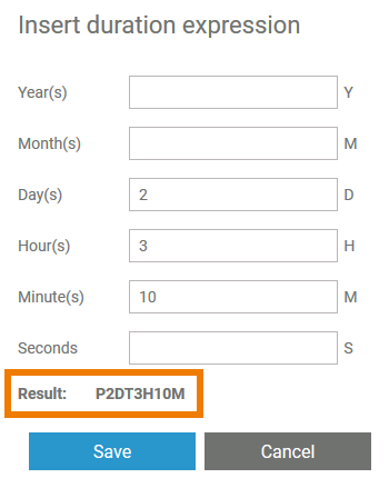 Image Added Image Added | Insert positive integers in the desired fields. The result is shown below. Click Save to close the wizard. | 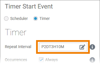 Image Added Image Added | The duration expression is displayed in the corresponding field. | Tip |
|---|
Once you are familiar with the notation of the duration expression, you can also insert it directly in the field. |
|
|
lane_handling
| Multiexcerpt |
|---|
| MultiExcerptName | lane_handling |
|---|
|
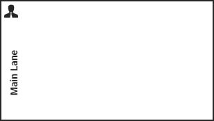 Image Added Image Added | For a role-based process model, you need at least one main lane. You can then add sublanes. | 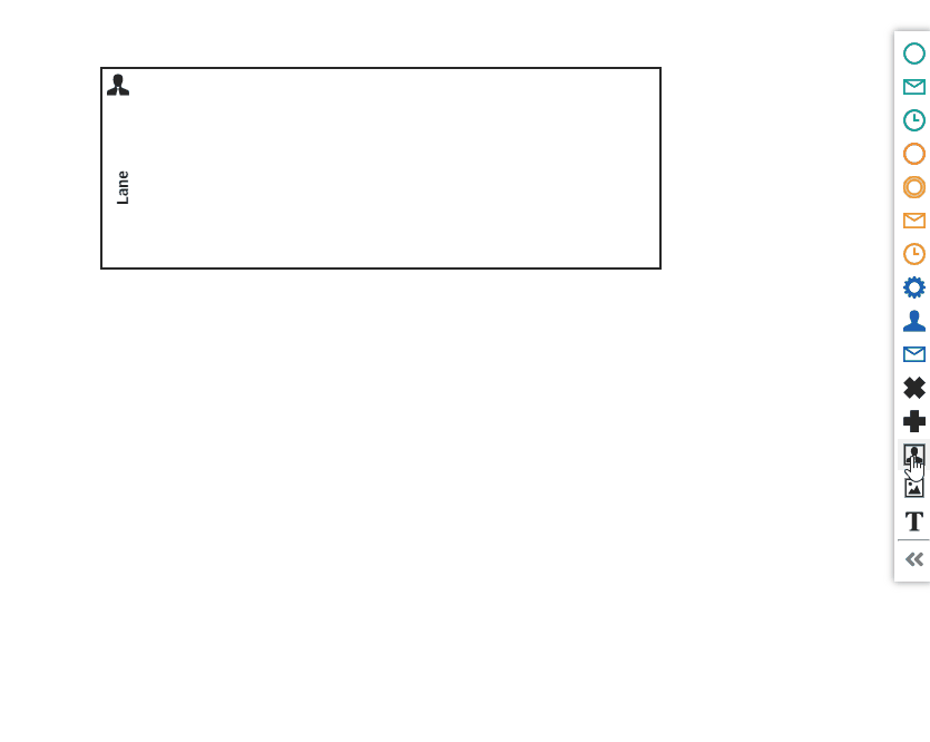 Image Added Image Added | To create sublanes, drag the next lane elements onto the header of the main lane element. Drop the new element on the border of an existing lane to position the new sublane. To create a sublane within a sublane, you can drag the element onto the body of an existing lane. | Multiexcerpt include |
|---|
| SpaceWithExcerpt | INTERNAL |
|---|
| MultiExcerptName | click_to_see_gif |
|---|
| PageWithExcerpt | _designer_excerpts |
|---|
|
| 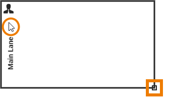 Image Added Image Added |
| Tip |
|---|
To activate the lane element, click its border or icon/header. If the element is active, an indicator is displayed in the lower right corner and the border of the element is thicker. |
| Before Deletion:  Image Added Image Added After Deletion: 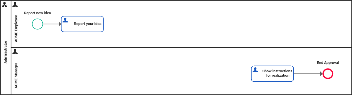 Image Added Image Added |
| Info |
|---|
| title | Deletion Behavior of Lane Elements |
|---|
| If you delete a lane element, it is erased from your work area including all content!
However, you can use restore the deletion by using Undo in the BPMN toolbar. |
|
|
open_role_editor
| Multiexcerpt |
|---|
| MultiExcerptName | open_role_editor |
|---|
|
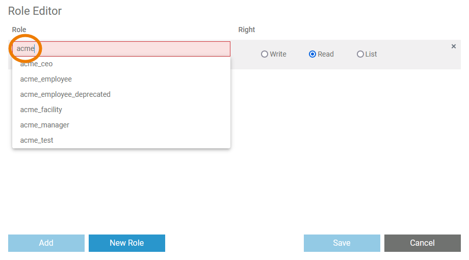
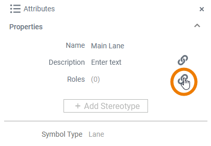 Image Added Image Added | When you click option Image Added in the attributes panel, a separate editor will open where you can assign existing roles and create new ones. | 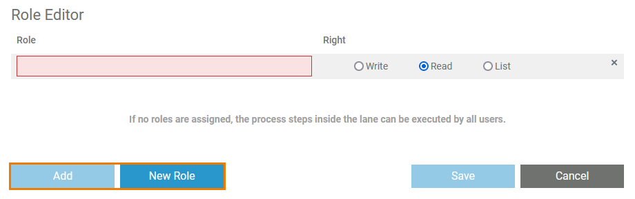 Image Added Image Added | In the role editor, you have two options: - You can add an already existing role.
- You can create a new role.
| Info |
|---|
If no roles are assigned to a lane, the process steps inside the lane can be executed by all users and a corresponding note is displayed. |
|
|
permission_administration
| Multiexcerpt |
|---|
| MultiExcerptName | permission_administration |
|---|
|
Image Added | In the pop-up window Permission Administration you can invite single colleagues or whole groups to access the element. By default, the creator of the element and everyone sharing the current namespace has write permissions. | Info |
|---|
To limit access to the element you can remove the group Everyone completely, or give it read-only permission.
If you want to restore permissions for Everyone, - select option Invite Group,
- search for group Everyone and add it again.
|
| Image Added | If you want to add other users, first select one of the options: - Invite Group: Allow whole user groups to access your element. Available groups are all distribution lists that have been created as a Role in the user management.
- Invite People: Add single users to your element and grant them read or write permission.
| Multiexcerpt include |
|---|
| SpaceWithExcerpt | INTERNAL |
|---|
| MultiExcerptName | tip_info_about_roles_in_admin_guide |
|---|
| PageWithExcerpt | _designer_excerpts |
|---|
|
| Image Added | Enter the name or email address of the group or person to the search field. Matching results are shown in a list. Select the entry you want to use. | Image Added | Click option Image Added to add the selected user or group. | Image Added | Once the user or group has been added, you can specify whether the user or the group should have read or write permission. Save your changes. |
|
pin_highlighting
| Multiexcerpt |
|---|
| MultiExcerptName | pin_highlighting |
|---|
|
While dragging the object flow, the color of the pins changes to assist you with finding matching connection points. 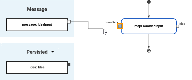 Image Added Image Added
| When you start dragging an object flow, all pins of the same type and multiplicity are marked blue.
Blue pins indicate that this pin is a valid target for the object flow. | 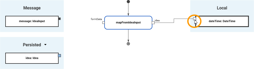 Image Added Image Added
| White connection points of variables indicate that you are trying to connect variables that do not have the same type or multiplicity.
The connection point is marked in white when you have reached it with the mouse pointer. | 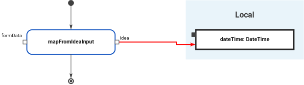 Image Added Image Added
| It is possible to draw an object flow to an invalid connection point but the relation will be invalid and displayed in red. |  Image Added Image Added
| A pin turns red if an object flow cannot be created at all. You cannot - connect a local variable with another local variable
- connect a persisted variable with another persisted variable
- draw a connection to a pin that already has an incoming object flow.
|
|
validating_error_types
| Multiexcerpt |
|---|
| MultiExcerptName | validating_error_types |
|---|
|
Different types of validation messages are displayed. Both, warnings and errors, are reported by the xUML Compiler, and refer to the implemented execution: | Icon | Error Type | Description |
|---|
 Image Added Image Added
| Warning | If the compiler reports a warning, you can deploy the service nevertheless. However, you should check the reported items in your service. |  Image Added Image Added
| Error | If an error is reported, deployment is not possible. Check the mentioned parts of the service, and eliminate the cause of the error to enable model execution | |
| Anchor |
|---|
duration_expression | duration_expression | Image Removed | Duration Expression Wizard
The settings Repeat Interval and First Occurrence contain the icon Image Removed.
Click the icon to open a wizard that supports you to define the necessary duration expression.
| Image Removed | Insert positive integers in the desired fields. The result is shown below. Click Save to close the wizard. |
Image Removed | The duration expression is displayed in the corresponding field.
| Tip |
|---|
Once you are familiar with the notation of the duration expression, you can also insert it directly in the field. |
lane_handling
| Multiexcerpt |
|---|
| MultiExcerptName | lane_handling |
|---|
|
Image Removed | For a role-based process model, you need at least one main lane. You can then add sublanes. |
| Image Removed | To create sublanes, drag the next lane elements onto the header of the main lane element. Drop the new element on the border of an existing lane to position the new sublane. To create a sublane within a sublane, you can drag the element onto the body of an existing lane. | Multiexcerpt include |
|---|
| SpaceWithExcerpt | INTERNAL |
|---|
| MultiExcerptName | click_to_see_gif |
|---|
| PageWithExcerpt | _designer_excerpts |
|---|
|
|
Image Removed | | Tip |
|---|
To activate the lane element, click its border or icon/header. If the element is active, an indicator is displayed in the lower right corner and the border of the element is thicker. |
Before Deletion: Image Removed After Deletion: Image Removed | | Info |
|---|
| title | Deletion Behavior of Lane Elements |
|---|
|
If you delete a lane element, it is erased from your work area including all content !
However, you can use restore the deletion by using Undo in the BPMN toolbar. |
open_role_editor
| Note |
|---|
This excerpt contains anchor links. These links must be added to the page the macro is used on. |
| Multiexcerpt |
|---|
| MultiExcerptName | open_role_editor |
|---|
|
Image Removed | When you click icon Image Removed in the attribute panel, a separate editor will open where you can assign existing roles and create new ones. | Image Removed | In the role editor, you have two options: | Info |
|---|
If no roles are assigned to a lane, the process steps inside the lane can be executed by all users and a corresponding note is displayed
|
validating_main
| Multiexcerpt |
|---|
| MultiExcerptName | validating_main |
|---|
|
| The validation results are displayed in the Validation panel. It is available in all editors: - BPMN Editor
- Execution Editor
- Mapping Editor
- Form Editor
If you use the panel preset, the validation panel is the second tab in the lower left corner. To return to the panel preset, go to the user preferences and click button Reset Panels. | Multiexcerpt include |
|---|
| SpaceWithExcerpt | INTERNAL |
|---|
| MultiExcerptName | tip_panel_management |
|---|
| DisableCaching | true |
|---|
| PageWithExcerpt | _designer_excerpts |
|---|
|
| 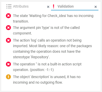 Image Removed Image Removed
| In the Validation panel, validation findings of a service are displayed. The icon in the panel header indicates if there are any validation issues: The list is sorted by error types: - Image Removed Error: xUML Compiler errors
- Image Removed Warning: xUML Compiler warnings
| Info |
|---|
You cannot test or deploy a service that still has validation errors. You need to resolve them first. |
Error TypesDifferent types of validation messages are displayed. Both, warnings and errors, are reported by the xUML Compiler, and refer to the implemented execution: |
| Icon | Error Type | Description |
|---|
Image Removed | Warning | If the compiler reports a warning, you can deploy the service nevertheless. However, you should check the reported items in your service. |
Image Removed | Error | If an error is reported, deployment is not possible. Check the mentioned parts of the service, and eliminate the cause of the error to enable model execution. |
Analyzing Validation Results
The validation panel is available in all editors, and shows xUML Compiler messages (Image Removedand Image Removed) no matter where they occur. Use the information given in the validation panel to check the mentioned elements of your service model.
Using the Displayed InformationIf you use the panel preset, the validation panel is the second tab in the lower left corner. To return to the panel preset, go to the user preferences, open the Designer Options and select option Reset Panels. | Multiexcerpt include |
|---|
| SpaceWithExcerpt | INTERNAL |
|---|
| MultiExcerptName | tip_panel_management |
|---|
| DisableCaching | true |
|---|
| PageWithExcerpt | _designer_excerpts |
|---|
|
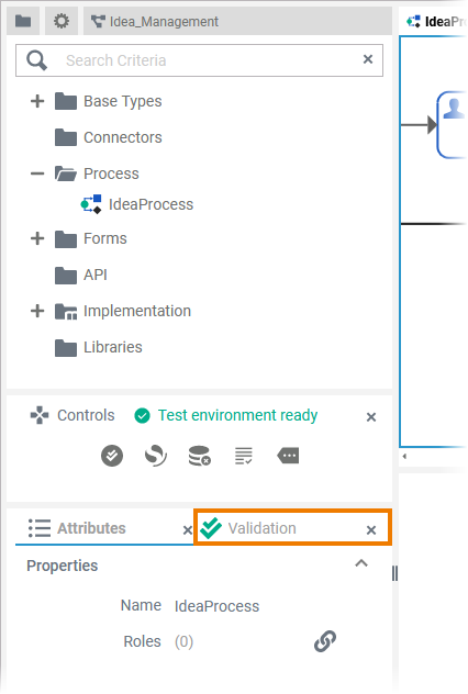
|
Image Added | In the Validation panel, validation findings of a service are displayed. The icon in the panel header indicates if there are any validation issues: The list is sorted by error types: - Image Added Error: xUML Compiler errors
- Image Added Warning: xUML Compiler warnings
|
| Info |
|---|
You cannot test or deploy a service that still has validation errors. You need to resolve them first. |
validating_using_diplayed_info
| Multiexcerpt |
|---|
| MultiExcerptName | validating_using_displayed_info |
|---|
|
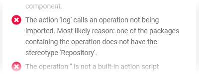
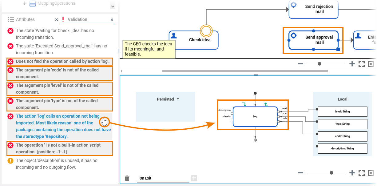
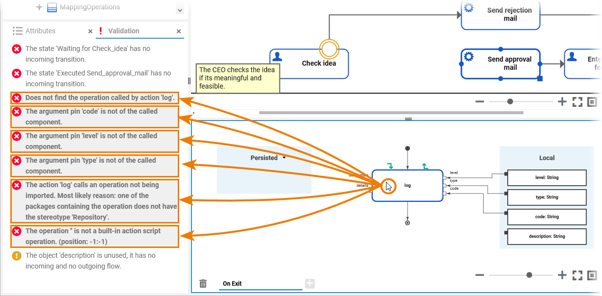
| Validation messages describe the error, and also provide information on how to solve the problem. | | The items in the validation panel are links. If you click on a message... - ...the related editor opens if not already open.
- ...the affected element is selected on the diagram pane.
- ...all other messages concerning this element are highlighted.
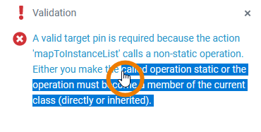
If the message refers to an element on the execution pane, the associated BPMN element on the BPMN diagram pane is also selected. | | This also works vice versa: Click an element on the pane to highlight all messages concerning this element. | | The handling in the Mapping Editor works the same way: Click a message to highlight the affected element or object flow in the editor. |
|
validating_sharing_validation_messages
| Multiexcerpt |
|---|
| MultiExcerptName | validating_sharing_validation_messages |
|---|
|
|
| Tip |
|---|
Sometimes you want to share a validation message with another developer. Select the displayed message (or the part you want to share) with your mouse or a double-click. Now you can copy and paste the highlighted content, e.g. to an email or a chat. |
|
|