Page History
| Otp |
|---|
...
Tabbed Pane Widget Specifications
The actual Tabbed Pane element is needed as a main template organizing the single tabs and their order and position. It is later assigned to the <<UITabState>>.
The way the tabs are organized is defined in the tabbed panes specifications.
...
Figure: Tabbed Pane Main UI Element
...
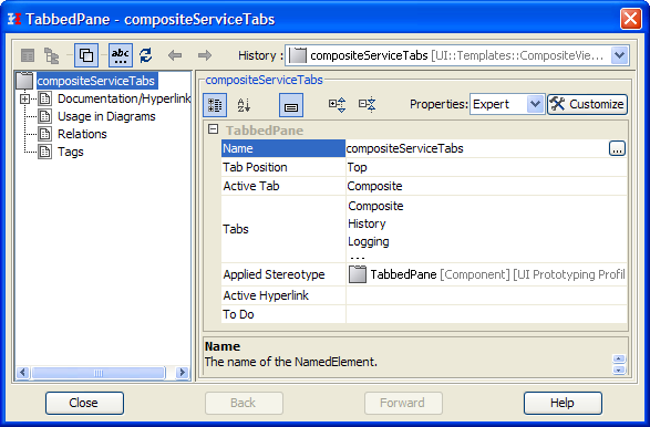
| Property | Description |
|---|---|
| Name | Name of the Tabbed Pane container |
| Active Tab | Defines which tab is initially active when the page is loaded. |
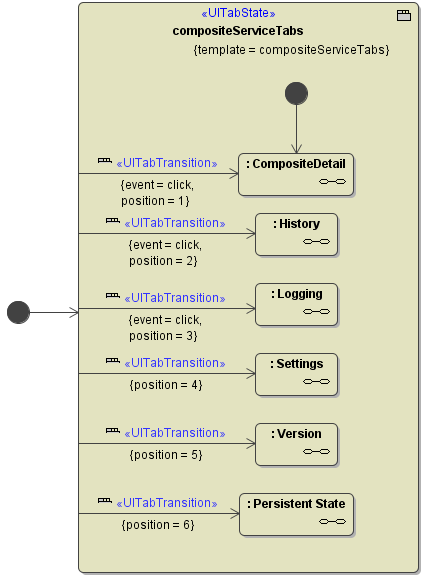
Tabbed Pane Navigation
...
The tab navigation is defined in a Tabbed Pane Navigation (<<UITabState>>).
The
...
...
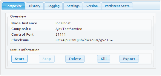
Overview
Content Tools