Page History
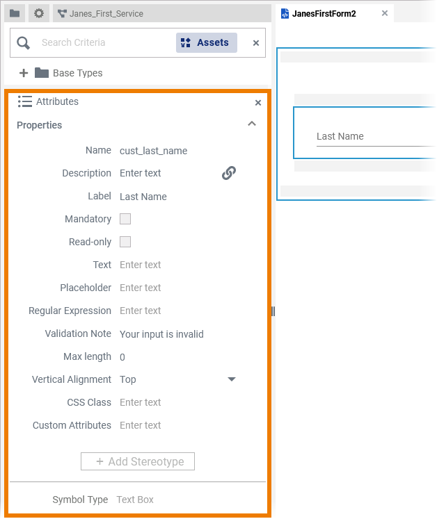
| Open the Attributes panel to configure a form element. The panel contains different settings for each element. For
|
Defining Preset Values
For some form elements you can preset values:
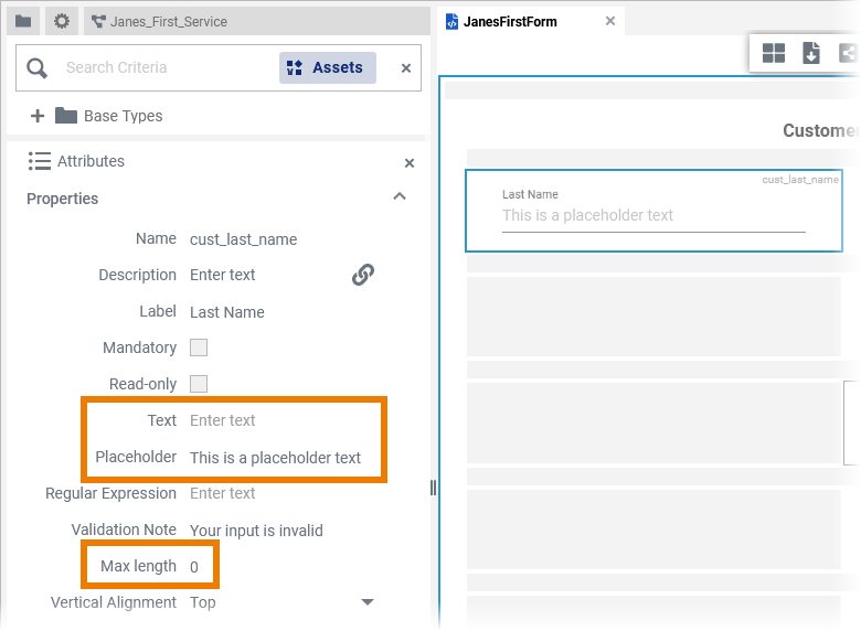
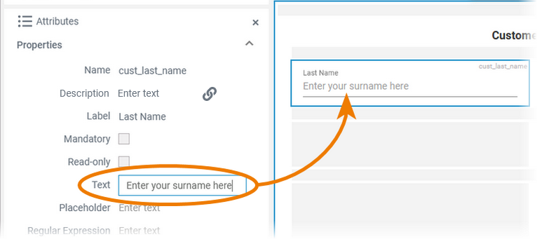
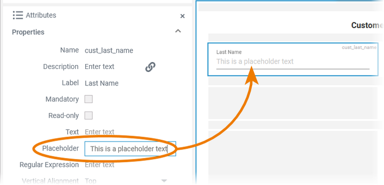
Text Box and Text Area
| |||||||||
| TextContent added to attribute Text is shown in the element. If the user does not change the content of the field during form execution, the content of Text will be saved in the database. | ||||||||
| Placeholder
|
Select Field and Radio Button Group
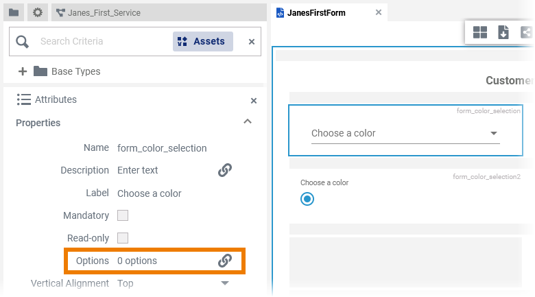
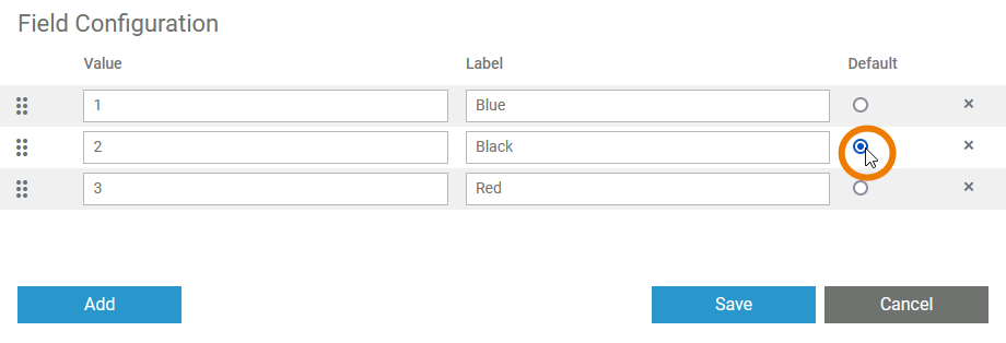
| The elements Select Field and Radio Button Group contain the attribute:
| ||
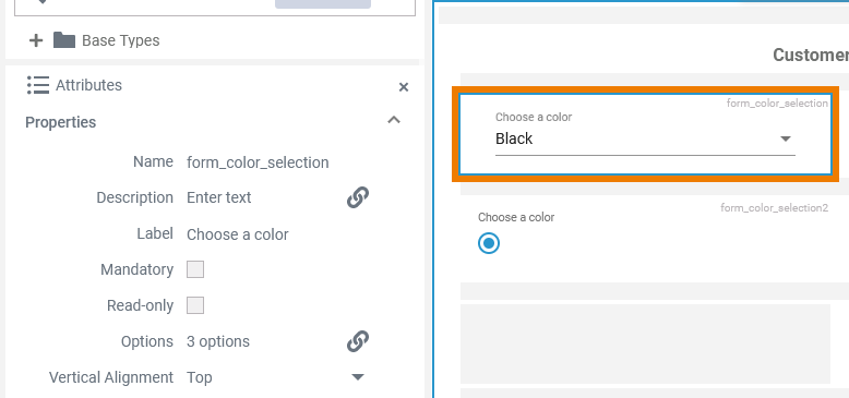
| If you click icon the icon Click Default Select the radio button in the Default column to preset this value as default in the element. | ||
| Example: The second value Black is preset as default value in the element. |
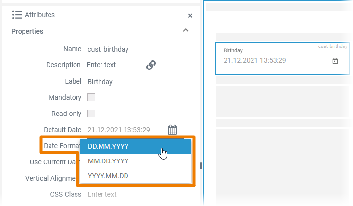
Date Picker
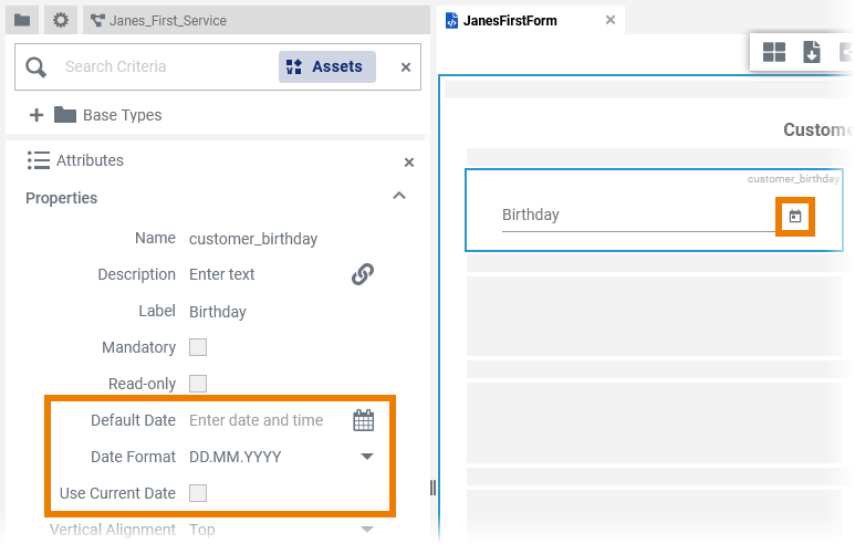
| The element Date Picker contains the three attributes:
|
| Use the Date Format field to define the format, in which the date shall be displayed. You can choose between three different date formats. |
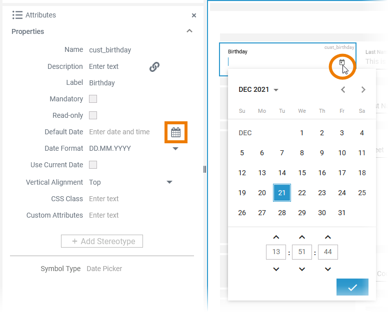
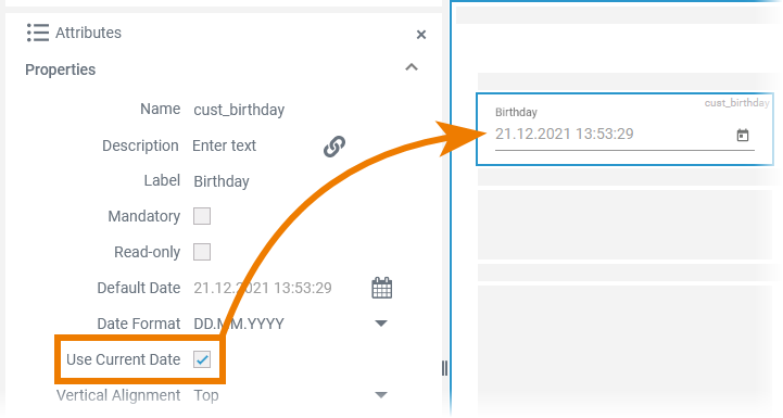
| By default the form date picker field is empty. You have two options to preset a date:
|
|
|
| Use the Date Format field to define the format, in which the date shall be displayed. You can choose between three different date formats:
|
| Otp | ||
|---|---|---|
|
| Rp |
|---|
Overview
Content Tools